47

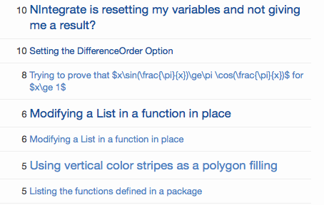
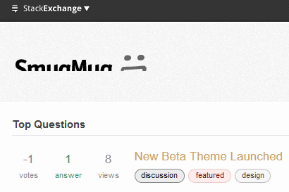
We launched the new Stack Exchange Beta theme on our Judaism site a few weeks ago. Starting today, we'll be gradually rolling it out to the rest of the Beta sites. Yes, we're retiring "Sketchy," R.I.P.

This post is to serve as a central place for reporting all new Beta theme related CSS and styling issues.

p.s. to keep the feedbacks tidy, I'll be deleting answers that have been fixed/addressed

29
  • 24
    Is this one called Grainy?
    – random
    Commented Mar 19, 2012 at 22:55
  • 1
    @random I haven't come up with a clever name for it yet. But I like Grainy!
    – Jin
    Commented Mar 19, 2012 at 22:57
  • Where's CogSci on the list?? I think a less Sketchy design may help us attract more industry professionals! Commented Mar 19, 2012 at 23:01
  • 4
    @TheUnhandledException We're rolling out about 8-10 sites per day this week. By the end of the week all the Beta sites will be converted to the new theme.
    – Jin
    Commented Mar 19, 2012 at 23:03
  • Wow, that's fast! Thanks for all your hard work guys! Commented Mar 19, 2012 at 23:04
  • 6
    Can gardening get a green version of that theme? Commented Mar 20, 2012 at 1:13
  • 10
    ::sniff:: We'll miss you, Sketchy! ::sniff:: Not because we actually liked you, of course. Just because we were used to you. ::waves soggy hanky:: Commented Mar 20, 2012 at 1:32
  • @Jin -- Could you show the link to the original announcement so you don't have duplicate error reports.
    – Naftali
    Commented Mar 20, 2012 at 13:21
  • 4
    This post is to serve as a central place for reporting all new Beta theme related CSS and styling issues. Erm, why not one post per issue? Like we've always done for every other category of issue, ever? Commented Mar 20, 2012 at 18:39
  • @LightnessRacesinOrbit IIRC Jin has typically created a thread on a site's meta to announce and discuss their theme. This is just the first on MSO because it's the first to apply network-wide. That said, there is precedent for broad feedback questions ending in tears, here.
    – Jeremy
    Commented Mar 20, 2012 at 23:03
  • @JeremyBanks: Indeed, I can't see how it could possibly end up any other way. Commented Mar 20, 2012 at 23:42
  • 1
    @LightnessRacesinOrbit you mean to have each Beta site's community reporting a css bug as one individual post on their Metas? Do you not see the inefficiency in that due to dupes?
    – Jin
    Commented Mar 21, 2012 at 0:59
  • 3
    @LightnessRacesinOrbit for now, meta.so is where network wide issues are reported and discussed, which is the case for the new beta theme.
    – Jin
    Commented Mar 21, 2012 at 1:03
  • 2
    So...when you say you're deleting answers that have been "addressed", does that include those which you've declined to address? If so, I'd say that's inappropriate. The community should still be able to vote on those suggestions. If you feel it necessary, you could edit the suggestion to add a horizontal rule and add the status-declined tag, and ideally, a short explanation of the rationale. I think that would be much more constructive than simply deleting them. (Obviously I understand deleting stuff that's been fixed and rendered completely obsolete.)
    – Cody Gray
    Commented Mar 28, 2012 at 4:32
  • 1
    @JonEricson: I can't see deleted posts, but I remember seeing an answer here about the accept button before.
    – hammar
    Commented Apr 4, 2012 at 23:52

13 Answers 13

21

Would it be possible to have a distinct favicon color for chat rooms? To be able to distinguish chat tabs from other tabs easily would be very nice.

(Currently the color for chat rooms is the same as for the main site.)

4
  • 17
    This has been bugging me too, especially when I have a bunch tabs open for main sites and their chats. It's on my list to do to create a separate set of favicons for chatrooms. (maybe a tiny chat bubble overlaying main site's favicon for chat).
    – Jin
    Commented Mar 20, 2012 at 0:54
  • I would actually like to have something common that distinguish it for all sites caht rooms - not just for beta. I would suggest an overlay on the main icon as a small talk bubble in the lower right corner.
    – awe
    Commented Mar 27, 2012 at 12:15
  • 1
    @awe agreed. In my last comment I meant for doing this for ALL SE sites.
    – Jin Mod
    Commented Mar 27, 2012 at 15:46
  • 2
    @Jin How about removing the speech bubble from the beta site icons, which would allow the font to be bigger and thus make them more readable? Leave the bubbles for the chat icons. Commented Mar 29, 2012 at 23:23
13

The font size in the favicon is too small. Can it be made (much) bigger please?

The old favicon featured one or two letters that were 8 pixels tall. The new favicon is only 5 pixels tall, making it 37% smaller than it used to be. This is hurting readability.

small
zoomed

It also makes it much harder to discern tabs from different sites, especially given the low contrast.

screenshot with beta icons

Here are a few other sites' large-font, high-contrast favicons:

Firefox on Windows 7

3
  • Especially when some site acronyms contains lowercase letters, those are barely legible. Commented Mar 29, 2012 at 13:08
  • I added a screenshot, hope you don't mind. I need to squint pretty hard to distinguish between TR and FR; CS isn't much better. The meta sites have better contrast. Commented Mar 29, 2012 at 23:22
  • 2
    I guess the main reason is because of those few cases where there are 3 letters in the logo. Examples: PCG (Code Golf) DSP (Signal Processing), MTV (Movies and TV). But I agree. Maybe the entire design of the logo should be re-considered.
    – awe
    Commented Mar 30, 2012 at 11:52
11

The "followed" link color is distinctly brighter than the "fresh" link color:

A comment that shows both link colors in the new beta theme.

(This answer was the link I'd already visited and this question was the link I hadn't visited.)

I noticed because I followed the link to the answer and was confused about which link I'd already followed. Just to be sure I wasn't going crazy, I checked the look of both link types on Stack Overflow:

Comment link colors on SO

So the first link, which I'd followed, looks "stale" and the second link draws my eye to it. This matches my intuition.

But the beta links are reversed to my eye. Neither color is particularly faded in the way I have come to expect from followed links. If you are going to have different colors for followed and unfollowed links (a good idea I'd say) you might as well highlight the difference.


My intuition is supported by research:

  • Use different colors for visited and unvisited links.
    • The color for unvisited links should be more vivid, bright, and saturated than the color for visited links, which should look "used" (dull and washed out).
    • The two colors should be variants or shades of the same color, so that they're clearly related. Using drastically different colors (say, orange and green) makes it hard for users to understand the relationship between the two types of links and to identify which color is the "used" version of the other.
    • Shades of blue provide the strongest signal for links, but other colors work almost as well.
    • As always, when using color to signal information, you should provide redundant cues for color-blind users. Making unvisited links brighter and more luminous than visited links will usually accomplish this goal.

See also, Increase link color contrast used on SE sites.

3
  • Actually, it's worse on the main page where questions I've read look like they are unread and vice versa. Commented Mar 26, 2012 at 18:34
  • 1
    Strongly agree. I visit beta sites semi-regularly, and each time I do I'm immediately confused by the link colours. It's very frustrating.
    – Jeremy
    Commented Sep 13, 2012 at 19:52
  • The problem I think is that the "vivid version" of the link color on the beta sites is too bright, so it looks actually less vivid against the white background (and this is even more a problem to the light-blue background of favorite-tagged questions). In the scetchy theme, the colors were originally switched, but this was no better as there is still a problem.
    – awe
    Commented Feb 12, 2014 at 13:19
8

The Cyan "Beta" text is really low contrast on the Grey bottom of the chat for all beta sites. Example:

enter image description here

You can see this on all beta chat rooms.

2
  • 1
    we'll be updating the chat skin very soon to the new beta theme.
    – Jin Mod
    Commented Mar 29, 2012 at 15:26
  • @Jin oh, I hadn't even noticed Chat is still sketchy!
    – Zelda
    Commented Mar 29, 2012 at 15:34
4

The font size is inconsistent on Tools/stats page:

enter image description here

It would be one thing if it was varied based on votes - not that I want that, but that would be consistent. This varies from title to title.

1
3

On the tags page, if one row doesn't contain any tag with the "x questions asked this month" line, the spacing changes on hover because the edit link is inserted. This leads to sudden movements of the whole page when moving the mouse across the tags.

2
  • I can't repro this. Do you have a url where I can test this? Also, what browser/ver/OS are you using?
    – Jin Mod
    Commented Mar 29, 2012 at 20:02
  • @Jin on Biology in the 6th row of tags (latest stable Chrome on Win 7) Commented Mar 29, 2012 at 20:02
3

Really (really really) uncommon thing to do I know but in post tags on the new beta sites don't work with <del> HTML tags as they did with Sketchy and on other sites:

>

An example is here. (The second and the third tag are not striked out.)

screenshot

1

May be this has to do with the browser but:

  1. The upvote/downvote/favorite/accept buttons almost blending into the background on travel.SE.
  2. Dropping the default font size for headers by a size or 2 also doesn't help.
  3. It appears that the text font is also thinner and blends somewhat into the white background making it hard to read.
  4. The sharing icons no longer seem prominent.
  5. I think that making the top Logo as bland as travel.SE came out to be doesn't seem appropriate.

Using Chrome on Windows & Linux.

1

Some sites' color schemes use a way-too-light background color for highlighting questions with tracked tags - e.g. Code Review. There's almost zero contrast with the normal question background, making it nearly impossible to see at a glance which questions have favorite tags (and thus making that feature basically useless).

enter image description here

1

I don't know if this is related to the new theme.

Sometimes the links on the header disappear. It doesn't happen all the time, but when it does it's really annoying.

enter image description here

Using IE8.

2
  • Have seen this in IE too - its strange
    – Rory
    Commented Apr 1, 2012 at 22:20
  • Yes!! I see this alot, especially after page refreshes on Answers or Comments. I often have to close IE completely and not just open a new tab, haven't seen it in FF yet.
    – MichaelF
    Commented Apr 6, 2012 at 15:19
1

The site header logo is getting chopped off in meta for me.

header

Example page. I am using Firefox 11.0 on Windows 7.

3
  • Seems to me that the image somehow is rendered too large on your machine. Odd.
    – Arjan
    Commented Apr 6, 2012 at 15:44
  • weird, no-repro here in the same environment
    – Nick Craver Mod
    Commented Apr 6, 2012 at 15:47
  • try refreshing your browser.
    – Jin Mod
    Commented Apr 6, 2012 at 16:21
1

The paging buttons look a bit strange.

Paging buttons

The active selected is just a red box, and the other page buttons are styled round buttons but with a rectangular shadow behind. It would be nice to have just the round style, and remove the rectangular shadow below. Also make a round shape for the red active one.

0

As I reported when chinese.stackexchange.com launched, there is still a problem with asian fonts being selected incorrectly in some browsers. This can be solved by setting language attributes in html, or by specifying asian font stacks properly (possibly with webfonts?).

You must log in to answer this question.

Not the answer you're looking for? Browse other questions tagged .