249

Update: A Release Candidate has been announced

Update: We've heard you! Alpha 2 is now released. Please let us know what you think.

As announced 6-8 weeks ago...

In a major effort to move as much UX cheese as possible in a single deployment significantly improve the site browsing experience, we have deployed a new version of the site navigation to Stack Overflow, Meta Stack Overflow and Meta Stack Exchange.

The great Parmesan earthquake of 2012

The catch is that this is only visible to users that explicitly enable it.

What's new?
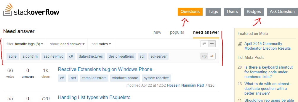
screenshot

This is the list of major changes we're introducing.

Unified home page

All major question lists have been merged into a single page, the home page. This page has three tabs: new, which shows fresh content; popular, which shows the top posts over time ranges; need answer which helps you find stuff to answer.

Almost all of these lists can be filtered by tag (we are working on the remaining ones). All of them allow different sorts and sets of questions. Finally there are further options to further customize your experience.

Simplified top navigation

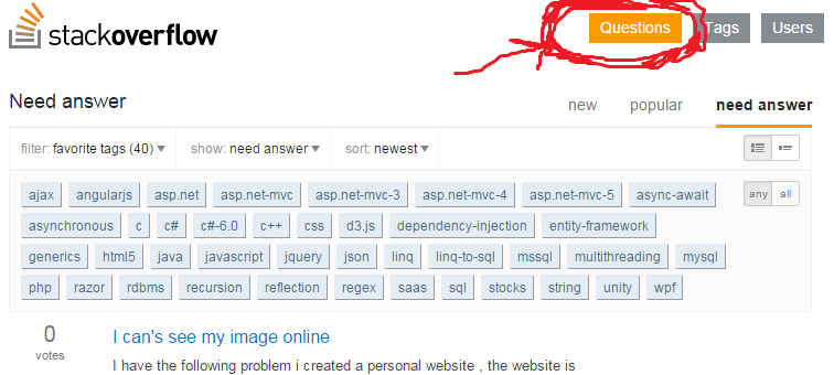
Questions is now highlighted whenever we show a list of questions, including the home page. Unanswered has been removed.

FAQ

How do I get this?

the new "New Navigation" panel

Go to your user preferences page, look at the bottom. Check the checkbox, or un-check it to go back to normal. Checking the box puts you in a waiting list.

We allow people in batches to verify behavior under load, ensure we've fresh eyes as we fix the inevitable bugs and so on.

There's a five minute cache expiration time, so any change you make might take a little to propagate.

Update: As we have 500 active testers now (you are amazing!), we will delaying new alpha activations until we roll out a set of fixes. Opting in now ensures you'll be in the next few hundreds to see the next version.


Update: We have activated 500 more testers after deploying a set of fixes. There are around 1000 testers active now. There are 3000 people in the waiting list, gosh! You might need to wait a little bit.

How can I help?

Here's what we really want to know :-)

  • that we are not breaking stuff you used to do
  • how easy is to find questions to answer, especially if you are a new user
  • any ideas for improvement and feature requests
  • bug reports

If there is anything you particularly hate, but it's not a breaking behavior, please think of a better alternative and suggest it as a feature request. <3

Please read this

How do I get back to you?

Use this question for general considerations only. Please use separate questions tagged with or as appropriate.

It's impossible to manage large amounts of bug reports or feature requests if you answer here. We periodically go through the list and ask answerers to move their bug/feature answers to a question and remove the post, and you likely will lose rep once the answer is gone.

What are the next steps?

We will spend the next few days hot fixing bugs which emerge. New ideas and breaking behaviors will be considered for the next iteration.


Thanks for all the feedback, we've planned the next iteration now, all the requests we're going to tackle in it are marked as . The ones tagged will be reconsidered in the next cycle. Obviously feel free to test and contribute more, the new homepage is not going away.

38
  • 15
    Is the option to opt in/out effective per site, or will it apply to Stack Overflow, Meta Stack Overflow and Meta Stack Exchange en masse?
    – j08691
    Commented May 20, 2015 at 14:12
  • 4
    @j08691 - en masse
    – JonH
    Commented May 20, 2015 at 14:12
  • 30
    The cheese! The cheese is moving!!!! By itself!
    – Braiam
    Commented May 20, 2015 at 14:25
  • 13
    since you are already reviewing the navigation, I would suggest to place the logout button in a more standard location since when I had the need to logout (I had logged in with another account) I was not able to find it and I had to search for it in the questions.
    – Sim1
    Commented May 20, 2015 at 14:30
  • Does "new" mean what the default front page means now, i.e. most recent activity (new posts, edits, Community bumps, etc)? Commented May 20, 2015 at 14:43
  • The default home page shows whatever it is showing in the old version (most recent activity on all sites, "interesting" on stack overflow). It's simply a rename.
    – Sklivvz Mod
    Commented May 20, 2015 at 14:47
  • 8
    I stared at that picture of cheese far too long :( Commented May 20, 2015 at 15:17
  • Does pagesize query parameter represents the no. of results returned from server? I have created a post in meta meta.stackoverflow.com/q/294839/1671639. Not sure whether it is the right place.
    – Praveen
    Commented May 20, 2015 at 15:27
  • 1
    @OverMind Ok, let me rephrase. Data shows that newly registered users (1/low rep) are not users who came here simply for an answer.
    – Sklivvz Mod
    Commented May 20, 2015 at 17:37
  • 1
    Is the live updating on certain settings (such as "recently active") currently disabled due to this being in alpha?
    – Travis J
    Commented May 20, 2015 at 19:56
  • 1
    @Sklivvz I hope that is being considered for addition, I always use the live update pages. Commented May 20, 2015 at 19:59
  • 2
    @Sklivvz - Hm, are you sure? Or does this one count: stackoverflow.com/… I tried and it doesn't seem to be offering "(n) new questions)". I cross referenced it with just a list of newest questions and it was definitely missing them as they came on in the live feed aspect.
    – Travis J
    Commented May 20, 2015 at 19:59
  • 1
    Should it not use AJAX to load when you change tabs ? Having the page load again is kind of.. strange, when most other sites with a tabbed ui use AJAX to load the data. Commented May 21, 2015 at 13:51
  • 4
    For those of you who, like me, are more concerned with what's going on in that picture than the new site navigation modifications, you can see more here.
    – raven
    Commented May 22, 2015 at 20:47
  • 1
    @Sobrique at some point yes, as long as they have the new user page. It's certainly something that will happen, but at the moment we want the feedback to be a tad more focused.
    – Sklivvz Mod
    Commented May 27, 2015 at 10:17

14 Answers 14

42

It's not clear (to me at least) what is the difference between the "need answer" and "no answer" options in the "show" drop down when viewing questions (need answer tab).

After experimenting a bit it seems that perhaps the difference is that the "need answer" are questions without an accepted answer, while the "no answer" questions are those without any answer at all. Is this truly the case? Perhaps the wording could be a bit more intuitive...

18
  • 4
    Need answer is very different from Unaccepted. Newcomers often say Thank you, it worked, but they didn't accepted it.
    – falsarella
    Commented May 20, 2015 at 15:24
  • 15
    Questions that "Need answer" are questions with no upvoted or accepted answers. Questions that are have "no answer" are questions without any answer. This behavior is inherited from the current navigation. Regarding an alternative wording: do you have a suggestion (needs to be coincise)?
    – Sklivvz Mod
    Commented May 20, 2015 at 15:36
  • @Sklivvz But what then does the "all" option do inside the "need answer" tab? Commented May 20, 2015 at 16:22
  • People like to see all questions in a tag sorted by newest, and answer questions as they are asked. It's the main way in which people (statistically) find stuff to answer on SO.
    – Sklivvz Mod
    Commented May 20, 2015 at 16:23
  • WRT the "need answer" vs "no answer" issue, I think "no answer" is concise and obvious. I don't see the need for a "need answer" option at all; the question has answers so it's then up to the OP to accept an answer, clarify the question, or add a bounty to it if the given answers aren't sufficient.
    – j08691
    Commented May 20, 2015 at 16:25
  • @Sklivvz But wouldn't this then already be part of the "new" tab? What does need answer -> all actually do compared to new -> newest. Or is non-redundancy not actually a goal of the new design (which would be fine, too, I just didn't have the impression it wasn't)? Commented May 20, 2015 at 16:27
  • 1
    @j08691 If any of the answers are good enough to get just a single upvote, it will indeed be up to the OP to do so as you suggest. But why is a question that has a single crappy -3 answer that doesn't solve the problem any less deserving of an answer than a question with no answers? Commented May 20, 2015 at 16:33
  • @ChristianRau the sorts are different
    – Sklivvz Mod
    Commented May 20, 2015 at 16:34
  • 3
    @Sklivvz How about leaving the button as "need answer", but having a small line of text under the heading when you're on that part of the navigation, that says, "Questions with no upvoted or accepted answers"? (and obviously corresponding short descriptions for the other sections) Commented May 20, 2015 at 16:34
  • 1
    Ever seen msdn forums, @j08691? Endless questions with one lazy, unhelpful answer, all unanswered for any real purpose. See: blog.stackoverflow.com/2008/09/ok-now-define-answered
    – Shog9 Mod
    Commented May 20, 2015 at 16:36
  • 2
    @Shog9 - no, I stay here ;)
    – j08691
    Commented May 20, 2015 at 16:49
  • 9
    @j08691 Personally I prefer the "needs answer" list to the "no answer" list. I would rather post answers to questions that have an existing incorrect or low-quality answer than a question with no answer at all, as the chances of educating more than one person is higher. No-Answer questions can be left to those that are seeking rep. Also in cases where there is an existing good answer with no upvotes, I upvote it :)
    – Rachel
    Commented May 20, 2015 at 17:22
  • @Rachel That's nice :) But the current options don't actually exclude the "no answer" questions, so you'd still have to sort through them.
    – Catija
    Commented May 20, 2015 at 17:25
  • @Catija That's fine too, some no-answer questions are interesting to me as well, or simply have no answer because they're more advanced :)
    – Rachel
    Commented May 20, 2015 at 17:45
  • 2
    @scunliffe I assume it is Need Answer (without an s) because it is plural, as in "These questions need an answer" (it's a small detail, I know, but you started it ;) )
    – Christina
    Commented May 22, 2015 at 7:46
37

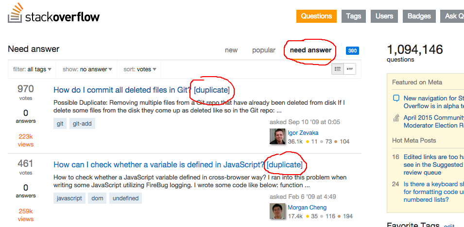
The need answer tab should show only questions that can be answered, but it is currently showing duplicated questions. I believe that is better to hide these questions in this view.

image

2
  • Thanks for your feedback. Can you open a separate question for this feature request or bug, and remove this?
    – Sklivvz Mod
    Commented May 21, 2015 at 14:33
  • Done.
    – Zanon
    Commented May 21, 2015 at 15:23
31

I am an avid refresher. As there is no live updates for certain queries, it is often required. My goto "cheese" before was hitting the Question "button"

enter image description here

However, doing that doesn't return me to the same setup that I previously had. It takes me to the default questions (newest) page instead of my carefully constructed settings.

This happens even if "popular" is selected as well, or any setup really.

I think part of this was the way it used to work, and part of it not the way it used to work. For example, it used to remember if you were on "votes", "frequently asked", etc. but it never remembered tags for example. I am not sure if there is a need to have it always default to newest, but it is a lot easier to click there (and I am so used to clicking there to refresh in the old UI) that it could at least be considered for retaining the current settings (or even just issuing the same url on click).

5
  • Does the Questions' link have the same behavior as the stack overflow logo's link?
    – falsarella
    Commented May 20, 2015 at 20:02
  • 1
    @falsarella - Clicking the logo takes you to "recommended" + "recently active". So, no it has a different behavior (now and before).
    – Travis J
    Commented May 20, 2015 at 20:03
  • As an FYI, this was reported separately as a bug: meta.stackexchange.com/questions/256862/…
    – Andy
    Commented May 22, 2015 at 17:42
  • 1
    @Andy - That is a little different. The bug report you show is related to showing live updates. However, this answer is addressing the issue of wanting to manually refresh but losing already configured settings. While I agree your post is a bug (there should be live updates on by tag question lists), it is not really what I am addressing here. This is also why I begin with "as there is no live updates for certain queries."
    – Travis J
    Commented May 22, 2015 at 17:55
  • Clicking "new" was my way of manually refreshing and it behaves the same way, clear filters and go to default "new"... annoying. Commented Jun 2, 2015 at 12:57
20

On the "Old" I use the Active tab, and when I click through my favourite tags, it always shows the most recent activity (new question, edit, new answer).

On the "New" I select "recently active" on the sort, which is fine, except when I click the next tag from my favourites the "sort" reverts to its original "newest". I use low-volume tags, and there is no point looking for newest questions, as they are rare, but you keep an eye on all happenings with active instead.

It's only an extra click, but it's an extra click, and you did ask.

2
  • 6
    Saving the last visited filter per tab is something we're considering for the next iteration.
    – Sklivvz Mod
    Commented May 20, 2015 at 17:43
  • 2
    @Sklivvz I just came here to suggest the same thing, but with a slightly different use case: I used to jump between tags looking for new questions because the Unanswered was pretty useless. I'm now finding that "Needs Answer" sorted by "Newest" works a bit better for me (as it filters out the recent-but-answered stuff on the more popular tags I frequent), but I have to reset that as I hop between tabs. On one hand it's new (welcome!) functionality, but in order to make use of it I have to click around more than I used to. I suspect many people would benefit, so I hope this change goes in! Commented May 24, 2015 at 18:36
18

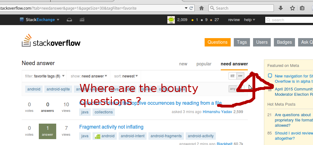
The little blue icon for bountied questions disappears if you filter by Needs Answer > Favorite tags, and does not come back unless you reload the page.

enter image description here

4
  • 1
    How many bountied questions are there with your tags? Probably, zero :-)
    – Sklivvz Mod
    Commented May 20, 2015 at 18:02
  • 5
    @Sklivvz, This is a bug, right ? And yes, I have [java] as one of my tags, and there are many bountied questions, so I should be able to go to them. Seems like there's an option for bounty questions under the "show" menu, but that the blue indicator disappears is kinda unintuitive. Commented May 20, 2015 at 18:07
  • 1
    Seems to be fixed now :-) Commented May 20, 2015 at 18:10
  • 1
    It's the normal behavior of our caching around bounties. Normally you don't see it becasue there are many users but there's less than 500 users with the new nav right now.
    – Sklivvz Mod
    Commented May 20, 2015 at 19:13
16

One aspect of this design which is a little jarring is when looking at

show: needs answer
sort: recently active

The main problem here is that recent activity on questions which need answers is mostly ... answers. So all I am presented with is a list of questions which were just answered. Could the activity be broken out somehow, perhaps into "recently edited"? Because that is really what I am looking for anyway in the "needs answer", "recently active" category.

1
  • 2
    +1 for "Needs Answer" (with an "S")
    – scunliffe
    Commented May 21, 2015 at 22:16
15

Is this intentional?

Tabs in Firefox

As you can see, all of the Firefox tabs are titled with the name of the site... Shouldn't the Meta one do the same? This is the view when just clicking on the Meta logo.

I know this is super minor, just curious.

1
  • This is consistent with the old title on tabs that weren't "active". Commented May 21, 2015 at 0:42
12

When I first get the 'new' tab, it shows the list of questions, and the ones with my favorite tags highlighted as usual. I then pick filter 'favorite tags' and get the following:

New Filter bug

This seems counter-intuitive. What is the 'favorite tags' filter supposed to achieve?


I then clicked on 'need answer', and did the filter and it worked just fine. I then went back to 'new' and it no longer showed the filter. It showed a 'show' and 'sort' filter. The show filter was on 'recommended'. I then clicked on it an chose 'all', and it immediately changed the choices to 'filter', 'show' and 'sort'. I keep repeating this cycle, so it's repeatable. Here's my loop without touching the filter option (just tabs):

new: - https://stackoverflow.com/?show=all&layout=expanded,
then hit 'need answer'
need answer: - https://stackoverflow.com/?tab=needanswer&layout=expanded,
then hit 'new'
new: - https://stackoverflow.com/?layout=expanded,
then hit filter tag 'recommended' and go back to first new:

10
  • Possibly caching?
    – Sklivvz Mod
    Commented May 20, 2015 at 17:27
  • @Sklivvz, see edit about endless loop. Commented May 20, 2015 at 17:31
  • On what site do you see this? Can you include the links to the pages as you cycle?
    – Sklivvz Mod
    Commented May 20, 2015 at 17:34
  • @Sklivvz, Stack Overflow, edited loop links in Commented May 20, 2015 at 17:37
  • I'm completely confused :-) The first part of the question is about tag filters, the second about tab navigation. Are you saying that tag filters disappear and then reappear when navigating? We are aware of that (in fact, it's in the question) and are working around it.
    – Sklivvz Mod
    Commented May 20, 2015 at 17:42
  • @skliwz, The filters disappearing is a third issue I didn't bring up. The first issue I wrote about was that while the favorites showed in the 'new' list, when you chose the filter 'favorite tags' I got nothing, including the posts that were just showing. The second issue was when I clicked on the tabs and got unintuitive results, i.e. the 'new' tab starts in the 'all' state, but when clicked from 'new answers' it goes to the 'recommended' state. Commented May 20, 2015 at 17:46
  • @Skliwz, studying it more, I'm thinking that the first time in it set me on the 'all' state in the 'new' tab, but anytime I click on 'new' now it goes to the 'recommended' state, and I only get to 'all' by clicking on the show option. So you probably set the 'new' tab to default to 'recommended' and that first time was a one-off. Personally, I think you should have the 'filter' option even with 'recommended', but you have to get the 'filter' option to work first. Commented May 20, 2015 at 18:36
  • That's unlikely to ever happen. The "recommended" questions are already filtered based on your favorite tags, with some magic sauce. If you filter all the questions down to a single tag, you are going to reduce traffic enough to be able to see all the new questions. Not seeing the tags, though, is a problem we'll address.
    – Sklivvz Mod
    Commented May 20, 2015 at 19:52
  • @skliwz, I notice that now on Meta SO I have the new navigation, and it is defaulting to 'all' in the 'new' tab, while SO is defaulting still to 'recommended'. Is this by design? Commented May 21, 2015 at 15:53
  • Yeah @LanceRoberts
    – Sklivvz Mod
    Commented May 21, 2015 at 19:07
3

I'm a bit disappointed with the new navigation system. I used to find question using an url like

https://stackoverflow.com/questions/tagged/powershell%20or%20powershell-v2.0%20or%20powershell-v3.0

(FYI I'm redirected to https://stackoverflow.com/?show=all&sort=newest&layout=expanded&tagFilter=list&tags=powershell%20or%20powershell-v2.0%20or%20powershell-v3.0)

with the new nav, the feed of that page does not refresh automaticaly, I have to reload the page to see new questions. To me, this is a major regression compare to old system

Update : I 've just realized that I cannot see the "bounty indicator" with the url above

homepage + fav tags = indicator OK homepage + favorite tags = indicator OK

tags in URL no bounties indicator enter image description here

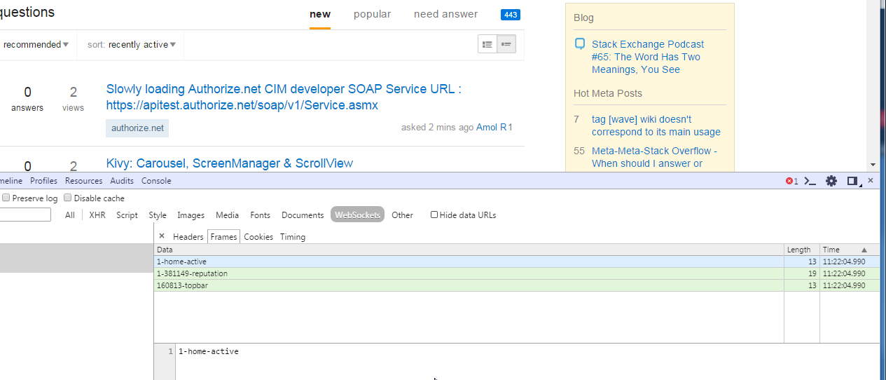
-- update 2, even with SO homepage, the feed is not refresh automaticaly, I can see the websockets but is seems they are never updated .

enter image description here

I feel lonely ... Am I the only user with this problem, what can broke /block websockets ??

2
  • 2
    Unless you filter by tag, you won't see updates via web sockets on SO on old nav or new nav, there seems to be a SO specific bug that we're looking into today though.
    – Sklivvz Mod
    Commented Jun 24, 2015 at 8:22
  • @Sklivvz I'm filtering with the url and this used to work with old navigation. Thank you Commented Jun 24, 2015 at 8:24
2

Under the "new" tab, I'd like to filter by tags and choose "favorite tags":

enter image description here

The interface shows that I have 6 favourite tags, while I actually have none.

I'm not sure what can be done here:

  1. Don't show a "favourite tags" filter if you don't have any tags in your list of favourites.

  2. Provide some form of information showing what's going on here (tooltip or otherwise).

3
  • If this is considered a bug, let me know and I'll write up a new question.
    – Werner
    Commented May 20, 2015 at 21:16
  • When you have no favorite tags, the ones where you are most recent are used. It's the same as in the old nav (go to unanswered and then "my tabs")
    – Sklivvz Mod
    Commented May 20, 2015 at 21:19
  • @Sklivvz: So not a bug then.
    – Werner
    Commented May 20, 2015 at 21:20
2

Unfortunately, I do not have screenshots, but I was part of the test group. I had the checkbox selected and the text below read

You are currently testing the new navigation

(that might not be a direct quote, but still..)

I made no changes to this, navigated away, proceeded to do other things on the site and noticed the new navigation was no longer in play. I went to my preferences and noticed the checkbox was no longer selected. I re-selected it and the text now reads

You are currently waiting to be part of the new navigation test group.

Is this a bug that auto-bumps you out of the test group?

1

I don't even realize the steps I took to see this, so I can't reproduce it at the moment, but there was a point in which I visited the questions page but had no tag filter dropdown. The other filters were present; I clicked the "questions" button again, and the tag filter returned. Perhaps I'm missing something obvious, but that seemed a lot like a bug to me.

I can now offer the steps where the "filter" disappears:

  1. If open a fresh browser and navigate to stackoverflow.com, the "New" questions opens up by default with no tag filter, showing "recommended" posts and ordered by "newest".
  2. Clicking the "Questions" button stays on "New" questions, adds the filter tag (defaulting to "all"), and shows "all" posts - still ordered by "newest."
  3. Changing the "filter" dropdown to "favorites" filters just as one would expect and appears to work just fine.

So this is all behavior within the "new" questions view - some with the tag filter, some without, and when it filters, it filters correctly, so I don't think it's a matter of "you can't filter this list yet."

Perhaps I'm alone in this, but I just wouldn't expect the "filter" (or "show" or "order") dropdowns to just disappear or reappear unless I changed to a list that didn't support that functionality at all.

1
  • 1
    From the announcement above: Almost all of these lists can be filtered by tag (we are working on the remaining ones).
    – user259867
    Commented May 22, 2015 at 15:16
1

I've been testing the new navigation for a few weeks now and I'm going back. Here's why:

  • As mentioned by Kayasax, the page doesn't auto-refresh, I have to refresh manually. (Looking at "Active questions" by tags).

  • When I refresh this is seen as a next page navigation in my browser (Firefox), so returning to the last refreshed page after having navigated away a few links deeper (like question, related question, etc.) isn't an obvious back to the first-in-history action any more.

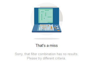
  • When I get the "That's a miss" icon, the page size is reset from my setting (usually 30) to 15. (Another issue is that the icon seems to be related to the speed the content is delivered, rather than not finding any matches. It the content takes too long to arrive, for whatever reason, the icon appears. A refresh without changing any tag usually shows results. But a similar thing often happens in the old interface too).

  • (Probably a personal reason) I don't use all these tabs. I always use a view of active questions in my selected tags, nothing else. I even have a pinned tab for it in Firefox. The old interface had everything I needed and nothing I missed.

0

With the new navigation, I'm having a problem when viewing questions. If I reload the questions page, or click on a question and go back to the questions page, I'm always returned to page 1 regardless of which page I was on. Also, the number of questions per page is always reset to 15.

It would be great if this one could be fixed. I'm currently using Opera Beta 37, but this has been happening in previous release versions as well.

2

Not the answer you're looking for? Browse other questions tagged .