43

Important: This question is being asked here, and not on the Programmers Meta, because I believe that several SE sites suffer from this same, specific problem.


On Programmers, I see a pattern emerging.

  1. New User sees the "Programmers" site title, and asks their incomplete, "fix my broken code" question.
  2. Community members comment that their question is off-topic, and recommend Stack Overflow.
  3. New User says "thanks" and leaves, leaving their undeleted question for the community to clean up.

What seems clear to me is that:

  1. New User has never seen the "What kinds of questions can I ask about here" page, or if they have, they've clicked through it without reading it.
  2. New User doesn't know how to move their question to the right place properly (i.e. post on new site, delete from old site).
  3. Community cleanup of such questions is onerous. The moderators on Programmers, following the principle that the community should moderate itself for the most part, are not proactive about removing such questions unless they're especially egregious.
  4. Migration is even more onerous.

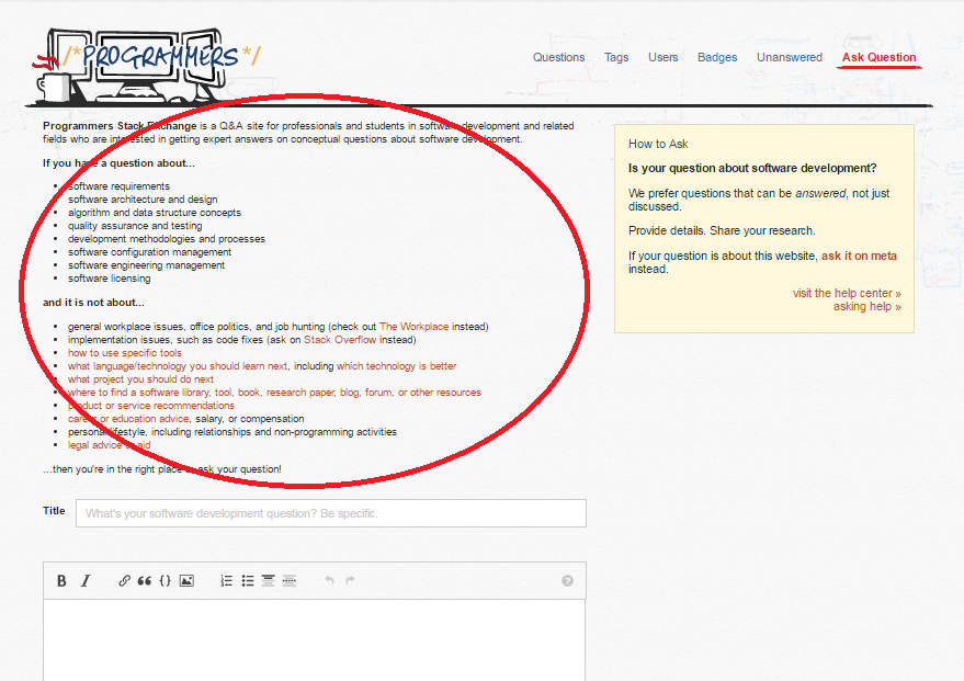
OK, so we have the Tour page. Here's what it says about topicality, about halfway down the page:

enter image description here

Note to those who are confused about Programmers' site scope: it's all right there, in black and white. However, I do notice a problem. It's circled in red.

That's our fault, the fault of the Programmers community. What we really meant to say was "Don't ask your code troubleshooting questions here; those belong on Stack Overflow." Coding tools deserves its own bullet. We should fix that.

However, what are the chances that the user is actually seeing this, and evaluating whether or not they should ask their question based on this?

So here's my question, in two acts:

ACT I: Is there a way to highlight the pain points of a particular site to new users specifically, so that we can be very clear that we don't want those questions that are clearly and unambiguously off-topic on our site, before they ask their question?

ACT II: Failing that, is there a way that we can fast-track the removal of such questions so that they no longer pollute our front page?

10
  • 4
    Why, look at this over here meta.stackoverflow.com/questions/319980/…
    – user1228
    Commented Mar 29, 2016 at 18:26
  • Reading it I'm a bit dizzy. But it seems to suggest encompassing some changes which may be relevant to above.
    – user1228
    Commented Mar 29, 2016 at 18:28
  • 3
    One of the most frustrating things for me, working my way up to a couple thousand rep on Chem.SE, was a lack of laid-out information about some of the inner workings of the SE site model. I'd go to do something, and then either it wouldn't work, or I'd be told by a mod or by the system that I was doing it wrong. (These things might be "further in to the SE experience" than what you're referring to, though.) The various things are second nature now, though, so I dunno how well I could recall them. Will try...
    – hBy2Py
    Commented Mar 29, 2016 at 18:29
  • 2
    @Won't: tl;dr: Right now all new users at Programmers really need to know is "Don't ask your code troubleshooting questions here," and "This is how to use the Delete link to remove your broken code question." There's also a bunch of recent history at Programmers Meta, including a failed "three votes to close" experiment (I personally don't think it failed, but).
    – user102937
    Commented Mar 29, 2016 at 18:29
  • There is a page they have to tick to agree to before they can ask. I have never read that page - the fact that it's a full A4 page of text doesn't make me want to read it. That needs changing. Maybe with memes - imgur.com/mj03Ubd Commented Mar 29, 2016 at 19:11
  • 1
    related: Let's help askers who are trying to circumvent question block at Stack Overflow (because per stats, about 10% of all (all) questions at Programmers are asked by these folks)
    – gnat
    Commented Mar 29, 2016 at 19:15
  • 1
    ...I would also consider tagging this with se-quality-project. Because flood of debugging questions at Programmers seems to correlate with rolling out features of this project at Stack Overflow. I wouldn't be surprised if other software related sites are impacted as well
    – gnat
    Commented Mar 29, 2016 at 19:41
  • -1, that circle was not freehand :) Commented Mar 29, 2016 at 22:40
  • 1
    somewhat related discussion at Code Review meta: What would Clippy say? "We have a question closure rate of ~30%. That's a significant burden on moderators and users who help triage the questions..."
    – gnat
    Commented Mar 30, 2016 at 16:00

2 Answers 2

31
+400

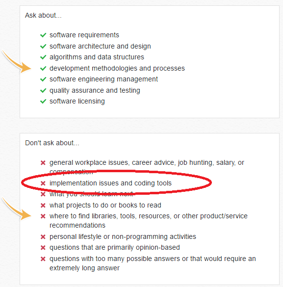
I think one way to accomplish this could be to cement the how to ask section directly above the interface for asking a question when the user has 1 reputation, or less than 50 reputation, or some metric along those lines.

For example, on programmers that could look like this:

enter image description here

An interesting way to test the success of this approach would be the same way that is being proposed for testing this approach: Explaining Stack Overflow: Experimenting with About Pages - which as far as I can tell is the standard way things are tested at Stack Overflow (company name, i.e. the whole exchange).

A split test. I do not have the data for closure rates on Programmers, but on Stack Overflow the rates are much higher for lower reputation users. Based on this assumption, it should be possible through the use of a split test to compare the closure rates of one population seeing this topicality section versus one population not seeing the section.

9
  • 4
    I like this. Short, sweet and impossible to ignore.
    – user102937
    Commented Mar 29, 2016 at 21:56
  • 4
    You would want to ignore the association bonus for whatever metric is chosen
    – jscs
    Commented Mar 29, 2016 at 22:11
  • @JoshCaswell - Yeah that is a good point.
    – Travis J
    Commented Mar 29, 2016 at 22:12
  • 2
    I like this idea, but it would probably work better if the number of dotpoints is reduced. If I was a new user who couldn't be bothered to read the existing popups, I would most likely skip this entire section. It should be short, sweet, and easy to read so that it is not ignored. Commented Mar 29, 2016 at 22:46
  • 1
    This is way too much text to read and it even triggers the TOS part of my brain. Nobody is going to read that.
    – isanae
    Commented Mar 30, 2016 at 0:47
  • 1
    @isanae: Only the latter half of that text (the questions we don't answer on Programmers) would be essential, and of that, I could live with just "We don't answer code writing or code troubleshooting questions here; those belong on Stack Overflow."
    – user102937
    Commented Mar 30, 2016 at 17:28
  • 1
    @RobertHarvey I'm not sure I understand what you're trying to accomplish. We all know that users don't read warnings and that putting larger or longer warnings only makes it worse. You really think a user would say "aw shucks, I wanted to post my homework question here, I guess I'll go somewhere else"?
    – isanae
    Commented Mar 30, 2016 at 17:42
  • 2
    @isanae: That's not what you said. You said the text was "too much to read." I offered a reasonable alternative. If you're position is "nobody will read anything, no matter what the size," that's different.
    – user102937
    Commented Mar 30, 2016 at 17:46
  • 2
    This is definitively a good idea, of course some won't read it, but more will instad of having that somewhere else. Becase a lot wont' bother to go through some other links before clicking the button "Ask Question" since they're here for that. Are they wrong ? probably, but they'll still do it, so there is no poin discussing that. So the only way to get around this is to make them read the points that most newbies don't know and post for nothing when then try to post.
    – Walfrat
    Commented May 20, 2016 at 9:14
10

On Stack Overflow, all new users see this page before they can ask their first question, and must tick the box and press "continue" to proceed. I assume this step was added to prevent exactly these sort of problems.

I'm not sure if this is unique to Stack Overflow, or if this currently also happens on other sites? The problem with this page is that it only links to the on-topic information, but doesn't actually present it. You need to click at least two links: /help/on-topic and /help/dont-ask. In total, there are six links with "more information", and a number of other links leading up to a total of 11 links in total.

Most people aren't going to click all that.

So:

  • Present this page, or a variant thereof, before a user asks the first question if this doesn't already happen.

  • Make sure it contains all the essential information in the body itself as concise as possible − don't make it a "link-only answer!"

1
  • 2
    only SO has this click through and Server Fault folks forced dev team to set them up one. At Stack Exchange they purposely design smaller sites so that askers aren't bothered to read instructions, "...the idea is that, since they get less traffic than Stack Overflow, there's not as much of a disincentive to prevent people from posting, since the community can help users fix problems with their posts, or close, flag, and delete"
    – gnat
    Commented Mar 30, 2016 at 5:13

You must log in to answer this question.