89

Update:

Thanks for all the feedback and bug reports! I am locking this thread so people don't keep answering it when we no longer monitor it.

If you see a bug or want to raise a feature request, please do so in the usual manner, as a new question.


Some of you may have noticed that we just launched the new profile and activity pages that we have been talking about for a while now on most Stack Exchange sites.

Most? Well, yes, the new design is dependent on a SE network-wide update (a new base css framework) that the design team have been working on. This is an ongoing effort and we will be launching the new pages as sites are moved to the new design.

You've all been hugely helpful already - much of what we love most in here came from feedback and suggestions you gave us on Meta.

But it's possible that it's not quite perfect yet. If you find any bugs and have any feedback to give, please post these as answers to this post.

Just post one issue per answer - that would help us focus on specific items one at a time.

8
  • 5
    These look great so far! Nice work to everyone involved in creating and testing them! Commented Apr 15, 2015 at 15:23
  • Can we cross-post from the previous feedback request question? Commented Apr 15, 2015 at 15:31
  • 2
    This is wonderful! Also, not sure if this should be its own issue as a proper answer, but I've noticed something weird (Chrome Beta): When hovering over visited N+X days, X consecutive line, my cursor displays an overtype tooltip, and changes into an interactive tooltip only after I click on it.
    – Unihedron
    Commented Apr 15, 2015 at 15:31
  • @Unihedro - beta versions are not supported... could be a bug there. Once it is out of beta we can revise.
    – Oded StaffMod
    Commented Apr 15, 2015 at 15:34
  • 3
    Nice Job! I love specially the badge progress tracking feature. So usefull! Commented Apr 15, 2015 at 15:35
  • Now, if you really want extra work, you might want to make it compatible with IE 8 . Again, this is just extra work. Commented Apr 15, 2015 at 16:11
  • @Oded should site specific bugs be posted here?
    – Tim
    Commented Apr 15, 2015 at 16:24
  • @Tim - if they are indeed site specific, might as well post them on the site specific meta.
    – Oded StaffMod
    Commented Apr 15, 2015 at 16:24

75 Answers 75

1 2
3
2

- as noted in comments, beta versions of browsers are not supported.

The tilde (~) in front of the numbers is a bit off in my font, and it looks like -44!-44 not ~44

5
  • 1
    What browser (version) and OS?
    – Werner
    Commented Apr 15, 2015 at 23:35
  • Windows 7; Google Chrome Version 43.0.2357.18 dev-m (64-bit) Commented Apr 16, 2015 at 0:33
  • 3
    Development-version browsers are not supported. See Which browsers are officially supported?
    – Werner
    Commented Apr 16, 2015 at 0:35
  • I can't really downgrade, I'll just live with it then. Commented Apr 16, 2015 at 0:38
  • True. Just saying that this might not be addressed until it's reproducible in non-development versions of the browser (version 42).
    – Werner
    Commented Apr 16, 2015 at 0:39
2

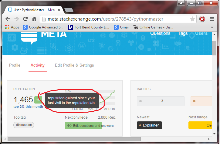
Can we capitalize the r in reputation (the first one) as seen below please:

enter image description here

All the other tooltips that start with a word have the first word capitalized.

1
  • 1
    Only the first r...
    – Werner
    Commented Apr 16, 2015 at 22:01
2

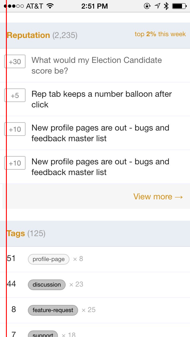
- we removed some of the information on the mobile view as otherwise this section would be overly cluttered and unreadable.

On mobile (for iphone at least), "last seen" no longer shows - regular mobile, not the app.

This is quite helpful information (did user have an opportunity to see my comment/answer?, etc), so please make it available again.

2

- we may revisit this at a later date.

Feedback: Profile configuration would be nice

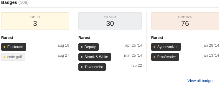
Specifically, I would like to be able to configure which badges are shown:

Screenshot of badge area

I consider it a mild insult that the site is suggesting that I'm somehow associated with Strunk & White (relevant discussion), and would prefer to hide that badge.

2

- it is the average between the max and min values represented in the graph.

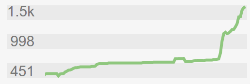
My rep graph shows numbers like 998 and 451. This annoys me so much - 998 is 2 off of 1000 / 1k and it isn't even clear what line the 998 refers to (the top of the grey segment or the bottom?).

enter image description here

My suggestion: Round to 1/100th of the rounded up number to 1sf:

Mine is 1,546. That rounds up to 2,000, and 1/100th is 20. Closest 20 is a reasonable number to round to.

Someone with 113,689 reputation would round to 100,000, and 1/100th is 1,000. So it would use steps of 1000.


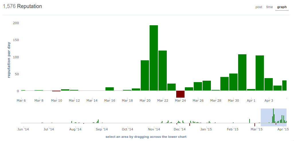
Note that this is only the new graph in the new profile. The rep-tab graph is fine:

enter image description here

1
2

Everything lines up nicely with the margin on the sides except for the votes/points.

Vote padding

2

- we have not been able to reproduce this bug.

Not sure if I should just edit my previous bug report or write a new one but I found another.

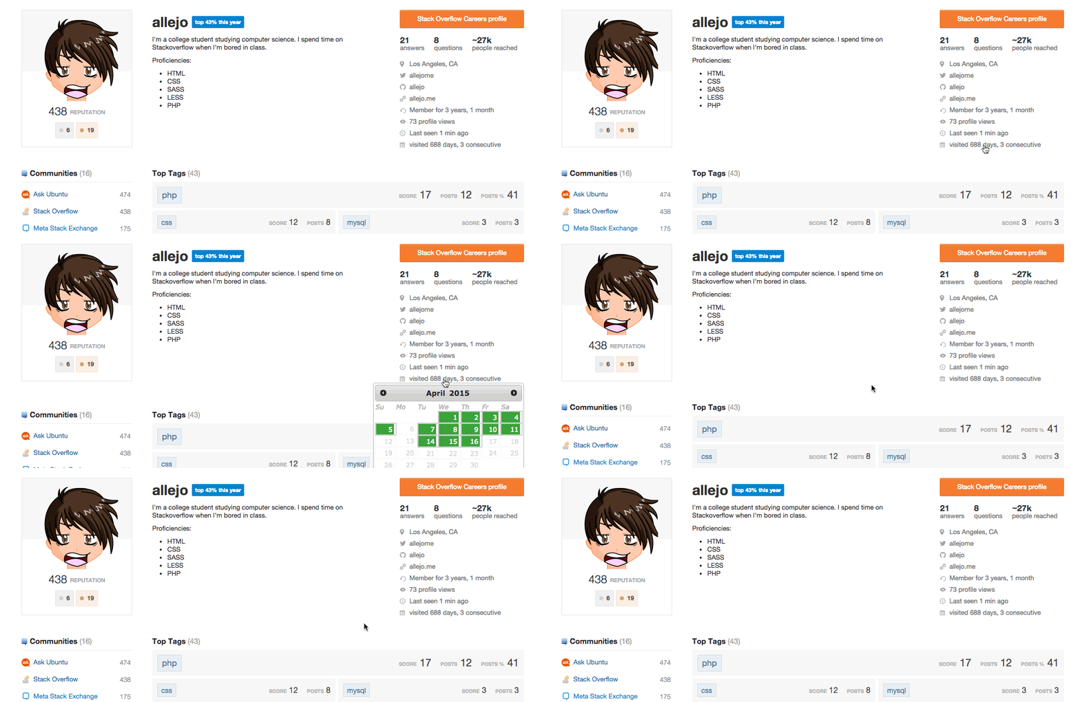
When I click on the days visited, the calendar pushes all of the content slightly downward. I'm using Chrome 41.

Calendar bumps everything

4
  • I can't repro this, which browser/OS are you using?
    – Stéphane StaffMod
    Commented Apr 16, 2015 at 12:31
  • Can't reproduce with Chrome 41, Windows 7
    – Oded StaffMod
    Commented Apr 16, 2015 at 13:05
  • 1
    @Oded, I'm using Chrome 41 on OS X and this bug shows up for me on Firefox 37 as well
    – allejo
    Commented Apr 16, 2015 at 14:30
  • @StéphaneMartin, ^
    – allejo
    Commented Apr 16, 2015 at 14:31
1

- we may revisit the design here at a later date.

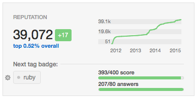
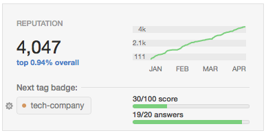
What are "X/Y score" and "X/Y answers"?

In the top left widget, it's completely unclear what the two "X/Y score" and "X/Y answers" are about or supposed to represent.

example 1

example 2

(OS X / Safari in case there should be a tool tip that isn't present.)

Suggestion (now that I grok it courtesy of the comments): make the tool tip appear when the two lines are clicked, much like the when you click the tag. Other possibility: relabel "Next tag badge" to "Next tag badge progress" or something to that order.

9
  • Do you see the text "Next tag badge" and/or a tag badge? Including a screenshot would probably be helpful.
    – apsillers
    Commented Apr 15, 2015 at 19:37
  • @apsillers - more clear? Commented Apr 15, 2015 at 19:42
  • 4
    It's the score you have out of what you need. Same with # of answers. You need 70 more points and one more non-wiki answer on that tag for the bronze badge. Click on the badge and you will get a description. related meta.stackexchange.com/a/253484/225304
    – codeMagic
    Commented Apr 15, 2015 at 19:44
  • 3
    Just to be perfectly clear: is it unclear to you that the meters are meant to be visually associated with the tag badge (which would qualify as a design issue) or is it unclear to you why the meters are associated with the tag badge (which is simply a misunderstanding of how tag badges are earned)?
    – apsillers
    Commented Apr 15, 2015 at 19:48
  • @codeMagic - ah, ok. Thanks! Thoughts on the suggestion I just added? Commented Apr 15, 2015 at 19:48
  • @apsillers - it's unclear that the meters are associated with the tag, per my edit a few seconds ago. Design issue. Commented Apr 15, 2015 at 19:49
  • 3
    I can see how it's confusing but if you understand how those badges work then it's fairly straightforward, imo. But making the entire thing clickable I think would improve it.
    – codeMagic
    Commented Apr 15, 2015 at 19:49
  • @codeMagic: Indeed, it's missing context. Relabeling it to "Next tag badge progress" or something to that order would have nailed it too. Commented Apr 15, 2015 at 19:52
  • 1
    I do think that cutting in the line above it and putting "progress" might make it more clear
    – codeMagic
    Commented Apr 15, 2015 at 19:55
1

- see the meta thread discussing it.

Helpful flags are publicly visible. I'm not sure if this is an intentional change.

They weren't in the past. Flag weight was visible in the distant past. I think the decision to hide helpful flags when replacing flag weight was because too many people had been farming flags too aggressively.

3
  • This was already in the previous iteration, live on Meta since February.
    – user259867
    Commented Apr 19, 2015 at 2:38
  • meta.stackexchange.com/a/249988/140505
    – Oded StaffMod
    Commented Apr 19, 2015 at 10:20
  • @Sue I wasn't arguing for or against it, just pointing out that it was a change that I hadn't seen explained, which worried me. Now that Oded showed me associated discussion, I don't have really object to the situation. Sorry.
    – Jeremy
    Commented Apr 21, 2015 at 22:51
1

"Last seen" to be orange again (as in previous version) when a user visited not long ago

enter image description here

It was a bug that was later fixed in the previous version too, see here

1

- in the next build.

All of a sudden the period you've been around for has gone all weird. This applies whether or not you're logged in or if you're looking at someone else's profile.

Member since today and for 2 years 10 months

1

– we currently support Firefox 36 and above.


- looks like enough people are having this issue that I re-added the vendor specific CSS rule.


I hacked together a user script with a workaround:

// ==UserScript==
// @name        SE profile box-sizing fix
// @namespace   http://stackexchange.com/users/2330629/palec
// @description Adds a -moz-box-sizing declaration that fixes the broken layout in FF version older than 29.0.
// @include     *://*.stackexchange.com/users/*
// @include     *://*.stackoverflow.com/users/*
// @include     *://*.serverfault.com/users/*
// @include     *://*.superuser.com/users/*
// @include     *://*.askubuntu.com/users/*
// @include     *://*.mathoverflow.net/users/*
// @include     *://*.stackapps.com/users/*
// @include     *://stackexchange.com/users/*
// @include     *://stackoverflow.com/users/*
// @include     *://serverfault.com/users/*
// @include     *://superuser.com/users/*
// @include     *://askubuntu.com/users/*
// @include     *://mathoverflow.net/users/*
// @include     *://stackapps.com/users/*
// @run-at      document-start
// @grant       none
// @version     1
// ==/UserScript==

// https://meta.stackexchange.com/a/253734/238706
// https://developer.mozilla.org/en-US/docs/Web/CSS/box-sizing#Browser_compatibility
// https://meta.stackexchange.com/questions/253359/list-of-communities-with-base-css-updates-completed
window.addEventListener('DOMContentLoaded', function(e) {
    var head = document.getElementsByTagName('head')[0];
    var style = document.createElement('style');
    style.setAttribute('type', 'text/css');
    var styleText = document.createTextNode('body.user-page #content *{-moz-box-sizing:border-box}');
    style.appendChild(styleText);
    head.appendChild(style);
});

A day after the new activity and profile pages went network-wide, the whole layout broke down for me. I use a no longer supported browser (older Firefox), but this is so far the only thing that went really wrong.

Looking into the console, the problem is with the CSS property box-sizing that’s supported in Firefox only as of version 29.0. Till then, only the vendor-prefixed version had been available (since virtually forever).

If you want to make me happy, change

body.user-page #content *{box-sizing:border-box}

to

body.user-page #content *{-moz-box-sizing:border-box;box-sizing:border-box}

in profile.css. This fixes the problem for me. I guess 27 added bytes are not a problem and they will make the difference between
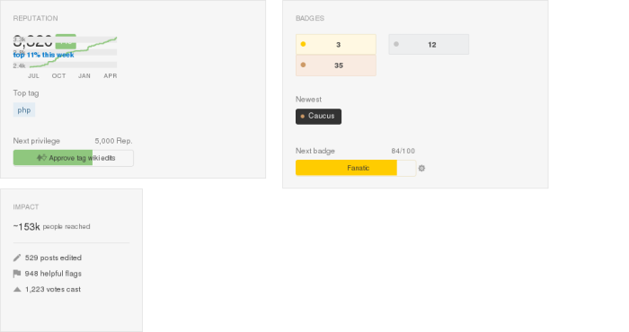
the boxes totally messed up

and

the boxes looking as intended

for me.

4
  • I just want to add that the day the new profile pages launched, they looked just fine. The next day is when they started looking like the screenshot posted by @Palec. This should be fixed by the SE devs.
    – Jeff
    Commented Apr 17, 2015 at 16:53
  • Which browser and in which version do you use, @Jeff? My old Firefox in not supported and I had known that before reporting, but hoped to get it fixed anyway. Maybe you reproduced the behavior in a browser that is supported. Anyway, if you care about fixing this, you might want to upvote this post.
    – Palec
    Commented Apr 17, 2015 at 17:09
  • Firefox 24. You can see a question I posted (a duplicate of this one) here: meta.stackexchange.com/questions/253740 ... To not support Firefox < 36 seems juxtapposed the universal dev mantra "compatibility first." I expect more from our gracious hosts whose entire schtick is dev Q&A.
    – Jeff
    Commented Apr 17, 2015 at 21:51
  • Thank you for reconsidering, @Oded. Hope I can make the Internet a better place soon by upgrading my OS and browser.
    – Palec
    Commented Apr 20, 2015 at 21:51
0

The next recommended badge seemed to be always Critic after I got the downvoting privilege.

I got that in Computer Science and Puzzling, and I didn't even upvote once there yet.

If it is ordered by the progress, it should be a bug. If instead it just suggest me downvoting someone immediately after getting the privilege, isn't Supporter (for the first upvote) more preferable?

5
  • But you already have the up voting privilege when you get the down vote...
    – Tim
    Commented Apr 17, 2015 at 11:35
  • @Tim It always recommend me to get Critic, but never recommend me to get Supporter. Both have the progress 0/1.
    – user23013
    Commented Apr 17, 2015 at 11:41
  • Did you have the up voting privilege before the new user page or not?
    – Tim
    Commented Apr 17, 2015 at 11:42
  • @Tim For Computer Science, yes. For Puzzling, I registered after the new user page and got that immediately by association bonus.
    – user23013
    Commented Apr 17, 2015 at 11:58
  • That probably explains it then - it's likely to track the newest available badge.
    – Tim
    Commented Apr 17, 2015 at 12:05
-11

- there is standard browser support to open links in other tabs. These are clearly links to external sites and we'd rather give users the choice (rather than take it away by forcing a new tab always).


Open new windows/tabs

Please set the Website, Twitter and GitHub links in the Profile tab as target="_blank" so it opens a new browser tab on click.

5
  • 15
    If I'm not mistaken there is not a single link within the SE network that behaves like that. Changing it here would be counter intuitive.
    – rene Mod
    Commented Apr 15, 2015 at 16:16
  • 4
    Just middle click on it...?
    – Tim
    Commented Apr 15, 2015 at 20:32
  • 2
    @rene The rep league pages show up in a new tab when you click on the corresponding link in your profile. Commented Apr 16, 2015 at 4:42
  • In that case I'm mistaken...
    – rene Mod
    Commented Apr 16, 2015 at 8:15
  • 1
    @rene also the links in close/flag dialogs. :) Commented Apr 16, 2015 at 8:38
-22

The grammar is incorrect for object pronouns:

example of incorrect grammar

The correct singular object pronoun should be him/her/them (if shared accounts are to be recognized). I'm one person, so 'them' is incorrect in this context (even if it does appear 'awkward' to some).

The convention to use 'them' as a singular gender pronoun is convention, not proper grammar. I know it sounds like nitpicking, but this is StackExchange where the correct form matters.

"There isn’t any way of using a singular pronoun to refer to someone without identifying that person as male or female. When it comes to the third person plural, English only has gender-neutral forms such as they, them, their, etc."

0
1 2
3

You must log in to answer this question.

Not the answer you're looking for? Browse other questions tagged .