189

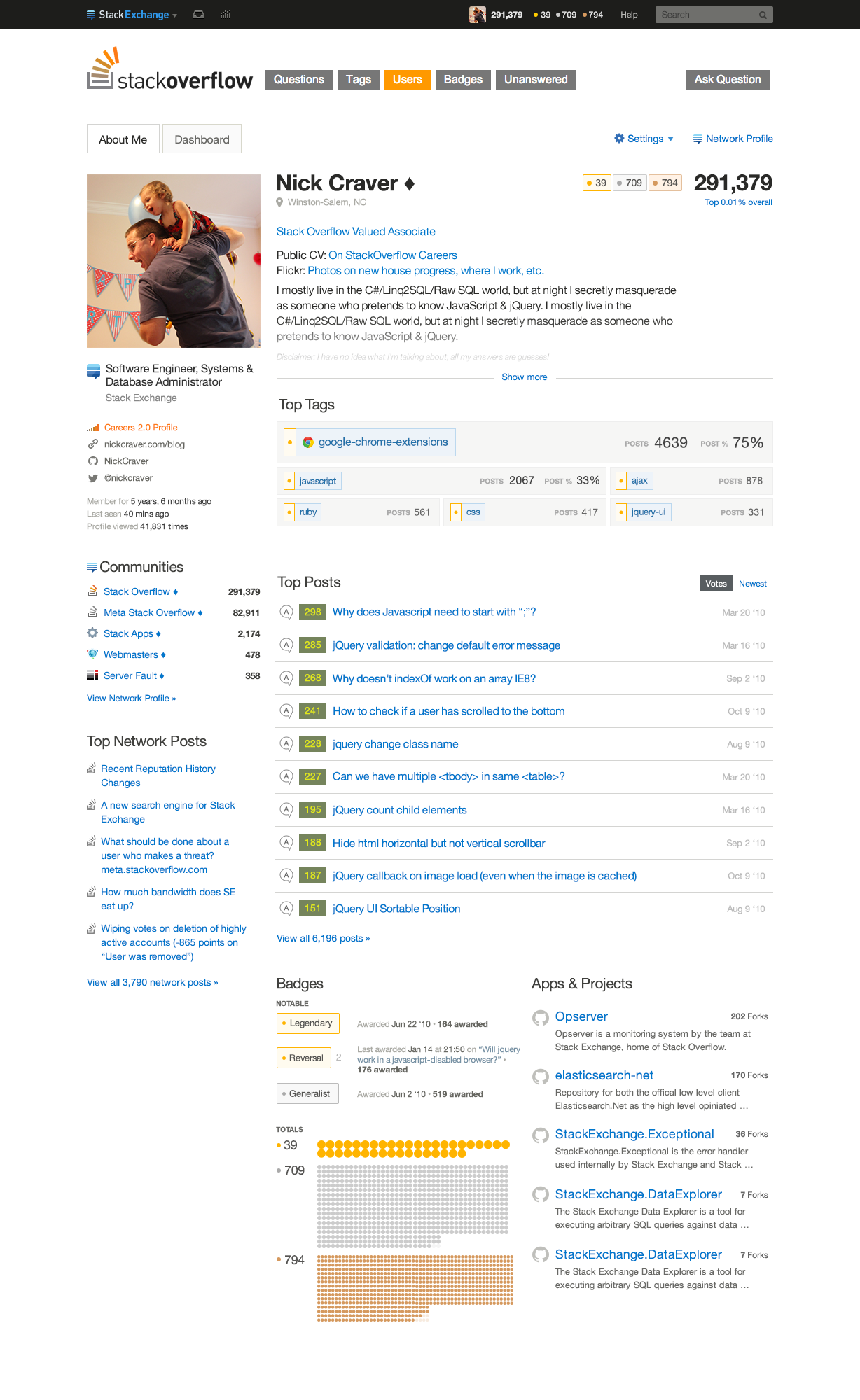
Wow, that took longer than expected (though right around the 6-8 week mark), but we finally have a semi-working prototype of the new profile page.

Recap

There’s a longer explanation on part 1 but the gist of it is this: we’re splitting the profile into two pages:

  • An “About Me” page which is what other people see when they look at your profile. It highlights your best stuff in a way that lets users quickly get a sense of who you are and what your interests are. For any deeper dives, you can switch over to the “Dashboard” view which houses everything else.

  • A “Dashboard” page which is what you see when you go to your profile from the topbar. It highlights the stuff you need to get to fast, and hides the stuff you don’t care about (your “about me” section, your Twitter profile, etc.). For now, it is just the existing view but we’ll work on this part next.

This part is just focused on the new “About Me” page.

The New Stuff

The prototype is only working on Stack Overflow so far, but you can try just about any profile by going to https://stackoverflow.com/users/reloaded/{id} (note: SO-only for now, must be logged in). Here are some handy examples:

EDIT: The historical reloaded page is no longer visible, but it looked something like this:
enter image description here

We made lots of little changes based on your feedback, but the two biggest changes are the Tags and Badges sections.

Tags

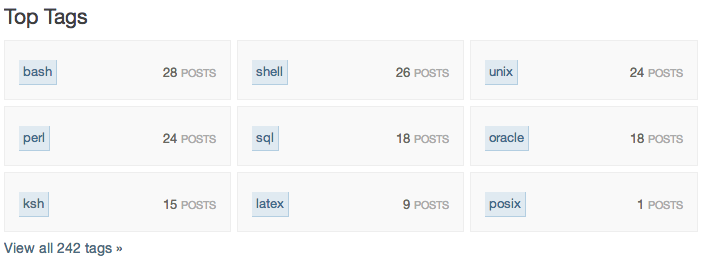
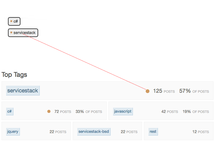
The tags section now gives a very basic visualization of where a user does most of their posting. The section shows between 6 and 9 tags for each user, and the size is based on the percentage of posts a user has in that tag. It's easiest to just look at some examples here:

The exact rules for how the sizing is done are still in flux, so if you notice a profile that seems off, just let us know and we'll see if we can tweak the rules.

Badges

After the last proposal was met with at worst confusion and at best a lot of "meh", we went back to the drawing board on the badges section. We were deeply inspired by this image:

Medals

We decided we wanted to focus on two things:

  1. Your most impressive badges, so they don't get lost in a pile of more common badges. If you're one of ~500 users who has earned the Generalist badge on SO, you darn well deserve to show it off.

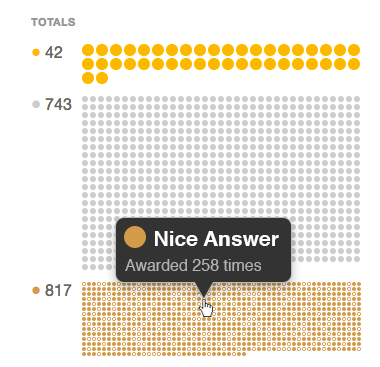
  2. A visual representation of just how many badges you've earned. At some point, 1500 bronze badges becomes just another number, and it's hard to wrap your head around the sheer quantity. So we wanted to show the number visually. For new users, we wanted to feel a sense of accomplishment every time a new one shows up, and for top users, we wanted to show just how ridiculously many badges they have.

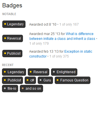
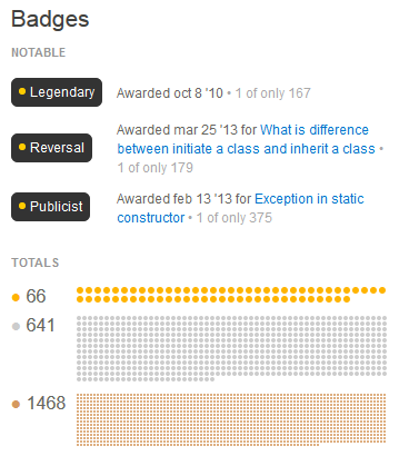
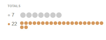
So here's the result: - Gheorghe Bulicanu - a newish user - Nerdess - a 1k user - SLaks - a top user The "Notable" section at the top lists your rarest badges, based on the number awarded on that site. The "Totals" section visualizes how many you have, and scales with your badge count. It also shows gold, silver, and bronze as different sizes to emphasize those rarer badges.

Other changes

We've made lots of other changes, but just a few I'll call out:

  1. The "About Me" section is easier to read, fits more, and hides less.
  2. Tags and Badges now use standard site styles
  3. The "Top Posts" section allows you to sort by newest
  4. The "Top Posts" section no longer shows badges, since it was too confusing
  5. Meta activity has been added to the sidebar (it’s just a placeholder right now -- we know it doesn’t work!)

Other notes that were common questions / requests:

  1. The current job and link to Careers profile are hidden for now, since they'll be optional anyway. We'll bring them back in a future version.
  2. The "Apps and Projects" section will be available on all sites (probably just called "Projects"). And yes, we know this section is just an image right now -- we'll get around to implementing it soon.
  3. Nothing that appears only to you on your profile, or to a moderator is implemented yet. This is just the “viewing somebody else’s profile” view.

Feedback

We know there are still bugs, so we’re looking more for big-picture feedback than minor bug reports. We’re still actively building the page, but wanted to get the early prototype out for feedback sooner rather than later. Let us know what you think!

75
  • 31
    This.is.sexy..!
    – brasofilo
    Commented May 6, 2014 at 17:28
  • 29
    Dang, that's a massive identicon. I finally feel the need to change my profile picture...
    – mhlester
    Commented May 6, 2014 at 17:32
  • 67
    "I don't understand this need to make everything 3x times bigger everywhere. Are people going blind?" Commented May 6, 2014 at 17:33
  • 21
    Nitpicking bastard here: Why not instead of "POSTS 102 % OF POSTS 33%" say "102 POSTS 33% OF POSTS"?
    – Bart
    Commented May 6, 2014 at 18:39
  • 20
    How are "impressive badges" chosen? I care more about my gold ObjC tag badge than the Marshal badge, and it's also a far rarer badge.
    – jscs
    Commented May 6, 2014 at 18:49
  • 22
    Any chance of letting us pick them, since the point is to show off?
    – jscs
    Commented May 6, 2014 at 18:51
  • 34
    Gravatars look absolutely horrible... well not horrible, but who needs a huge blob of random colors staring at you. Probably will inspire me to actually upload an image. But otherwise, looks pretty good. Commented May 7, 2014 at 9:50
  • 7
    I suggest changing "View all $N questions & answers »" to "View [all] [$N1 question[s]] [&] [$N2 answer[s]] »". Now you can click view questions/answers even if there are none.
    – zch
    Commented May 8, 2014 at 19:04
  • 6
    Agree on the gravatar size; most gravatars are optimized for the default 32x32 display and don't give you anything when you supersize them.
    – mmyers
    Commented May 8, 2014 at 22:22
  • 9
    So much wasted space... also the interface is way too minimalist for me, but I guess it is trendy to make UIs less efficient. Commented May 8, 2014 at 22:47
  • 7
    Agree with @CodyGray the badge visualization seems pointless it's just a lot of dots taking up a lot of space.
    – user692942
    Commented May 9, 2014 at 14:48
  • 31
    Ugly. This is not FB or Twitter.
    – Mikael S.
    Commented May 9, 2014 at 15:12
  • 14
    I like the old UI better in most every way including the badges section. I'm sure I won't be the popular vote, but I think the old UI was "utilitarian" and the new one is "flashy" but less useful than the dashboard. I won't enjoy looking at the new one, and did enjoy looking at the old one when poking someone's username.
    – BenSwayne
    Commented May 9, 2014 at 23:07
  • 12
    Do whatever you guys want to do, just give us an option to revert to the older version. I don't like this thing as it stands for now... Commented May 10, 2014 at 16:59
  • 13
    Why put 1/2 the info in 2x the space? Also, being deeply inspired by the Korean People's Army is uninspiring, to say the least.
    – mcalex
    Commented May 13, 2014 at 7:43

38 Answers 38

159

Badge popup

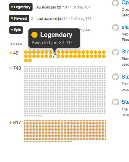
As I commented on Josh's answer, I'd love to see something like this:

enter image description here

As a concession to the case where you have a lot of badges, particularly bronze, how about something like this:

enter image description here


Update: I made a demo

I've updated this so all that needs to be sent over is a list of badge ids. The HTML is then expanded from the list.

25
  • 21
    This example shows a Legendary badge and an Epic badge. Given that you can't get Legendary without first getting Epic, I'm not sure that Epic is all that notable when you also have Legendary (though it is worth showing if the user does not have Legendary yet). I've got both; I was debating whether to raise this as a separate issue/answer. Also, do you consider Gold 'subject' badges where there are small numbers of the badge awarded as noteworthy? (For example, only two people have a gold Unix badge at the moment; that's arguably more noteworthy than having both Legendary and Epic.) Commented May 8, 2014 at 18:11
  • 12
    The bronze badges can get so tiny, do you really want a popup when you hover over each one? It would be very hard to hover over a particular bronze badge because of its size on the screen.
    – user163250
    Commented May 8, 2014 at 18:13
  • 19
    @cupcake The purpose of this view is to highlight the magnitude of badges you have earned. I imagine mousing over the bronze badges with the popup would be very satisfying...
    – fredley
    Commented May 8, 2014 at 18:15
  • Love the art and fonts smoothing ! +1 Commented May 9, 2014 at 6:34
  • Maybe just do the popup for gold badges? In this example there are 1500 silver and bronze badges. At (ballpark figure) 20 bytes per badge that would be 30kb more traffic and probably more in the page for something which almost nobody will use.
    – Raidri
    Commented May 9, 2014 at 8:14
  • @Raidri See my further suggestion. This way at most only one popup per badge type would need to be loaded.
    – fredley
    Commented May 9, 2014 at 8:21
  • @fredley Yes, that could work, but I am still not sure, if it's worth it for that many badges.
    – Raidri
    Commented May 9, 2014 at 8:29
  • 1
    @Raidri The point is to feel awesome about how many badges you have. Seeing this on my profile would make me feel awesome :D
    – fredley
    Commented May 9, 2014 at 9:54
  • 3
    I wonder how big the html is going to be for this when someone has thousands of different badges...
    – PlasmaHH
    Commented May 9, 2014 at 10:56
  • 3
    @PlasmaHH you're not the only one wondering that - this probably can't be done for technical reasons alone
    – Nick Craver Mod
    Commented May 10, 2014 at 3:50
  • 2
    @NickCraver :-(
    – fredley
    Commented May 10, 2014 at 8:55
  • 3
    @DavidFullerton How about this?
    – fredley
    Commented May 13, 2014 at 10:53
  • 7
    What problem would this solve? I doubt anyone goes like "I wonder what badge that is, on line 16, row 42". It doesn't really matter which badge is which and to browse them, the list view is way more useful. I admit though, hovering to get a tooltip was the first thing I tried when I saw those tiny badges. I think I just did this because almost every abridged data on se has tooltips.
    – kapex
    Commented May 13, 2014 at 17:29
  • 1
    I agree with kapep (and not because of my own feelings about the badges visualisation) If I want to see what the badges are, there are far more practical ways to do it. This suggestion has fun value, but in terms of outright practicality, I'm not sure what purpose it serves. Commented May 14, 2014 at 0:03
  • 2
    @fredley that looks pretty good. I think we'll do something like this, though maybe not right away since there are so many other pieces to get done. Commented May 15, 2014 at 15:04
114

enter image description here

DON'T CHANGE ANYTHING | KEEP IT LIKE IT IS | NO MAKEOVERS

12
  • 67
    Tempted to upvote just for the gif... Commented May 6, 2014 at 23:06
  • 57
    I personally agree with this answer. The new profile page looks completely useless to me. It shows a few "top" badges and tags.. The old profile did that just fine while keeping all the other important information I want right there, easy to access. Yeah the profile page could use a redesign, but why remove functionality?
    – ɥʇǝS
    Commented May 6, 2014 at 23:20
  • 4
    @ɥʇǝS Nobody said anything about removing functionality. Please read the post; it outlines the plan.
    – balpha StaffMod
    Commented May 7, 2014 at 3:44
  • 5
    @balpha /s/remove/move. I must say though, the design factor looks great. I also like that I get the important stuff when I click on myself, but I still don't like how most of the important stuff I want to see on a profile is hidden under "dashboard". But, I suppose I will get used to it :-/
    – ɥʇǝS
    Commented May 7, 2014 at 3:46
  • @ɥʇǝS That's valuable feedback -- make a case for it in an answer here.
    – balpha StaffMod
    Commented May 7, 2014 at 3:50
  • @balpha Done. Forgive me if some of them are just nitpicks.
    – ɥʇǝS
    Commented May 7, 2014 at 22:13
  • 5
    [+1] as I agree for the simple reason that it’s never a good idea change a “winning“ concept.
    – e-sushi
    Commented May 8, 2014 at 17:32
  • 10
    I downvoted though the GIF is hilarious :) I simply don't agree that change is bad. Sure, the prototype can be improved but it's heading in the right direction
    – davegson
    Commented May 8, 2014 at 22:05
  • 1
    +1 Add his voice, boy... Commented May 10, 2014 at 17:00
  • 2
    @balpha Shush, removing functionality and making things that do a function harder to do, basically the same thing. I don't care what badges someone has if I want to find out about any gems of interesting Qs they have.... atm it works great :)
    – Alec Teal
    Commented May 11, 2014 at 4:34
  • 14
    You know when you go to some page on some site, and it has been completely pointlessly changed, redesigned, madeover. And you think "wow it is so annoying when they completely pointlessly change, redesign, makeover a page like that." That is exactly what you're looking at here. it is an ABSOLUTE CLICHÉ of utterly, totally, fully, completely, hopelessly pointless change, redesign, makeover.
    – Fattie
    Commented May 11, 2014 at 20:44
  • God, this is hilarious.. You made my day.. :P Commented Nov 28, 2014 at 12:31
105

tag section

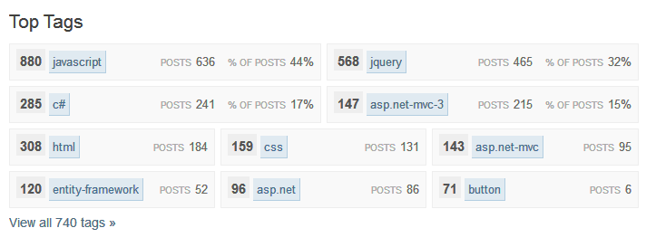
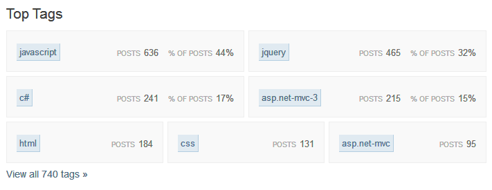
The new tag section has three fewer tags and takes up nearly twice as much area. It would be nice if it could be condensed while still retaining some of the interesting information (such as score in tag). Since space is an issue, and people are already used to the format, I think keeping the old score display still works here.

To make it fit, perhaps cut the line-height and the height definitions from .tag-container and cut the padding in half. The tag area takes up a lot of space in my opinion, and it really doesn't need to be that spacious (unless there is more planned to go in there in which case disregard the spacial note).

To me, this just looks cleaner

Enter image description here

than this:

Enter image description here

11
  • 21
    I wouldn't say it looks cleaner, but I'd much rather have the score there than either the number or percentage of posts. Commented May 6, 2014 at 21:09
  • 49
    Please leave the score in there. Commented May 6, 2014 at 21:15
  • We talked about score, but struggled since they don't "add up". But we'll take another look. On the number/size, they key goal here was to visually convey when some tags dominate a user's activity at a glance, without depending much on the numbers/text. The final version will have more font size difference between the three sizes, which is why the boxes are taller than seems necessary.
    – Jaydles Staff
    Commented May 6, 2014 at 21:30
  • @Jaydles - For the size, as noted, if there is a plan then disregard that :) For the score, personally it does not seem out of order if it is included but the tags are sorted by "% of posts". I can understand that ordering. However, it would be nice if the score could be included, even if it isn't the basis of the sort order.
    – Travis J
    Commented May 6, 2014 at 21:32
  • @Jaydles - Also, for the "% of posts metric", it seems that my first 4 tags account for 108% of my activity. There may be a bug there. Ah right, sometimes they overlap - nevermind, although slightly confusing.
    – Travis J
    Commented May 6, 2014 at 21:38
  • 1
    @TravisJ, we're trying to convey that we want you to give 110% out there, champ! You're almost there!
    – Jaydles Staff
    Commented May 6, 2014 at 21:40
  • @Jaydles, maybe if not the tag score, then at least a circle for tag badges? (I do really wish there were a score though...)
    – mhlester
    Commented May 7, 2014 at 1:55
  • Maybe the tag box could have a bronze/silver/gold border if you have the appropriate badge?
    – Troyen
    Commented May 7, 2014 at 8:40
  • 14
    @Jaydles the percentages won't add up for the same reason...I'd much rather score was kept as well, it's much more useful. Currently it says I posted a ton of things in this tag...ok fine, but of what quality? Without score it's only a volume indicator.
    – Nick Craver Mod
    Commented May 7, 2014 at 10:52
  • 1
    @NickCraver, stop showing off, you! Okay, I'm sold in theory - we'll talk to the designers to see what our options are.
    – Jaydles Staff
    Commented May 7, 2014 at 14:04
  • Yes please, put back the score. It's a much more valid indicator of knowledge than the raw number of answers that bear that tag.
    – KPM
    Commented May 30, 2014 at 16:52
100

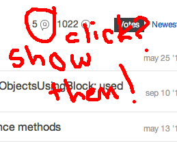
There doesn't seem to be a way to get to a list of all my badges at the moment.

There's also some bits that seem like they should be clickies (a.k.a. "links"), but are just images.

Link to the badge list, sorted by classes, or (maybe better), a page for each class.


There's a lot of dead space here. At least the "Posts NNN" text should be a link, I think, to the same thing as the tag image to the left. But why not the whole box?


There's a link for these right below the table, yes, but these Q and A bubbles look like filter controls, especially being next to the Votes/Newest sort buttons.


The heading should link to my full list of badges, and it would be cool if clicking on each of the groups led to a page displaying that badge class.

9
  • 18
    I appreciate your visual retelling of the journey you took searching for something to click. (I think the lack of a "view all" link for badges was just an oversight; we pretty much were going for every section having a link to a page with more detail.)
    – Laura StaffMod
    Commented May 6, 2014 at 19:14
  • I figured there'd be a link to the badge list eventually, @Laura, but it seemed wise to mention it just in case.
    – jscs
    Commented May 6, 2014 at 19:16
  • 6
    Agree, those should all be clickable -- except maybe the badges header since the other headers aren't clickable right now. Commented May 6, 2014 at 19:17
  • 3
    Can I add another SHOW ME suggestion? When I hover over the badges in TOTALS, I'd like to see a little popout of which badge that is, and maybe when I earned it. Pretty please?
    – fredley
    Commented May 6, 2014 at 20:08
  • Yeah, I was thinking of something like that, too, @fredley. Why not post an answer?
    – jscs
    Commented May 6, 2014 at 21:05
  • @JoshCaswell Done!
    – fredley
    Commented May 6, 2014 at 21:21
  • 2
    In the tags, should it be noted if someone is in the Top N (e.g. Top 25 or Top 30) contributors in that tag? Commented May 8, 2014 at 18:15
  • When I click on the A/Q icons, the view changes to show only answers or questions, but I can't get back to showing all posts unless I refresh the page. Also, when you hover over the badge counts at the top, they change color slightly, indicating you can click them. If you can't click them, remove the animation.
    – tbodt
    Commented May 9, 2014 at 23:18
  • [obligatory commendation for freehand red circles]
    – dang
    Commented May 30, 2014 at 19:53
80

Please, please, please do not make the profile pic that huge! I literally winced and produced a pained sound when I clicked on my test profile page. It looks horrible, completely over-sized and just needlessly occupies space.

I could count the pores on poor Slak's face and could easily count the pixels on nerdess'. We have had various discussions over the years with the SE team politely explaining that no, this is not a social media site but a Q&A site. Why this sudden urge to make our profiles appear like facebook?

Everything else is much better than version 1, I think you might be on to something here but just please make that pic smaller.

15
  • 22
    Yes, please. We generated our gravatars with the current usage needs in mind; not all of them scale well to such a large size. Commented May 8, 2014 at 3:09
  • 9
    @MonicaCellio: That's not really a very good argument, though, since the only way to get people to choose avatars that work at larger sizes is to start showing them at such size. Commented May 8, 2014 at 15:40
  • 31
    @IlmariKaronen why should we need to? Do you really expect the millions of SE users to all update their avatars? I don't want a huge photo dominating my profile and I certainly wouldn't want to force users to change their pics like this. Ideally, this type of makeover should be painless for the user and not require any input/reaction from him/her. In any case, my main consideration is aesthetic, I find the huge pic to be out of proportion and ugly.
    – terdon
    Commented May 8, 2014 at 15:49
  • 5
    @terdon: I have no strong opinions either for or against big avatars, but if we do want them, this is the only way to get them. The only way to increase the resolution of a (non-autogenerated) avatar is for the user to upload a bigger image, and the only effective way to encourage users to upload high-resolution avatars is to start using them in a context where high-resolution images look better. Otherwise, if we don't want to "force users to change their pics like this", we'll be locked in to the current maximum avatar size (as shown on the current-style profile page) for all eternity. Commented May 8, 2014 at 15:57
  • @IlmariKaronen agreed, and that's precisely what I want. I see no reason to increase the avatar size, it just causes extra work (we all need to update/modify ours) and I at least find it horribly ugly. So why do it at all? It seems to be creating problems and solving none. The current size is fine.
    – terdon
    Commented May 8, 2014 at 15:59
  • @terdon: If you feel that bigger avatars are intrinsically "horribly ugly" and worse than small ones, then that's a valid argument against them. However, the extra work is not; if bigger avatars are even slightly better than small ones in any way, then the continual benefit of having them will eventually overcome the one-time cost of switching to them. Commented May 8, 2014 at 16:03
  • 6
    @IlmariKaronen I agree with terdon that the humongous image is ugly. But if you want to encourage a behavior change, you can start by offering an option. Don't assume that everybody is using photos that they shrunk down & it's trivial to make a new version from the original; some existing gravatars are the size they are and won't get bigger. Is it worth making millions of profiles ugly just because somebody thinks bigger is better, globally? Remember that some of these gravatars convey identity across the Internet, so "just do something else" isn't free. Commented May 8, 2014 at 17:20
  • 2
    @MonicaCellio: How would you "offer an option" here? Design two different layouts for the profile page, one for small avatars and one for large? Use the old profile page design for users with small avatars? Or just show a small avatar surrounded by a huge blank space? Commented May 8, 2014 at 17:48
  • 1
    @IlmariKaronen many options: 1) Leave the avatar as is, why make it larger? 2) Allow the user to resize as desired 3) Allow users to choose between the current and a larger size, make it an opt-in. I don't see why any of these apart from 1 would be useful but it is certainly possible to give options.
    – terdon
    Commented May 8, 2014 at 17:54
  • 1
    I dig the new size - mine is after all a landscape view tho. Commented May 8, 2014 at 17:57
  • @terdon: My point is that the proposed design is based on a certain avatar size. If you change it (or make it user-adjustable), you either need to redo the whole design or leave a whole bunch of white space. Yeah, I think we can all agree that the avatar here doesn't look very good at that size, but honestly, would this (or even this) be any better? Commented May 8, 2014 at 18:34
  • 10
    All the other places the profile image is shown are very tiny. It's already hard to pick a profile image that looks good tiny in chat and as big as it is on the current profile page.
    – user215040
    Commented May 8, 2014 at 23:50
  • There is one compromise option, one of the few things that didn't earn too much flak when Flickr overhauled their UI last year: if the profile pic is smaller than the display space, it shows up as a normal-resolution inset on top of a pixelated version. (I kind of liked the effect, and haven't changed mine yet.)
    – AmeliaBR
    Commented May 9, 2014 at 1:05
  • 6
    This isn't the only place that uses Gravatars, so you can't use them at a size that Gravatar doesn't support.
    – Marti
    Commented May 10, 2014 at 16:10
  • Some numbers may help. Gravatar supports from 1px to 2048px (though they do warn most users have smaller images). The new profile uses 256px; the old 128px. So the new profile is 2× what it was, 3.2× Gravatar's default and yet only 1/8th of the maximum. Life would be better if Gravatar supported multiple images per address so you could specify one image for 128px and below and another for 129px and above. However if they were going to allow that they'd probably already allow different images at different ratings. I guess "Globally Recognised avatar" means "the same everywhere" whatever size. Commented May 11, 2014 at 22:02
59

Top Tags

The first profile I looked at was my own (obviously ;-):

My boring tags

Two things that stick out:

  1. No percentages.

    Presumably that's since I have 205 posts and so my top tag is < 15% or somesuch.

  2. is odd here.

    My one answer just happened to be to a really popular question. (I guess I should be glad the algorithm didn't pick up my answer to a question.) This set of tags fails to highlight my best stuff. If there were a way to eliminate secondary tags and focus on specific languages, that would help make this section more meaningful. , , and seem less meaningful than , , and in my opinion. I don't really know how to separate then algorithmically, however.

A user's tags are kinda boring

But the far larger problem is that tags don't tell a good story in isolation. This section reminds me of the terrible "Skills" section of resumes. It doesn't tell anyone anything useful about me as a programmer. If the tags were listed next to each "Top Post" we wouldn't need the "Top Tags" section at all. Since this cuts off the bottom of my "about me" section, it should be awesome. Instead, it just gets in the way of the good stuff below.

We already get this right in other places:

I think a traditional tag cloud tells a better story. To me, this looks like me:

My tag cloud

All I did was grab the tag set from all of my questions and questions I've answered (using this query) and pasted the result into a cloud tag generator. (The one I picked strips punctuation and single-letter words, so c# and .net aren't displayed properly.)

Here's brian d foy, who knows way more about Perl than I do:

brian d foy

The story is more interesting because you can "read" it at a glance. brian is an expert in Perl and I dabble in a variety of languages including Perl. Notice that this doesn't take into account anything but frequency. With tag scores and badges, a visualization could be substantially more rich. Perhaps tags could be colored gold, silver and bronze for users that have the equivalent badge in that tag.

It strikes me that 6-9 tags displayed with dry statistics lack the context provided by 25-50 tags displayed according to frequency. My tag cloud accurately tells you how often I thought about the POSIX spec (essentially never) while answering questions. brian d foy's tells you that the books he listed in his "about me" are worth buying. Can you tell the story of this user?

Sophia Taylor

Either list tags with "Top Posts", find a dramatically better visualization of tags, or move "Top Tags" way down on the page.

13
  • Gotta think about some of your other suggestions, but the problem with the ones you highlight as being better in the current profile is that while you're right that they contain more information, they only convey any to someone who commits to parsing a very long list of items - if you give people two bullets, they probably read 2. If you give them 100, it's better if they really care, because they get 98 more pieces of info, but if they were looking for a snapshot, they actually get 2 fewer, because they wind up reading none.
    – Jaydles Staff
    Commented May 7, 2014 at 19:03
  • 10
    @Jaydles: The other displays of user's tags are better because they include more context and not simply more information. Jon Skeet and Eric Lippert know a hell of a lot about C#. But the tag display tells that story rather poorly. Show me the tags on their top posts and you wouldn't need to have a separate tag section. Adding tag score would help a tiny bit, but it would still be 6-9 "skills" without any real way to contextualize. A tag cloud seems like a better approach. (I.e., just the tag name sized by importance.)
    – Jon Ericson Staff
    Commented May 7, 2014 at 19:22
  • 1
    Regarding the tags for that brand-new user: Those will get special treatment until they're above a certain threshold; that justn't implemented yet.
    – balpha StaffMod
    Commented May 8, 2014 at 15:08
  • You have 1 posts in [posix]. cough giant S cough Commented May 8, 2014 at 23:39
  • @michaelb958: I might have hidden a link in my answer... ;-)
    – Jon Ericson Staff
    Commented May 8, 2014 at 23:47
  • 8
    -1 I would not want a tag cloud on my profile. Whilst they can be variably effective if used to express the appropriate data and implemented well, they're inherently extremely ugly and inelegant. There's probably a better way. Commented May 9, 2014 at 5:28
  • 2
    every thing but the tag cloud :P
    – SMR
    Commented May 9, 2014 at 10:14
  • ...can you tell the story about this user?... Yes I can, she likes to go out, while not behind a computer!!! XD Commented May 11, 2014 at 12:01
  • @Awal Garg: That's actually an important point: the tag display often shortens long "about me" sections which implies that tags tell a user's story better than they do themselves. I'm not convinced the current visualization does. Tag clouds get much closer to doing so.
    – Jon Ericson Staff
    Commented May 12, 2014 at 4:58
  • 3
    +1 for the tag cloud! Great idea, intuitive and instantly understandable.
    – terdon
    Commented May 14, 2014 at 12:14
  • Tag clouds are not fashionable at the moment, but they do a great job of getting information across very quickly and intuitively.
    – Ben Miller
    Commented May 16, 2014 at 16:24
  • Tag clouds don't work very well for a number of reasons: 1. Unless the additional data is included in title attributes, visually impaired/non-style based users don't see any difference in the data. 2. Jon's last example shows a classic issue - one tag massively outweighs the others, which makes them hard to read. 3. Comparing users tags is harder - the sizes are effectively subjective as they are sized relative to the user, rather than objectively size compared to everyone. Commented May 20, 2014 at 11:14
  • @Zhaph - Ben Duguid: These problems are likely fixable by someone designing a custom tag cloud for this purpose. You might notice I played around with number of tags and image size to get a result that was pleasing to me. This would need to be automated. In particular, the last example used all of the user's tags, even though only one of them was repeated. Also, I used the "medium" Imgur size for the two users with < 10k of reputation.
    – Jon Ericson Staff
    Commented May 20, 2014 at 16:23
49

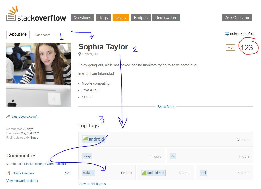
I think the rep count gets a bit lost on the right hand side, the 'reading trail' usually starts from the left and moves down.

Reading direction in blue, rep in red:

enter image description here

Possible alternatives:

  • Rep next or underneath the name

  • Some highlighting or weight for the number that would drag attention to the right side of the layout

  • Rep as an overlay on avatar?

6
  • 14
    I'm curious about what would show up in eye tracking, now... Commented May 9, 2014 at 5:08
  • 18
    I agree with Yisela, it took me some time to find the rep. Commented May 9, 2014 at 6:58
  • 4
    How about rep under image, like the old style?
    – Justin
    Commented May 9, 2014 at 23:05
  • I like the overlay on the image idea
    – SeinopSys
    Commented May 11, 2014 at 11:19
  • "Member of 1 Stack Exchange Communitie s" Commented May 13, 2014 at 2:45
  • 2
    You're right - rep was stranded. New version has rep under the avatar. Good call.
    – Jaydles Staff
    Commented Jun 3, 2014 at 17:18
47

I would rather see this:

some notable and recent badges

Than this:

a couple of noteworthy badges

Or at the very least, I would like to see the 'recent' section. The visualisation itself doesn't add much value for me, and the 'recent' section is far more valuable.

I get what you're up to here with the visualisation, and I understand you want to give us a sense of scale for just how many 1468 thingies is - because at that scale it becomes just a number. The dots don't actually add all that much for me, though: seeing all the dots there makes me think "that's a lot of dots", which is not much different to thinking "that's a big number". The sense of scale is lost to me either way. I do see that 641 silver thingies is a lot more than 66 gold thingies, but I already knew that.

(Maybe it's different for others, but the numbers themselves have more impact for me than the dots. No lie, I'm actually surprised those are a whole 66 gold dots: it doesn't look like nearly that many until I count them!)

What's far more important to me is what the badges are that they have. Hence being able to see a list of their recent badges, similar to what we currently have, is important to keep around.

10
  • 6
    I agree 200%...
    – ɥʇǝS
    Commented May 9, 2014 at 16:23
  • 4
    Agreed, and also, the total number of badges is already on the profile page next to reputation, we don't need the same info twice.
    – DPenner1
    Commented May 10, 2014 at 3:14
  • 9
    The funny thing is that, to me, the dots seem less significant than the numbers. I look at the dots and think, Ooh look, a bunch of dots, but when I glance over to the numbers, suddenly I know how many badges this person has. The dots do nothing useful for me.
    – Justin
    Commented May 10, 2014 at 4:57
  • 4
    +1 If they force us with that badge scale thingy, I would use Adblock plus to disable that tomato plantation. Commented May 10, 2014 at 17:03
  • I don't hang around meta often enough to have the 125 reputation needed to downvote this idea. The proposed re-design is much more informative than the old one. And looks good for show-off ! Commented May 12, 2014 at 12:39
  • @chronodekar What is more informative in my user profile having freckles in 3 colours over having three numbers, and then reasonable information in place of the freckles? And if you are here to show off, then something is wrong, sorry.
    – yo'
    Commented May 12, 2014 at 12:56
  • @tohecz I'm here to advance my intelligence. And by nature, enjoy showing it off! Commented May 12, 2014 at 13:07
  • 2
    hmmm, interesting juxtaposition between advancing intelligence and switching numbers and words for colors and pictures because they're much more informative.
    – mcalex
    Commented May 13, 2014 at 8:35
  • 1
    @mcalex colors and pictures help (ever looked at a graph?), though I don't think they do in this circumstance Commented May 13, 2014 at 8:38
  • I know they help, but when you want more information, ie, once you've grokked the picture, you go to the numbers and words.
    – mcalex
    Commented May 13, 2014 at 8:40
35

Please don't take this as a negative stance to what is being accomplished here. Your continuing drive to try to innovate is much appreciated, but to me the benefits seem to be a little on the 'light' side.

1. Tags

It's great having more information such as the amount and percent of total posts a tag represents, but this means nothing if you just post rubbish, and post a lot.

Instead, (or in addition) we should have tag score as well as the percentile you are within the tag vs all other users.

Also, having only a few tags on display gives the wrong impression. If all your tag post amounts are separated by a single post, does this display make sense? NO. Maybe on the left have the top 5 tags in a table with scores, then a collection of other tags in some space to the right. Or the current list of top 10, but with more metrics.

TLDR:

Problem: Unconvincing use of space, potentially unhelpful metrics

Solution: Keep tags the same size, display a (sortable) list with information, including tag score and percentile of all users for that tag. Do this for maybe the top 10 tags, similar to at present.

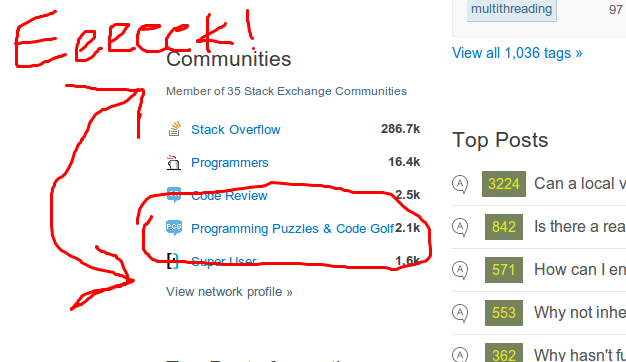
2. Communities / Top Posts from other communities / Top Meta posts

I'm not sure whether it's just me, and I know the current profile page has a list of accounts..but I often have to provide a link to my Stack Overflow account page to potential employers, because increasingly they are asking for it.

This is because I work in this field, the field they are interested in.

I don't want them to see an opinion I post or protracted debate I get into on meta. I also don't want them to see I also post on other Stack Exchange sites - I'm trying to present a view of myself about programming, not how to invade and do unholy things to unwitting players on Dark Souls. I'm aware this is all traceable via the network profile section, which is fine- I just don't like it being so easily accessible.

Only today I was on https://money.stackexchange.com/, and I saw a pretty senior member of the Stack Overflow community had posted a question about debt. Why on earth would they want a prospective employer looking at their Stack Overflow profile immediately have this pop up in their face?? In honesty it would be great to have the option to turn off any membership of other sites from being visible - for fear of stopping people posting on them for fear all their dirty laundry is getting aired in all the wrong places.

I'm aware there is Careers 2.0 for the careers aspect, but it, er, links back to your profile page anyway, so the issue still exists. My Stack Overflow profile should be totally Stack Overflow centric - the rest of my Stack Exchange interactions should be on the metrics (Dashboard) page, if present at all.

TLDR:

Problem: I have a real issue with these lists. Stack Overflow is for programming, my profile is for Stack Overflow, and should reflect this. Employers are asking for a Stack Overflow profile link, why would I want them to see my posts in Arqade?

Solution: We already have a network profile link, I can trace through my other interactions through this. Alternatively add a new tab under the dashboard section for 'network activity'

3. Top Posts

Questions and Answers should be kept separate

They are fundamentally different things, keep them apart. They are the two sides of the site. This is not a forum site which you can reduce every item to just being a 'post'. Typically people looking at a profile care about one or another, they should be easily identifiable, and at the moment it's a total muddle.

Also, the link at the bottom then says 'View all 908 questions & answers »' with separate links on 'questions' and 'answers'...which means you aren't able to view all 908...only one or the other type. This makes no sense.

TLDR:

Problem: This is a Q & A site, not a forum, users don't have posts; they ask questions or provide answers, which are two fundamentally different things, and should not be mixed together. I view a profile and want to immediately see one or the other clearly distinguished and identifiable

Solution: Keep separate sections for questions and answers. By combining the two, you obfuscate what people are trying to find.

4. Badges, Apps & Projects, Missing Bounties/Votes Content

For the badges, it isn't obvious what notable means, even with the '1 of only..' text. What if it isn't notable to me? I'd be inclined to list the 'most recent 3'.

I'm also not convinced I need yet another place I have to maintain a list of my applications and projects. If this can somehow hook into Careers 2.0 then great... Otherwise, it feels like a bit of a duplication of purpose between the two sites.

Not only this, but we now have less information than we had before, and where are the bounties and votes sections? For some users, these are particularly interesting (even if only for seeing how close you are to the 600 votes on questions badge).

TLDR:

Problem: Content has been replaced with less interesting or less relevant content. No bounties or votes sections. Duplication with Careers 2.0 page with projects area, Badges section not really interesting any more - usability replaced with looks.

Solution: Keep an area for bounties and votes. If we have a projects section, ensure it can be linked to a Careers 2.0 page, change notable badges with most recent / notable sortable list, dont use badge graphics for each badge, just have badge x number.

5
  • 4
    #3 so much. I answer more questions than I ask, but that doesn't mean I'm not proud of the questions that I do ask. Show as many top questions as answers. Commented May 9, 2014 at 11:07
  • 1
    @TheGuywithTheHat +2 for Dark Souls II
    – SW4
    Commented May 9, 2014 at 13:51
  • 2
    +1 for all the points. And I'm especially curious what will show instead of Projects on other SE sites. Because SE is not SO/Carrers for many of us.
    – yo'
    Commented May 11, 2014 at 20:02
  • 2
    +1 for everything, but especially for #2. I have enough reputation on The Workspace that it is shown in my "Communities" section, with a few questions being in my "Top Posts from other Communities". I do not want potential employers being presented with a link to browse my Workspace questions and answers, and viewing how I handle things like salary negotiations, workplace conflicts, quitting my old job, finding a new job, or possibly even questions about them.
    – Rachel
    Commented May 12, 2014 at 21:20
  • 1
    #2 Absolutely. Bringing in the top badges to show off your most impressive achievements and top tags where a user does most of their posting is inconsistent with chucking in something from somewhere entirely irrelevant.
    – mcalex
    Commented May 13, 2014 at 8:02
34

Per balpha's request I've tried to expand my concerns into an answer.

My main problem with the redesign is: It moves a lot of the information I want on a user's profile under "dashboard" and/or makes it harder to get to. Here's a brief overview of everything the new profile page has, and the stuff it's missing I think it should have:

  • Newest questions and answers

  • Top questions and answers

I really prefer the two column layout, one for questions, one for answers, but I suppose I can get used to one column. However, it would be really good if you could make the little icon that differentiates between question and answer more.. obvious? Currently I have to look at it really carefully to tell if it's a question or an answer.

  • Badges

The new profile really doesn't have this, I can see their top badges, and I can see their total badges, but that's it. There isn't even a way for me to see a list of all their badges, much less recent ones. This was already addressed in several answers and I like what they propose.

  • Votes

Sometimes I am interested in a user's voting specs/habits. There isn't anything relating to votes on the new page what.so.ever.

  • Reputation

This isn't a biggie, but hey, shouldn't there be something to do with reputation on the new page? I could care less about tags, but that's thrown right into my face! (more on this later).

  • Tags

I go to a user's profile when I want to look at their tag data, top tags, tags they have a score of 5 in and just tags in general. The new mockup has some interesting specs, but it doesn't show score or utilize space well.. at all. As another answer noted this could really be improved. Right now there is just too much space, and it looks ugly.

  • Bounties

I feel this is a big one. There's absolutely nothing about bounties. I think the new profile should at least show active bounties.

  • Top posts from other communities

I feel this shouldn't be there. If I want to see a user's network activity I will go to their network profile. Right now it's taking up space that more important things could be occupying. Like bounties, reputation, votes, etc.

  • Apps and projects

I think this is a cool idea and inclusion, but it isn't going to be much use outside of the programming sites (my understanding is it only ties into GitHub, did I miss something?) (the projects section will let you use arbitrary links). I suggest you put it on a flip-card like thing with "top posts":

enter image description here

That will make more space for important things. Or, if you're feeling up to it, make it customizable per site. We could have Launchpad Repos on AU, All Recipes recipes on cooking, etc.

  • Accounts

Often times I have quick access to a user's account on my main site and I use that as a jumping off place to get to another of their accounts (for whatever reason). This is actually well implemented, and I like it, although swapping the "network profile" with "more accounts" like you did will take some getting used to. Also, long site names could use some tweaking ;)

enter image description here

  • Top meta posts

This is really cool, and a great way to expand "Meta profile" into something a little more useful.

  • Mod buttons

Please tell me you didn't move all my mod buttons under the dashboard...


tl;dr

While the overall design looks nice, it feels like most of the functionality has been made harder to get to, and the idea of "two" profile pages (dashboard/profile) makes it feel... awkward and duplicated.

3
  • Agree with nearly all suggestions here. I don't agree that "Top posts from other communities" shouldn't be there -- it's nice to know at a glance if a user who doesn't have a lot of rep on this site is active on another one, versus a total new user. But I do like the idea of making that section share space with the "Projects" section. That also provides some content for that space if the user hasn't added any projects to the profile.
    – AmeliaBR
    Commented May 9, 2014 at 1:13
  • I like "Top posts from other communities", I like "Apps and projects", and I really like the fact that this is being split into two pages. The first page you go to if you want to be narcissistic or see what you look like to others; the second page you go to if you want to do anything with your account. Other than that I agree with this answer, but confused about whether I should upvote due to partial agreement... Commented May 9, 2014 at 16:19
  • @Goos I have no problem with either of those, but I take issue with the fact that they are taking up space more important stuff should be occupying.
    – ɥʇǝS
    Commented May 9, 2014 at 16:22
30

Tags

Why is there so much blank space? Why don't all of them have percentages? Why is so much bigger than when it only has 3% more posts?

3
  • 2
    I would hazard a guess that it's because it's still the top tag - reguardless of by how much.
    – AnonJr
    Commented May 8, 2014 at 17:59
  • @AnonJr: Well, I have over twice as many [css] posts as [html] posts but they're on the same row... Commented May 9, 2014 at 11:20
  • @Bolt don't know... I was making an educated guess based on a brief look.
    – AnonJr
    Commented May 9, 2014 at 14:11
30

There's rather much blank space.

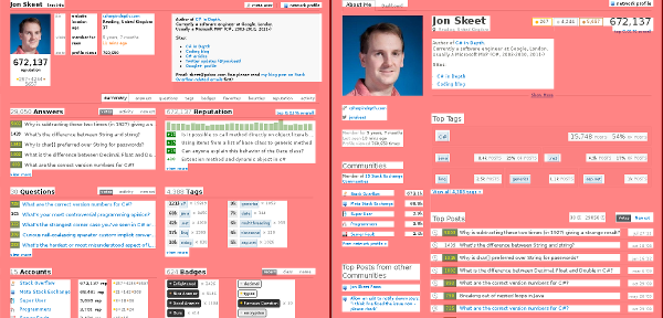
Current left, proposed right:

highlighted blanks

7
  • 20
    There's nothing wrong with whitespace if it makes it easier to visually parse & understand the information being presented. Commented May 8, 2014 at 21:56
  • 27
    @David I agree, but when the padding between sections is thrice the section heading font height, I think things have gone too far.
    – Anko
    Commented May 8, 2014 at 22:08
  • 7
    @DavidFullerton - with the greatest respect saying there is 'nothing wrong' would mean nobody had a problem with it, which this post kind of contradicts. I think you mean it has merit.
    – SW4
    Commented May 9, 2014 at 8:33
  • @DavidFullerton and vice versa
    – mcalex
    Commented May 13, 2014 at 8:03
  • @SW4 A little late but "saying there's nothing wrong would mean nobody had a problem with it" is not true. There can be nothing wrong with it and people still take offense to it. Those people are just wrong.
    – TylerH
    Commented Jul 16, 2014 at 13:57
  • @TylerH - if people have a problem, there is something wrong, whether fundamentally or perceptually - both are valid within a community and if presented en-masse should be addressed.
    – SW4
    Commented Jul 16, 2014 at 14:00
  • @SW4 If you include lack of understanding/knowledge on how something works in "something wrong", then yes I guess you are correct. And of course I agree that concerns should still always be addressed.
    – TylerH
    Commented Jul 16, 2014 at 14:05
24

Can I choose the posts that appear in Top Posts from other Communities? (sidenote: capital O for Other?), or at least hide ones I don't want there, similar to how I can choose what gets displayed on my Careers 2.0 profile?

Also, should Meta.SE posts be included in the list? Meta posts and meta votes are rather different, so maybe should be included in the Top Meta Posts section rather than other communities?

4
  • About the second paragraph: meta.stackexchange.com/questions/231112/… Commented May 12, 2014 at 19:03
  • much upvote very doge...
    – Rachel
    Commented May 12, 2014 at 20:48
  • @Rachel so regret
    – fredley
    Commented May 12, 2014 at 20:50
  • 1
    But seriously, I gave this a +1 because there are times that I do not want my activity on one site broadly published across other sites, or have specific questions from those sites showing up on my SO profile page. For example, I've asked quite a few questions on The Workspace, and if I'm showing a potential employer my SO profile page, I don't want them seeing my posts from there regarding salary negotiations, co-worker conflicts, or how to quit my job.
    – Rachel
    Commented May 12, 2014 at 21:12
21

I like what you have done so far. I think it would also be good if we could see the awarded tag-badges against the top tags.

Tag Badge

19

badge section

If the new badge display is going to be showy then let it be. It needs to have more than 3 badges for those who have earned more than 3 awesome badges.

Jon Skeet comes to mind, mostly because of the example in this post. He doesn't seem to have much more than the other users because only 3 "notable ones" are listed. Sure, there is a list of bulleted badges below but to the eye they are small enough that they sort of blend into a lot of noise. The 3 are the main ones that get noticed, and almost every user has at least 3 badges.

Did you know Jon Skeet has 44 gold tag badges? While his zone of badge bullets below is impressive, there is nothing else down there and more than likely users wont scroll just to see how far the badge bullets go. It would be nice if there was a way to work in at least a few more of his impressive badge work. I am not sure what that would entail, but 3 doesn't seem to really represent the "notable" section enough in my opinion.

Also, some of the tag badges are kind of notable, especially when you were the only one to get them

enter image description here

18

Staff feedback in comments: the project section will allow arbitrary links! :D


The "Apps and Projects" section will be available on all sites (probably just called "Projects"). And yes, we know this section is just an image right now -- we'll get around to implementing it soon.

Thank you. But this needs to be implemented correctly if it's offered to other sites, and that should mean the following:

The projects section must allow arbitrary links.

Currently it just displays github, and it seems that was the original plan. But if expanded to other sites, it must allow us to link to whatever site we want: a tumblr link, a github, our personal domain at example.com. Otherwise it's going to be not very useful, because most other sites won't really have a reliable central project hub.

For perspective, this was going to be SO-only in the first version of this profile page redesign. We requested it here and here, and the first of those links was the 5th-ranked answer. I'll quote my comment from there, which gathered 16 unicorn points:

+1 Please make this available to other sites, and don't limit us to whitelisted hubs. On RPG.SE, which is not techincal/programming, there are people developing their own RPG systems, and I'm working on a tabletop simulator. All of these projects are as significant to us as github projects are to a developer, and none of them have one single hub site in common. Arbitrary links might come with spam concerns, but we can already provide an arbitrary link in our 'website' field.

You may get people promoting their own sites, and I'll be linking to my own tabletop simulator site & blog when it's launched, but if those sites are our projects, that's kind of the point! If you're concerned about people providing inappropriate links, like a Kings of Chaos recruiter link on Arqade or a sales referral page on Server Fault, (a) we can already link to those things in our website field, (b) you should counteract this with some means of drawing moderator attention to these fields. But not by limiting us to whitelisted hubs.

2
  • 10
    Yes, this is the plan based on exactly that feedback. You'll be able to link to whatever you want. Commented May 9, 2014 at 3:00
  • 2
    Thank you very much then. :) I appreciate it a lot. Commented May 9, 2014 at 3:01
14

No matter what awesome formula you are going to use to determine the Top Tags - somebody will always be unsatisfied with them.

Me for instance - I do not want PHP be one of my top tags since I have no idea about it and don't even like it. Or maybe someone is totally proud of a tag having only a score of 10 on it.

Can we just make that list editable so we can just put there what we want?

I guess it should be named Favourite Tags then.

3
  • 15
    It's completely your own fault. You shouldn't have answered PHP questions if you're ashamed of this knowledge. :P
    – Athari
    Commented May 8, 2014 at 18:55
  • 15
    @Athari: Not that I'm ashamed, but I have, for example, a gold Java badge without ever having written a single Java program - just because I have been answering regex questions that happened to be tagged Java as well... Commented May 9, 2014 at 7:28
  • 3
    Can only support that. The fact that most OpenGL questions are for OpenGL ES doesn't magically make me an iOS or Android expert even though those belong to my top tags. I haven't ever touched a single smartphone. Commented May 9, 2014 at 10:00
13

The tags section does not use the available space in an optimal way. There is too much blank space (mentioned before by bjb568), and long tags do not fit in a box as seen in the screenshot below (hint: look at the tag).

The tag overview looks fancy, but unfortunately it is a bit weak on conveying information. The currently most important piece of information is missing: The number of (up)votes. It has been replaced by "% of posts", which imo is a bit redundant because you can easily estimate the % of posts by a simple calculation. Please revert back to the showing something related to votes (e.g. your rank within a tag (absolute or relative)).

1
13

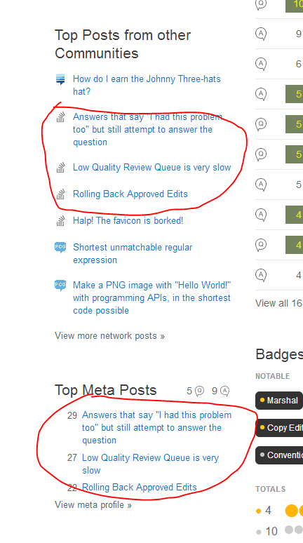
One problem I noticed immediately is that some of my meta posts are listed in two places:

enter image description here

All my posts that are in "Top Meta Posts" are also in "Top Posts from other Communities", making "Top Meta Posts" redundant except for where it displays the number of meta Qs and As.

3
  • 3
    That was just a bug, meta posts aren't supposed to show up in the top posts list. Fixed now.
    – balpha StaffMod
    Commented May 12, 2014 at 12:00
  • Doesn't it not matter anymore with the MSO/SE split? Commented Jun 12, 2014 at 20:47
  • Ahh, nevermind. I was thinking the system treated mSO as the meta of SO, but it was a different site. Whoops, not thinking clearly... :) Commented Jun 12, 2014 at 20:51
12

Top tags

Considering tags are huge, they can contain more information like tag badges (100, 400, 1000 upvotes). Blocks can be colored based on percents. But they are still just wasting space.

Top posts

I'd rather see Q and A icons colored. It's hard to distinguish them at first glance.

About me

I don't see any point in removing Age. Location is barely readable (why #aaa, not #eee?).

And it's not clear where links below avatar come from.

Communities

Old Accounts list was better. I like badges.

Badges

Notable badges should exclude lower tiers. There's no point in showing "Epic" if the user has "Legendary". (Or "Publicist" and "Booster" in my case. I'd rather not see these random linking badges at all, if possible.) And more badges can be displayed than just three.

12

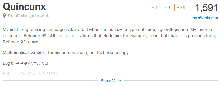
enter image description here

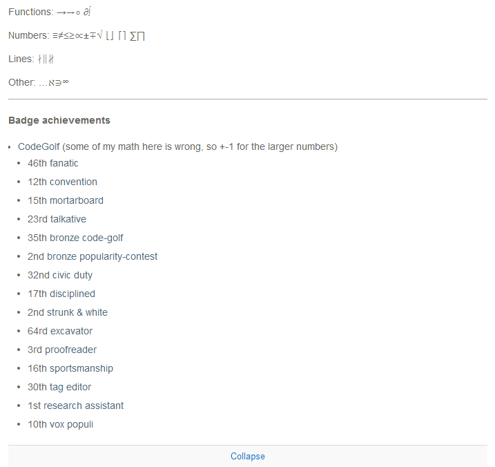
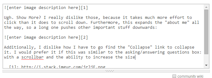
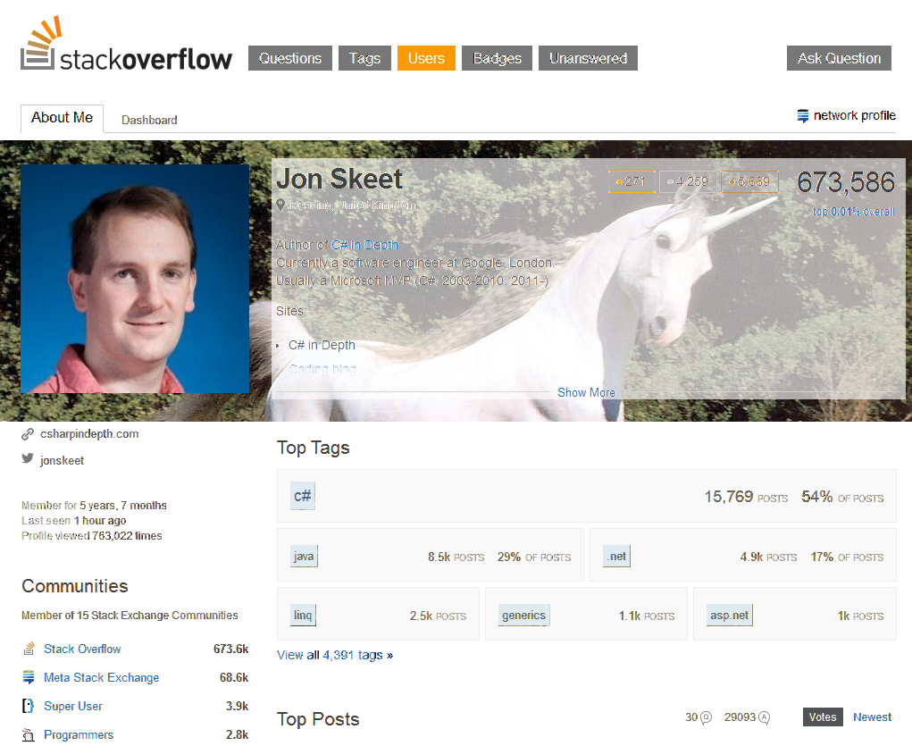
Ugh. Show More? I really dislike those, because it takes much more effort to click than it does to scroll down. Furthermore, this expands the "about me" all the way, so a long one pushes other important stuff downwards:

enter image description here

Additionally, I dislike how I have to go find the "Collapse" link to collapse it. I would prefer it if this was similar to the asking/answering questions box: with a scrollbar and the ability to increase the size:

enter image description here


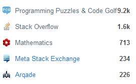
Also, the communities list has really long names.

enter image description here

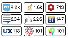
I prefer the idea of taking the big favicon for the site, putting it in a box, and adding the reputation on the right. Then, the communities can be listed in a flow layout, with an immediate mouseover with the site's full name. Something like this (perhaps less grid-like or without the box; with a mouseover/expand when mouse over a site):

enter image description here

4
  • 11
    +1 for the collapsed sites idea
    – Kazark
    Commented May 12, 2014 at 14:13
  • 5
    +1 because I also hate the "Show More" click... we should be able to just scroll down
    – Rachel
    Commented May 12, 2014 at 20:43
  • Great idea! Just don't use that font please. It's almost as bad as Papyrus... (at least, on sites, not mockups). Commented Jun 12, 2014 at 20:45
  • @AnnonomusPenguin Sorry about that. I used the ux.se mockup generator to create the box and the numbers, thinking I could add the images, but I couldn't, so I used MS Paint to finish it.
    – Justin
    Commented Jun 12, 2014 at 20:48
12

One thing: can there be an option to change the background of it, almost like a cover photo? I made a mockup here:

A picture is worth a thousand words*. Excuse my pun. :P I think it would be a great way to add some color and personalization to a profile. Plus, moderators could mess with Jon Skeet's cover picture and change it to unicorns some people could add fun meta-themed photos!

* May be more or less than one word depending on compression, file size, computer architecture (64 vs. 32 bit), etc.

Image source... hope you like the mockup because I got a lot of weird looks today.

3
  • 5
    +1 for the unicorn :)
    – TheDoctor
    Commented May 14, 2014 at 0:24
  • 5
    Oh yeah, no half-assed stuff, make it go real Facebook! ;-( Commented May 15, 2014 at 23:43
  • 5
    I agree with @ChristianRau. The whole idea of "personal profile" is wrong. The more "personal" the profile is, the worse. I'm not going to change my gravatar, no matter how ridiculous YOU are going to make it. If I'm allowed to put a background image to my profile, I'll make it a photo of my ugly buttocks in a thong. This is not Facebook!
    – yo'
    Commented May 30, 2014 at 11:01
8

Can we have some control over which badges are displayed as "Notable"?

Or at very least, tweak the logic to give a higher priority to tag-specific badges since I feel they are ones that users are probably the most proud of.

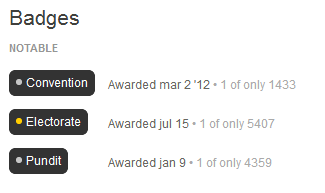
Right now my "notable" badges are Convention, Electorate, and Pundit, none of which are very impressive.

enter image description here

I would much rather show off my gold WPF and C# badges

4
  • 6
    Tag badges aren't shown right now, but should be -- we'll add that. We may also just globally exclude some badges that are rare but not very interesting (like Convention / Electorate) Commented May 12, 2014 at 17:27
  • @DavidFullerton Good enough for me, thanks :)
    – Rachel
    Commented May 12, 2014 at 17:43
  • 1
    Tag badges are included now, and it turns out that my (kinda black box-ish) sorting order granted you your wish :)
    – balpha StaffMod
    Commented May 15, 2014 at 17:51
  • For me my super-rare tag badges would also be far more important in this section than generic ones, even if the latter are gold.
    – Hubert OG
    Commented May 19, 2014 at 9:33
6

Some feedback (I'll skip the positive and concentrate on improvement suggestions and/or complaints, sorry):

  1. "Notable badges" logic seems wrong.

    Mine didn't list tag gold badge - which seems more notable both conceptually, AND by rarity (37 ever awarded) - than "Booster" (1000+ awarded and not that big of an achievement).

  2. Badge visualization: you can't hover over gold badges and see what they are.

  3. The space utilization IMHO needs to be re-worked.

    In case of SO profile, a picture is NOT worth 1024 words.

    My Gravatar takes up 50% as much space as the "About me" text... which in turn has so little vertical space as to be almost useless.

  4. Related to #3: there's too little vertical space for "About me" text - and nobody will ever read the full text if they have to click a link to expand it.

  5. Top tags list takes up too much vertical space. You can squeeze 100% same design into 33%-50% less vertical space by removing margins; and free up space for #4

2
  • Your point 1 was addressed by a question asked 16 hours before your query. The comment to that answer states that presently tag-badges are not presently included in Notable Badges, but will be. Commented May 13, 2014 at 23:20
  • Good points, but as to #4, at the moment (old profile) people have to scroll larger about me sections, too. You could argue that noone will ever read it if they have to scroll it either. Something has to be done to not make it huge by default (as there are maybe other people like me, for which it is actually too much room even in unexpanded form). Commented Jun 5, 2014 at 11:45
5

I like the idea of the visual badge representation, a lot. But when you get to people with a lot of badges, something weird can happen:

enter image description here

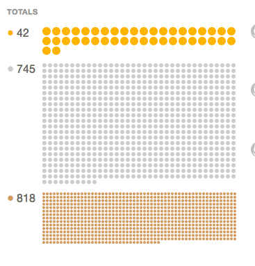
There are quite a few more bronze badges than silver ones, yet the size of the badge-dots-area is less than half of the silver one! Even though there are actually more dots, it makes it look like there are lots more silver badges than bronze ones. I think this is a little odd. I think there's something going on where gold and silver badges are supposed to be bigger than the bronze dots in all cases, but on the profile you linked for someone who only had bronze badges the dots were still pretty big... So, I dunno. I get that silver badges are more important than bronze, but it just still seems strange to me for it to be SO much bigger when there's actually a lot less of them.

1
  • 20
    This is basically by-design. Those 745 silver badges are more impressive than 818 bronze badges, and so should show up larger. You still may be right that it's weird, but it is intentional. Commented May 8, 2014 at 21:48
5

I question the criterion of deciding what a top tag is. I think frequency of use is more meaningful to me than how much reputation has been awarded in the tag, and better reflects interest in niche topics that differentiate. Top tags is almost redundant as it stands with top individual posts anyway. My #2 tag is apparently "static" which I've only participated in twice (and I didn't pick to add that tag on those posts!). Whereas "Delphi", I've used more often than my #1 tag... But that doesn't even come close to appearing in the top tags list because it's a niche topic that doesn't get a lot of votes compared to say, Java.

Secondly, I dislike how prominently my participation on Biblical Hermeneutics (BH) (for example, top posts in other communities) shows up on the new Stack Overflow profile. I don't want my top BH posts on my Stack Overflow profile! I want my Stack Overflow profile to reflect my participation on Stack Overflow...not hobby sites, I'd prefer these less integrated, or at least an option to hide particular sites/questions from the "top sites" and "top questions" list.

3
  • The new tags section does use frequency (# of posts with this tag). However, it looks like there's a bug where it's only counting answers, so your #1 tag is Java instead of Delphi stackoverflow.com/users/reloaded/272208/jessica-brown Commented May 8, 2014 at 18:12
  • 5
    Arguably, the real problem with static is that it's a bogus tag ("Hey, I need a 'static' expert! Does anyone here know 'static'?") that should be nuked and buried. But yeah, some kind of filter / opt-out / customization mechanism could be nice. Commented May 8, 2014 at 18:13
  • Just to follow up on the tag issue, I fixed this the other day. Delphi is now the first in your top tags. /cc @DavidFullerton
    – balpha StaffMod
    Commented May 12, 2014 at 11:16
5

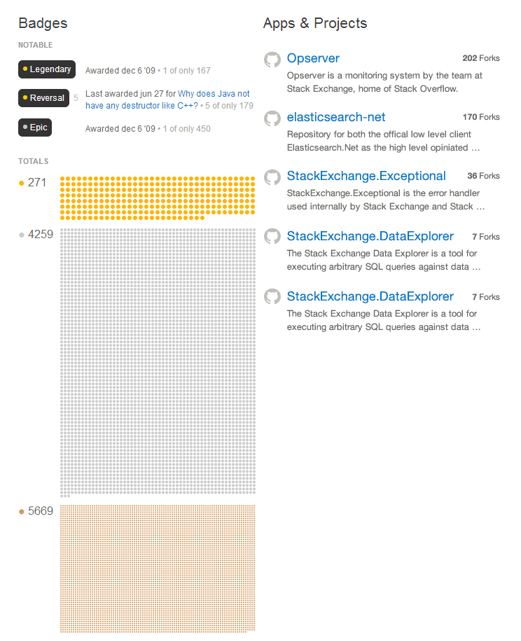
If this feature suggested here (hover for badge) is implemented, we'll need to make the badges bigger.

The badge view looks fine with a new user:

However, when you look at Skeet:

You get the point. If the hover feature was implemented, then it would be impossible to use for some users. Although this shows me that almost six thousand badges is a lot, it makes the page much longer than necessary. And unicorns don't like bragging. I vote that we either veto this whole badge idea (I don't like this option much), or move them elsewhere. Maybe if it's too long, split it up into two columns?

3
  • I say veto it. If we can't have the pop-ups I don't want it.
    – ɥʇǝS
    Commented May 14, 2014 at 0:56
  • 1
    The hover would likely not be enabled at the very top end of the scale (those tiny bronze badges). Also, Jon Skeet is an extreme outlier even among top users. The next highest user, Darin Dimitrov has 1/4 the badges and looks pretty reasonable. We considered making one more "Jon Skeet" scale for badges but haven't done it yet. Commented May 15, 2014 at 14:58
  • 6
    @DavidFullerton Jon Skeet doesn't change his badges to fit the page, the developers redesign it to fit his badges ;P
    – ɥʇǝS
    Commented May 22, 2014 at 15:10
5

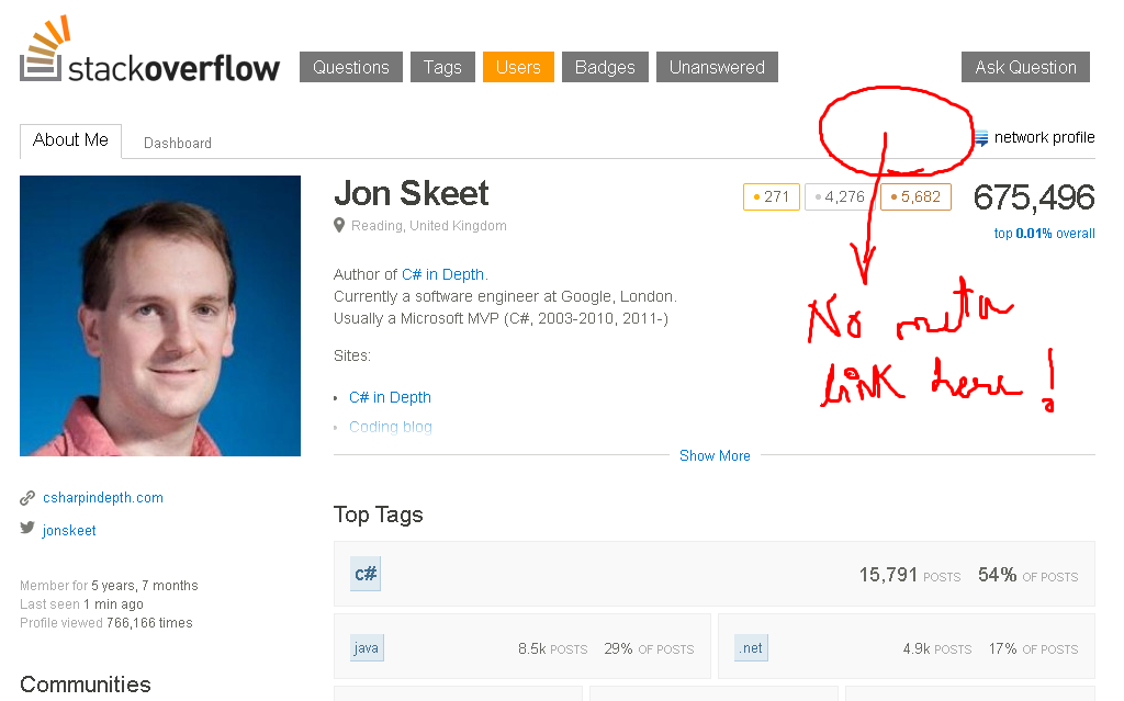
there is no link to view the user's Meta.Stackoverflow profile... I just noticed this while viewing Jon Skeet's profile...

What is this guys? Didn't expect this from SE programmers!! (lol)

enter image description here

4

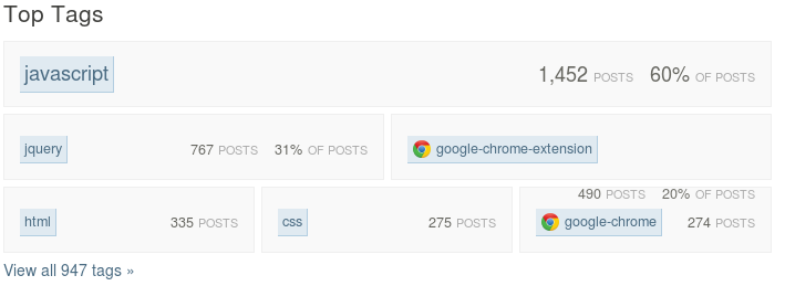
Interesting. Nick Craver's apparently posted 108% of all his posts.

Under his Top Tags, 75% of posts were in jquery, and 33% of posts were in Javascript.

At first glance, this is a little bit unclear. As @Mystical points out, this is because tags overlap, but from the outside, it just looks incorrect.

4
  • 3
    Tags can overlap.
    – Mysticial
    Commented May 7, 2014 at 1:15
  • 12
    Needs one of those funky Euler diagrams
    – Shog9
    Commented May 7, 2014 at 2:58
  • 20
    Arguably it should be more. Isn't anyone else wondering how it would work that 75% of the questions he answered are about jQuery, but only 33% are about JavaScript?
    – balpha StaffMod
    Commented May 7, 2014 at 3:47
  • 1
    @balpha: Because if a question is about some specific jquery functionality, knowing just javascript and not specifically jquery isn't of much use. A [javascript] tag is not useful than.
    – sth
    Commented May 9, 2014 at 10:40
4

Several points I would add (I hope I don't dupe any points mentioned before):

  1. I don't consider my profile text really important on SE. Currently it serves its purpose well: my TeX.SX profile; in the new profile, it looks a bit strange: me reloaded. I suppose this is the case for many people. People are here to help or to get helped, so why the focus on personal info? (Btw, notice how ridiculous useless the gravatar is.)

  2. The Q and A buttons would use some work IMHO. In large scale, they are quite indistinguishable, same shape, same colour. I think that the most important thing you want to know is whether the user excels in questions or in answers (which is not necessarily given by the number of them).
    enter image description here
    In small scale, they look like a circle and an up-arrow:
    enter image description here
    I apologize for not offering a better alternative, I'm neither an UX expert nor a designer; I just want to point out these two problems.

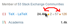
  3. The on-mouse-over change in the community list, if it needs to change on mouse over, could be done in a bit more sensible way. Currently, the rep number jumps a mile when you mouse over it, which is quite distracting. Let's keep the rep on right and show the badges on the left of it:
    enter image description here
    I understand the point that the order is always rep then badges. If you want to keep it so, let's make the badges either shown all the time, or not shown at all.

0

Not the answer you're looking for? Browse other questions tagged .