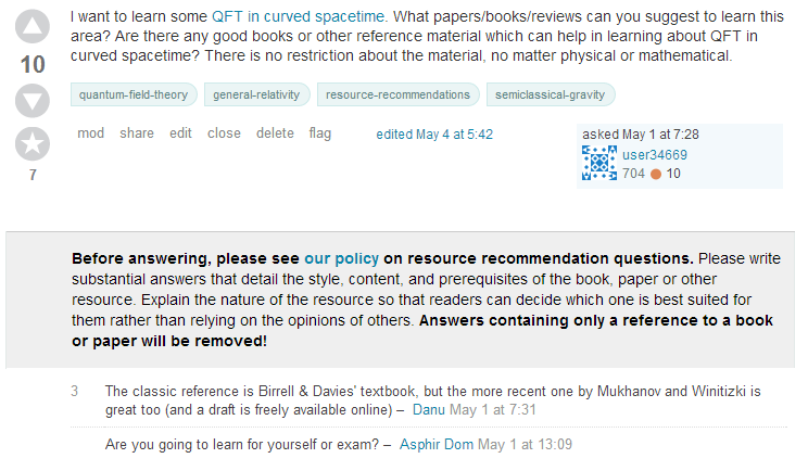
It looks like banners for questions that are on-hold/closed/locked/deleted/etc are now located above the comments, rather than below.
I'm curious why this change was made. Increased visibility for the banners? Cheese-moving quota not met?
Comments can be... noisy. While they do sometimes contain information useful in understanding why a given post was locked / migrated / closed / etc., even this is of secondary importance to knowing the status of a post - and until we can agree on a suitable system for getting rid of irrelevant comments, there's a pretty decent chance that the commentary won't help much in any case.
In addition, the former placement of status banners was tragically similar to that for advertisements (as Mauro pointed out a while back) - not really ideal for critical information.
So we've moved all the status banners directly under the posts on which they're applied. This applies to all status banners except for Protected when the viewer is a new user (which will continue to appear at the bottom of the page in lieu of the UI for posting an answer).
Of particular note is the effect this has on moderator-applied post annotations, which are intended to provide warnings or other crucial information about a given post:

Increased visibility for the banners?Bingo. These were getting lost under the comments, and new users simply never noticed them.