39

Update

This is now live across the network. See the new post for feedback now that you can see it in action.

Original Post

I’m still noodling on the user profile while on our way to full responsiveness. This next round addresses feedback from my prior post, but I’ve separated it into a new post for a cleaner history.

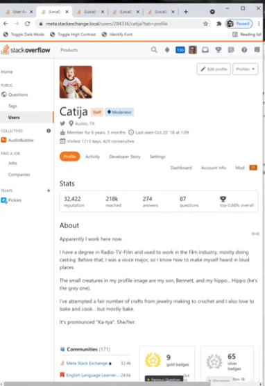
This time, I’m trying something new. Here’s a 5 minute tour of what I’m doing with way more context, and way more examples. You also get to see my face 😛. Screenshots alone just aren’t cutting it on such a dynamic part of our app.

Remember, I’m just working on that top portion of the profile pages in this round of updates. I fully intend to ship what I’m demoing here. I think this round of changes will serve us well moving forward.

Some changes:

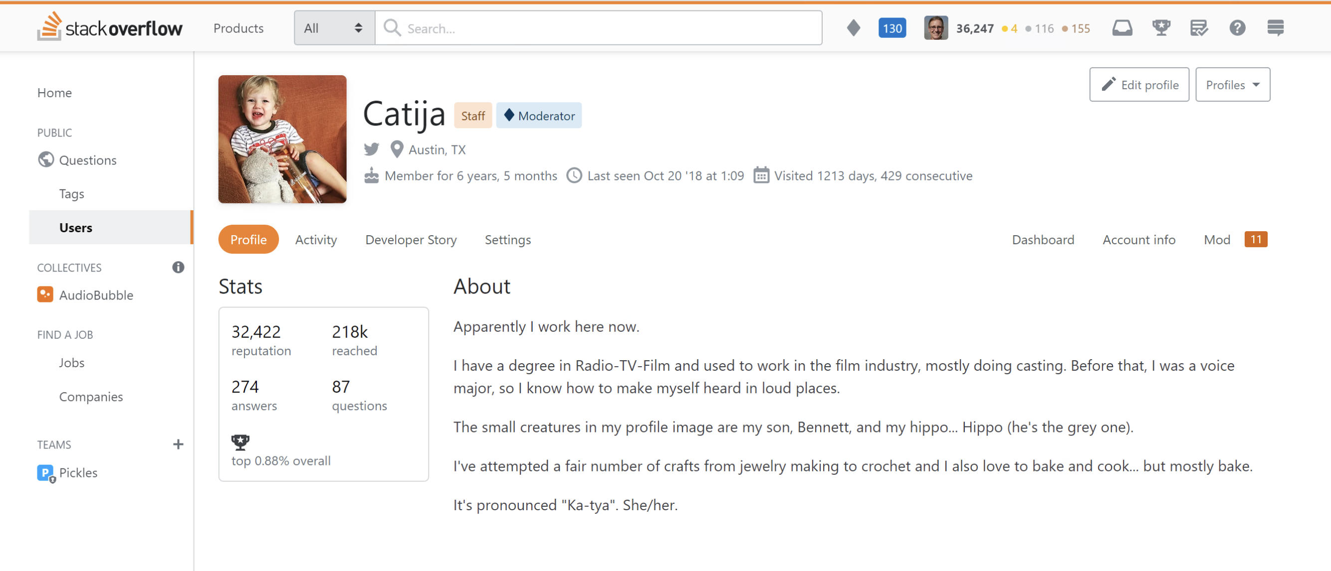
  1. Unifies the navigation between each section: Profile, Activity, Developer Story, Settings
  2. Groups profile links
  3. Groups moderator-only links
  4. Refines the placement of about me and various stats
  5. Removes some redundant stats
  6. Adds a "Read more" button on longer bios. No more scrolling!

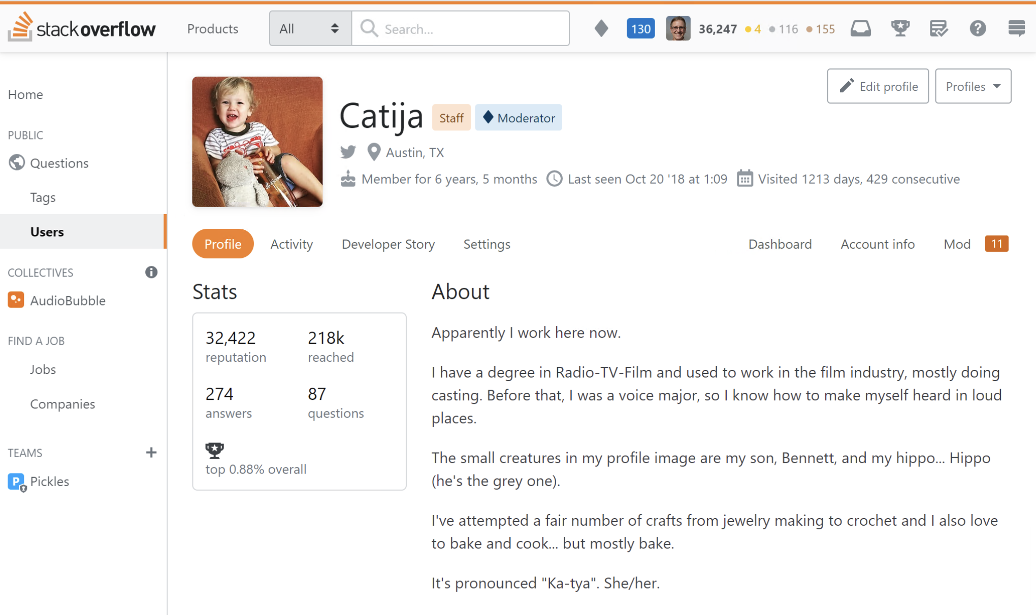
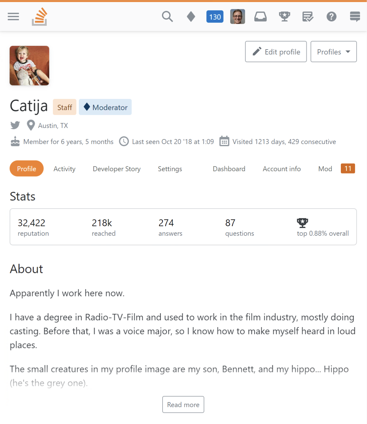
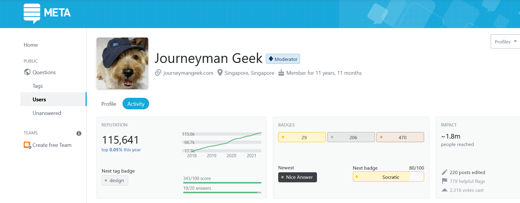
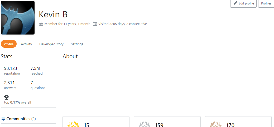
Some screenshots

Ok, but for real, watch the tour.

Desktop layout Tablet layout Phone layout

A note on the profile changes

These are some big changes, but there is so much room for improvement in these profiles. I’m trying to balance a light touch and a full redesign. I can’t run every change by the Community ahead of time, but I respect the thoughts and opinions that are respectfully shared here. Thanks for all the feedback! Please keep it coming!

Remember, I’m just a guy trying to do right by all of you.

49
  • 12
    This is not live. I'm gathering feedback but "I fully intend to ship what I’m demoing here".
    – Aaron Shekey StaffMod
    Commented Aug 16, 2021 at 19:31
  • 11
    @JohnOmielan Yes. It is so I may possibly tweak some parts of what I'm showing and take your feedback into consideration for possible future changes.
    – Aaron Shekey StaffMod
    Commented Aug 16, 2021 at 19:40
  • 6
    Oooh, sorry it's not in the demo @Glorfindel. It shows you your Teams profiles, network profile, and meta / main site links. If there's just the one link, I plan on showing just that link with no dropdown.
    – Aaron Shekey StaffMod
    Commented Aug 16, 2021 at 19:53
  • 10
    Thank you for the demo. It's so much easier for me to understand the reasoning behind the changes you're making in that format. The redundancy and somewhat haphazard layout in the profile has bothered me for a long time and I'm glad to see that you're making some improvements there.
    – ColleenV
    Commented Aug 16, 2021 at 20:01
  • 4
    @ColleenV It's pretty shocking when you compare how much shared info is on both the Profile and Activity page. 😬
    – Aaron Shekey StaffMod
    Commented Aug 16, 2021 at 20:03
  • 9
    I haven't watched the video yet to understand the changes properly, but many thanks for posting on meta to get feedback first! It's great to see that the meta-feedback (feedback about getting feedback) from last time has been taken on board so quickly. Something in intra-company communication is working better than it was a few years ago, so kudos to everyone involved in that change. Commented Aug 16, 2021 at 20:35
  • 8
    @Sabito錆兎 I don't plan on taking it down, but I feel like it won't be relevant to the wider YouTube audience. Just using YouTube for the good automatic captioning to keep it accessible. And the free hosting, lol.
    – Aaron Shekey StaffMod
    Commented Aug 16, 2021 at 20:42
  • 8
    If there's a "read more", can there also be a "read less"?
    – LShaver
    Commented Aug 16, 2021 at 22:04
  • 12
    @AaronShekey so we'll need to use a user script in future? There have been so many arguments in favor, why make it so difficult by not adding back on? If you are curating the site, it's a very useful tool, see this spam burst: metasmoke.erwaysoftware.com/domains/64613 as an example; btw Last Seen has disappeared from my profile, just double checked
    – Vickel
    Commented Aug 16, 2021 at 23:38
  • 5
    @AaronShekey You wrote to Vickel that "Last seen is available on your own profile, and if you're a moderator". This seems to imply everybody has "Last seen" in their own profile, with moderators having it available for all profiles. However, I'm not a diamond moderator on any site, with my checking my profile on this site & 2 other ones showing the "Last seen" values are not appearing, just like Vickel stated in the comment above. Are you perhaps planning to at least add back "Last seen" for everybody's personal profile? Commented Aug 16, 2021 at 23:42
  • 14
    Does it make sense to have "Last Seen" for your own profile? It's your own profile so you know that you are currently active. Commented Aug 16, 2021 at 23:55
  • 6
    @CaveJohnson, one could be, if you trying to get the Enthusiast/Fanatic badge, to check if your activity on the site was registered correctly. Anyway the main reason I've mentioned in my comment above: If you are curating the site, it's a very useful tool, see this spam burst I mentioned above as an example.
    – Vickel
    Commented Aug 17, 2021 at 0:05
  • 15
    I watched your video, the voters on this new Announcement (and I) support this over your original announcement where there are 2 feedback posts supporting "Last Seen", with votes: +290/-6 and +246/-4. That's +536/-10, or 54x (5360%) more in favor than against - that's the elephant in the room, a criticism not addressed in the video nor this announcement (though briefly touched in the above comments, and mostly deleted at the other post).
    – Rob
    Commented Aug 17, 2021 at 3:55
  • 5
    @cat, why is it restricted to upvoters? - aren't the downvoters able to do the same thing? --- You can do whatever you wish with whatever is presented, add them, subtract them, look at them individually, ask Aaron your own question, not answer on his behalf.
    – Rob
    Commented Aug 17, 2021 at 9:29
  • 12
    Might want to explain why Last Seen is gone, as mentioned in the comments here. I'd seen zero of the proposed changes, but do use Last Seen to see if an OP could be expected to have groomed their question regularly. As in, if there's a seven year-old question and techs have changed, if last seen was five years ago, I'm going to feel freer to edit the question without asking to keep it relevant or engage answers differently since the groomer has left the building. TL;DR I use Last Seen for functional, make-the-site-better reasons, and noticed its removal.
    – ruffin
    Commented Aug 17, 2021 at 13:27

7 Answers 7

24

I think you yourself pointed the major flaw in profile redesign:

I can’t run every change by the Community ahead of time

Above is what makes things unreliable and unnecessarily difficult. Sorry if this may sound like a broken record but I would want to repeat advice from previous post on that matter: make it possible to deploy profile changes to one of (part of) sites in the network.

This would let you have it tested as thoroughly as it gets. Also, this would make things inherently safe: whatever bug occasionally slips into production, you would be able to easily roll it back if needed by a simple flip of the switch, by turning new profile off at the affected site(s).


I can't tell how much effort this would take (I guess quite a bit of it) but I believe this would be a very worthy investment that would serve you well for years to come.

7
  • 2
    This is a great idea. I missed it in the other post for some reason.
    – 41686d6564
    Commented Aug 17, 2021 at 10:54
  • 2
    probably worth stressing importance of safety here: doing changes to profile involves a risk of accidentally exposing data that is supposed to be private (legally or informally). This risk could be mitigated by making it contained within one of / part of sites and by making it easy to roll back the changes
    – gnat
    Commented Aug 17, 2021 at 10:55
  • 1
    Maybe this should be posted as a separate feature request?
    – 41686d6564
    Commented Aug 17, 2021 at 10:56
  • 3
    @41686d6564 I still have some hope that they already have this feature and Aaron simply missed it somehow. Afterall, they have (and actively use) partial deployments in many other parts of the system. Though yes, if it turns out really unavailable for profile changes, this would indeed qualify for feature request
    – gnat
    Commented Aug 17, 2021 at 11:12
  • 3
    Surprisingly, this takes quite a bit of development effort that the team doesn't have the bandwidth to manage. I know it sounds like that can't possibly be true, but based on how the profiles are "owned", me and my tiny team need to push forward without wrapping these changes behind some sort of flag.
    – Aaron Shekey StaffMod
    Commented Aug 17, 2021 at 17:05
  • 5
    well @AaronShekey that's not quite a surprise to me. I was merely hoping that you missed this way by mistake but I wrote this answer assuming the worse (which turned to be unfortunately true). And my point is, despite much effort required, getting this option is worth it. Think of it, your current rework is not the first time when profile is changed and I bet it won't be the last one...
    – gnat
    Commented Aug 17, 2021 at 17:28
  • 5
    ...And issues you had this time aren't the first I observed and I bet won't be the last - and it can be even more painful if you think for example of the risks of leaking private data mentioned in my prior comment. I understand that this is hard but please please try to improve this, I believe the payback will be well worth it
    – gnat
    Commented Aug 17, 2021 at 17:28
19
+100

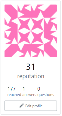
Can we get more emphasis on reputation?

I'm not a fan of how you've crushed the 'Reputation', 'reached', 'answers' and 'questions' statistics into one tiny box. Reputation is a very important indicator of experience, both in the site and in their primary technologies. It definitely deserves a bit more recognition than the other statistics.

I'm hoping at least you can put the reputation on one line by itself, and the other statistics into the second line. Something like:

enter image description here

The proportions are a little off (rep count too big), but that's just a rough idea


For mobile, I was thinking the reputation take up half the 'bar', and the other stats take up the rest of the space:

enter image description here

Here's a code snippet:

#other-stats {
  flex-wrap: nowrap !important;
}

#av {
  width: 200px !important;
}

<link rel="stylesheet" href="https://unpkg.com/@stackoverflow/stacks/dist/css/stacks.min.css">
<div id="user-card" class="user-card d-flex md:fd-column mb32">
  <div class="flex--item ws2 fl-shrink0 mr24 md:mr0 md:w-auto">
    <div class="profile-avatar d-flex fd-column ai-center s-card bar-md p12" id="av">
      <div class="w100"><img src="https://www.gravatar.com/avatar/5312ba01c0be1f885ae166eb1a0ccb75?s=420&amp;d=identicon&amp;r=PG&amp;f=1" alt="" width="210" height="210" class="bar-sm avatar-user mb8 w100 wmx2 hmx3 h-auto"></div>
      <div class="d-flex flex__allcells6 fw-wrap gs4 fc-light px4 wmx2">
        <div class="flex--item" style="
    font-size: 1.5em !important;
    margin-bottom: 20px;
">
          <div class="fs-body3 fc-dark" style="
    font-size: 1.5em !important;
    text-align: center;
">31</div>
          reputation
        </div>
      </div>
      <div class="d-flex flex__allcells6 fw-wrap gs4 fc-light px4 wmx2" id="other-stats">
        <div class="flex--item">
          <div class="fs-body3 fc-dark">177</div>
          reached
        </div>
        <div class="flex--item">
          <div class="fs-body3 fc-dark">1</div>
          answers
        </div>
        <div class="flex--item">
          <div class="fs-body3 fc-dark">0</div>
          questions
        </div>
      </div>
      <a class="s-btn s-btn__outlined s-btn__muted s-btn__icon s-btn__sm mt12 w100 wmx2" href="/users/edit/1054486"><svg aria-hidden="true" class="svg-icon iconPencil" width="18" height="18" viewBox="0 0 18 18">
          <path d="m13.68 2.15 2.17 2.17c.2.2.2.51 0 .71L14.5 6.39l-2.88-2.88 1.35-1.36c.2-.2.51-.2.71 0zM2 13.13l8.5-8.5 2.88 2.88-8.5 8.5H2v-2.88z"></path>
        </svg> Edit profile</a>
    </div>
  </div>
</div>

Other than that, I'm pretty happy with the way things are going. Thanks for getting community feedback this time.

It would also be nice if you added a slightly darker background in the highlighted area here, but that might just be a matter of personal preference.

4
  • 1
    Would changing the number itself but not its placement be enough? For example, what about if the number of reputation points you have (but no other statistics) is bolded?
    – bobble
    Commented Aug 16, 2021 at 20:43
  • 9
    I disagree reputation is very important. It has some importance but it is already over-inflated. No need to draw even more undue attention to it.
    – VLAZ
    Commented Aug 17, 2021 at 5:34
  • 5
    @VLAZ It certainly is more important than the other statistics. Commented Aug 17, 2021 at 14:15
  • 2
    @0Questions1Answer why would it be? The "reached" stat is bogus and unreliable but why would questions asked and answered be less important? Reputation barely has a meaning to other users.
    – VLAZ
    Commented Aug 17, 2021 at 14:18
17

What stats are being removed?

You say

  1. Removes some redundant stats

But I don't see anything in either the tour or your post that details exactly what those stats are?

1
  • 9
    In the video (link to video at relevant timestamp), he mentioned that the badge count is displayed in two places: under the avatar and in the new badge section. It looks like the badge count under the avatar are removed in the mock-up. So that is probably the redundant stats that are being removed. Note the mock-up cuts off the new badge section but I presume that will remain. Commented Aug 17, 2021 at 3:27
9

Can you please rank for us the order of importance that Stack Overflow the company currently assigns to each of the different parts of the profile?

(E.g. the profile image, the bio, the tags, the stats, the rep value, the other communities.)

The last post talked a lot about doing away with things for vanity reasons, but this seems to be the opposite, so I'm curious to see how your own internal perspective compares to the realized outcome.

The new layout seems to highlight/promote "vanity" content very strongly compared to the old layouts. The image, name, "vanity" stats (e.g. people reached, top % user, reputation--to an extent--vs. site-relevant stats like active tags, Qs, As, etc.) and bio (remember, people as users are ancillary at best to the point of Stack Overflow: quality questions & answers) are now pushing all other content below them, especially in the mobile view which is supposed to be the reason for all these changes:

new mobile view showing 100% vanity information

There's no actual "content" (in terms of the site's purpose) visible at all in the view above. I also think it's a bad idea to have a horizontal scroll bar.

I know everyone is different, but when I visit another user's profile (and thus land on their /profile page, for example), I am interested in the following things:

  • Their member since/last seen values (the latter of which has been taken away from us) to help guide my user moderation activity/answering activity
  • Their top tags and tag scores to inform me on where that user is active and how much effort they've expended and expertise they appear to have been afforded by the system/the community; where their focus is on the site.
  • Their most recent questions and answers (the last ~15-20 of which are conveniently placed on the /profile view) in order to either see other high-quality content or to look for patterns during user moderation (e.g. spam)

Rarely do I care to see their badges, their "stats", or their profile image. Very rarely do I care about their bio.

Also, regarding

This next round addresses feedback from my prior post

The main request from the last round, the request to have "Last Seen" restored, seems more or less ignored. The top answer and at least ten other answers that were very positively received by the community asked for this.

Can we at least have an explanation on why the only option for a very useful feature (that caused no actual problems for >10 years) is a complete about-face, resulting in totally removing it, rather than putting it behind a toggle or checkbox left up to the user? It is a big shame that, with all this work going into the profile redesign, this one metric being removed will cause a lot of usefulness to be lost.

(Also, I like the video idea, but the circle filter for your video feed was a bit distracting due to its small size; your face kept tilting in and out of view!)

6

I wonder what's the 'advantage'/perceived value in having a profiles drop down menu.

In a sense - a profile for meta is the 'same' as the main site profile. "Teams" are now essentially independent private sites, and unless you're on the same team, you're not going to bother with anyone else's profile.

Maybe its a meta denizen bias (Meta? THIS IS META!) - but it feels like we could compress it down to just a network profile link (and navigation is as shallow as it gets), and let folks view and manage profiles from the respective sites - main,meta or team .

2
  • That only works if you’re navigating your own profile. I use those buttons more on other people’s profiles (mostly to switch between main site/meta site though).
    – ColleenV
    Commented Aug 17, 2021 at 13:00
  • The switch to/from meta is one i use quite often as well, if that became going to SE or digging through a dropdown...
    – Kevin B
    Commented Aug 17, 2021 at 14:32
6

It is so cool that you made a YouTube video for us. I want to applaud your courage for sharing your image and voice with the community. And your openness for giving us a stream of consciousness coming from the designer himself.


Structuring the feedback is actually tricky this time. (I'm hoping this might help other contributors chip in their feedback.)

  1. Adds a "Read more" button on longer bios. No more scrolling!

Looks Perfect.

  1. Refines the placement of about me and various stats

About Me - Looks Perfect.

Various stats - this is a tough one! (let’s split it up).

  1. Separating the stats from the profile rectangle into a horizontal box

    Looks good (departure from tradition, but ok).

  2. Removing badges from the profile rectangle.

    Looks good (I'm a badge freak and this removes emphasis from badges, but ok).

  3. Adding "top overall/this year" to the stats (formerly only shown in activity tab).

    It works. (This was restricted to the Reputation box in activity.) Perhaps stack the three small badge icons with numbers in them instead? (Just putting the idea out there.)

  1. Groups profile links

Looks good having a DDL. But you lose the 1-click. Having the links/panel also worked as sort of eye candy. (Split decision here - does responsive design profit from this or is it a design choice?)

  1. Groups moderator-only links

I'm not a moderator, so I can't form an opinion. Same as the above I suppose.

  1. Removes some redundant stats

I'm not entirely sure if this repeats the second part of point 4?

  1. Unifies the navigation between each section: Profile, Activity, Developer Story, Settings

The gist of the issue. The other changes were cool (no real objections). I'd argue having the profile on top in the activity is redundant (putting the tiny user icon somewhere could work just as well, I'm waiting to hear opinions on this).

(Not listed, mentioned in the video at 3:27). "Apparently this user prefers to keep an air of mystery about them."

I think the entire box and title could be omitted when the user hasn't filled out the about me.

(But it has to be noted: There were only two default humorous remarks on the profile, the other being "we respect a laser like focus". So if these go we will have something to miss about them - the same was said of the 404 pages. What would be the elegant solution for this? Because there is no substitute for good humor.)

Edit:

As I thought having the profile on top of the activity tab doesn't look good and clutters the page.

As it looks now

screenshot of current activity tab

I think it would look better like this

screenshot of possible activity tab

0
5

Why does the About section seem to have a fixed height?

enter image description here

There's no reason the section below it can't just roll up into it.

8
  • There should be a placeholder there if the about section is empty. Looks like a bug!
    – Aaron Shekey StaffMod
    Commented Aug 31, 2021 at 16:30
  • well, no, i used a fake space to get rid of the image
    – Kevin B
    Commented Aug 31, 2021 at 16:30
  • 1
    also... unrelated likely, but the just now on the above comment has no spacing from my name? from your staff badge as well
    – Kevin B
    Commented Aug 31, 2021 at 16:31
  • Unrelated to this ship, but we've been working on whack-a-mole bugs in that area.
    – Aaron Shekey StaffMod
    Commented Aug 31, 2021 at 16:32
  • I do see the reason now, it's the stuff below it is literally a separate 2 column system, not part of the two columns up top. I assume the rest of the page simply isn't part of this ship, similar to the last one.
    – Kevin B
    Commented Aug 31, 2021 at 16:36
  • If you want the layout to look correct, I'd suggest removing any text from your bio so it's truly empty. I suppose we could check for whitespace items...
    – Aaron Shekey StaffMod
    Commented Aug 31, 2021 at 16:40
  • Yep, that works, and the reason i added the whitespace has been fixed, so we're good there
    – Kevin B
    Commented Aug 31, 2021 at 16:44
  • @KevinB Reported: meta.stackexchange.com/questions/369280/…
    – Ollie
    Commented Aug 31, 2021 at 16:52

You must log in to answer this question.

Not the answer you're looking for? Browse other questions tagged .