replaced http://pm.stackexchange.com/ with https://pm.stackexchange.com/
Source Link

The Help Center looks intimidating. I can no longer direct a new user to the FAQ to read about the scope of a specific site because this information is nowhere to be found.

Has there been any A/B testing before rolling this feature out? In its present state the Help Center is a clickfest-heavy, sensory overloaded hive of pages. I had to use Wayback Machine to get the old contentsold contents and concoct a mockup of a better (IMHO) layout:
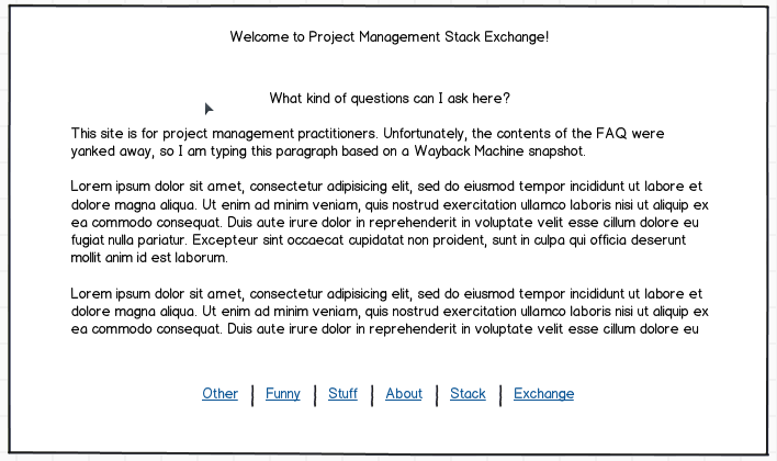
Mockup

The Help Center looks intimidating. I can no longer direct a new user to the FAQ to read about the scope of a specific site because this information is nowhere to be found.

Has there been any A/B testing before rolling this feature out? In its present state the Help Center is a clickfest-heavy, sensory overloaded hive of pages. I had to use Wayback Machine to get the old contents and concoct a mockup of a better (IMHO) layout:

Mockup

Source Link
Deer Hunter
  • 6.3k
  • 2
  • 23
  • 54

The Help Center looks intimidating. I can no longer direct a new user to the FAQ to read about the scope of a specific site because this information is nowhere to be found.

Has there been any A/B testing before rolling this feature out? In its present state the Help Center is a clickfest-heavy, sensory overloaded hive of pages. I had to use Wayback Machine to get the old contents and concoct a mockup of a better (IMHO) layout:

Mockup