replaced http://meta.stackexchange.com/ with https://meta.stackexchange.com/
Source Link

I like the "hide excerpts" feature, it lets me fit more questions on the screen.

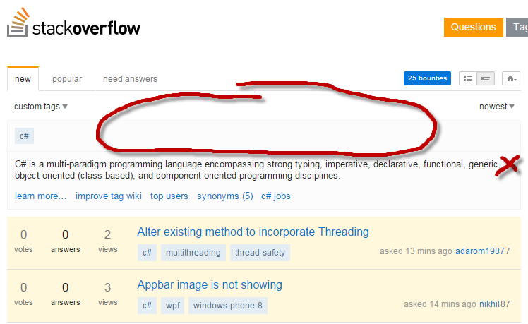
But when I pick a single tag from my favorites (my usual navigation pattern), the interface takes more screen estate than before, thus pushing the first question down the screen.

So here's my : please let me hide tag excerpts. I know what is by now, no need to remind me every day that it's a multi-paradigm programming language... :-)
Another option would be to hide tag excerpts from tags which are in the favorite list.

To be fair, it's not the tag excerpt box per se which takes more space than before, but now there are additional UI elements that push the whole thing downwards, and there's too much empty space on the top of the page:

empty space

Also, the excerpt is on a light gray background, which emphasizes it. Overall, it feels much more prominent than before. I'd prefer the first question be higher up on the page - this is the important part after all.

EDIT: OldCurmudgeonOldCurmudgeon's suggestion:

My 2p'worth


Just noticed the following (new vs old):

tab titles

How to reproduce:

  • Click on a tag
  • Title says "New 'tag' questions - Stack Overflow"
  • Click on the "new" tab
  • Title now says "Stack Overflow"

I like the "hide excerpts" feature, it lets me fit more questions on the screen.

But when I pick a single tag from my favorites (my usual navigation pattern), the interface takes more screen estate than before, thus pushing the first question down the screen.

So here's my : please let me hide tag excerpts. I know what is by now, no need to remind me every day that it's a multi-paradigm programming language... :-)
Another option would be to hide tag excerpts from tags which are in the favorite list.

To be fair, it's not the tag excerpt box per se which takes more space than before, but now there are additional UI elements that push the whole thing downwards, and there's too much empty space on the top of the page:

empty space

Also, the excerpt is on a light gray background, which emphasizes it. Overall, it feels much more prominent than before. I'd prefer the first question be higher up on the page - this is the important part after all.

EDIT: OldCurmudgeon's suggestion:

My 2p'worth


Just noticed the following (new vs old):

tab titles

How to reproduce:

  • Click on a tag
  • Title says "New 'tag' questions - Stack Overflow"
  • Click on the "new" tab
  • Title now says "Stack Overflow"
added 60 characters in body
Source Link

I like the "hide excerpts" feature, it lets me fit more questions on the screen.

But when I pick a single tag from my favorites (my usual navigation pattern), the interface takes more screen estate than before, thus pushing the first question down the screen.

So here's my : please let me hide tag excerpts. I know what is by now, no need to remind me every day that it's a multi-paradigm programming language... :-)
Another option would be to hide tag excerpts from tags which are in the favorite list.

To be fair, it's not the tag excerpt box per se which takes more space than before, but now there are additional UI elements that push the whole thing downwards, and there's too much empty space on the top of the page:

empty space

Also, the excerpt is on a light gray background, which emphasizes it. Overall, it feels much more prominent than before. I'd prefer the first question be higher up on the page - this is the important part after all.

EDIT: OldCurmudgeon's suggestion:

My 2p'worth


Just noticed the following (new vs old):

tab titles

The old tab titles for browsing a single tag were much better when you browse several of them simultaneously.How to reproduce:

  • Click on a tag
  • Title says "New 'tag' questions - Stack Overflow"
  • Click on the "new" tab
  • Title now says "Stack Overflow"

I like the "hide excerpts" feature, it lets me fit more questions on the screen.

But when I pick a single tag from my favorites (my usual navigation pattern), the interface takes more screen estate than before, thus pushing the first question down the screen.

So here's my : please let me hide tag excerpts. I know what is by now, no need to remind me every day that it's a multi-paradigm programming language... :-)
Another option would be to hide tag excerpts from tags which are in the favorite list.

To be fair, it's not the tag excerpt box per se which takes more space than before, but now there are additional UI elements that push the whole thing downwards, and there's too much empty space on the top of the page:

empty space

Also, the excerpt is on a light gray background, which emphasizes it. Overall, it feels much more prominent than before. I'd prefer the first question be higher up on the page - this is the important part after all.

EDIT: OldCurmudgeon's suggestion:

My 2p'worth


Just noticed the following:

tab titles

The old tab titles for browsing a single tag were much better when you browse several of them simultaneously.

I like the "hide excerpts" feature, it lets me fit more questions on the screen.

But when I pick a single tag from my favorites (my usual navigation pattern), the interface takes more screen estate than before, thus pushing the first question down the screen.

So here's my : please let me hide tag excerpts. I know what is by now, no need to remind me every day that it's a multi-paradigm programming language... :-)
Another option would be to hide tag excerpts from tags which are in the favorite list.

To be fair, it's not the tag excerpt box per se which takes more space than before, but now there are additional UI elements that push the whole thing downwards, and there's too much empty space on the top of the page:

empty space

Also, the excerpt is on a light gray background, which emphasizes it. Overall, it feels much more prominent than before. I'd prefer the first question be higher up on the page - this is the important part after all.

EDIT: OldCurmudgeon's suggestion:

My 2p'worth


Just noticed the following (new vs old):

tab titles

How to reproduce:

  • Click on a tag
  • Title says "New 'tag' questions - Stack Overflow"
  • Click on the "new" tab
  • Title now says "Stack Overflow"
My 2p worth - vertical real-estate is expensive as most monitors are wider than they are tall.
Source Link

I like the "hide excerpts" feature, it lets me fit more questions on the screen.

But when I pick a single tag from my favorites (my usual navigation pattern), the interface takes more screen estate than before, thus pushing the first question down the screen.

So here's my : please let me hide tag excerpts. I know what is by now, no need to remind me every day that it's a multi-paradigm programming language... :-)
Another option would be to hide tag excerpts from tags which are in the favorite list.

To be fair, it's not the tag excerpt box per se which takes more space than before, but now there are additional UI elements that push the whole thing downwards, and there's too much empty space on the top of the page:

empty space

Also, the excerpt is on a light gray background, which emphasizes it. Overall, it feels much more prominent than before. I'd prefer the first question be higher up on the page - this is the important part after all.

EDIT: OldCurmudgeon's suggestion:

My 2p'worth


Just noticed the following:

tab titles

The old tab titles for browsing a single tag were much better when you browse several of them simultaneously.

My 2p'worth

I like the "hide excerpts" feature, it lets me fit more questions on the screen.

But when I pick a single tag from my favorites (my usual navigation pattern), the interface takes more screen estate than before, thus pushing the first question down the screen.

So here's my : please let me hide tag excerpts. I know what is by now, no need to remind me every day that it's a multi-paradigm programming language... :-)
Another option would be to hide tag excerpts from tags which are in the favorite list.

To be fair, it's not the tag excerpt box per se which takes more space than before, but now there are additional UI elements that push the whole thing downwards, and there's too much empty space on the top of the page:

empty space

Also, the excerpt is on a light gray background, which emphasizes it. Overall, it feels much more prominent than before. I'd prefer the first question be higher up on the page - this is the important part after all.

EDIT: OldCurmudgeon's suggestion:

My 2p'worth


Just noticed the following:

tab titles

The old tab titles for browsing a single tag were much better when you browse several of them simultaneously.

My 2p worth - vertical real-estate is expensive as most monitors are wider than they are tall.
Source Link
Loading
added 218 characters in body
Source Link
Loading
Source Link
Loading