added 8 characters in body
Source Link
BradleyDotNET
  • 4.4k
  • 3
  • 13
  • 14

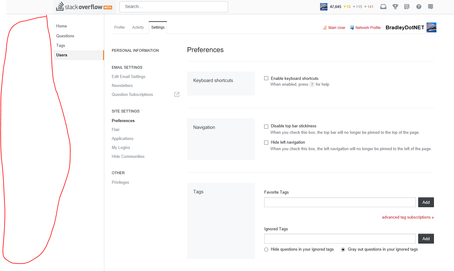
That menu has a lot of whitespace; I mean a lot.

left-nav

And yet even with my rather large browser window it pushes the content to the right slightly. I'm guessing it's so darn big to accommodate large team names; but this still feel really excessive. I expected it to hug the actual side of the screen.

I expected it to hug the actual side of the screen.

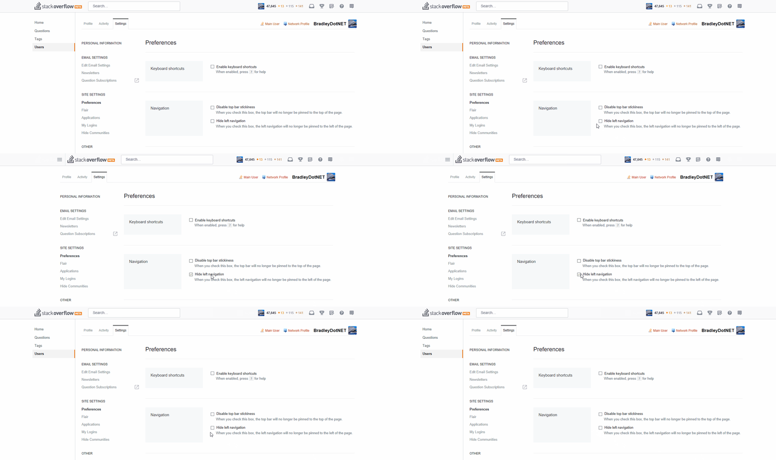
GIF of the content jumping when nav is introduced (fullscreen, 1920x1080, Edge):

enter image description here

That menu has a lot of whitespace; I mean a lot.

left-nav

And yet even with my rather large browser window it pushes the content to the right slightly. I'm guessing it's so darn big to accommodate large team names; but this still feel really excessive. I expected it to hug the actual side of the screen.

GIF of the content jumping when nav is introduced (fullscreen, 1920x1080, Edge):
enter image description here

That menu has a lot of whitespace; I mean a lot.

left-nav

And yet even with my rather large browser window it pushes the content to the right slightly. I'm guessing it's so darn big to accommodate large team names; but this still feel really excessive.

I expected it to hug the actual side of the screen.

GIF of the content jumping when nav is introduced (fullscreen, 1920x1080, Edge):
enter image description here

added 171 characters in body
Source Link
BradleyDotNET
  • 4.4k
  • 3
  • 13
  • 14

That menu has a lot of whitespace; I mean a lot.

left-nav

And yet even with my rather large browser window it pushes the content to the right slightly. I'm guessing it's so darn big to accommodate large team names; but this still feel really excessive. I expected it to hug the actual side of the screen.

GIF of the content jumping when nav is introduced (fullscreen, 1920x1080, Edge):

enter image description here

That menu has a lot of whitespace; I mean a lot.

left-nav

And yet even with my rather large browser window it pushes the content to the right slightly. I'm guessing it's so darn big to accommodate large team names; but this still feel really excessive. I expected it to hug the actual side of the screen.

GIF of the content jumping when nav is introduced (fullscreen, 1920x1080, Edge):

enter image description here

[(its = possessive, it's = "it is" or "it has". See for example <http://www.wikihow.com/Use-Its-and-It%27s>)]
Source Link

That menu has a lot of whitespace; I mean a lot.

left-nav

And yet even with my rather large browser window it pushes the content to the right slightly. I'm guessing itsit's so darn big to accommodate large team names; but this still feel really excessive. I expected it to hug the actual side of the screen.

That menu has a lot of whitespace; I mean a lot.

left-nav

And yet even with my rather large browser window it pushes the content to the right slightly. I'm guessing its so darn big to accommodate large team names; but this still feel really excessive. I expected it to hug the actual side of the screen.

That menu has a lot of whitespace; I mean a lot.

left-nav

And yet even with my rather large browser window it pushes the content to the right slightly. I'm guessing it's so darn big to accommodate large team names; but this still feel really excessive. I expected it to hug the actual side of the screen.

Source Link
BradleyDotNET
  • 4.4k
  • 3
  • 13
  • 14
Loading