Clarification and wordiness as this answer has become popular
Source Link
Cᴏʀʏ
  • 1.4k
  • 2
  • 7
  • 10

In my opinion, I think the highlight on the tabs should be on the left side. It just flows better to me. The orange, because, like most other tab highlights in the UI, they flow top => down or left => right (at least for LTR languages)

Additionally, the highlight bar butting up against a single pixel gray vertical line is jarring and distracting depending on the content in the center panel. On

When on the left, it still highlights the tab but, againdoesn't look like a scrollbar (as per the comments), to meand doesn't clash with the vertical line content separator. The only difference is it pushes the text in the tab in by the width of the border, looks cleanerso the words don't exactly line up.

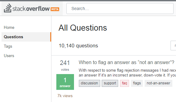
Current:

Highlight on right side

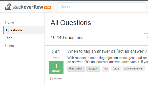
Tweaked:

Highlight on left side

In my opinion, I think the highlight on the tabs should be on the left side. It just flows better to me. The orange bar butting up against a single pixel gray vertical line is jarring and distracting depending on the content in the center panel. On the left, it still highlights the tab but, again, to me, looks cleaner.

Current:

Highlight on right side

Tweaked:

Highlight on left side

In my opinion, I think the highlight on the tabs should be on the left side. It flows better, because, like most other tab highlights in the UI, they flow top => down or left => right (at least for LTR languages)

Additionally, the highlight bar butting up against a single pixel gray vertical line is jarring and distracting depending on the content in the center panel.

When on the left, it still highlights the tab, doesn't look like a scrollbar (as per the comments), and doesn't clash with the vertical line content separator. The only difference is it pushes the text in the tab in by the width of the border, so the words don't exactly line up.

Current:

Highlight on right side

Tweaked:

Highlight on left side

added 25 characters in body
Source Link
Shadow Wizard
  • 174.9k
  • 33
  • 437
  • 863

In my opinion, I think the highlight on the tabs should be on the left side. It just flows better to me. The orange bar butting up against a single pixel gray vertical line is jarring and distracting depending on the content in the center panel. On the left, it still highlights the tab but, again, to me, looks cleaner.

Current:

Highlight on right side

Tweaked:

Highlight on left side

Source Link
Cᴏʀʏ
  • 1.4k
  • 2
  • 7
  • 10

In my opinion, I think the highlight on the tabs should be on the left side. It just flows better to me. The orange bar butting up against a single pixel gray vertical line is jarring and distracting depending on the content in the center panel. On the left, it still highlights the tab but, again, to me, looks cleaner.

Current:

Highlight on right side

Tweaked:

Highlight on left side