After the change in the name and addition of the icon, we can also watch over things. Are anyone from the designing team following the show? ;)
Jokes apart, I like improvement in popup and removing extra options from it. However, there are some concerns from me.
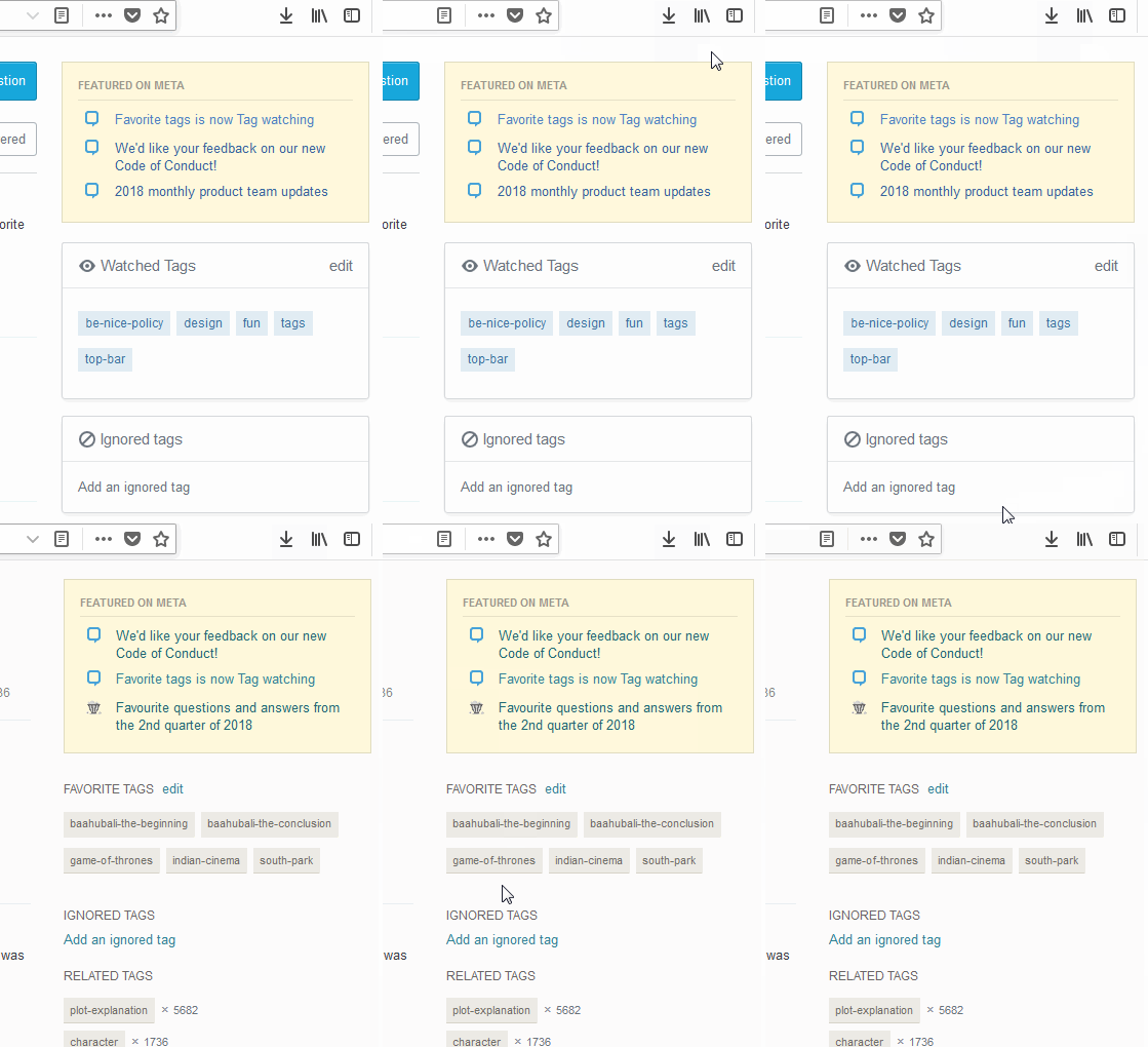
Boxes take more space in the page
I think the dialogue boxes for watched and ignored tags are occupying more space on the page.
I think this can be reduced by some margin. Note that it takes more space even when the tag names are smaller.
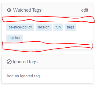
Empty white space in the dialogue boxes
There is white space above and below the tags. This can be removed a bit to reduce redundant space. This space is not present in current design. Some space can be saved by doing.
Can this be implemented?


