Minor: changed one word to italic type
Source Link

Perhaps on smaller / mobile screens the ‘entire’entire footer could be collapsed into a single bar (revealing the rest via CSS on mouseover/mobile touch)?

Perhaps on smaller / mobile screens the ‘entire’ footer could be collapsed into a single bar (revealing the rest via CSS on mouseover/mobile touch)?

Perhaps on smaller / mobile screens the entire footer could be collapsed into a single bar (revealing the rest via CSS on mouseover/mobile touch)?

Added details of browser zoom used in screenshots and added extra link and image
Source Link

Perhaps on smaller / mobile screens the ‘entire’ footer could be collapsed into a single bar (revealing the rest via CSS on mouseover/mobile touch)(revealing the rest via CSS on mouseover/mobile touch)?

Why? Well…Well…

These are screenshots from my iPhone of that page as it appears (as of earlier today), in the deprecated ‘mobile’ view (A) and the ‘full-site’ view in both ‘responsive’ (B) and ‘non-responsive’ (C)/(D) modes (higher-resolution pdf version):

NoteNotes: Screenshots taken at about 2120 UTC on 2 December 2021

  • Screenshots taken at about 2120 UTC on 2 December 2021
  • (If the links in the images seem small, that is because my little iPhone’s browser is set to to default all sites at 50% zoom.)
  1. the answer submission form is at the very bottom of the page
    • is therefore easy to find / navigate to (a touch-screen analogue to “Fitt’s Law”, perhaps?)
  2. the page title is shorter (category excluded?),
    • which makes reading browser tabs
    • or a list of browsers bookmarks / history entries on a narrower screen much easier,
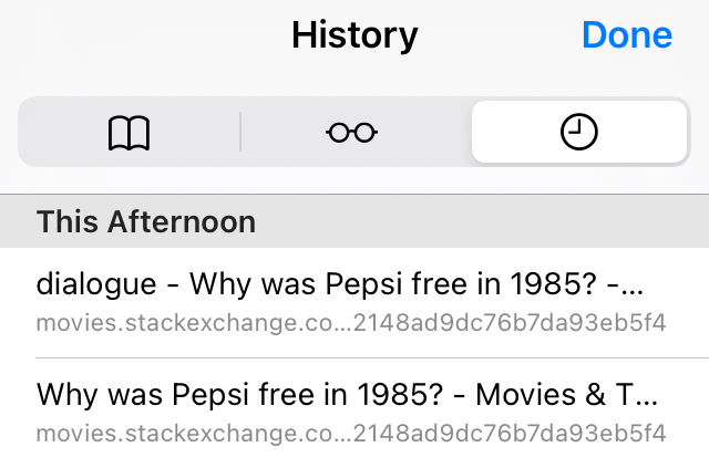
      • especially for longer category namesnames; example browser history with a relatively short category name: browser history snippet
  3. The comments on both question and answers are not optimized for space nor ease if reading
  4. it’s just much shorter and less visually cluttered

Perhaps on smaller / mobile screens the ‘entire’ footer could be collapsed into a single bar (revealing the rest via CSS on mouseover/mobile touch)?

Why? Well…

These are screenshots from my iPhone of that page as it appears (as of earlier today), in the deprecated ‘mobile’ view (A) and the ‘full-site’ view in both ‘responsive’ (B) and ‘non-responsive’ (C)/(D) modes:

Note: Screenshots taken at about 2120 UTC on 2 December 2021

  1. the answer submission form is at the very bottom of the page
    • is therefore easy to find / navigate to (a touch-screen analogue to “Fitt’s Law”, perhaps?)
  2. the page title is shorter (category excluded?),
    • which makes reading browser tabs
    • or a list of browsers bookmarks / history entries on a narrower screen much easier,
      • especially for longer category names
  3. The comments on both question and answers are not optimized for space nor ease if reading
  4. it’s just much shorter and less visually cluttered

Perhaps on smaller / mobile screens the ‘entire’ footer could be collapsed into a single bar (revealing the rest via CSS on mouseover/mobile touch)?

Why? Well…

These are screenshots from my iPhone of that page as it appears (as of earlier today), in the deprecated ‘mobile’ view (A) and the ‘full-site’ view in both ‘responsive’ (B) and ‘non-responsive’ (C)/(D) modes (higher-resolution pdf version):

Notes:

  • Screenshots taken at about 2120 UTC on 2 December 2021
  • (If the links in the images seem small, that is because my little iPhone’s browser is set to to default all sites at 50% zoom.)
  1. the answer submission form is at the very bottom of the page
    • is therefore easy to find / navigate to (a touch-screen analogue to “Fitt’s Law”, perhaps?)
  2. the page title is shorter (category excluded?),
    • which makes reading browser tabs
    • or a list of browsers bookmarks / history entries on a narrower screen much easier,
      • especially for longer category names; example browser history with a relatively short category name: browser history snippet
  3. The comments on both question and answers are not optimized for space nor ease if reading
  4. it’s just much shorter and less visually cluttered
Source Link
Loading