This post is now locked due to a lot of off-topic or very tangentially related issues being posted here. It's so large that it is pretty hard to find/triage issues listed. If you have a concern related to left nav, theming and/or responsiveness, then I'd encourage you to post them as a question on MSE or on the meta of the specific site you're concerned with.
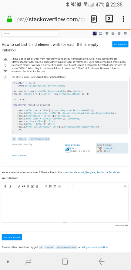
We have released left navigation bar, our new theming and a our initial responsive design work on Stack Overflow and Meta Stack Exchange (it's been live on MSO for a week). This work has been in progress and being discussed with the community for several months. The motivation for the work is covered in my post entitled Ch-ch-ch-changes: Left nav, responsive design, & themes, so check that out if you have any questions about why this work is important.
Left nav and theming
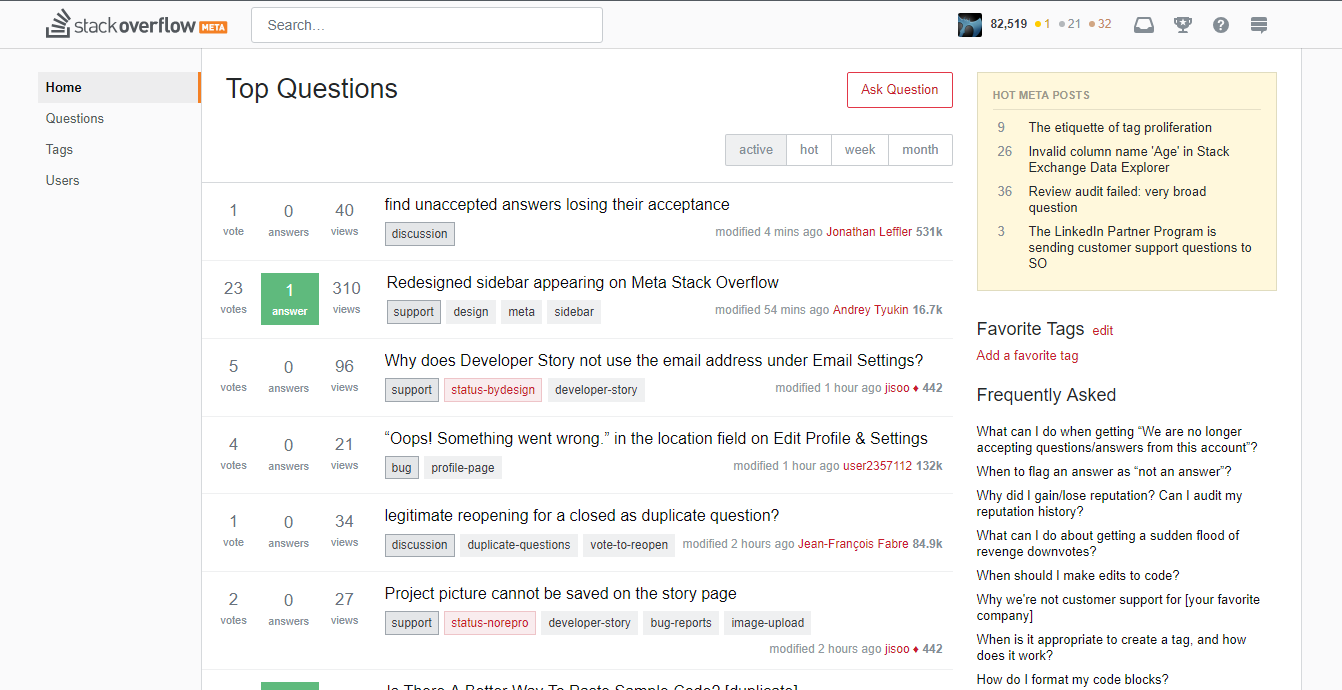
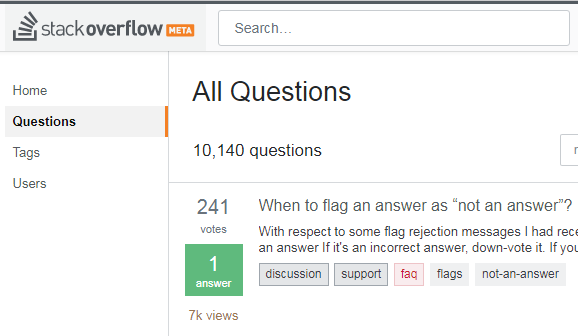
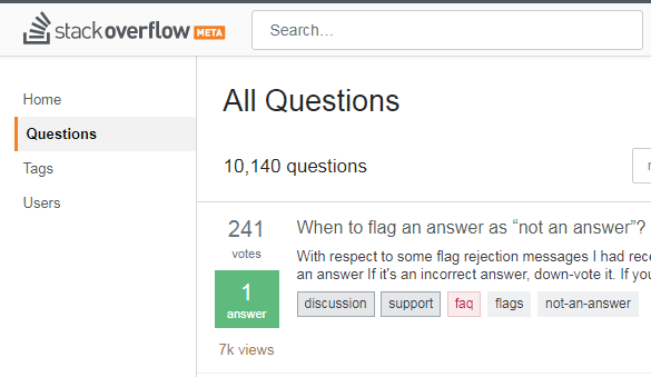
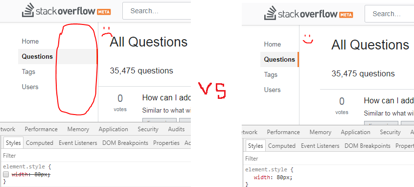
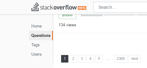
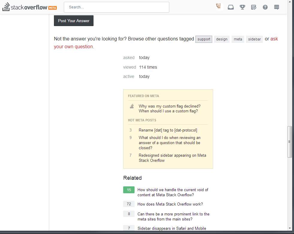
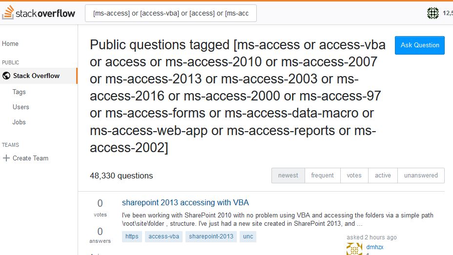
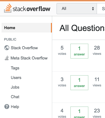
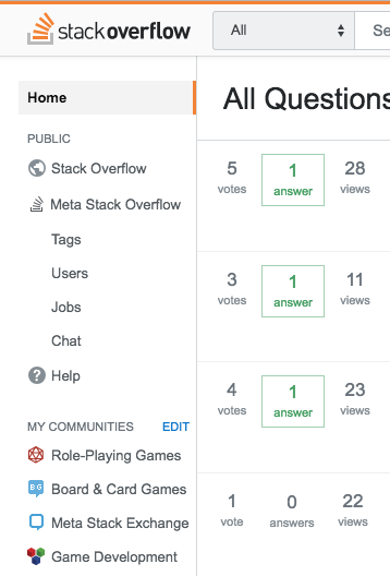
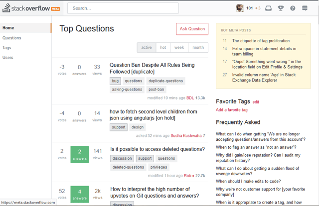
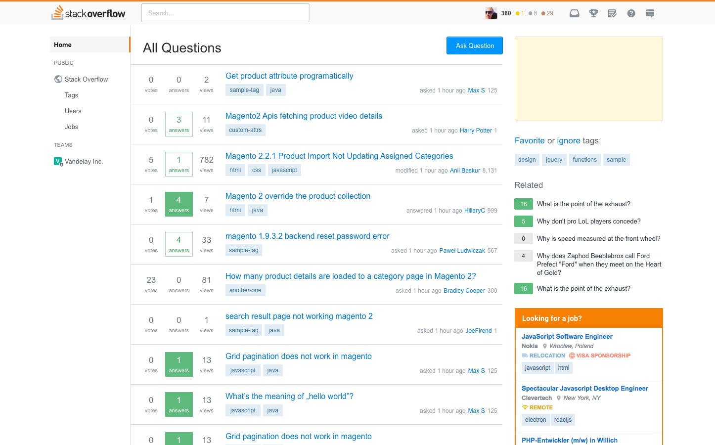
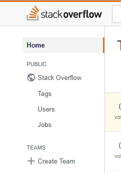
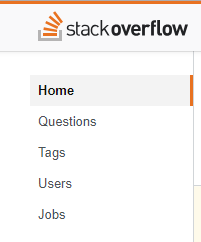
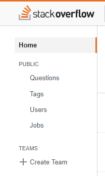
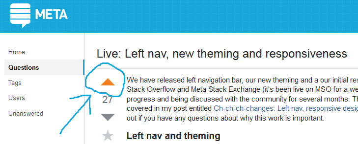
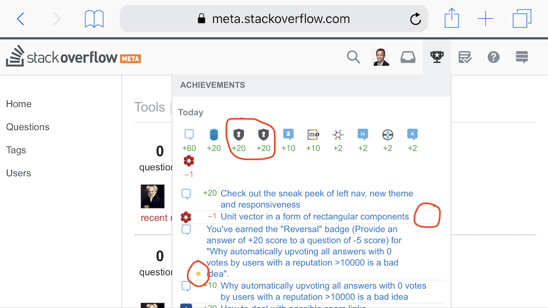
Check out the new left navigation and new theme (most relevant to MSE). This work creates greater experience consistency across the Q&A sites and will increase in the velocity of bug fixes, improvements and new features to all sites thanks to a fully unified code base.
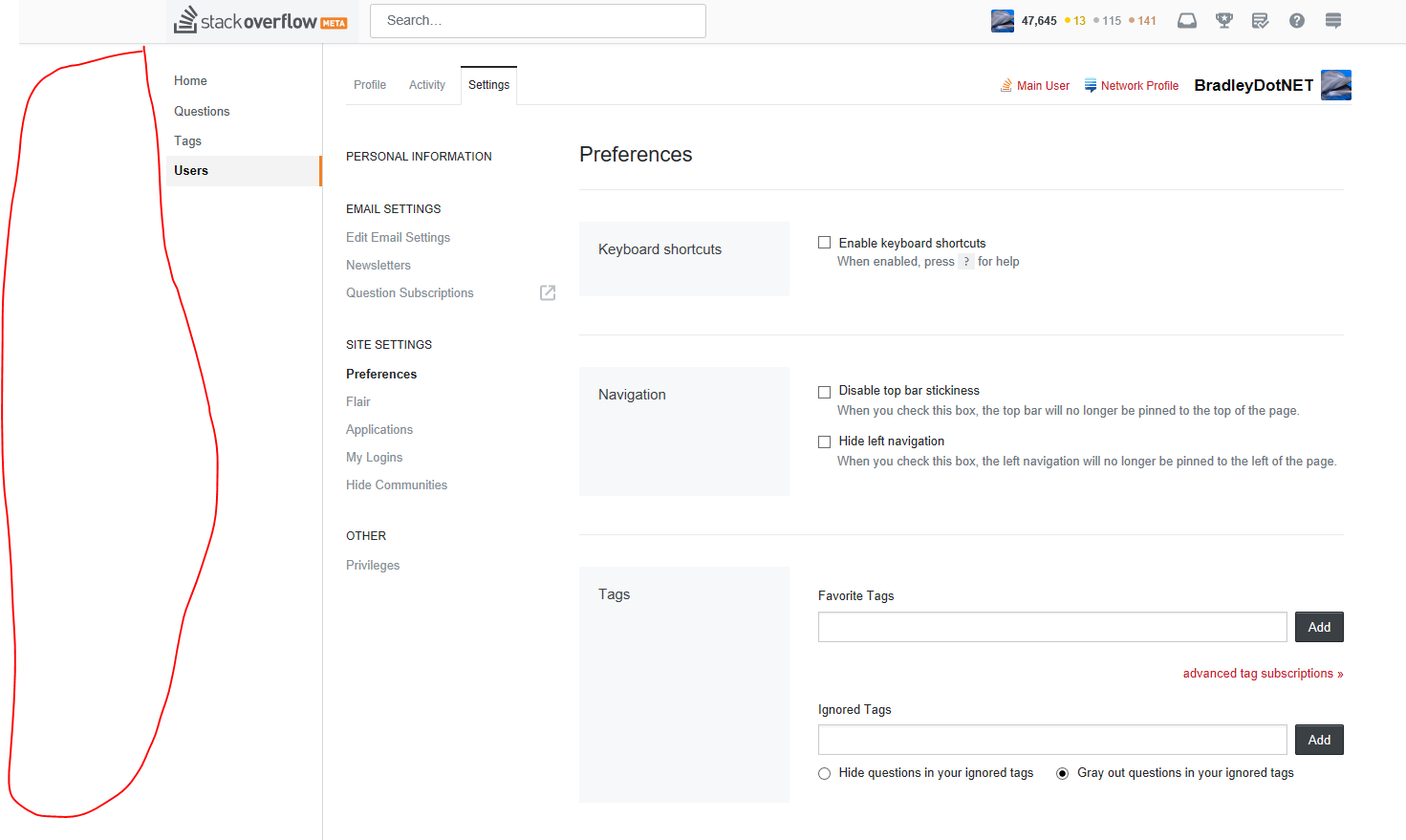
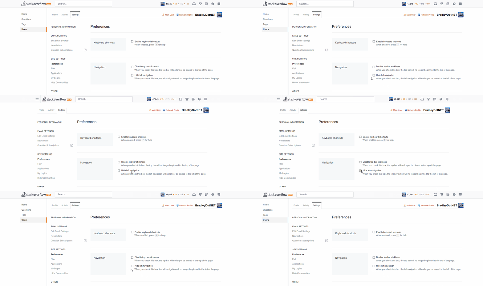
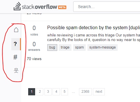
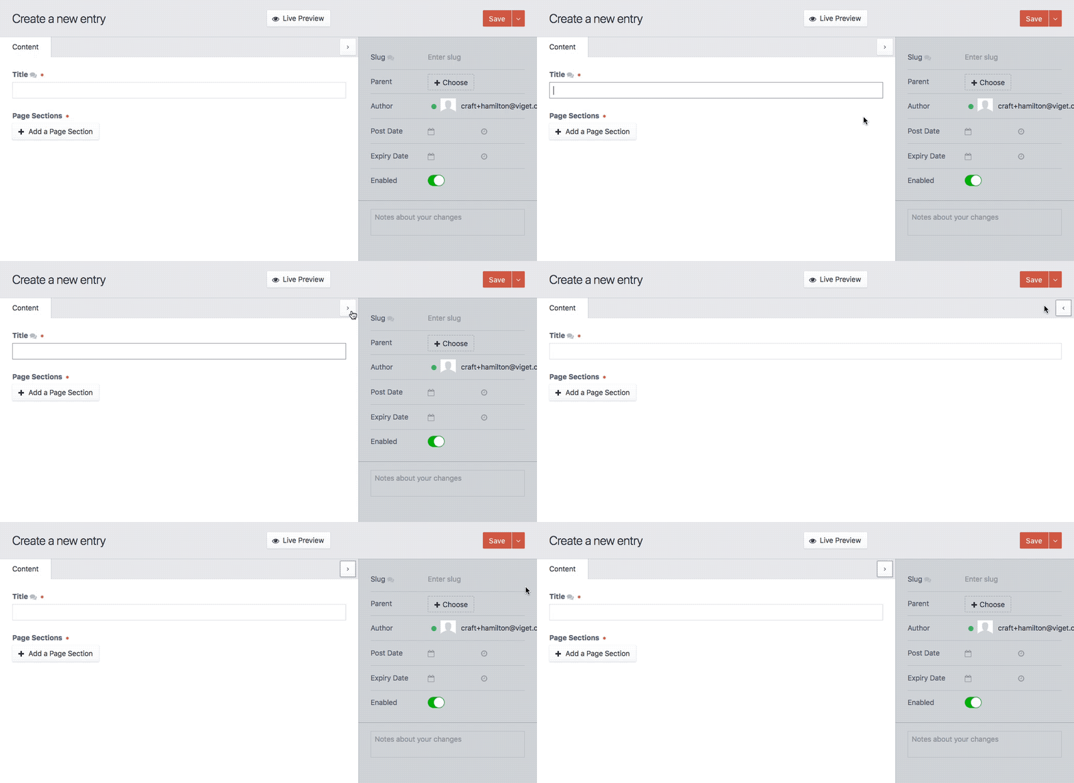
Based on early feedback from our initial announcement we've added a preference to unpin the left nav so it doesn't take up space. Just head on down to your local preferences and check the box.
This is the biggest changes we made based on early feedback from the community. Check out the full list here: Left nav, responsive design, and theming next steps
Responsive design
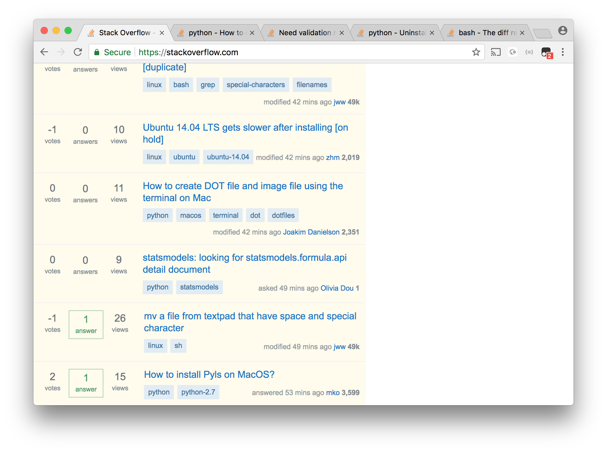
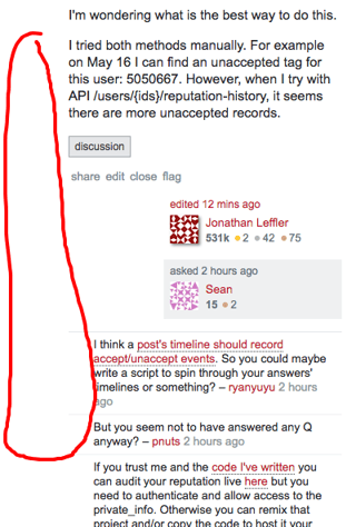
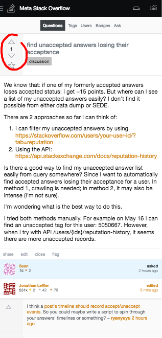
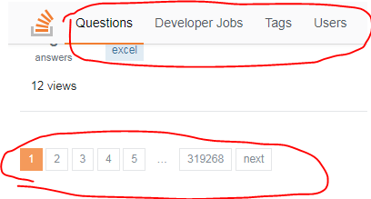
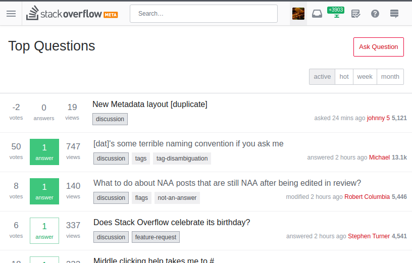
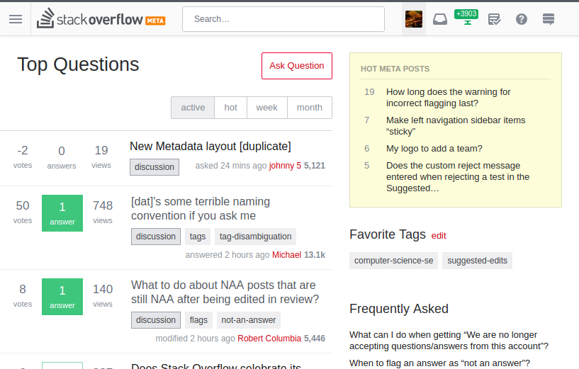
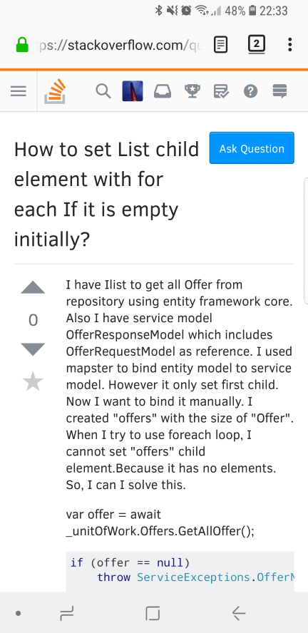
Many of the most used pages on the site are now responsive to your window size. This benefits people who have lower resolution devices or like to have multiple windows in view. This functionality has been live for a few weeks for Stack Overflow for Teams users.
This is a work in progress and this step is a part of our effort to validate our significant changes to page layout code. Not all pages are responsive yet, asking a question and many moderator or review activities will not work in a smaller viewport and you'll need to expand the window. We are making improvements to this experience week by week, so it will just keep getting better.
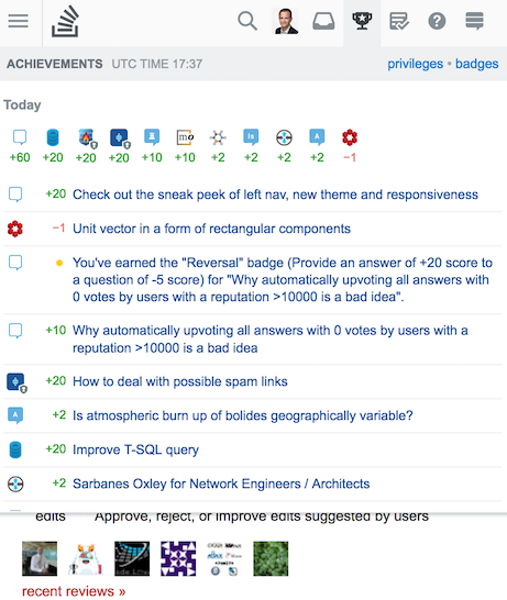
We haven't fully optimized this for mobile devices, but click the "full site" option in the footer and you will get the responsive design on your phone. If for some reason you need access to the non-responsive version, we have a temporary feature for turning that on. Just click "Disable Responsive" option in the footer. This is a temporary feature that will go away once all the pages/features have been made responsive. The mobile optimized view will also remain in place until we finish making all the changes.
You can read more about the ins and outs in Responsive design is enabled for Teams users.
When is this coming to other sites?
After we gather feedback via this sneak peek on MSO/MSE we will be releasing this on other sites. Currently the plan is as follows:
- Mid-June:
- ✅ release to SO and MSE
- ✅ post update on fonts and theming: Fonts and the new Q&A theming
- July: release to network sites with "stock" theme and 5-10 other sites
- August - September: release to the remaining sites. As we have more details we will update individual communities in their local meta.
Feedback
If you encounter a bug or a usability problem feel free to post it on MSE. We are eager to make updates so that this rollout goes smoothly for all communities.


