-16

For the remainder of updates, see the tracking post:

Rollout of responsive design site themes - Tracking post


See updated schedule below and updated stock theme

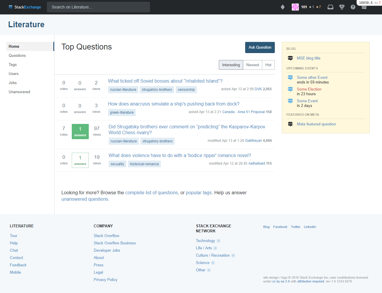
As promised (albeit delayed), we are posting site themes for our first group of network sites for comment. The goal here is to allow the community in general and users of these sites specifically to see how the new theming will be applied to these sites.

Again, we acknowledge that this is a painful change for sites that have rich, custom themes. I want to reinforce that the theme changes are a required step to deliver ongoing value to the sites with as little friction as possible. We released changes for tag watching (aka favorite tags) this week and will be releasing a beta of custom question list functionality soon. The only way to make sure Q&A improvements are quickly available to all Q&A sites is to fix our themes.

To recap from the original post on themes:

Every Q&A site has its own theme. But there is great inequality in the level of theming that we support. A few (~10) get Cadillac treatment, some (<50) are more like a Honda, while most (~100) are a Yugo. The reality is we created a theming system that we didn't have the design resources to fully support, thus the inequity. In addition, as currently defined, our theming gets in the way of releasing new features on the sites.

In order to deliver the left nav, responsive design and future improvements to all sites we've created a more standardized way to support theming. This will reduce the burden of supporting designs as we make Q&A improvements. The result is that most sites will see an improvement in the level of theming that they can get. While some sites will see a reduction. All of Q&A (Enterprise, Teams, etc) will standardize on this new theming scheme.

- Ch-ch-ch-changes: Left nav, responsive design, & themes

Next steps

Schedule

  • Early July: Collect and respond to feedback from this post
  • Early August: Release first 10 sites
    • Code Golf gets new "stock theme" today (08/03/2018). If all goes well we will start rolling out to other stock theme sites in August.
    • First 10 sites start getting updated early next week (08/07/18ish)
  • Late August: Post/release next 10-20 sites for comment
  • Late August - September: Rinse and repeat

Feedback

Please review the mockups and feel free to provide constructive feedback in answers below. We aren't going to revisit the choices we've made around simplification, so it would be more productive to keep feedback focused on the application of the new theme scheme.

Enough talk, show me the money

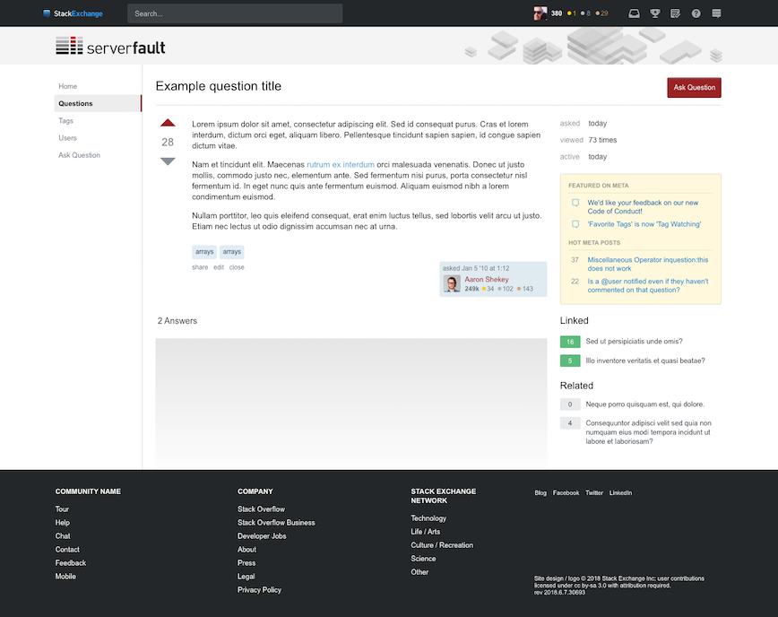
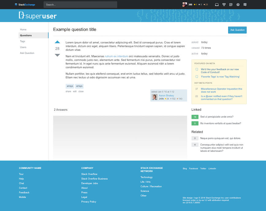
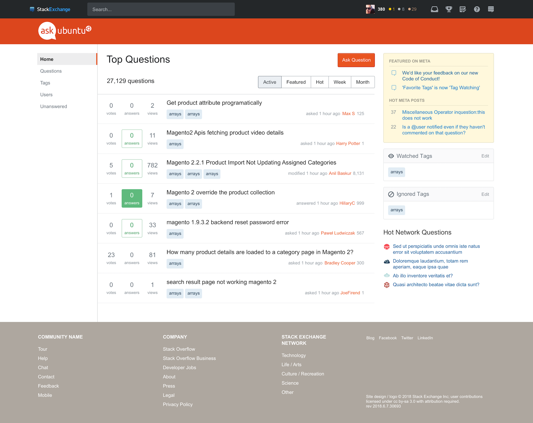
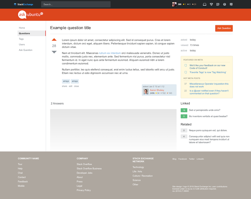
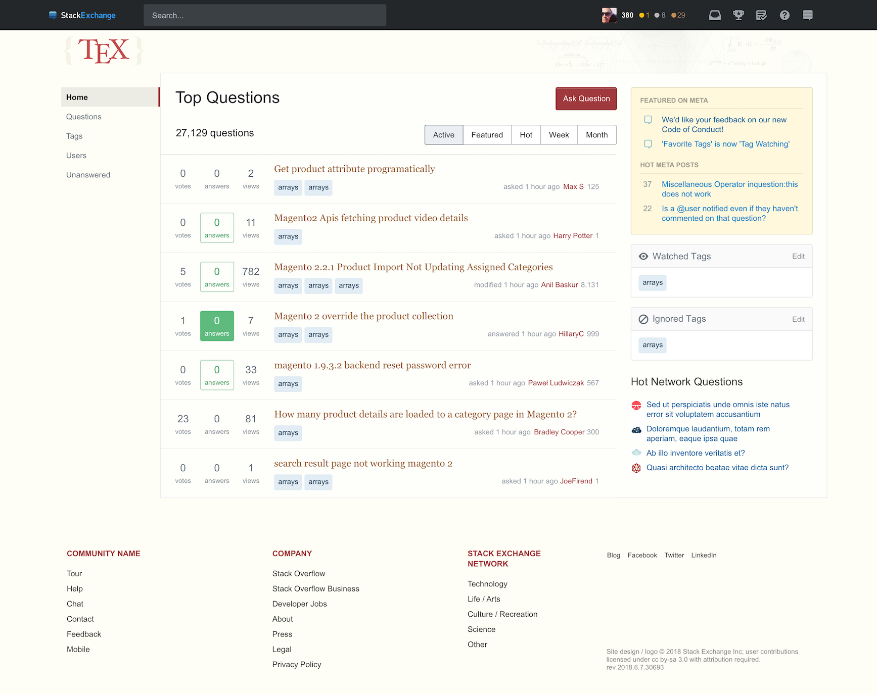
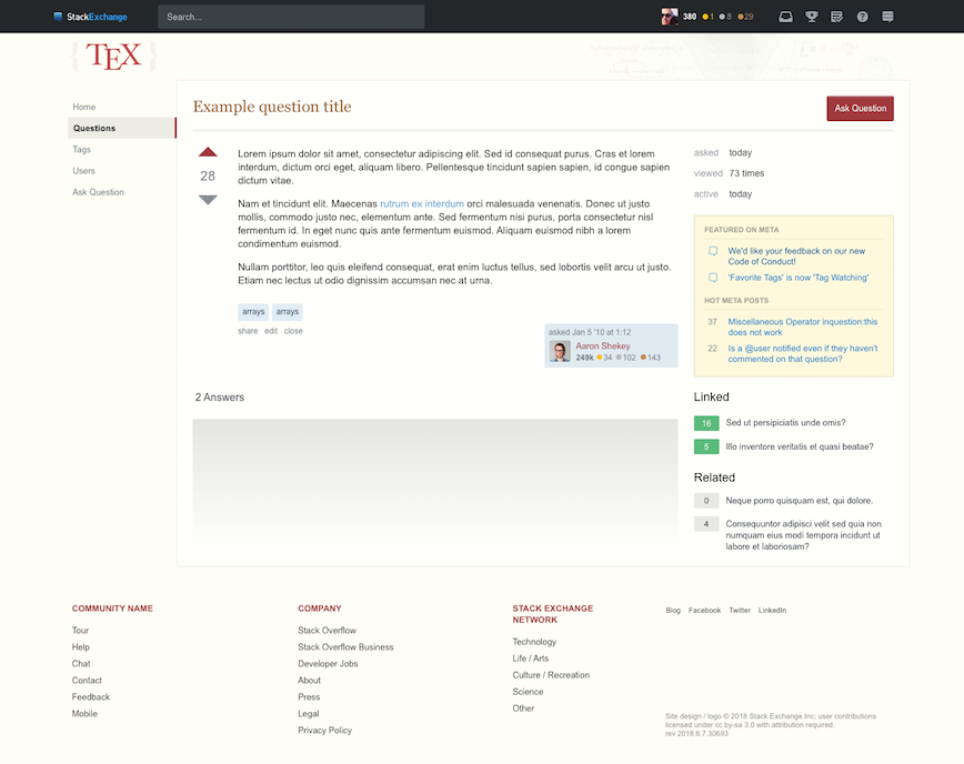
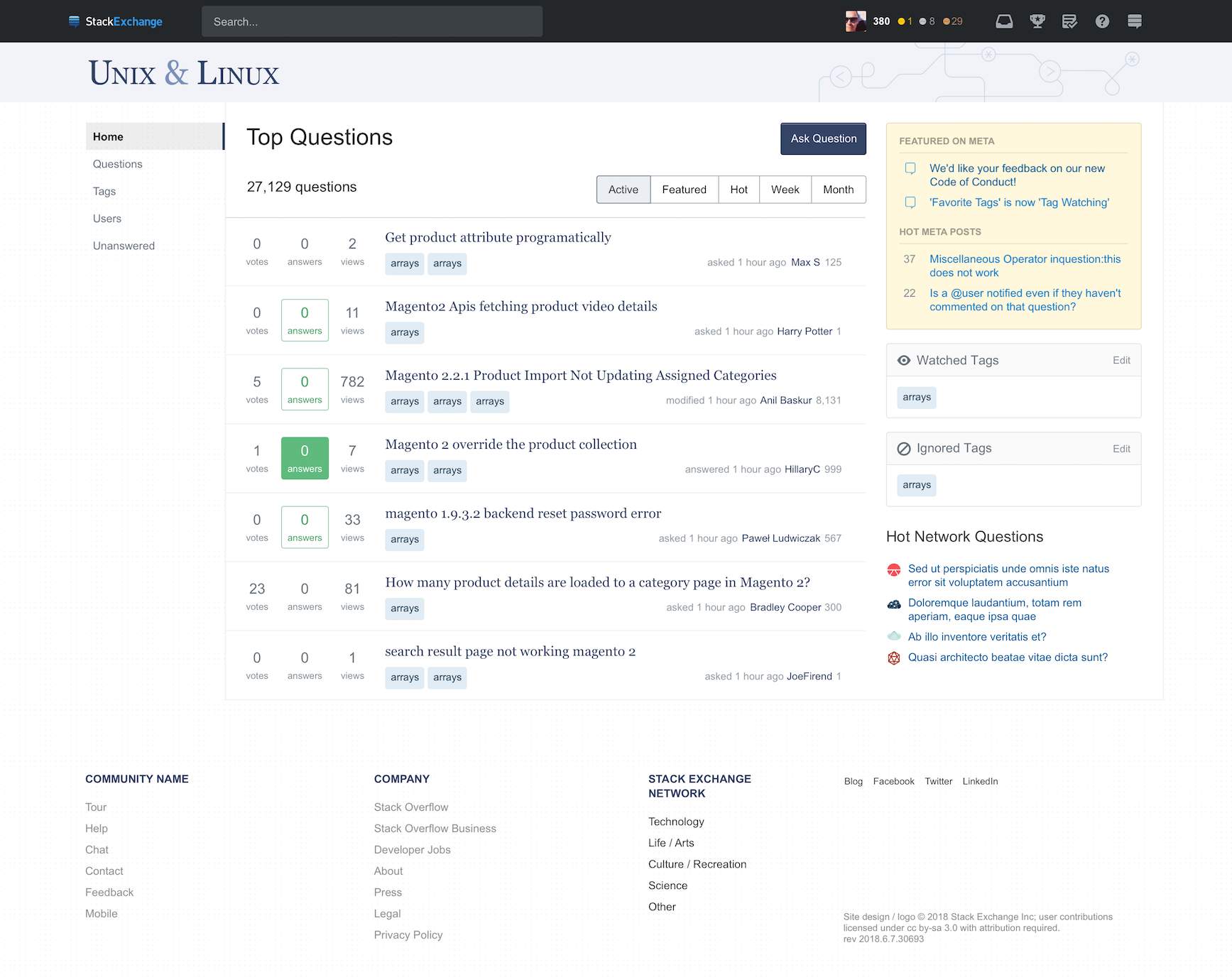
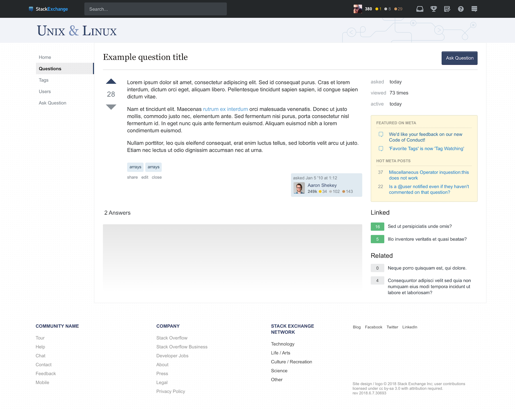
We have 10 sites that are ready for comment. You can click on the mockups below to see the image in a larger format.

Server Fault

Server Fault home page

Server Fault question page

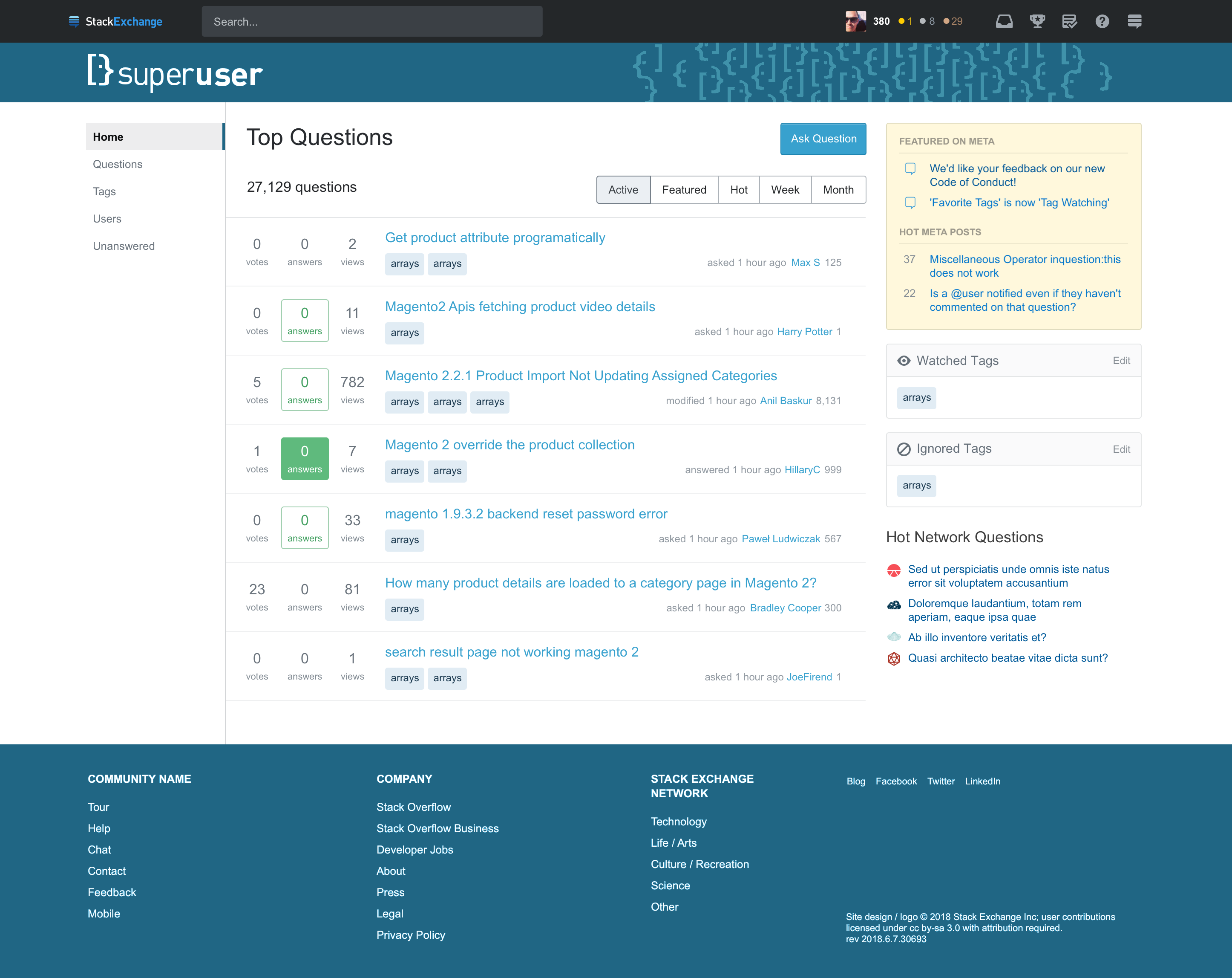
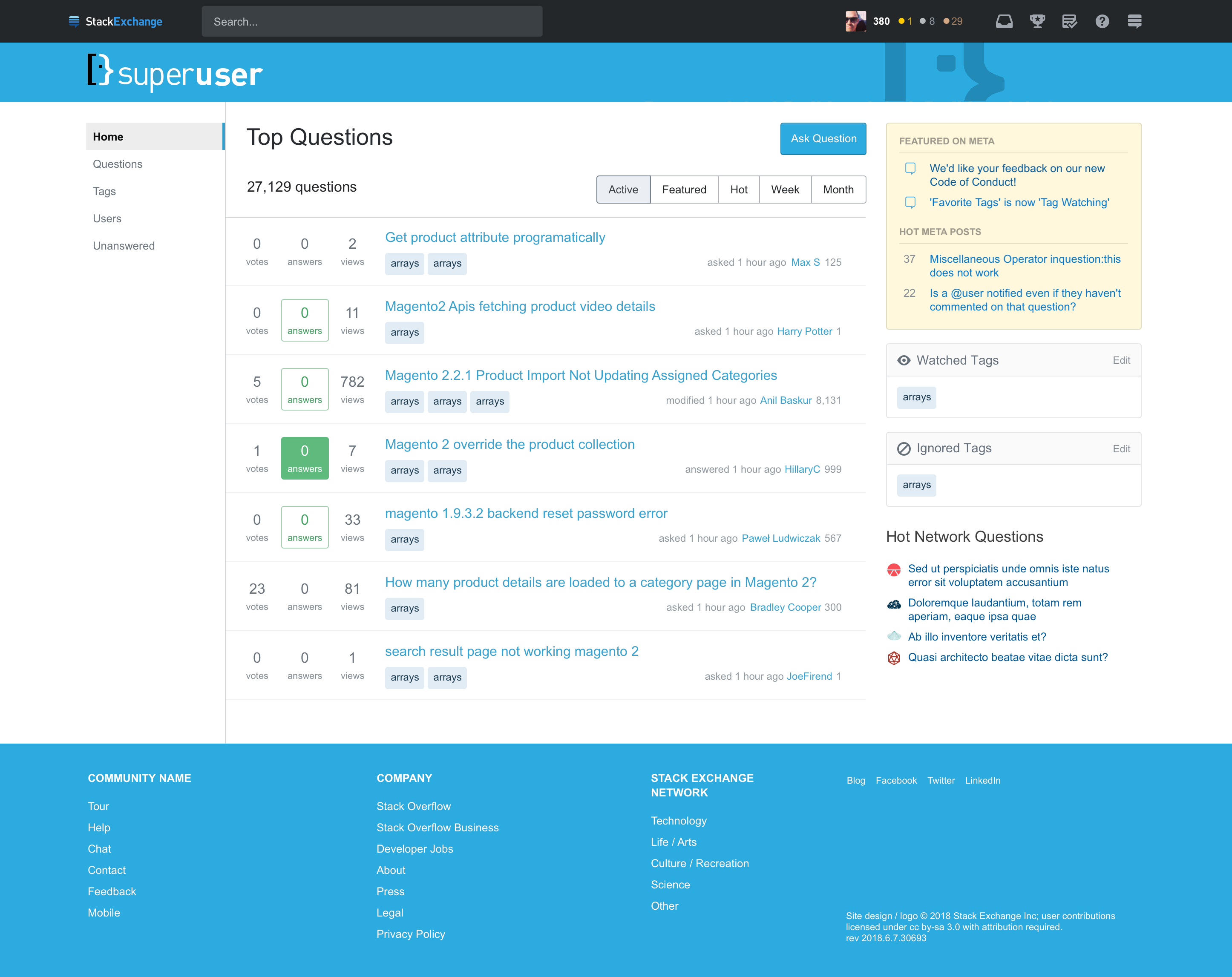
Super User

Super User home page

Super User question page

Ask Ubuntu

One special note, the current Ask Ubuntu theme sports an extra "top bar" that provides navigation to other Ubuntu sites. We are dropping support for this bar in our new theme. The application of this bar is inconsistent across the Ubuntu sites and it is lightly used on AU.

Ask Ubuntu home page

Ask Ubuntu question page

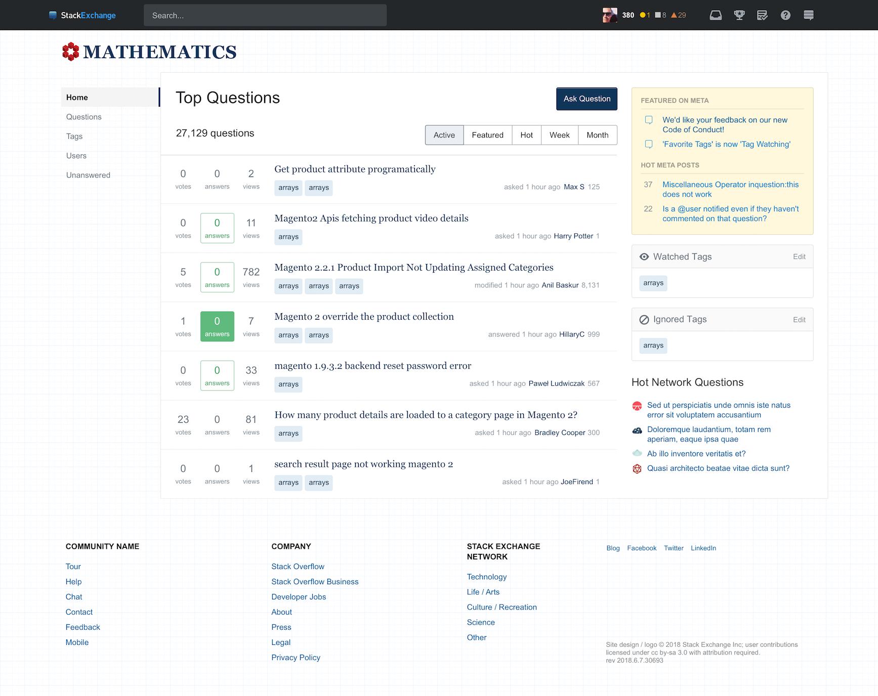
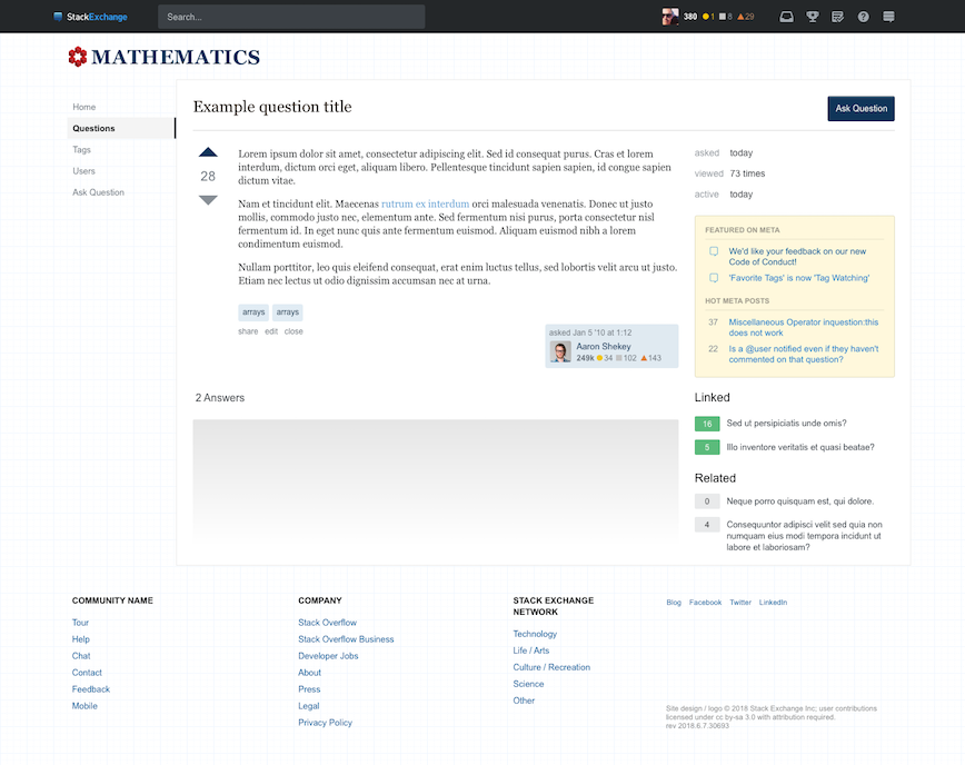
Mathematics

Mathematics home page

Mathematics question page

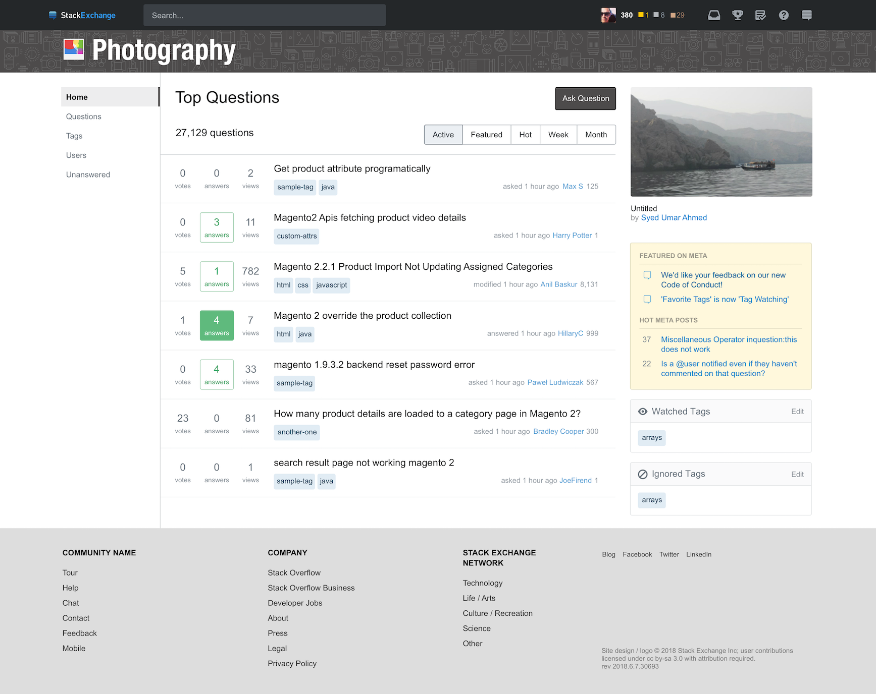
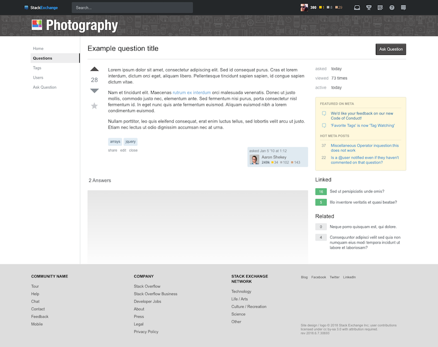
Photography

Photography home page

Photography question page

TeX

TeX home page

TeX question page

Unix & Linux

Unix & Linux home page

Unix & Linux question page

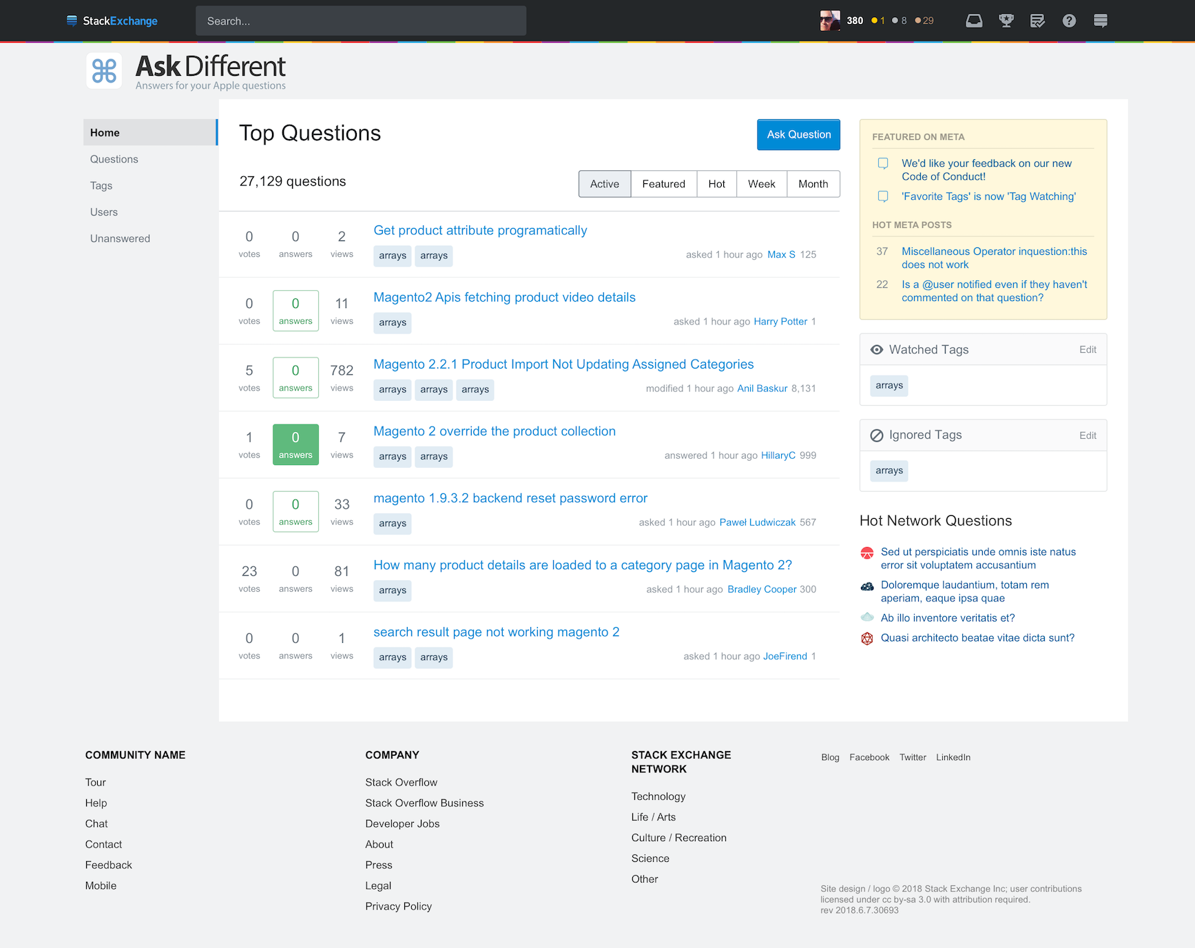
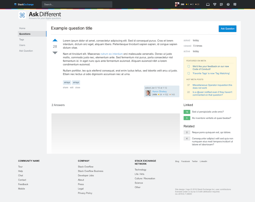
Ask Different

Ask Different home page

Ask Different question page

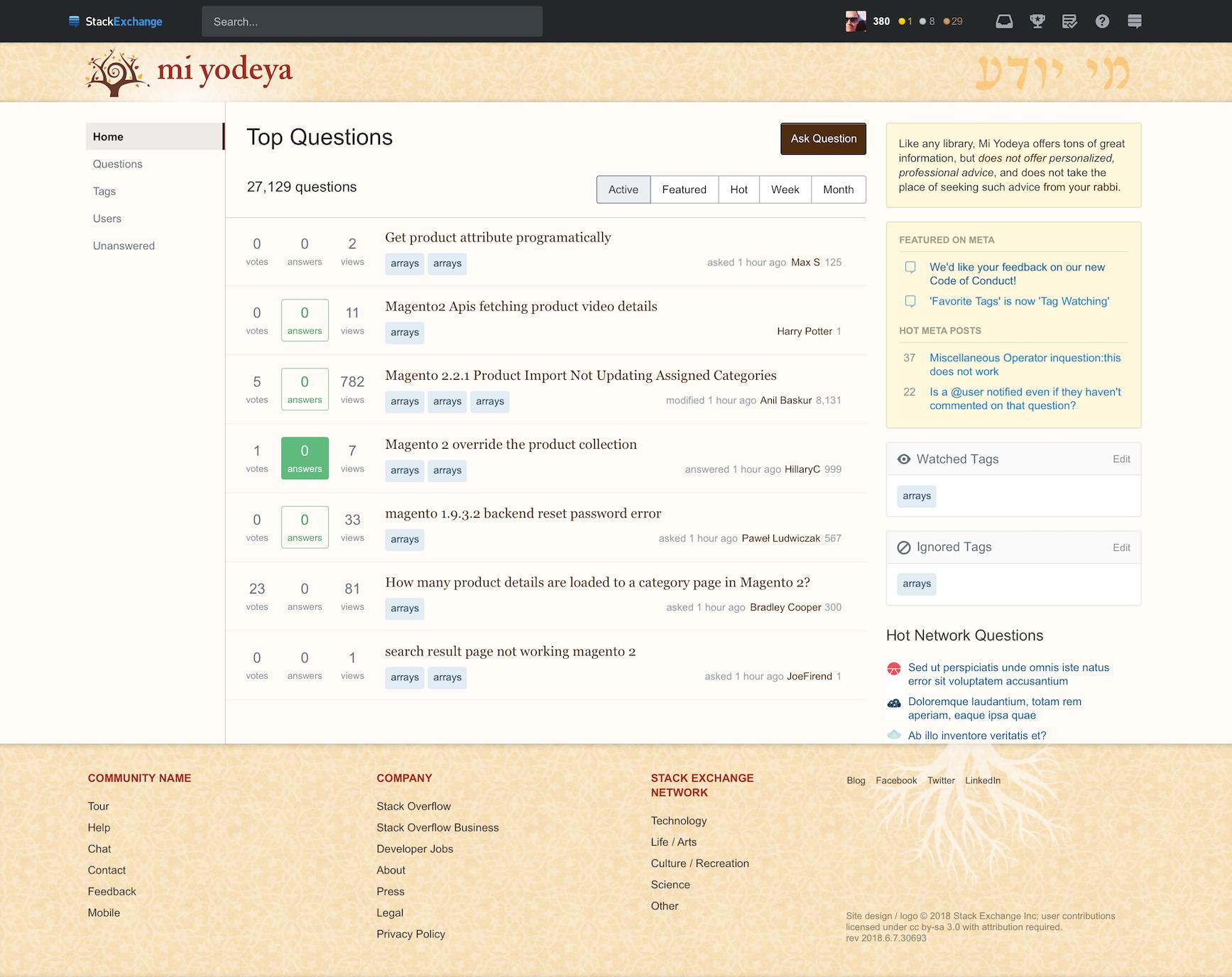
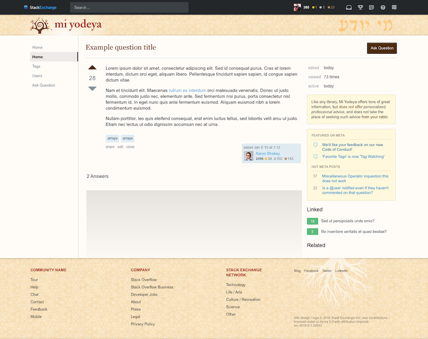
Mi Yodeya

Mi Yodeya home page

Mi Yodeya question page

Stock theme

(This theme will be used on most Beta sites and Graduated sites without custom site designs. These sites will be updated in the first round and then some may be eligible for a custom theme after the remaining sites that currently have custom themes have been updated.)

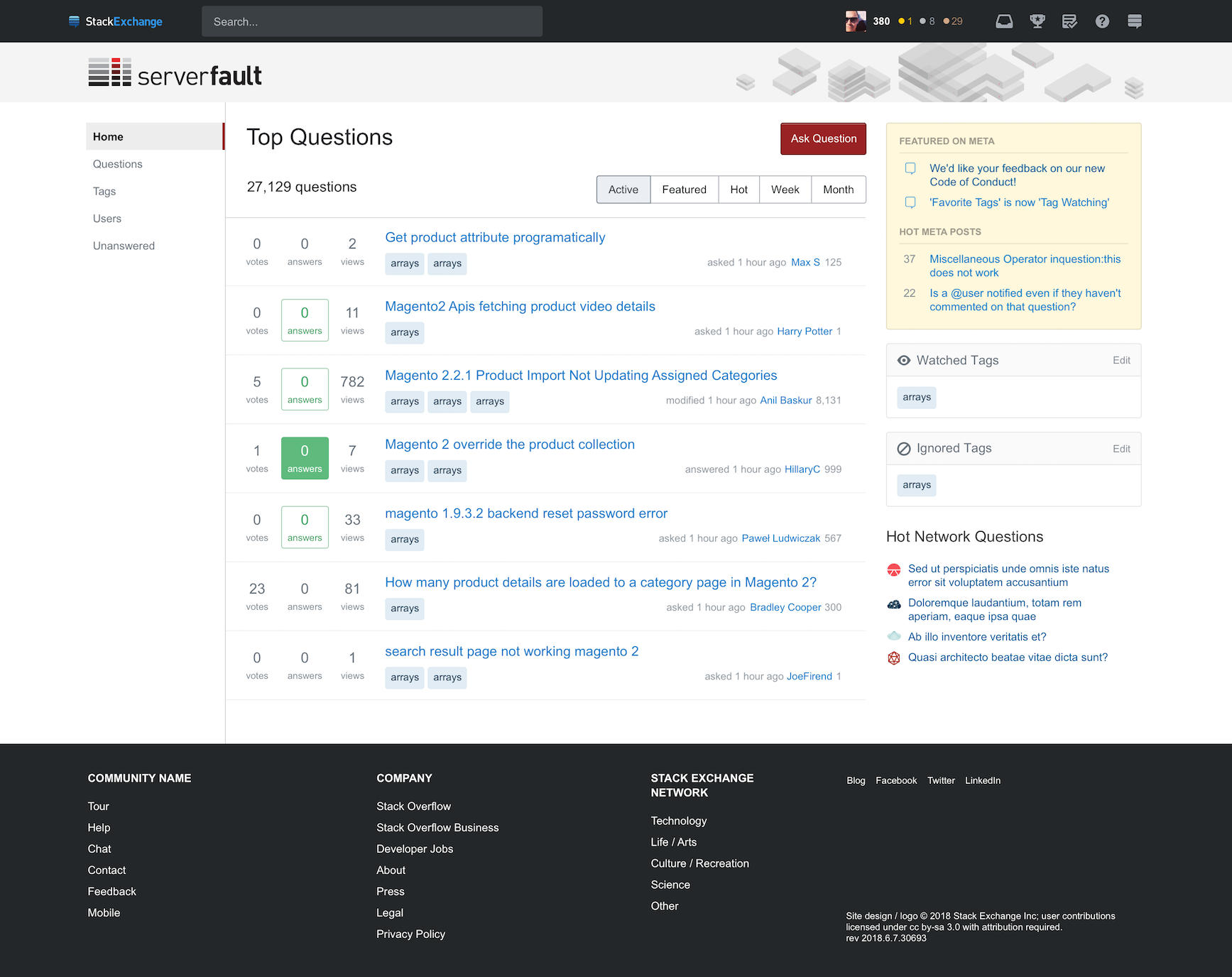
Stock theme home page

See earlier iteration of home page

See earlier iteration of question page

18
  • 14
    Comments archived. We'll try our best to respond to specific criticisms and suggestions for improvement posted as answers, but comments under the question itself don't thread and are easy to miss; it quickly turns into a shouting contest. Please, if you have something important to say about this... Write an answer.
    – Shog9
    Commented Jul 11, 2018 at 19:29
  • 36
    @Shog9 [..] but comments under the question itself don't thread and are easy to miss ... well, exactly the same applies to "just write an answer" advice. Nobody is going to read more then first top 5-10 answers so yeah, after few hours there no point in posting anything. No matter how relevant and constructive Your idea is, it will just sink.
    – Skipper
    Commented Jul 12, 2018 at 7:48
  • 14
    @Skipper That's not true; Joe and Shog specifically are requesting people to write answers. The answers are not for you or me, they are for the SO dev team. Of course you can expect the asker to read all the answers.
    – TylerH
    Commented Jul 12, 2018 at 13:48
  • 1
    @Shog9 I've got nothing against archived/chat-converted comments, but that link shows just one. ;) Here's the beginning. Commented Jul 12, 2018 at 20:27
  • 49
    Pushing for flat consistency is entirely the wrong way to be going if you want each site to be a community with its own culture and feel. You should feel like you're going to another website...moderation and spirit is different, by necessity. If you don't feel like you left one site for another, you're making a mistake. (Might there be a meta post about the decision making process--and how the sidebar that was near-universally panned, is now being used as the impetus to go along with and mess up other sites too, as if the feedback didn't happen? Why is feedback being given, then?) Commented Jul 12, 2018 at 21:20
  • 5
    Apparently Magento is on topic across pretty much the entire network. Good to know, if I ever use it :P Commented Jul 13, 2018 at 6:18
  • hi guys, please find a way to hide elements, like Blog, Featured on Meta and Hot Meta Posts. I prefer my tags on the upper right! Thank you. Commented Jul 13, 2018 at 12:39
  • 18
    Have to tell.. never clicked at none links on the new left navigation since launch Commented Jul 13, 2018 at 16:35
  • any responsive design mockups?
    – kenwarner
    Commented Jul 13, 2018 at 20:11
  • 1
    +1 for making the "Ask Question" button more visible in the new themes. On one or two sites it took me > 20 seconds to find it in the past. Commented Jul 15, 2018 at 17:51
  • 7
    Why downgrading? I don't see any value added with theses. Are the sites that harder to maintain when they have a custom CSS?
    – Winter
    Commented Jul 16, 2018 at 13:51
  • @Winter To answer your last question: yes.
    – TylerH
    Commented Jul 16, 2018 at 15:03
  • Consistency across all sites from UX is important and I think you have achieved that. No surprises, keep it plain, simple and predictable. Less colors is good. I don't like downvotes, though it is not part of the themes, it makes the site generally not welcoming. The reason people come to stackoverflow is not to kill time, but ask or answer genuine questions. I think there should be more research done to reach out to those under represented communities -- which don't feel comfortable voicing opinions. W Commented Jul 17, 2018 at 2:28
  • 2
    @RajeshJain Complaints about downvotes have no place in the discussion about themes. If you feel that strongly about them, then post your own meta question about it.
    – fbueckert
    Commented Jul 17, 2018 at 17:11
  • @kenwarner Best way to check out the impact of responsive changes is to play with this site. Responsiveness can't be evaluated via static comps.
    – Joe Friend StaffMod
    Commented Jul 17, 2018 at 19:30

27 Answers 27

217

Stock Theme

All beta sites look alike now, so clearly the stock theme isn't going to help disambiguate among them just like the current beta theme doesn't. But could we avoid the stock theme having the same exact colors as non-stock sites? Meta.SE and Super User should have theming that says clearly "not the same as those". Going forward, one of the benefits of "graduation" (or whatever concept replaces it) is that you get to move away from the default; this combination makes it look like these two sites have regressed to that default.

1
  • 5
    @JoeFriend one possibility, assuming that you're going to do something different for Super User anyway, would be to change Meta.SE -- specifically, move it to a grayish theme, to align it with the per-site metas and maybe more strongly send the message that this is a meta site to all those people who mistakingly post their programming questions here. (Welcome back from vacation!) Commented Jul 17, 2018 at 23:46
149

Super User

I agree with Sonic the Inclusive Hedgehog's comment, Super User looks too much like Meta Stack Exchange. I suggest making Super User a bit darker. Here is an image of approximately what I suggest (I'm not an artist so the colors may need to be adjusted a bit):

enter image description here

This answer focuses only on the color. There may be other issues with the design that aren't addressed here.

5
  • 31
    I really like this - it's different enough that I don't think 'mSE' when I see it, but maintains the cleanliness and maintainability staff want. +1.
    – Undo
    Commented Jul 9, 2018 at 19:31
  • 1
    Which tool did you use to change the color of this image? Commented Jul 10, 2018 at 12:27
  • 2
    @IamtheMostStupidPerson Paint.net Commented Jul 10, 2018 at 20:31
  • 7
    The color is too similar to the Software Recommendations theme
    – clickbait
    Commented Jul 11, 2018 at 2:59
  • 4
    Can we not use the #2cabe1 color that makes up the actual SuperUser logo? Neither the original redesign, or this adjustment use that color anywhere in their implementation. Commented Jul 12, 2018 at 10:36
124

Super User

As a long term user, and a moderator on Super User, I'm pretty frustrated with the approach taken, and as a lot of folks pointed out, we got stuck with what's basically a beta theme. I'm frustrated, and actually a little angry with how this turned out, and I actually have been a fan of the new responsive layouts. Every other site seems to have a theme that's derived from what they have now, and respects their traditional colours and identity. Super User's does not. I'd go so far as to say it looks like your designer phoned it in. It's... really bad.

Looking at this... Super User basically has the stock theme. It has just enough changes that it maybe had someone look at it and go "eh, lets just throw that on there, it'll be fine". It's... not...

It kind of ignores our long established site identity; it's somewhat drab and well - you guys did our logo a disservice by making it monochrome. It really needs to be two coloured as it has been throughout the history of the site.

Speaking of indignities our poor logo has gotten, my users have pointed out {'] (almost) has gotten mangled on the right, making our poor super user face look like he had a bad day with the heroine of Kill Bill. I do urge the graphics designer in question to take a good look at our logo, and consider the impoliteness of chopping the back of someone's head off. I even wonder if the graphics designer went "eh, I don't want them to notice I copied the generic theme. I know! I'll add in this element that almost looks like the site logo?"

I do think that a remix of mathematics colour scheme - maintaining the white base we've had, or Server Fault's would feel more in line with what we've been used to. It maintains our distinct site identity, allowing us to keep our logo intact, doesn't look like the generic theme, and doesn't require a ton of redesign. The mathematics theme looks super close to the current scheme, and having a similar design to Server Fault reflects that we were one of the original trilogy in four parts.

As is though, I'm sad to say, I actually seriously hate the new design the more I look at it.

16
  • 1
    Considering how bland and unthemed Superuser is now, I would think SU users would see it as an improvement... certainly not warranting of this level of indignation. The actual issues I can see here are: 1 the icon field is not well-aligned on the design mockup's banner, 2 the main site icon is now all black instead of one thing being black and one thing being blue, and 3 the mockup's primary color is the exact same value as the default site mockup. Each of these are easy and minor things to adjust.
    – TylerH
    Commented Jul 10, 2018 at 14:04
  • All white actually. And well, I feel considering my usual style of complaining about things is understated, my sheer level of indignation... is a little surprising. But its there, and its the site that I've been on the longest. Its been getting angrier with every edit so I probably should shortly wander off and go to bed. Commented Jul 10, 2018 at 14:12
  • 9
    Also, that its easy to fix doesn't make it any better. Worse in fact Commented Jul 10, 2018 at 14:18
  • 18
    @TylerH as a user of Super User it isn't an improvement. It was one of the original trilogy sites, has a larger userbase than Server Fault and yet it feels like the SU design has been done as an afterthought.
    – Burgi
    Commented Jul 10, 2018 at 14:24
  • 2
    @Burgi I appreciate that, and I agree it should be iterated and improved. However, you can't really argue there is a unique or memorable design to Superuser right now. Design-wise the only thing it has that is unique right now is "[.} Superuser" as a title at the top. No banner, no background, no unique borders or badge icons, sidebar content, etc. The "phoned-in" style adds more unique identifying elements.
    – TylerH
    Commented Jul 10, 2018 at 14:41
  • @Burgi The title's icon going from 2 to 1 colors is a loss & should be fixed, but it is a 5 second change. I have been there before where I've been with a site with thousands of users and had themes that everyone loved and then we moved away and lost the themes, I know that it hurts. However, this is quite the visceral response, IMHO.
    – TylerH
    Commented Jul 10, 2018 at 14:44
  • 2
    I prefer "passionate". You should come hang out in Root Access to understand the strength of the community.
    – Burgi
    Commented Jul 10, 2018 at 14:59
  • 15
    @TylerH People get passionate when they feel that things which amount to "5 second changes" seem to not have been considered at all or when things as prominent but as easy to adapt as link colour are just overlooked altogether. When you have a design that has been well-thought out and working for years, then you get angry when people do a half-assed 1 hour job on it. The natural removal of some things isn't a problem. The (seemingly) careless way it is done with is. When it seems like SE thinks users won't notice or care and thus doesn't put care into the work, that's what gets people. Commented Jul 10, 2018 at 16:18
  • 1
    @ChristianRau I understand that, having lived through losing custom skins on a forum where I spent 10 of my most formative years every single day. At any rate, as I said above you can't really call the visual design "well thought out" as distinct from the rest of the network. There is no design on Superuser. This mockup above actually added one and it moved Journeyman to post this answer simply because the person who made the mockup changed a very minor thing in a very minor way, not realizing how emotionally attached it might make some people who'd been regular users for ~10 years.
    – TylerH
    Commented Jul 10, 2018 at 18:58
  • 34
    FWIW, I agree. Super User's ending up way too close to both the MSE theme and the stock beta theme. I'm not a designer myself, but I'll ping the one working on these.
    – Adam Lear StaffMod
    Commented Jul 10, 2018 at 21:23
  • 1
    Thank you Adam - I do hope this gets fixed Commented Jul 11, 2018 at 1:03
  • 7
    @TylerH while stripped down and very simple, I'd argue that SU has actually had a design. It has been, as how Joe describes it - a bit of a honda, though I guess to us, its a classy '80s lexus or one of those boxy volvos. Someone just swapped it out for a neon green prius. I see a few faces I'm actually unfamiliar with complaining about it with various levels of articulateness. Its the little things, those 5 second changes that actually tie together a site, especially one with a long history (in SE timelines) and a fairly strong sense of community. These things matter to us. Commented Jul 11, 2018 at 4:11
  • 2
    @JourneymanGeek It's fine if they matter :-) Everyone likes a good looking site that is unique. I'm just saying maybe don't equate a mockup to what sounds like a personal slight against long-time users. I mean, this is someone's job, and you're accusing them of not putting effort into it and making it sound like they aren't doing a good job at all. You don't even know what they were tasked with! Maybe Joe or Jon or Joel or whoever just said "make a basic mockup of this site, don't spend more than a minute or two on each one."
    – TylerH
    Commented Jul 11, 2018 at 15:17
  • 3
    @JourneymanGeek Not to mention... the whole point of this question and what it asks for is feedback from you to help inform the design decisions. The mockups in the question are starting points, not "here's what your old site is gonna look like, read 'em and weep fellas".
    – TylerH
    Commented Jul 11, 2018 at 15:18
  • 2
    @TylerH ^add to the fact that the way the new theming is being built, it's supposed to be easily changable so as to enable rapid deployment of new sites with custom themes. If a community like SU disliked their theme, they could probably ask [feature-request] after [feature-request] to tweak the site theme how they wanted, which is better than the current option of watching design tweaks and bug fixes languish in [status-planned] hell.
    – Robotnik
    Commented Jul 13, 2018 at 0:37
115

This is an area that we've decided to standardize.

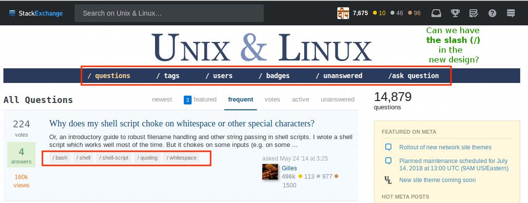
Appearance of tags

Several sites have a custom appearance for tags that's associated with the site's theme. This is generic feature which gives sites that use it a unique look but is disappearing in your new design. It's used on at least:

Unix & Linux

I will really miss the (forward) slash-ed (/) navigations and tags that is giving the unix-like feelings! Can we preserve that in the new design?

enter image description here

Do you know how much is it liked by the community? look at the name of chat-room: /dev/chat!

5
  • 79
    It basically seems that with this redesign that if you thought something was cool or unique about a certain Exchange, it's not coming back.
    – SGR
    Commented Jul 10, 2018 at 7:35
  • 51
    If the navigation bars were really Unix-like, they would read /qst /tgs /usr /bdg /etc ask. Commented Jul 10, 2018 at 17:54
  • @SGR It was announced months before. And it was clearly stated, that any custom stuff like vote buttons tags or menus need to be unified.
    – Skipper
    Commented Jul 12, 2018 at 7:51
  • 14
    @Skipper yes, and SGR's complaint has been raised constantly since then. It's not as though people are first now complaining about the sites being cookie-cuttered.
    – Kevin
    Commented Jul 15, 2018 at 20:41
  • 2
    @Skipper If everything needs to be unified, each individual SE design will be reduced to the GCD of all of them, and as diverse as the network is - or soon used to be - the unified design will most likely look so bland that I won't know which particular SE I am currently on without looking at the window title. Until now the (graduated) SEs were so diverse and each had their unique charm that I instantly knew where I was (a look at the vote buttons or the tag design was enough): Branding works! (who knew?). They have to go, you say, but why? If I have to give all that up, where is my trade-off?
    – BMWurm
    Commented Aug 13, 2018 at 13:30
88

Meta Sites

How will the metas of these sites look? Will they follow the same system we currently have - that is, a grey-scale version of the main site theme?

If so, how will that look in cases of sites that are already predominantly grey scale like Photography? Inverted grey/white values?

Or, like SO and MSO, will the only difference be the color desaturation of the site logo and the addition of the word "meta"?

1
  • Yeah, there's very little difference in look between Software Engineering and Software Engineering Meta.
    – clickbait
    Commented Jul 25, 2018 at 18:21
80

Stock Theme

Please, make a different site design for stock theme. This looks exactly same as Meta Stack Exchange except the lines and meta logo in the header. But that difference is too trivial to notice.

This not only makes the users think that they are on Meta Stack Exchange [Some don't like this and don't feel welcomed here :( ]. but also removes the uniqueness of Meta design. Make some changes to the Stock Theme.

I agree with Monica's answer about adding this theme to Graduated sites without design. I don't think changing the colours of graduated sites without design (e.g. Anime & Manga) sites is very much helpful or makes the users better because they only get the same design as Meta Stack Exchange and common design of Beta sites. They don't feel any different from being a Beta site. It looks like putting old wine in the new bottles.

Meta Stack Exchange had this theme since long (at least since I joined) and I like it very much because it is unique. If this site's theme is added to main sites, it loses its uniqueness. I also feel its classification will also be mixed up (Meta's design is given to main site.).

So, please consider changing the themes of Stock Theme and graduated sites without design and make Meta Stack Exchange design unique.

1
  • 4
    If it helps, my understanding is that once all of the sites have the new layout, there will likely be more differentiation between beta sites and graduated sites, and designing the new themes will be easier, since the layout is simpler. This is, therefor, an intermediate step. :)
    – Catija
    Commented Jul 9, 2018 at 19:01
74

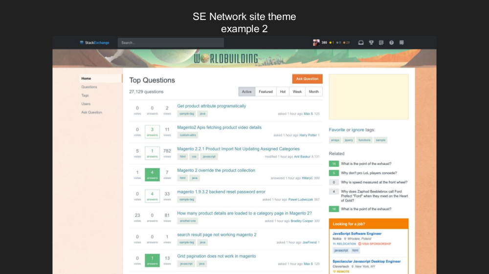
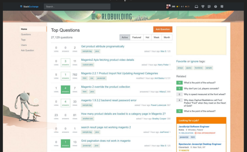
Worldbuilding

I know that the Worldbuilding.SE theme make-over hasn't been finalized and released yet, but in the ch-ch-changes post, you link to a document that includes this image:

enter image description here

(Compare to old background.)

A couple questions: What's happening with the ridges at the bottom? You know, the part that makes it look like the world is in construction?

Second, what's happening with those figures? You've incorporated the header image, but... what about our friends in the theme there? Can't we fit them in somewhere?

enter image description here

Also, as an aside - the different colors on the right and left are IMO distracting. Both sides should be the color that's currently on the right, to be more true to the original theme.

There is currently a "Save The Robot!" campaign on Worldbuilding Meta, and some additional critique on the proposed site design in this answer to that question, that are relevant to this post.

8
  • Maybe even on the header image. Commented Jul 10, 2018 at 12:41
  • 17
    Seems easy enough to just leave the background transparent, instead of giving it a color at all. Then our robot and traveler will be safe, the colors won't be clashing, and you'll still get to to have your menu over there on the left where you want it.
    – AndyD273
    Commented Jul 10, 2018 at 13:10
  • 6
    In life/arts, we're at 3rd place for questions per day, 2nd place for number of answers, and at 1rst place for percent of questions answered. Shouldn't we be able to retain some of our beloved site design? Commented Jul 10, 2018 at 13:45
  • 2
    @FoxElemental I don't think measuring from a subcategory is valid; for example, there are only 7 categories, but Worldbuilding.SE in 3rd, 2nd, and 1st place in Life/Arts does not equate to a proportional standing in Overall; overall Worldbuilding.SE is 39th in questions per day and 31st in number of answers. Worldbuilding.SE is tied with 10 others overall for 1st place in % of questions answered at 100%, but another important metric (arguably the most important) is Traffic. Overall, Worldbuilding.SE is at a middling 61st place in traffic.
    – TylerH
    Commented Jul 10, 2018 at 14:19
  • 10
    I think the universal request from all WB.SE members will be to maintain Slartibotfast and his human traveling companion.
    – James
    Commented Jul 10, 2018 at 14:51
  • 30
    The campaign to Save the Robot has begun. I think we'd like to head some of these issues off before a design is proposed and it's too late to fix 'em.
    – HDE 226868
    Commented Jul 10, 2018 at 15:13
  • 6
    Long live Slartibotfast and Alice! The site won't be the same without them.
    – kingledion
    Commented Jul 10, 2018 at 16:16
  • 15
    +1 At first I thought they removed the characters in the left sidebar because they wanted to simplify it to be only solid colors. But it looks like the Mathematics redesign has a background image there, so why can't WorldBuilding keep the background image. Commented Jul 12, 2018 at 0:19
70

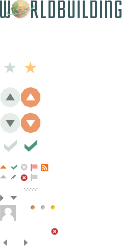
I'm very happy to see custom badge icons made the cut. And equally sad that custom voting buttons didn't. I don't understand why the choice of graphics (as long as the dimensions are the same) would matter; therefore, I don't follow the trade-off here.

Speaking of trade-off: I don't care for the left nav¹, and I don't think the biggest problems of SE as a platform are small UI issues. (Whatever became of the SE Quality Project?) Maybe I'm being unfair, but from my perspective sites will lose some of their flair for marginal improvements.

So what's left is hope that these alignments will enable more relevant changes down the road. You could ease at least my mind by mentioning some things on the roadmap to sweeten the deal.


  1. I almost never use the links contained there, so it's just noise that stays with me when I scroll. The things I do frequently use -- search, mod tools, flags, review queue (if I wasn't a mod), link to meta, notifications -- remain out of sight² in the top bar.
  2. I user-style the top bar to float with me when I scroll, so I'm actually fine with that. The point is, the left bar doesn't add anything for me. It seems to exist solely for teams, which I don't use (except the mod group, which obnoxiously takes over the SO main landing page).
13
  • 13
    Yeah I don't understand the desire for having the left nav at all. I don't expect I'll be using it at all. That said, at least it's unobtrusive, and nicely out-of-focus to the main content I'm interested in. Commented Jul 9, 2018 at 22:17
  • @WeaponsGrade You can also just get rid of it entirely if you really don't like it. I've found it pretty useful, personally.
    – Catija
    Commented Jul 9, 2018 at 22:54
  • Yes, I guess we can keep a lot of things the same if we want, using user scripts and styles. We already use SOUP as bugfix overlay, so why not. :/
    – Raphael
    Commented Jul 10, 2018 at 5:41
  • 1
    Just FYI: The displayed size of the various voting buttons does vary across sites. In addition, their registration within the displayed area is not consistently centered. However, all those which I've checked did have blank space available in the sprite sheet such that the displayed area could just be adjusted. Centering the registration, is also something that's reasonably easy, but would have to be verified on a site by site basis. So, basically, yes, it's possible, but would have taken a bit of work.
    – Makyen
    Commented Jul 10, 2018 at 15:37
  • 7
    @Makyen I think standardizing voting button dimensions and positioning, maybe with community involvement as a requirement, would be a fair compromise.
    – Raphael
    Commented Jul 10, 2018 at 16:40
  • 8
    @Raphael Yeah, frankly, it's not that much work and permits keeping an additional, significant part of the per-site themes. To be honest, it's something that I would have expected to be defined from the the 3rd or 4th site. As something like the SE sites develop (multiple things, slightly different), it's normal for there to to be significant variation in the first couple. However, when you reach 3+ you should be putting some standards/specification in place which all future designs follow (as to what they can do).
    – Makyen
    Commented Jul 10, 2018 at 17:04
  • 2
    That doesn't mean that the specification can't evolve as your designers want to do new things for additional sites, just that it must be added to the spec. and compatible with existing sites (i.e. some thought about how it impacts current and future sites, not just the one the designer is working on at that time). Unfortunately, that wasn't done at the time.
    – Makyen
    Commented Jul 10, 2018 at 17:05
  • 1
    Now, they're attempting to wipe out technical debt. Unfortunately, doing so in a manner which significantly reduces site individuality, which, IMO, isn't a good business move due to making the existing sites less attractive to people who share a focus on the site's subject matter. Ultimately, IMO, that will result in less traffic to the sites than would have been the case if more individuality was kept on a per-site basis. I can certainly understand the desire to make the code-base more uniform, but that doesn't mean that the sites couldn't keep more of the individuality which already exists.
    – Makyen
    Commented Jul 10, 2018 at 17:06
  • I totally agree on the left menu. I rarely use those other menu items, and could easily find them at the top when needed. Keeping them fixed/floating on the left wastes valuable screen space that could be used for something useful, and is a distraction. Moving them to the left and then inventing stupid artwork to fill their old space at the top was not an improvement; it introduces no benefit and degrades the UI.
    – fixer1234
    Commented Jul 11, 2018 at 19:36
  • 1
    The left menu can be hidden inside your preferences. There's a lovely "Hide Left Navigation" checkbox that works wonders. Commented Jul 12, 2018 at 15:42
  • 1
    @KyleFairns Good point. However, 1) Preferences seem to be broken, not syncing correctly to the settings currently active, and 2) then then we have no nagivation menu, which is not good either.
    – Raphael
    Commented Jul 12, 2018 at 16:02
  • @Raphael I get by without the left menu. I go to the whole list of questions by using the stackoverflow logo, I ask questions using the ask question button, I view tags based on the ones that I have favourited and I rarely ever search through users anyway - essentially there is no need for it Commented Jul 12, 2018 at 16:05
  • 5
    With you on the voting buttons and badges. I'm really really surprised it went that way and not the complete reverse. Commented Jul 12, 2018 at 20:15
59

This is not an implementation issue. We believe there is value in keeping the elements used for key interactions consistent across the sites. You don't interact with badges, so we thought that was an area we could give on.

Just so we're clear...

Custom badge icons are staying, but custom upvote/downvote icons are gone...despite both being defined by the same image resource?

Worldbuilding's SVG

I can understand a desire to have these be "standardized," but these small details go a long way towards making a site feel like it has its own feel. I'm constantly amused by the up/down vote button's styling on Money.SE: They're little stock chart graph things (I'm sure there's a name for them).

Telling a site "look, you can only change part of this SVG. These bits are off limits" makes no sense.

Unless you've removed them from this resource entirely, to which I ask: why? It clearly wasn't motivated by the cost savings aspect that the new theme push is based off of. Having to remove it from the theme-SVG and refactor it elsewhere took development time that obviously could have been Not Done and let sites keep the flair (i.e., it literally cost more money to remove than to keep).

I am disappointed.

6
  • There's always the possibility that they're breaking them off into their own sprite sheet, but at least on this meta they're still unified into a single sheet. And even if they do, saying "this bit here can be on its own sprite sheet but that bit there can't" still makes very little sense.
    – E.P.
    Commented Jul 13, 2018 at 12:03
  • 3
    Previous request to keep voting buttons customized.
    – E.P.
    Commented Jul 13, 2018 at 12:05
  • 14
    @E.P. That's more or less the meat of my answer. The development time taken to separate them into their own sprite sheets is development time spent removing a feature that is already set up in a easily maintainable way. And thanks for the link, upvoted it. Commented Jul 13, 2018 at 15:28
  • 1
    There's got to be balance. Consistency across sites is just as important as site-internal consistency. Dealing with custom buttons is one of the hardest things of adjusting to a new site. (I can figure it out by location only, but it's just not natural to me.)
    – jpaugh
    Commented Jul 13, 2018 at 18:08
  • @E.P. This has been officially declined now. Commented Jul 17, 2018 at 23:28
  • 4
    Well this is kind of sad. The main reason the staff were so adamant about not supporting this is because "it's so hard to implement", but as soon as it's pointed out that it's actually utterly trivial, they cry consistency. Commented Sep 1, 2018 at 22:13
47

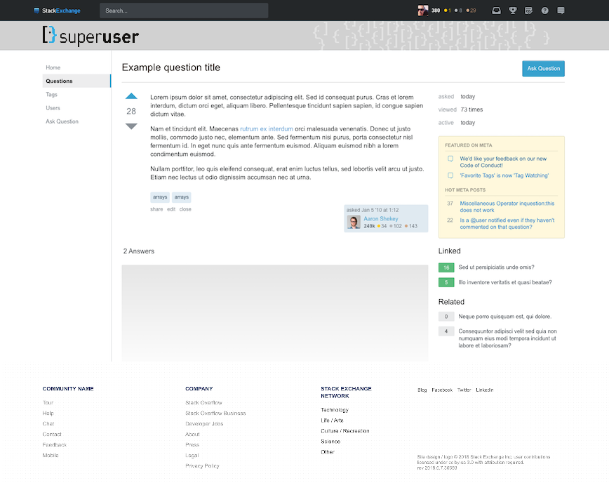
Super User

Almost anything would be better than the MSE/stock look-a-like being proposed.

However, as also mentioned by Journeyman Geek here and here, and by Kolappan Nathan here, I think it is very important to keep the current coloured logo.

I would prefer something similar to the Unix & Linux theme:

Mock up similar to Unix & Linux

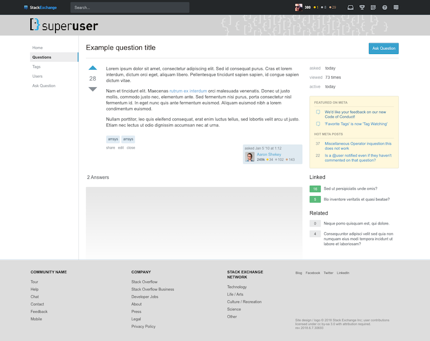
possibly with a grey footer:

Mock up with grey Footer

I'm not very keen on a black footer like Server Fault, though.

4
  • 2
    Your hired!. Seriously, actual constructive criticism and ideas. I considered doing my own mockups which keep the 'normal' current logo, the rest of the changes are something that'll happen anyway (footer being huge, sidebars etc.), at least have something individual about the colour scheme. Commented Jul 11, 2018 at 9:49
  • @djsmiley2k Thanks. When do I start? ;-) Yeah, I think keeping the current logo is the most important thing. I'm not too fussed about the the actual footer/header colours, except I don't like Server Fault's massive black footer.
    – robinCTS
    Commented Jul 11, 2018 at 9:56
  • r.e. the footer, I wonder if it's going to be visible like that all the time >_< Commented Jul 12, 2018 at 18:46
  • @djsmiley2k No. It should be just like this page and only visible when you scroll to the bottom. (MSE already has the new theme.)
    – robinCTS
    Commented Jul 12, 2018 at 19:42
45

Link colours

From a first glance, there seem to be quite a few problems still with choosing the proper colour palette tailored to the individual sites' themes as originally designed by SE's hired designers in an elaborate design process.

The voting buttons' colour has fortunately been fixed and tailored more to the site design. But from a first glance all the proposed themes seem to use the same light blue colour for links, some of them even on the user account boxes when they previously didn't. Sites like Tex.SE and MiYodeya.SE really stick out and just seem incoherent this way.

Now I don't have too much experience in professional UX design, but to me colours make a huge part of a working theme, more important that small icons even. The colours those sites' designs currently use have been well thought out to fit to their themes. And on a normal SE question/answer page links are not an all too uncommon find.

I'd really implore you to reconsider robbing the sites of this significant part of proper theming and design with unifying colours in this way. It should be a really small change but with a huge impact for identification and theming.

37

Mi Yodeya

Header

Could we increase the contrast between the Hebrew מי יודע and the background? On the current site, the background is lightened behind the logo, which is also where that text appears, so even though the text color is (apparently?) the same, the contrast is better.

Because the header background is constant across the width on the new design, we probably need to darken that text. Since the text is no longer overlaid on the logo, please consider making the Hebrew and English texts the same color.

Site-specific notice

I assume this is just because of how you did the mockups (those aren't our questions :-) ), but could you confirm that the "professional services" notice will appear as it does now? Where will that appear in a small viewport?

Tags

Is the coloring on tags (text and background) customizable? The "SE blue" isn't the best fit with our background color, though presumably I'll get used to it. Asking just in case that's something we can tune.

Question page

Thank you for preserving our voting color! SE orange would have definitely been jarring there.

4
  • 2
    Are you actually okay with the sans serif font in the question body? I remember MiYodeya being on the forefront of complaints about throwing away the custom fonts first and foremost because sans serif wouldn't work so well. But now they did do away with sans serif afterall and only kept it for the title. Commented Jul 9, 2018 at 20:48
  • 3
    @ChristianRau wait, what? I can't actually read the fuzzy text in the sample question body (I know it's lorum ipsum), but I don't see anything that looks like Hebrew there. What are you looking at? They promised us our Hebrew wouldn't get messed up, so I didn't go looking for that. Commented Jul 9, 2018 at 20:59
  • I'm just talking about the sans serif font in general. Am I imgining things or is noone actually seeing that? I haven't seen it adressed so far here or on MiYodeya and it seemed like a strong point. Commented Jul 9, 2018 at 21:03
  • 5
    @ChristianRau oh, I see what you mean! Yes, that does look like sans-serif body font, and that's going to be a problem for our Hebrew. Thanks for catching that. Commented Jul 9, 2018 at 21:04
36

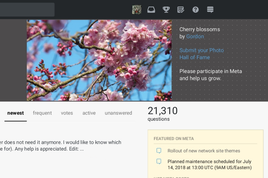
It's great that the Photography site will retain its "Image of the Week". It's been part of the site's look for a long time and would be sorely missed. I'm certain that there are other sites that will enjoy having a small spot in the upper right reserved for their site specific usage.

The only problem is that previously there were two important links and accompanying text associated with the photo: Submit your Photo and Hall of Fame.

While retaining the photo credit is important and was done, omitting those links will hide the fact that participation is open to everyone and that there are rules for submitting a photo. We don't necessarily need fewer submissions and definitely don't need the contest hidden along with the FAQ.

Here's the current upper right corner:

Current

Here's the proposed upper right corner:

Proposed

We need: An additional one or two lines under the photographer credit for those two links.

We will be supporting a per-site disclaimer (ala Judaism or Health) but we won't support a more general mod message at this time. If mods across the network think this is a thing we need to support we can consider a feature request. Based on the information I have, the way you're creating that message wasn't really how that functionality was designed to be used (most mods can't edit the HTML).

A line for the moderator-selected 'Site Message' ("Please participate in Meta and help us grow.") would also be appreciated. Deciding on this early and making it as cross compatible with the desires of other sites as possible will save the trouble of revisiting this point.

8
  • 1
    Maybe implement Image of the Week as dynamic community ad?
    – Raphael
    Commented Jul 12, 2018 at 13:22
  • Community ads have, upon mouseover, a 'footer' bar that includes a link to the relevant thread on meta. Maybe something like that could be done for the submit your photo and hall of fame links? This is, after all, writing new code (as in, it wasn't there before in the new template) that's piecing together bits and pieces from elsewhere, so it can happily include a couple more bobs and odd-ends.
    – E.P.
    Commented Jul 12, 2018 at 14:47
  • Implementing hover/mouseover for accessibility on mobile devices introduces more code and issues supporting different browsers, but with ADs (that might favor not clicking on) loss of functionality is less reported. We currently get 446 / 28 = 15.9285714 photo submissions per week, we don't want to do anything to discourage submissions. -- Challenges of implementing: Re-thinking “hover” functionality with touchscreens in mind, etc.
    – Rob
    Commented Jul 12, 2018 at 16:49
  • 9
    Hiding the links behind a hover-over footer bar would defeat the point of having a highly visible "Submit your photo" image. (How often do you see an ad or a photo and go "oooo, I think I'll mouse over it just in case"?) Commented Jul 13, 2018 at 19:23
  • Can we get this on gdse? graphicdesign.stackexchange.com could go a long way to increase our member engagement
    – Ryan
    Commented Jul 23, 2018 at 20:19
  • We want this on blender.se too. Everyone wants a Cadillac apparently ;)
    – gandalf3
    Commented Jul 23, 2018 at 21:38
  • 1
    @JoeFriend - Thanks for going to bat for us.
    – Rob
    Commented Aug 23, 2018 at 23:14
  • 1
    RE: "General mod message" - I don't think it needs to be more complicated than this comment box - except that only the Moderator would have write access, and if there was no message then nothing would be visible to non-mod users. --- Reusing 'comment box code' would allow 600 characters (maybe MathJax) and the same Markdown they are used to. If that's not the way we are going then that's how it is. Thanks for considering the request.
    – Rob
    Commented Aug 31, 2018 at 19:10
28

Those elements have been removed from both sites.

Super User + Server Fault

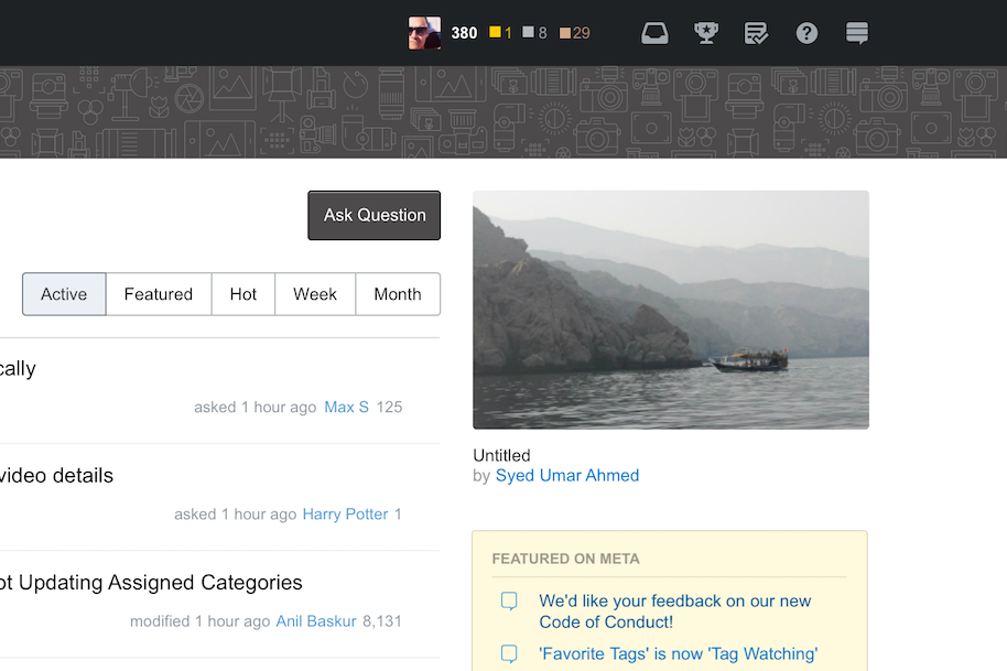
Is it just me, or are the proposed top-right patterns on those sites just way too chaotic? I'm referring to the unorganized pile of rectangles for Server Fault, and the squiggle-like set of unaligned braces and brackets on Super User.

And those are the parts of each page that I noticed right away. They just jump out. Not a good first impression, especially for new users...

A better "role model" to follow might be the subtle and smooth speech balloon pattern on the top right of Meta Stack Exchange.

9
  • 1
    On the other hand, pulling their attention over to the top right where the "Ask Question" button is might be a positive accidental feature. Commented Jul 9, 2018 at 22:14
  • 1
    Maybe, if the button is prominent enough so that the decorations don't steal all the attention.
    – jkdev
    Commented Jul 9, 2018 at 22:18
  • Now that you mention it, I noticed the "Ask Question" button and the top bar have very similar colors on Meta SE. Some other sites too. Why is that? Seems it makes the button hard to see and people might miss it...
    – jkdev
    Commented Jul 9, 2018 at 22:19
  • 10
    I just hope that Super User's mishmash of brackets have an equal amount of close brackets...
    – Robotnik
    Commented Jul 10, 2018 at 1:46
  • @Robotnik it is meant to be a face
    – Burgi
    Commented Jul 10, 2018 at 14:10
  • @Burgi I meant the stuff on the right of the theme, not the logo :-)
    – Robotnik
    Commented Jul 10, 2018 at 23:29
  • I actually really like the visuals on the right-hand side. In fact, the first thing I thought when I saw the new SF theme was "wow, I really like the graphics in the header, they look really modern" Commented Jul 11, 2018 at 18:03
  • I actually find the Server Fault art visually attractive, although it's hard to imagine what its connection is to the site. If there's going to be artwork, it should serve a purpose of representing the site in some way, not just be a location on the page to stick random artwork.
    – fixer1234
    Commented Jul 11, 2018 at 19:13
  • The Server Fault header image should have more red in it, I think looks a little bland in all gray. It would match the current ("old") theme where the red buttons are, even if just a visual reminder, sort-of.
    – chrki
    Commented Jul 13, 2018 at 6:00
25

Super User

Kindly do not change the logo color of Super User to all white. Preserve the dual colored logo which it currently has.

Ask Ubuntu

The footer color of the proposed design does not match with the theme. It would be great to have a footer color that matches with the Ask Ubuntu theme.

22

Super User

I think brand colouring and identity is important. I have slightly tweaked the proposed Super User theme to use the on-brand colour from the colourised Super User logo:

Super User logo

The right-hand side logo mosaic doesn't really represent the Super User logo that I am familiar with. The logos are disjointed, and it looks like they've just been plastered wherever the designer felt was good enough. I opted to replace that with a desaturated closeup of the most familiar parts of the Super User logo. Additionally, I have returned the dual colours back to the left-hand side logo (even though it's really black and white).

Super User theme redesign

6
  • 3
    It’s “better”, then what’s being proposed, my complaint with the theme is the sidebar. I could never figure out how to get to active new questions to be first. Easy with the current theme
    – Ramhound
    Commented Jul 13, 2018 at 2:18
  • 2
    The giant user on the right side is spying on me through a gap in the UI... Commented Jul 13, 2018 at 13:36
  • 2
    This is a good design, and I like it. But, why be so dismissive of the efforts of another person? I can't upvote the snark. :-/
    – jpaugh
    Commented Jul 13, 2018 at 18:03
  • 1
    @jpaugh hmm.. you are right. I guess my reaction is somewhat based on the fact that there has been effort put into the design, but perhaps not a lot consideration for keeping true to the overall brand of our site. I’ll consider an edit when I am near my computer to come across as more constructive. Commented Jul 13, 2018 at 21:52
  • @Ramhound You just need to click on questions in the sidebar. Commented Jul 15, 2018 at 10:51
  • @MichaelFrank this is fantastic - much better than the currently proposed design - I like how you incorporated the colors. -SU mod.
    – studiohack
    Commented Jul 31, 2018 at 12:37
21

The Internet has a surfeit of sites that exist for no reason other than to slap ads on copied Stack Exchange content, in the hope of making a quick buck. (For more on this, see A site (or scraper) is copying content from Stack Exchange. What should I do?.) A substantial number of these sites use very generic-looking designs, and often use the site's topic as a title. For example, you wouldn't see "Shady Content Farm - Software Engineering Q&A" at the top of such a site, but you might see "Coding questions" or just "Programming".

The proposed stock theme, while much better than those leeches' themes overall, appears to fall into the same pattern when it comes to titles. Even with the official SE header bar in place, I'm afraid that the majority of users might confuse our beta and other not-yet-custom-designed sites with untrustworthy content thieves because of the design's plainness in conjunction with its focus on a large, unstyled subject-matter-for-a-title. As a result, they might think SE sites aren't trustworthy, or worse, think that SE itself is some kind of rule-breaking content thief.

To be fair, this applies to the existing beta theme as well—in fact, I think there might be an existing MSE post about that; I couldn't find it after a few minutes of searching, though—but I see the current moment as an opportunity for improvement at minimal marginal cost.

0
17

Quantum Computing

Currently, QuantumComputing.SE is a bit unique, in that it has a sponsor for the site. This means that it has a design that incorporates e.g. the logo of the site sponsor.

What's going to happen with that? Is the logo and other stuff going to stay?

3
  • There appears to be no technical barrier to having the logo remain on the right side of the header, as מי יודע is placed there in the new Mi Yodeya design. Commented Jul 10, 2018 at 14:20
  • 1
    There are also several other logo proposals that have a stronger connection to the site's subject. A re-design would be a good time to look at those.
    – E.P.
    Commented Jul 12, 2018 at 14:50
  • We pre-designed a version of sponsored sites when that was rolled out so we should be good.
    – Joe Friend StaffMod
    Commented Jul 17, 2018 at 23:14
15

Stock Theme

I agree with other posters that it looks too much like Meta Stack Exchange. A better color would be light blue (as we have now for Code Golf, Open Source Beta, etc.)

The thin white sans-serif font for "Community Name" also jumped out at me. I've never seen that on any SE site, and I hope it's changed before the theme is published.

13

The new theme has a site identification bar that no longer holds the menu items that have been moved to the left side. In their place, new artwork has been invented.

  • Ask Ubuntu, Ask Different, and Stock Theme: solid color, at least it's simple and neat.
  • Mathematics and Photography: wallpaper of a regular pattern, easy on the eyes
  • Unix & Linux and Mi Yodeya: faint recognizable object (diagram and Hebrew letters); a more regular diagram would be preferable on Unix & Linux, but at least the one shown doesn't immediately trigger projectile vomiting.
  • Server Fault: regular artistic pattern with a little visual interest
  • TeX and Super User: a chunk of jarring faint irregular noise

I have a hard time imagining worse artwork than used for TeX and Super User. Those two artworks trigger a visceral negative reaction. They are actually hard to look at. Luckily, I don't use TeX, so I don't have to see it. But that trash needs to be cleaned on Super User. Even going back to a solid color would be preferable.

I'll also add that the original two-color logo served as a site brand. Making it one color is unnecessary, and a degradation of the logo.

2
  • Actually, I was pretty disgusted at the Unix logo, when I finally saw it (it is very faint). The one on TeX doesn't impress me, but it doesn't look so bad either. Commented Aug 13, 2018 at 0:58
  • The TeX's top banner is highly hated in the community itself, so I truly hope something will happen with that.
    – yo'
    Commented Aug 14, 2018 at 9:16
12

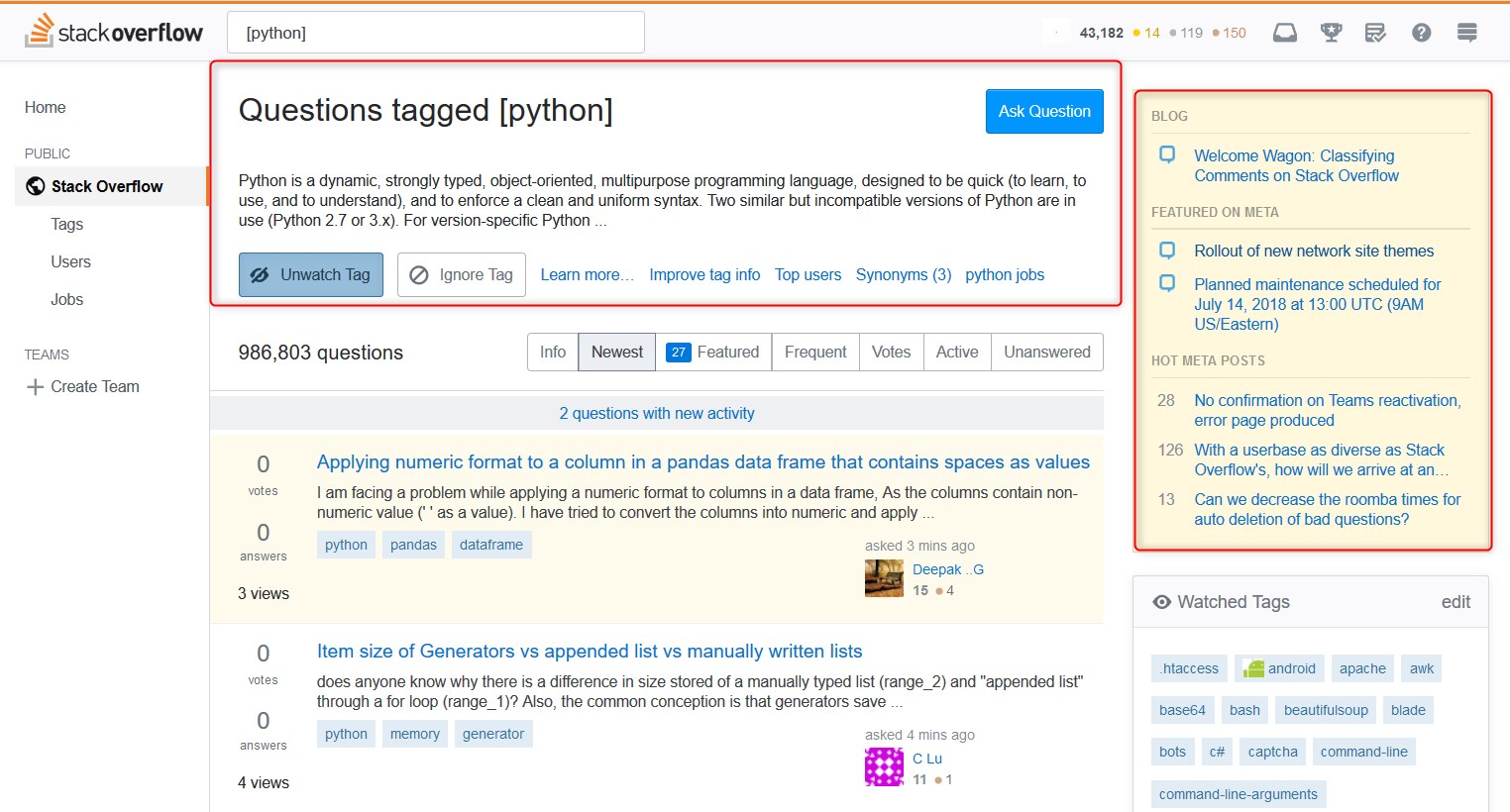
All Stacks

enter image description here

I normally browse new questions by tag on Stack Overflow and I don't like to see the same tag definitions over and over again taking 1/3 of the viewing area. I'm also not interested in BLOG, FEATURED ON META or HOT META POSTS, at least all the time, I'd like to click on tags (alphamagically sorted?) without having to scroll every time.


Improvements?

  1. Templates should include options to close or hide certain page blocks.
  2. Users should be able to personalize their habitat and feel conformable asking, answering and moderating questions.
3
  • Pedro, we will have future improvements coming soon (look for a meta post this week) that will address your concern. That said, this above design isn't likely to change for now.
    – Joe Friend StaffMod
    Commented Jul 17, 2018 at 22:54
  • 3
    @Joe So what is the point of asking for feedback if you aren't going to address the issues? "If it isn't broken don't fix it." There was no reason to start this new gimmick and introduce more problems when there are plenty of important issues to work on.
    – Masked Man
    Commented Aug 10, 2018 at 11:51
  • 1
    @MaskedMan: Not saying I agree with the whole "Ask for feedback and then ignore it" schtick, but they did say this redesign is blocking other improvements, possibly including some of the things you are currently thinking of as more important.
    – Kevin
    Commented Aug 15, 2018 at 0:24
12

Two nearly-coincident rgb values chosen at one point resulted in Why is the changing-link-color scheme so subtle for beta sites?. It's difficult from the mock-up images to tell if this has been tweaked. Any chance the contrast will be adjusted?

The reason this is important is that sometimes sequential words or phrases have separate links. With the changing highlighting this is easily visible upon mouseover. Otherwise there's only the tiny url reveal at the bottom of the browser.

From that question (both are GIFs):

enter image description here

versus

enter image description here

10

I think it's good for people to be skeptical when changes are made. So, I'd like to point out that the Question described one stage of the proposed schedlue like this:

  • Early July: Collect and respond to feedback from this post

However, this very post didn't exist until 'early July' had already past. It was posted on July 9th.

Will 'late July' in the next stage of the process be July 16th?

Or will there be a meaningful consultation/feedback process which allows for enough time for feedback to be both given, digested and acted upon?

4
  • 3
    Our once beautiful and quirky EL&U theme, especially before the jet-black topbar was enforced upon it, what will it be like now? Its glory days are counted. :( Commented Jul 12, 2018 at 0:29
  • The point of this post was to collect feedback. I'm working on responding to it all and then we will start implementation with that feedback in mind.
    – Joe Friend StaffMod
    Commented Jul 17, 2018 at 23:21
  • 1
    Early August is upon us (scared face) Commented Aug 3, 2018 at 21:24
  • 1
    Start the countdown. The new theme/style is horrible. Commented Sep 5, 2018 at 11:28
7

Ask Ubuntu theme

I worry that there's not enough contrast in Ask Ubuntu's new footer. Looking at the Unix & Linux footer, the foreground is #898989 and background #fff, so a contrast ratio of 3.50:1, whereas Ask Ubuntu's #fff on #aea79f only gives a ratio of 2.38:1. Could a darker background colour be chosen?

6

Mi Yodeya

I like the changes overall, including the Hebrew text on the top right.

I notice that, in the previous design, the tree's branches and roots are centered. Now that the site name is on the top left, for consistency with all other SE sites, it may not make sense to have the roots visible at all, especially if they're on the bottom right where they don't match the rest of the pattern.

2
  • 1
    Ideally they should move to be under the logo, which is the top of the tree. Commented Jul 10, 2018 at 2:36
  • I was thinking that. Although then they'd overlap with the links "Tour," "Help," "Chat," etc. which would make those links less easily visible.
    – jkdev
    Commented Jul 10, 2018 at 2:41
6

GD.SE would like to have an image of the week similar to Photography. Those dimensions are fine to minimize coding.

2

Will it have have similar issues to the one introduced by the "Live: Left nav, new theming and responsiveness" - there some complaints were (to summarise):

  • Search field was weird size
  • Focus of left navbar/taking up too much (white)space (especially on small screens!)
  • Doesn't scroll with page (Looks fixed?)
  • It moves the right nav to the bottom (if it makes it redundant...)
  • Could toggle left nav it with a button for better small screen compatibility (that demo from here?)
  • etc...

IMHO, this could work - just please test and make sure it works soon as in scenario's with small screens!

1

You must log in to answer this question.

Not the answer you're looking for? Browse other questions tagged .