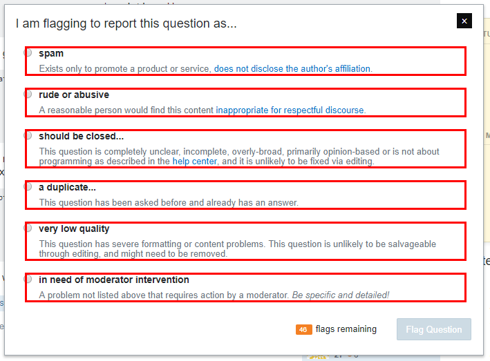
We're no strangers to discussion of the flag dialogues, particularly when it comes to comment flags. Since that discussion two years ago we've been reassessing how comments are used on the network and have found that we need to change how comment flagging works - as Tim Post said in the Code of Conduct announcement blog post:
But we’re not done, not by a long shot. Our research indicates that the most problematic places on our sites tend to be free-form comments, so we’re working diligently on coming up with a way that lets users express feedback through the system; this not only ensures that users see compassionate, actionable guidance, but also helps remove the perception that there are people taking pleasure in picking at their work.
To that end, this post is here to highlight the user interface changes that have been made over the last weeks and talk a bit about the new text and how it furthers the goals of the Code of Conduct while also making flagging clearer for everyone.
There are a number of considerations in this process which include:
- How can we make flagging easy and accessible to users?
If problematic or unnecessary content isn't flagged, removing it is difficult, so we need to be sure that users:- know that flagging is an option, particularly users who are unfamiliar with the sites.
- know how and when to use flags without making the flag dialogue too text-heavy or complex. We want to be particularly mindful of people who may not speak English as a first language.
- How can we make flag handling easy and clear for moderators?
Moderators are largely responsible for handling comment flags and some sites get huge volumes of them, so we need to be sure that moderators:- aren't overloaded with many extraneous/noisy flags by being clear about when flags are appropriate, particularly custom flags.
- can easily decide whether a flag is valid or not based on the flagging text.
Making flagging obvious and accessible.
The first changes that were made revolved around making comment flagging more obvious to users by having the flag icon visible at all times and accessible to low-reputation users by running a test on Stack Overflow of allowing users with less than fifteen reputation to flag comments on their own posts, including on answers to their own questions. As of right now, both of these are undergoing testing and may be updated or adjusted in the future, specifically:
There's a lot of discussion about how noisy having the flag icons permanently visible on the page on every comment you can flag would be. That's understandable. The question is, does the benefit of permanent visibility outweigh the extra noise it might create, or will it simply create noise for limited gain? If the latter, how can we address this while making flagging more accessible for everyone?
When it comes to allowing <15 reputation users to flag comments, we're looking at how much this affects the flag queue for moderators - are we seeing a huge uptick in flags and, if so, are those flags marked helpful or declined?
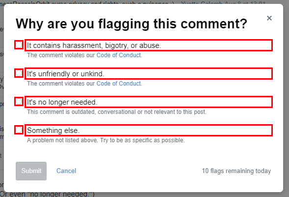
UPDATED: Adjusting flagging reasons to connect with the Code of Conduct.
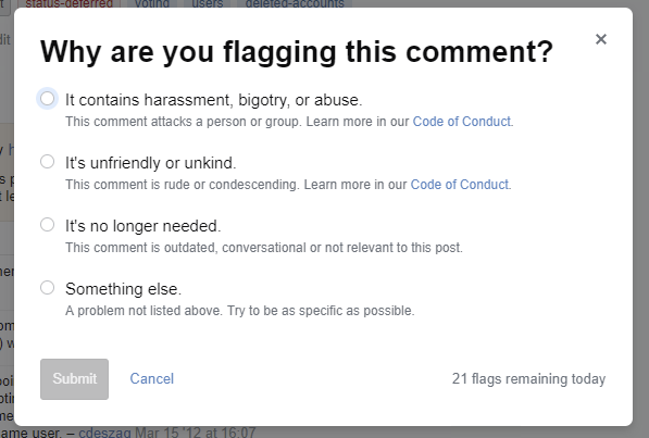
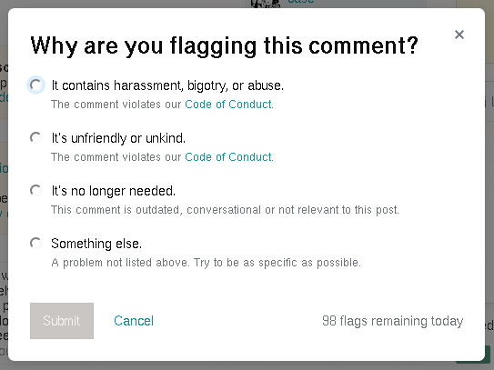
A lot of the concerns I've heard in the last few months revolve around users having difficulty determining whether a comment was bad enough to be called "rude or abusive" or if it was more on the side of being unwelcoming without crossing into abusive territory. To address this, we've split the rude or abusive flag reason in two parts:
We've separated attacks on people or groups from general rude behavior and added explanations for each flag type.
- It contains harassment, bigotry, or abuse.
This comment attacks a person or group. Learn more in our Code of Conduct. - It's unfriendly or unkind.
This comment is rude or condescending. Learn more in our Code of Conduct.
The first flag should be used for blatantly abusive statements while the second should be used for statements that are rude or unwelcoming but don't cross the line into attacking a person (or the content they've posted) or a group of people. I go into more detail about this in a related answer.
In general, you're more likely to need the second option than the first but having two options helps our moderators see the degree to which someone is breaking the Code of Conduct and - in the case of high-flag-volume sites - triage handling the more severe flags first. If you never use the first option, that's fine too. Both flags bring the comment to the attention of our moderators.
In addition to this, we've made some adjustments to the text for the other two flag reasons though their intended usage is unchanged. For information regarding the changes to the "no longer needed" flag, see my explanation here.
Flag dialogue user interface changes.
As part of the ongoing work to standardize the user interface across the Network, when updating this flagging interface, it's been brought in line with Stacks, the CSS & pattern libraries for the Network. As various updates are made, you can expect to see more of the sites' infrastructure become coherent with this design.
In addition to this, a thank you response toast notification was added when a user flags a comment to show appreciation for that flag - and in the case of unwelcoming or abusive flags, an apology for the comment. The implementation for this is still being moved over to the Stacks styling, see this related answer on Meta Stack Overflow for more information.
As you may guess, a lot of this UI design is still a work in progress. Several users have pointed out some concerns they have. If you have some of your own, please feel free to do the same.
It's our goal to be as up front and open about these changes as we can be. If you have any questions about the updated comment flagging that's not addressed here, please let us know.

