121

The Public Platform team would like to announce another release in a series of planned work for the Review queues. This release focuses on refreshing the queue user interface in preparation for further improvements to the user experience. Starting today, we will roll out these changes in three phases across the network.

Roll-out plan

We have planned for these UI changes to ship in three distinct phases affecting specific queues across the network. We will update this post as each phase is rolled out.

What Where When
Phase 1 • Home page (/review)
• Close and reopen votes queue
• Stats/History view
• Steward badge
Meta Stack Exchange
Meta Stack Overflow
Shipped!
January 28, 2021
Phase 2 Changes from Phase 1
• Suggested edits queue
• Low quality posts queue
• First posts queue
• Late answers queue
SuperUser
Ask Ubuntu
Shipped!
February 16, 2021
Phase 3 Changes from Phase 1 + 2
• Triage queue (SO only)
• Help and improvement queue (SO only)
All network sites Shipped!
February 23, 2021

UI changes to all queues

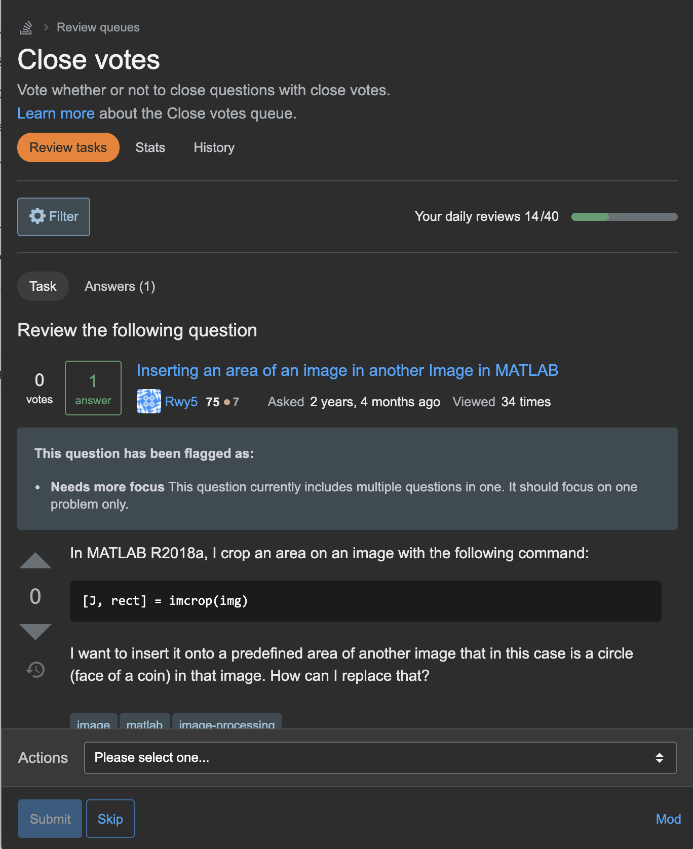
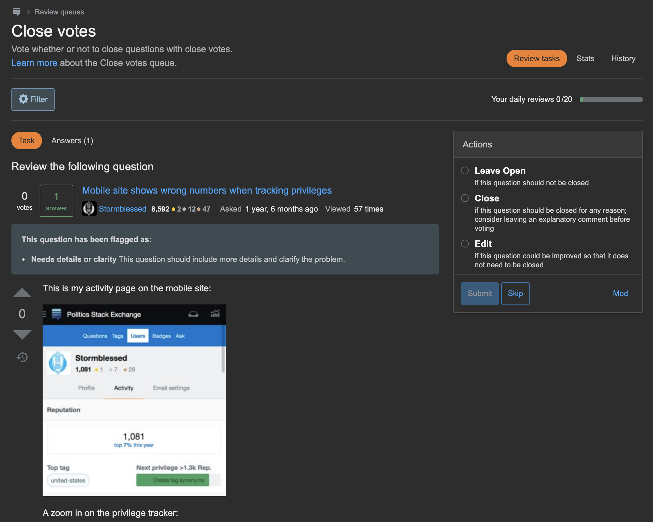
updated close votes queue

All review queues will be adopting a new user interface that focuses on providing reviewers with context to make deliberate, thoughtful decisions on review tasks. We shared an initial design proposal in our product discovery phase and made sure to include that feedback into the final design.

Responsive/Mobile-friendly design

new mobile view of close votes queue

We utilized Stacks to update the visual design in the review queues. As part of this update, we were also able to make the queues responsive and utilize mobile-friendly UI components.

Changes

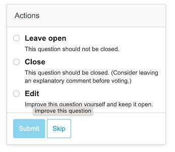
  • Actions menu - We’ve removed the action buttons for a menu-style component. Selecting an action now requires a bit of pause and mitigates robo-reviewer behaviors we've seen in the past. Instructions are now always visible and associated with each action.

  • More context - Users can now toggle between the review task and the necessary context (original question, answers, and comments) on the task page to assist in making educated decisions on a task. No need to open new browser tabs!

  • Vote controls and follow feature - We heard from you that being able to vote directly on all tasks as well as the option to follow posts and receive updates on changes would help in the reviewing process. These features will be available in all queues.

  • Filter button - We’re highlighting this feature (where it’s available) with a button and replacing the easily missed text-link.

  • Review count - We’ve removed the badge progress bar in lieu of keeping track of how many tasks you can complete in a queue (don’t worry, the badge bar isn’t gone).

Review home page

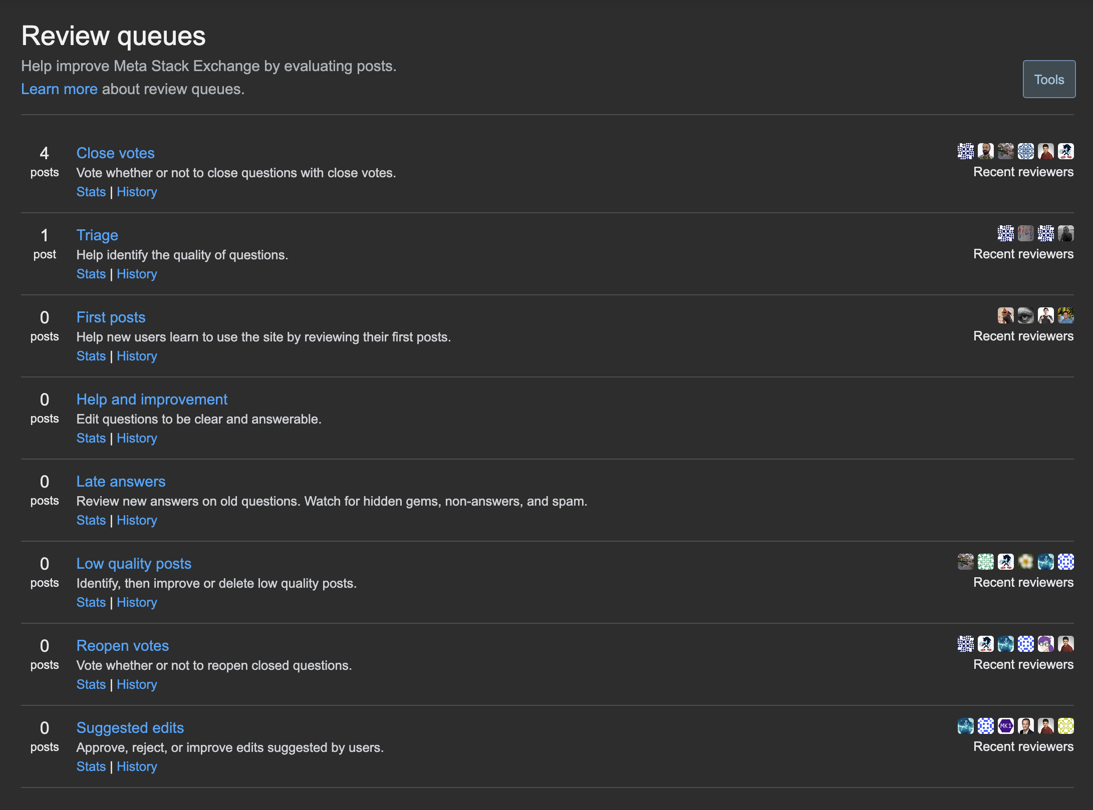
updated review queues home page

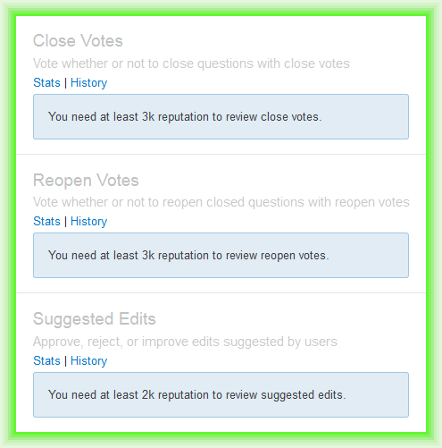
The review homepage has received a Stacks update as well, setting it up for forthcoming plans to create better onboarding for new reviewers. This page now provides a bit more information to new reviewers.

Changes

  • Only the queues available/earned by the user are clickable

  • Includes additional text about necessary reputation to earn access to new queues

  • Available queues are prioritized to the top and then sorted by the number of tasks in each queue

Additional updates
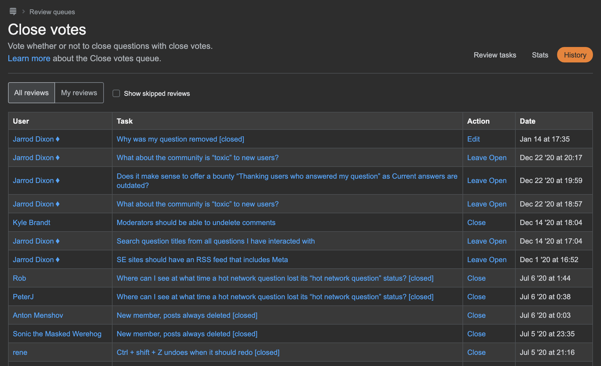
updated history page

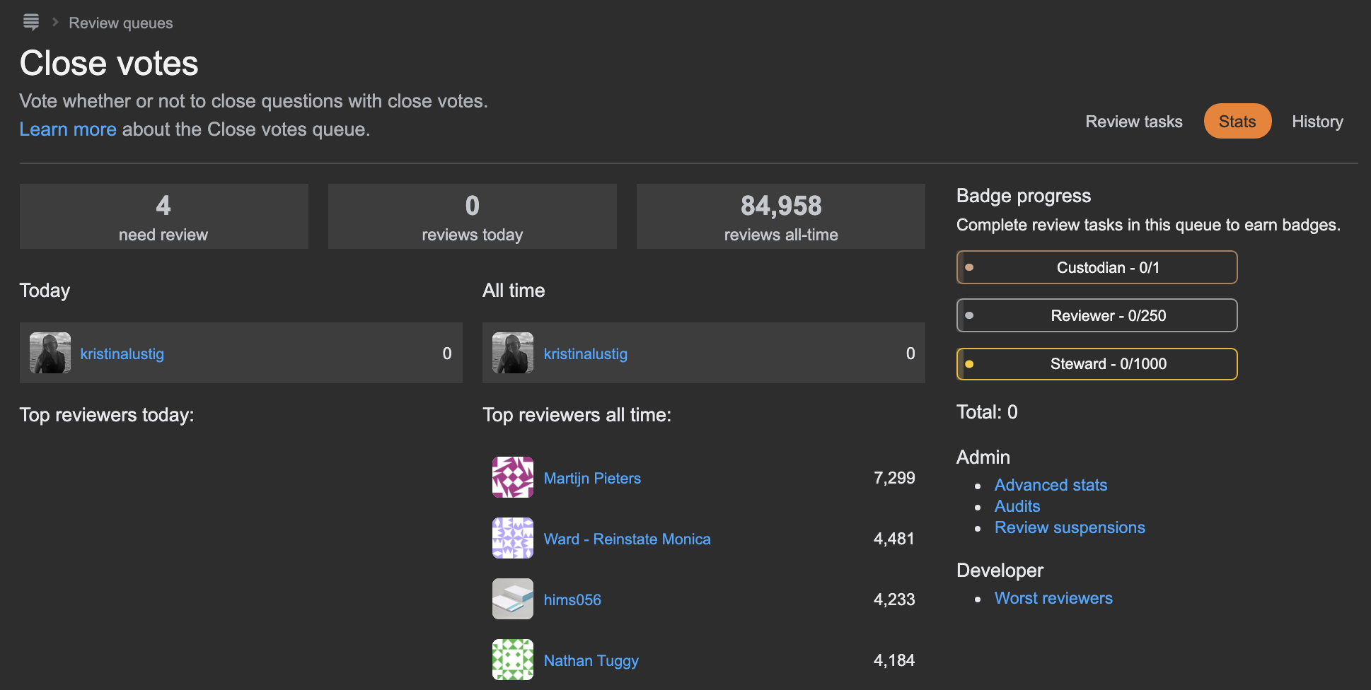
updated stats page

All aspects of the Review queues are receiving some much needed design attention. Here a few more changes you can expect to see:

  • There is more incentive to continue reviewing. The Steward badge can now be earned multiple times for every 1,000 reviews in each queue. If you have already completed 2,000 or more reviews, we will backfill any additional Steward badges that you have already earned. You can expect to see them accrue over the next few days.

  • History view - Added and rearranged a few UI components so that users can better navigate and utilize the page

  • Stats view - Updated badge progress bar

Feedback

Please leave any feedback or bug reports related to this release below this post. We will be reviewing responses on this post for one month following Phase 3 (March 23, 2021). After March 23rd, please ask a new question to report any new issues.

35
  • 27
    You have Dark Mode on ... Meta Stack Exchange? I knew about Meta.SO from Catija's screenshots in the stacks-editor announcement ...
    – Glorfindel Mod
    Commented Jan 28, 2021 at 17:41
  • 7
    What's behind the decision to show the "questions list" view of the post title, its asker, and ask date instead of the normal question view? Likewise, why are you injecting the meta information about the review item in between the title and the post body? Both of those decisions are confusing to me.
    – TylerH
    Commented Jan 28, 2021 at 23:24
  • 15
    Look at the dates and names in those screenshots, @Ollie / Glor - this is likely a local or dev-tier build running against a dump from the MSE database. Any theme can be selected in that context - dark-mode Physics, for instance. Which just leaves the question of why Lisa is NOT using dark-mode Physics?! 😏
    – Shog9
    Commented Jan 29, 2021 at 1:46
  • 4
    Thanks for adding responsive design. I use the site (math.se) exclusively on mobile device and it was a real pain handling reviews . Commented Jan 29, 2021 at 2:21
  • 5
    I think it would've been better if Phase 1 included an opt-in on Stack Overflow. Only ~900 users have access to the Close and reopen votes queues on Meta.SE and Mata.SO's queues are almost always empty :(
    – 41686d6564
    Commented Jan 29, 2021 at 9:31
  • 5
    The giant gap between the title and body of the question is jarring and confusing. The body follows from the title, so putting the reason for flagging between the two like you did is like putting it between the first and second paragraph of the question. Except this is worse in some sense, as the title is now part of an entirely different thing and doesn't appear to be the title of what appears below at all any more. That thing also duplicates the score and answer count. Commented Jan 29, 2021 at 21:11
  • 3
    @StephenRauch Probably because the user profile image is not relevant info to have for reviewing posts, and screen real estate is limited as it is
    – TylerH
    Commented Jan 29, 2021 at 22:16
  • 5
    Wow, you can update the Review Queues but still cannot deliver site designs? Some sites have been waiting nearly five years to get their look feel updated as promised. You implemented a generic site design which was supposed to standardize and make easier the rollout of the designs. That was a few years ago now, too. So, just curious? You have time for this but not for site designs? Commented Jan 30, 2021 at 13:49
  • 5
    @Pᴀᴜʟsᴛᴇʀ2 I understand your frustration and I know that it's difficult to be waiting for so long. But we can't make site designs at this point. We have major needs for improving very basic elements of our sites so that they function well and so that people understand how to use them. This change improves the review experience network-wide, site designs benefit a single site and are purely cosmetic. On smaller sites, the improvements to review may not be as important but these are still valuable changes.
    – Catija StaffMod
    Commented Jan 30, 2021 at 14:56
  • 3
    @Trilarion it's not that they aren't important... but it's like trying to paint a house while the foundation is failing. Paint serves a purpose in protecting wood siding and making the house look approachable but I don't think anyone would argue that painting a house that has identical paint to the ones in the neighborhood but has foundation issues is the right choice - do you?
    – Catija StaffMod
    Commented Jan 31, 2021 at 16:17
  • 5
    @Pᴀᴜʟsᴛᴇʀ2 They probably cannot deliver site designs because they are working on review queue updates (among other things). The review queues have been needing an overhaul for more than 5 years anyway. Sites can wait to have a new background image.
    – TylerH
    Commented Feb 1, 2021 at 16:10
  • 4
    Does the new version include the ability to flag low-quality spam, or do we still need to open a new window for that?
    – Mark
    Commented Feb 3, 2021 at 21:30
  • 5
    @Braiam, yes, there is: the system can automatically decide that a post is low-quality, or someone could flag it as "very low quality" instead of "spam".
    – Mark
    Commented Feb 16, 2021 at 21:54
  • 3
    Answering for Lisa here @TylerH - we're following the answers to this question closely, so this is still the best place to share your thoughts.
    – kristinalustig StaffMod
    Commented Feb 24, 2021 at 16:51
  • 3
    @SonictheAnonymousHedgehog yes - please do. sorry it got passed over, but submitting it as a new question is definitely the best way to get it looked at.
    – kristinalustig StaffMod
    Commented Apr 11, 2023 at 15:24

113 Answers 113

116

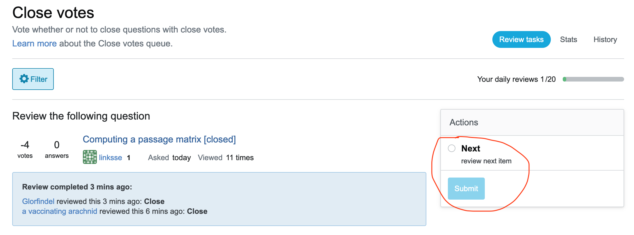
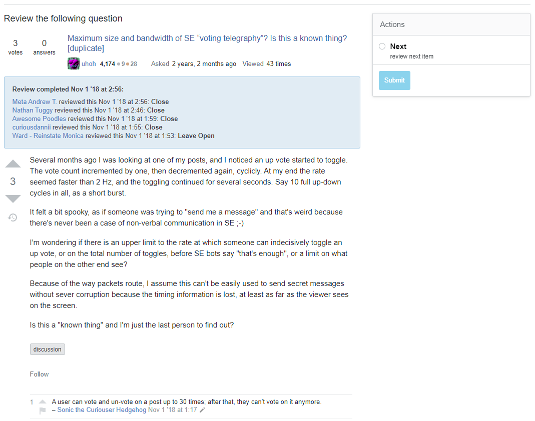
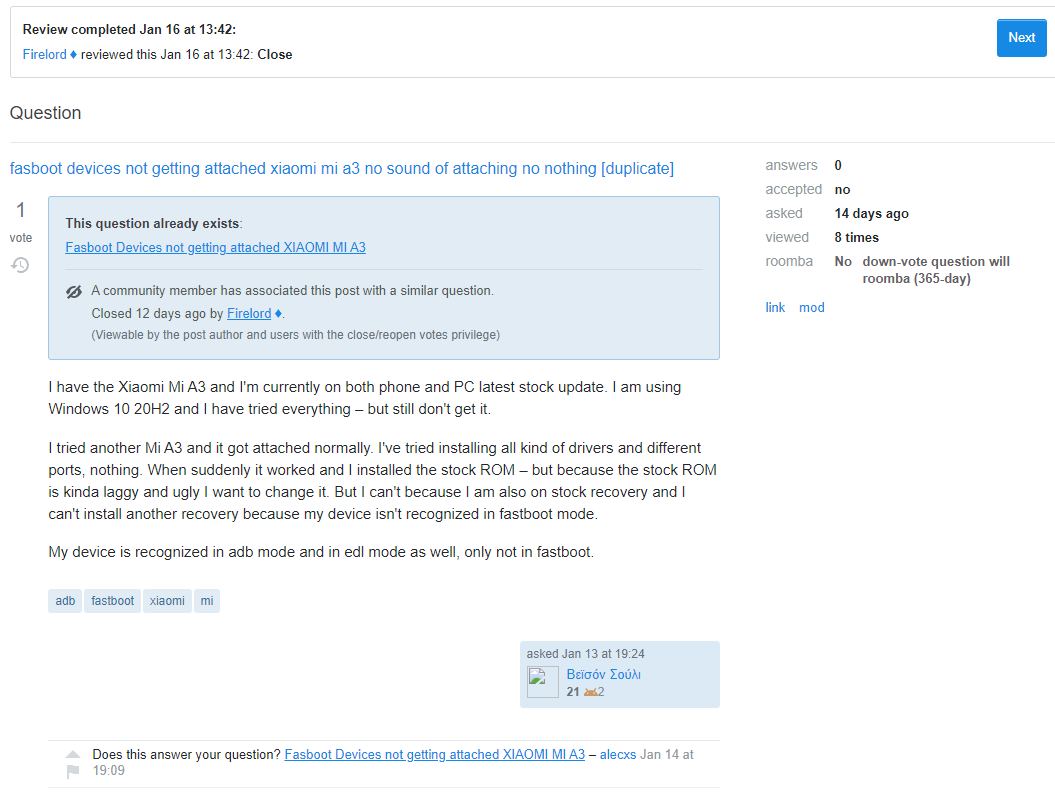
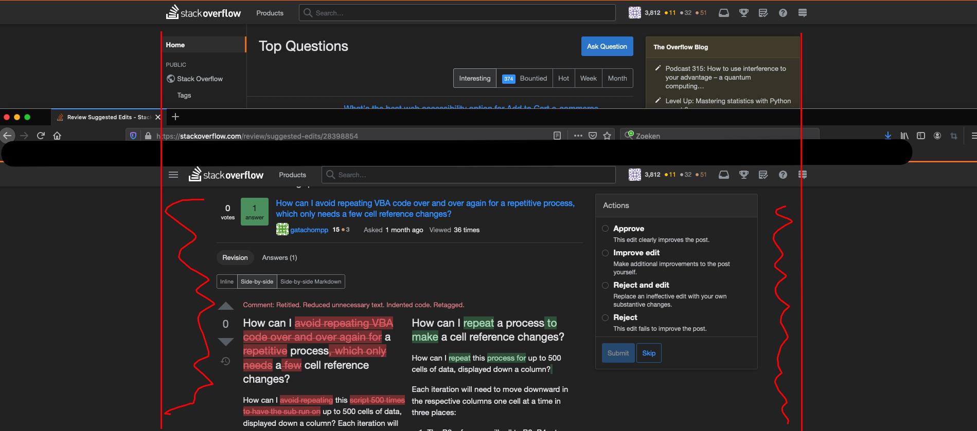
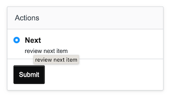
In the old review queues, when you visit a completed review, you can just click Next to proceed. Now you have to check the radio button and click 'Submit'. Can this be just a single click please, just like 'Skip' also is in the new queue? My touchpad will thank you for that.

enter image description here

2
  • 43
    Yeah, that's very annoying. Should be one-button action, like "skip". Next isn't even an action, while Skip technically is!
    – Shog9
    Commented Jan 28, 2021 at 19:19
  • 3
    This issue appears to have been fixed. When I go back to a review I have completed, I now see a blue "Next Task" button inside the blue banner. (Just like in the new banner after an audit.) Commented Feb 24, 2021 at 14:03
66

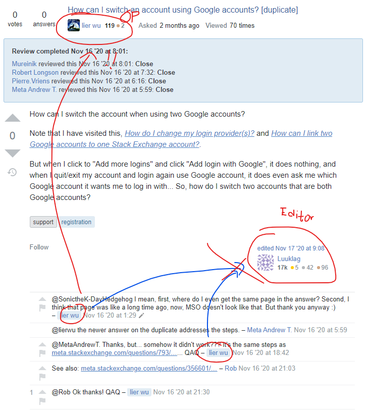
Not sure if it’s a bug or deliberate change, but something that has been tripping me over and over while viewing the history is that the placement of the editor’s user card looks more prominent and can be mistaken as the OP.

P.S. Well, I think I have to get accustomed to now... (cue XKCD #1172)

5
  • 20
    Good feedback - we were talking yesterday about modifying that design to include just a small avatar and user name beside the edited text and moving it back left. I'm not going to add the status-planned tag just yet but we are thinking about how to fix that.
    – kristinalustig StaffMod
    Commented Jan 28, 2021 at 18:36
  • 3
    @kristinalustig Any update on this discussion? Would really love to see the author info back in a usercard at the bottom right just like the normal/organic question view shows it (and have the editor usercard in the bottom middle of the question).
    – TylerH
    Commented Feb 24, 2021 at 16:25
  • 2
    @TylerH We haven't started work on this yet but Brian added it to our backlog with some notes - he and I will chat about it this week or next and figure out the best way to proceed. We'll update this answer when we do have something to share!
    – kristinalustig StaffMod
    Commented Feb 24, 2021 at 16:49
  • 1
    @kristinalustig Awesome, glad to hear it. It immediately and consistently trips me up in the queue 0:-)
    – TylerH
    Commented Feb 24, 2021 at 20:14
  • 4
    Thanks for the report. We've gone ahead and added back in the "asked by" card at the bottom, which will keep the information where you're used to seeing it. We weren't saving any vertical space anyway because the edited card was still the full card. We may go ahead and make some adjustments to this in the future, but we'll be sure to keep this particular issue in mind as we make future changes, and we'll work to keep the placement of various bits of information consistent. The update will be in the next build, either later today or tomorrow.
    – kristinalustig StaffMod
    Commented Mar 9, 2021 at 18:30
48

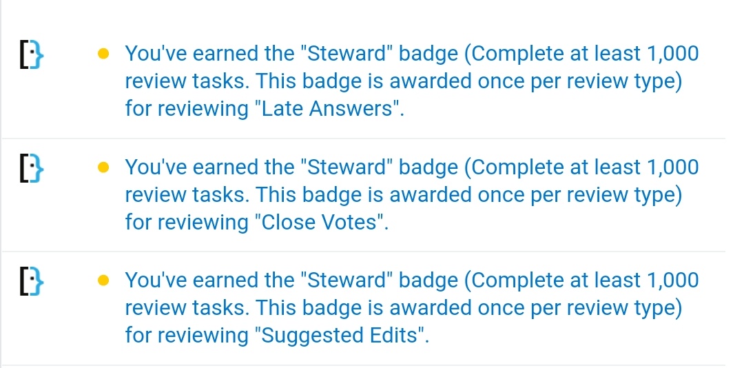
The Steward badge can now be earned multiple times for every 1,000 reviews in each queue.

The badge descriptions do not reflect this and need updating

7
  • 24
    We can't update these strings on a per-site basis, so we're in a position of having to decide to leave them as-is for the sites getting early access to this new functionality - or - going ahead and changing the text everywhere. We discussed it and, since the change will be true eventually, we're going to change the string network-wide now and wait to award the badges when the change launches to the network.
    – Catija StaffMod
    Commented Jan 28, 2021 at 17:48
  • Ahh, now I've read this, it all makes sense the recent odd system behavior.
    – W.O.
    Commented Jan 29, 2021 at 15:43
  • 3
    It's very nice to have this badge change buried under "Visual design changes to the review queues" titled post
    – user379859
    Commented Jan 29, 2021 at 17:12
  • 5
    @Kos: There have been two other posts dedicated to the topic: Award criteria of the steward badge changes and Steward badge can now be awarded multiple times. Commented Feb 2, 2021 at 7:42
  • @Scott I feel there a lot more which is happened because people had questions and they didn't have answers
    – user379859
    Commented Feb 2, 2021 at 15:17
  • 1
    With a significant amount of feedback- I suspect that it's just kinda lost in the clutter. I for one find the sheer number of answers overwhelming
    – Journeyman Geek Mod
    Commented Feb 2, 2021 at 15:33
  • 1
    @Scott Those posts were made a day after this post (one by a normal user stumbling upon it), and this post is the one whose subject also brought the multi-award change to the environment, so it's not an unreasonable criticism that this post should have mentioned it.
    – TylerH
    Commented Feb 3, 2021 at 14:31
42

Immediate reactions

(no posts in the queues, so going off screenshots):

  • Love seeing the presentation of posts being brought back into line with question pages. In particular, the stats at the top are a lot harder to miss than the sidebar on the old UI.

  • Love the responsive design - phones are an ideal interface for review, as it involves lots of small tasks; perfect for standing in line at the grocery store.

  • I personally hate dropdowns for actions: they default to hiding what is available. On mobile they have the additional issue of being modal: I can't both select an action and scroll through what I'm acting on. And I use an Android phone, where they're actually kinda usable; from what I've seen, this will be a real problem on iOS devices, where they present a weird scrollable UI seemingly inspired by "The Big Wheel" from the old Price is Right gameshow.

    an iOS select picker next to that wheel from the gameshow

    Remember: the goal here is for folks to make informed decisions based on a careful examination of the post being reviewed - anything that separates the action from the post risks working against that.

  • I'm a little bit concerned about the position of the task description itself: putting it between the post stats and the post seems... Odd? It actually took me a minute to find it.

Other thoughts

The make-or-break for this is gonna be how folks actually use it. Voting in particular is potentially problematic: when we first tried that, it resulted in a MASSIVE skew for voting on Stack Overflow.

I'm happy to see that you intend to test this on Ask Ubuntu and Super User - they get enough traffic to potentially flush out some issues. I'm unclear on whether you're rolling out the phase 1 changes there before you do on Stack Overflow.
Regardless, it will be critical that you monitor behavior after this goes live. Not just how many reviews are done, but the breakdown of their disposition and side-effects. For example, if more First Posts are upvoted and later closed, there's something weird happening; if more posts going through the close queue are being downvoted and answered, there's an issue. Etc.

Looking forward to trying this out on my phone once it's live on a real site!

12
  • 8
    SO will be part of Phase 3, so it won't get any of these changes until we've seen them in action on SU and AU. :)
    – Catija StaffMod
    Commented Jan 28, 2021 at 18:01
  • 4
    "it resulted in a MASSIVE skew for voting on Stack Overflow" is there any reference of that? What was the problem?
    – Braiam
    Commented Jan 28, 2021 at 18:25
  • 7
    Yeah, the dropdown isn't really nice on iOS: i.sstatic.net/Gnl7b.jpg - you have to click 'Done' before you see the change. And the 'action bar' floats all the way to the bottom if you scroll.
    – Glorfindel Mod
    Commented Jan 28, 2021 at 19:05
  • 2
    Is that... One single screen @Glorfindel? Or did you paste together two separate ones? It is very confusing.
    – Shog9
    Commented Jan 28, 2021 at 19:07
  • 1
    Sure, @Braiam - meta.stackexchange.com/questions/149621/…
    – Shog9
    Commented Jan 28, 2021 at 19:07
  • 1
    One single screen, iPhone 11 / iOS 14
    – Glorfindel Mod
    Commented Jan 28, 2021 at 19:08
  • 22
    Wow. Just... Wow. Every time someone shows me a <select> from iOS, there's something new to facepalm about.
    – Shog9
    Commented Jan 28, 2021 at 19:09
  • 1
    What does it look like on Android? I don't really have a strong opinion on the select from iOS, but I've only used iOS and desktops.
    – jrh
    Commented Jan 28, 2021 at 20:06
  • 1
    @jrh on Android the dropdown is shown as a modal dialog Commented Jan 28, 2021 at 21:11
  • Oi, SU is a real site :D
    – Journeyman Geek Mod
    Commented Jan 29, 2021 at 8:37
  • 1
    It's not live yet on SU, @JourneymanGeek! (Not that I have enough rep there anyway though)
    – Shog9
    Commented Jan 29, 2021 at 17:18
  • @MetaAndrewT. ah... yeah, that is much better. For a native app that's fixable for iOS by just not using a dropdown and using a table view instead (even Apple's own system apps don't use the big wheel thing for every "select a thing from a list") but I bet SO is stuck using something more generic and they may have been "helpfully" railroaded into using "everyone's favorite" default native option.
    – jrh
    Commented Feb 18, 2021 at 14:19
29

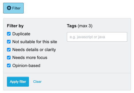
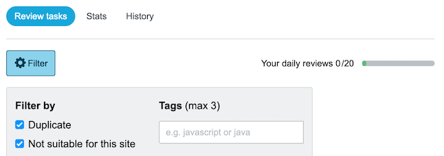
When trying out the filter in the Close Votes review queue on Meta Stack Exchange, the system suggests me to filter on or . The queue is empty right now, but I'm pretty sure it will remain empty forever if I filter on that. Please use the current site's top tags or none at all.

enter image description here

4
  • 3
    Thanks for this report - all fixed!
    – kristinalustig StaffMod
    Commented Feb 2, 2021 at 15:20
  • Thanks - but badge should be badges, I guess. That's the master.
    – Glorfindel Mod
    Commented Feb 2, 2021 at 15:22
  • 3
    The updated code is either using a site setting where the desired tag examples are listed, or grabbing from the top tags for each site, in that order. It looks like it's actually just perfectly cutting off the "s" at the end of the input: if you inspect the element it does say "badges." Since the length of the placeholder will change per-site, I'm not going to make any adjustments to the length of the input.
    – kristinalustig StaffMod
    Commented Feb 2, 2021 at 15:27
  • 1
    Ah, you're right, now I see it too.
    – Glorfindel Mod
    Commented Feb 2, 2021 at 15:38
25

Could rollbacks in the edit summary show the revision number and not the raw text of the revision, as shown here (from the Reopen Votes queue):

enter image description here

So it looks like this:

enter image description here

That would be much more helpful than a bunch of characters.

6
  • 7
    I would say this is a bug rather than a feature request.
    – 10 Rep
    Commented Jan 29, 2021 at 1:09
  • @10Repsaysgetvaccinated Possibly. I've never seen a rollback in a queue before, so I couldn't say.
    – Ollie
    Commented Jan 29, 2021 at 1:10
  • 1
    @Ollie can you please give more details about where you are seeing this text appear (your screenshot chops off the context), which queue?
    – Yaakov Ellis StaffMod
    Commented Feb 2, 2021 at 9:31
  • @YaakovEllis Updated my answer.
    – Ollie
    Commented Feb 2, 2021 at 17:13
  • 2
    This has been completed
    – Yaakov Ellis StaffMod
    Commented Feb 8, 2021 at 19:49
  • Thanks @YaakovEllis. Example, for anyone who wants to check.
    – Ollie
    Commented Feb 8, 2021 at 19:51
22

For duplicate closure, it seems the link to the duplicate is not shown on the completed Close Vote review item now. E.g. a random completed review which the question is currently a dupe of The Complete Rate-Limiting Guide

Compare to the current Close Vote review on other sites

19

I suppose the "All reviews" should show all the reviews in that queue (privilege for >10k).

However, clicking it just reloads the page appending a ?skipped=false (if it doesn't exist) parameter. That button should be either removed or disabled for <10k.

1
  • 2
    Thanks for the report - I fixed this, it should be a much better experience now.
    – kristinalustig StaffMod
    Commented Feb 2, 2021 at 15:21
19

The revision comment is truncated. For example on this question (review) the revision comment is:

Active reading [http://stackoverflow.com/legal/trademark-guidance (the last section) ].

But what is actually shown is this:

2
19

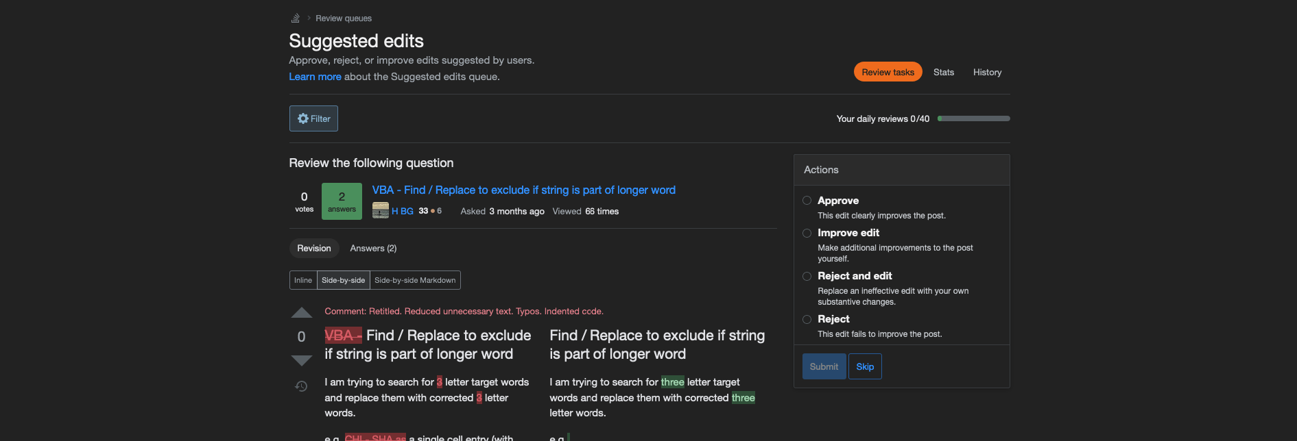
Make better use of the screen real-estate.

My favourite view to review in is the side by side view, usually the markdown version of it. As it currently stands the site is served with a max-width instead of being totally responsive. This is already painful on some long posts without many paragraphs, but in this review view it is even worse.

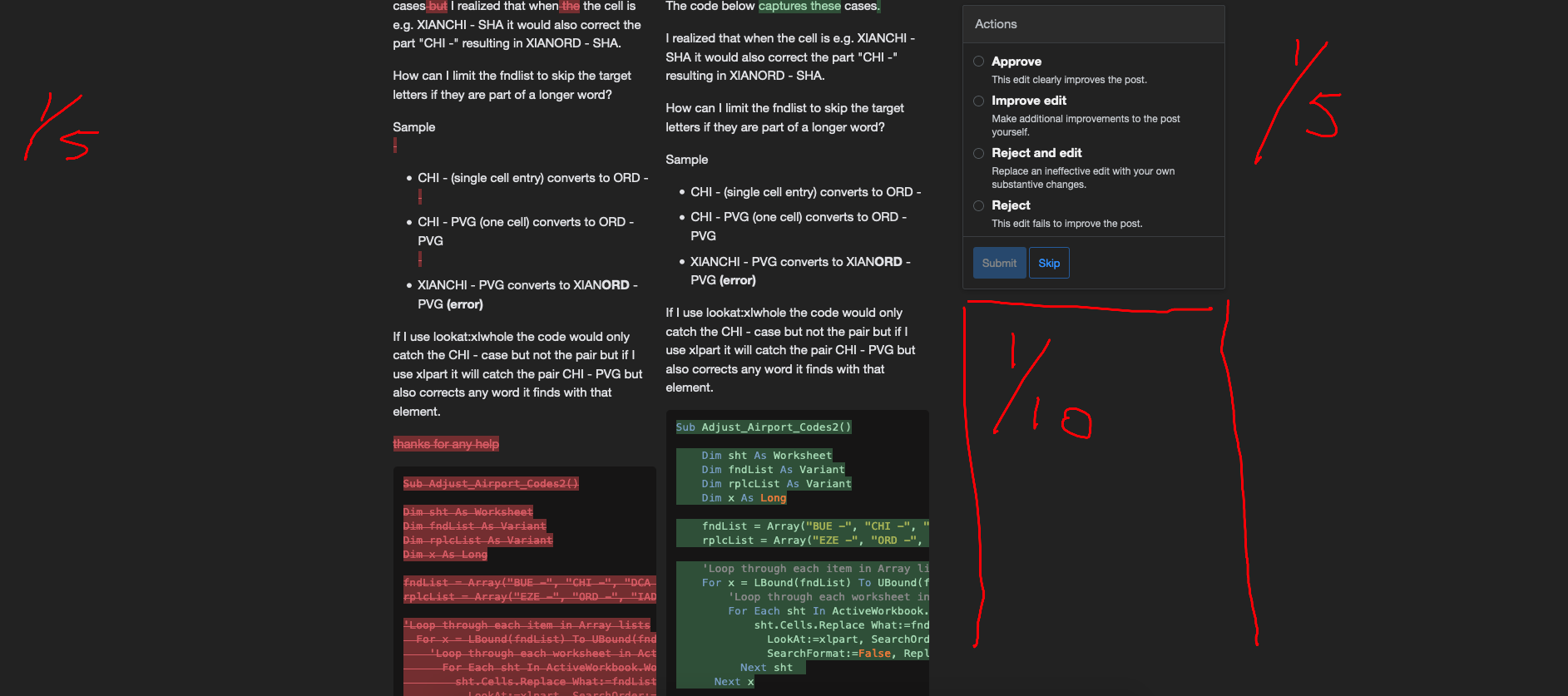
Take a look at this screenshot, of the entire width of my monitor:

The screen is divided in about 5 equal parts, of which only 2 out of the 5 carry meaningful content, namely the side by side diffs. When reviewing long posts this becomes extra painfull, as then half of the screen will be empty (The first and last column, and half of the column that carries the actions box):

enter image description here

Can we move the actions box back on top, so I can use at least 3/5th of my screen to view the content that is actually of interest.

11
  • 1
    Re: this and your other request, I actually am working on a request (not sure how to post it yet-- as an answer or a separate question since this is now fully rolled out). Compare the current rollout: i.sstatic.net/QoBih.png with my 15 minute re-layout effort (WIP): i.sstatic.net/wr4ss.png
    – TylerH
    Commented Feb 24, 2021 at 16:53
  • Not sure what you would expect to be put under the "Actions" section, btw. The old layout also had an actions section on the top right and nothing below it IIRC.
    – TylerH
    Commented Feb 24, 2021 at 16:55
  • @TylerH I don't really see any major differences between your two screenshots.
    – Luuklag
    Commented Feb 24, 2021 at 17:11
  • @TylerH I was thinking to put the actions as a horizontal sticky bar on top, so you could make the two diffs colums wider.
    – Luuklag
    Commented Feb 24, 2021 at 17:12
  • 1
    I made a series of changes. You may need to open each image in a new tab and swap back and forth to compare them; should be pretty obvious then. I removed several superfluous items that each took up their own "row" of space on the page. The main result is that the question content actually starts on the top half of the page now instead of 60-70% of the way down the screen.
    – TylerH
    Commented Feb 24, 2021 at 19:04
  • Yeah on mobile it was hard to see, but on a real monitor its obvious @TylerH. I think removing the "Learn More" info is not the best, but does save some space. Especially moving that banner with the filter and your remaining reviews further up to helps a lot.
    – Luuklag
    Commented Feb 24, 2021 at 19:19
  • 1
    Yeah for sure; in my personal env with those user styles applied I have a couple notes in comments along the lines of "this should probably return, but I need JS to make it work well/look pretty" since the mockup I made was just CSS-based for time. At any rate, I just posted an answer here suggesting all these changes and explaining each of them in depth. We'll see how it goes!
    – TylerH
    Commented Feb 24, 2021 at 20:01
  • 1
    Related: diffs are too narrow. Commented Feb 24, 2021 at 22:34
  • @SebastianSimon yeah you're right, on second glance that is more or less the same. I just didn't know what to think of that answer.
    – Luuklag
    Commented Feb 24, 2021 at 22:36
  • If I could upvote this multiple times I would. With such thin columns I now find myself scrolling/panning horizontally code blocks alot more to ascertain what suggested edits were made.
    – RobC
    Commented Feb 25, 2021 at 14:53
  • 1
    See my comment on this answer: meta.stackexchange.com/a/361378/344828 but basically this would require much more substantial changes to the site that we're not currently prepared to make. We may revisit it in the future. Thanks for bringing it up!
    – kristinalustig StaffMod
    Commented Mar 9, 2021 at 18:50
17

When hovering over the date the question was asked, I'd expect a tooltip with the exact date (like almost everywhere else you see a relative timestamp) but not in the new review queue UI:

enter image description here

17

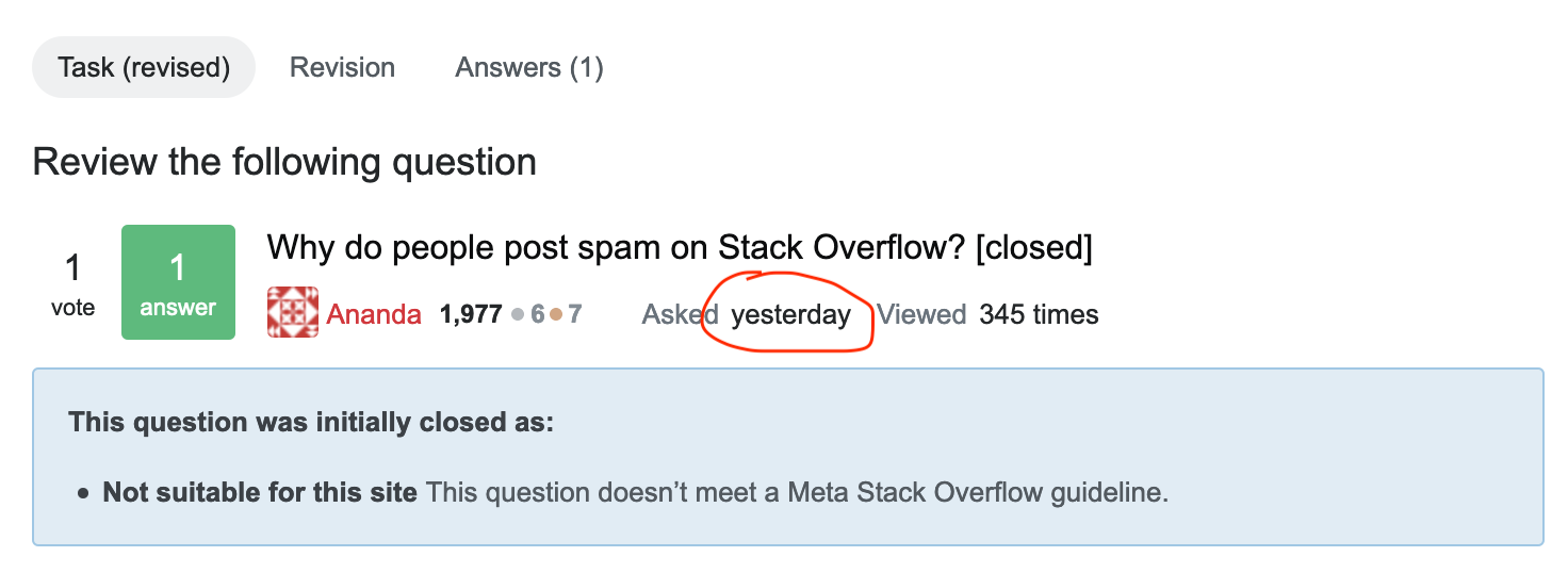
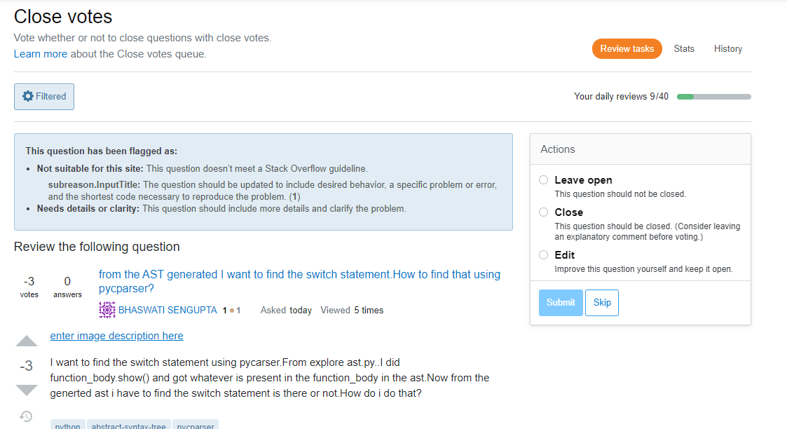
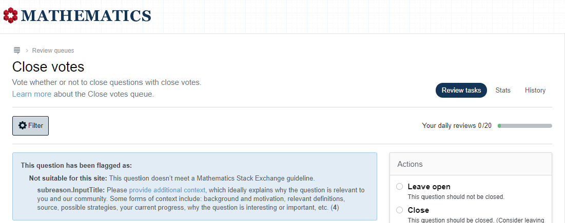
There's a small UI bug I noticed in Close Votes on SO. Below "Not suitable for this site", it says "subreason.InputTitle"; I assume that's not what it's supposed to say. This is only noticable with any of the "A community-specific reason" close reasons.
Really awesome picture

This bug is also visible on Math SE, and likely all other sites with community-specific close reasons.
Another really awesome picture

(Thanks to KReiser for screenshot and confirmation this also affects Math.SE)

4
  • 4
    This can also be seen on Math.SE for one of it's community specific close reasons here. It looks like it may affect every community-specific close reason.
    – KReiser
    Commented Feb 24, 2021 at 0:53
  • 3
    Also previously reported on MSO: Close vote queue, flagged as showing "subreason.InputTitle". Commented Feb 24, 2021 at 23:11
  • 1
    This also shows up on Academia.SE Here's an example with multiple close reasons.
    – Anyon
    Commented Feb 25, 2021 at 19:13
  • 1
    Whoops, thanks for the catch. We had a missing @ sign in there - this should be fixed in the next build (likely a bit later today).
    – kristinalustig StaffMod
    Commented Mar 3, 2021 at 17:09
16

This is implemented. If community-specific close reason votes exist on the item, they will be shown indented underneath the main close reason. These will always be shown (departure from current functionality where it is only shown if you click on a more button). - Yaakov

Not possible to see which community-specific close reason a question was flagged for in the close queue, if the question has close flags but no votes

In the old design of the review queue, if a question was flagged as Not suitable for this site (i.e. "off-topic", "A community-specific reason", etc.), it was possible to click the "more" link to expand the reason and see which specific sub-reasons under that umbrella the question had been placed into review for. This list included both sub-reasons from users with the close voting privilege casting actual close votes and those chosen by users who don't have enough rep to vote to close casting a flag to close:

Review showing a question flagged as "Needs debugging details"

(credit to Ryan M for the screenshot)

However, in the new review interface, there doesn't seem to be a way to see the specific reason(s) which have been chosen by users without enough rep to cast close votes casting flags:

enter image description here

There is another way to view sub-reasons others have selected, by opening the closing dialog, but that only includes sub-reasons chosen by voters, not by flaggers, so this means that if there are only flags and no votes the dialog will be completely empty, and even if someone voted, there's no way to see if a flagger chose a different sub-reason from the voter(s).

Can a way to see which sub-reasons under Not suitable for this site have been selected including by recommend closure flaggers please be added to the close queue?

1
  • 2
    This has been completed. See notes above.
    – Yaakov Ellis StaffMod
    Commented Feb 9, 2021 at 15:41
15

I've had a chance to play with the Close Vote Review Queue a bit now on Stack Overflow where the overwhelming bulk of my reviewing activity occurs. My main takeaway is that there are some good functionality improvements (yay for letting us up/down vote in the close vote queue!), the tradeoff is a very expensive one: screen space

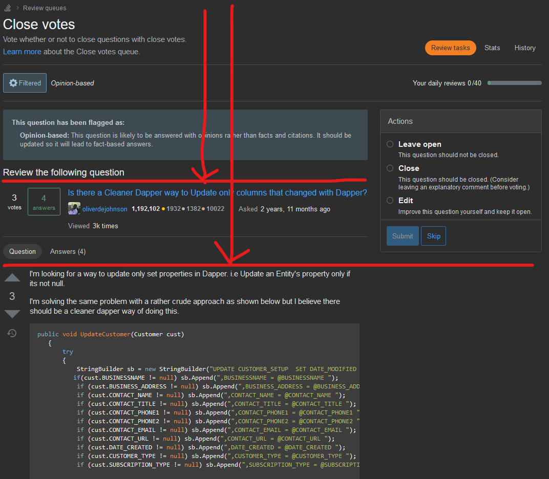
I see a lot of (in my humble opinion) unnecessary/redundant content on the page, and the end result is that the actual content of the page is pushed down for me past the halfway point of the screen (reference: I have 24" monitors at 1920x1080 resolution):

(and I actually set the top bar to display: none for these screenshots, so imagine everything is even further down the screen).

screenshot of close vote queue highlighting how far down the page

As you can see by the arrows and horizontal lines, we have to track wayyy down the screen just to get to the point of queue; all the content outside of the question title and body is not going to change from item to item, and most of it is not stuff we need to see ever, so why are they taking up so much real estate?

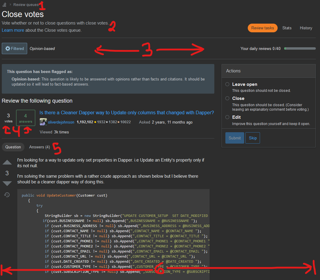
Here's the same screenshot with number labels for a list of suggested changes below: enter image description here

  1. We don't need this link. If someone wants to go back to the questions page, they can click the existing Stack Overflow logo link about 50px above this and go back to the home page, which is /questions for anyone who is logged in. Likewise we already have the top menu option for review queues available if we want to go to the All Review Queues page. One extra click is not worth saving if the cost is 50px of valuable vertical screen space.

  2. Same as above; we know what the close vote review queue is, and it's amply explained by other sections of the page as well... the flag/close banner, the URL, the 'review' UI, the 'Action' menu items on the right, etc.. I'd rather see users taken to the privilege page or a FAQ page the first time they click on the specific review queue than have this take up yet another 50-75px of screen space, if anything.

  3. Why is this on its own line? Especially if you expand the size of the container to not be so small (see item #6) there should be plenty of space to move this up to the line above.

    3a. (Not pictured) Why is the "Filter" menu not a modal that appears outside the document flow? As it is, it pushes the page down unnecessarily when it's open. It's a small thing, but just feels like an obvious 'miss' in the execution here.

  4. Not convinced we need this information... at least, we definitely don't need the question score, because it's shown on the very next line where I can actually vote on it/click to break out the full up/down vote information. I suspect that this entire row was just copied from the /questions page due to that being the most portable location for getting that info. All we need to see in this line is the question title. There is some use to seeing the number of answers (mostly in being able to see and vote on said answers from the queue)... so that bit I'm still on the fence about. The OP name and rep and ask date belongs at the bottom right of the question, but that's a separate bug/request here already being tracked/reviewed.

  5. Again, we don't really need this info/option, at least not for the Close Vote queue; what answers a question has, or whether it has any in the first place, are irrelevant to whether the question is close-worthy. The only exception I can think of here is in the case of deciding which question should be duped as a target of another, but that's a case where you'll want to be looking at each question on the /questions/ page anyway rather than in the queue.

  6. The width of the main container element is 1100px. But with the sidebar force-hidden by the new layout, we could easily expand this up to 1200px to reclaim some wasted gutter space and show a more "normal"-width container. I'm sure this change would be great across all review queues, but especially so for the suggested edit queue, where diffs are shown side-by-side.

  7. (Not pictured) I also removed the "Review the following question" header element; again it's obvious we need to review this question, because we're in the review queue and this is the question on the page...

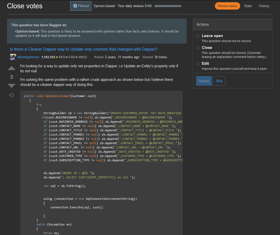
Taking all those things into consideration, I made a quick mockup with the Stylus add to demonstrate what this would look like (again, I'm focused on the Close Vote review queue here):

(NB: I have since re-added a grey HR/border between the question title and question body, but it isn't visible in this screenshot. Imagine there is one):

mock-up of new/improved CV Queue page layout

If you compare the 1st or 2nd image in a tab vs this 3rd one in a separate tab and swap back and forth, you can see there's a lot more space available in my modified version for the actual meat & potatoes of the page: the question being reviewed.

And just for those who might want to take that layout and run with it in their own user styles, here's the code I have that makes these changes:

div.container { /* making the page container a more reasonable width. */
    max-width: 1200px !important;
}
.s-page-title--text > nav { /* hide the nav menu at the top.  */
    display: none;
}
.s-page-title--text  p.s-page-title--description { /* hide the description of the vote queue. */
    display: none;
}
.s-page-title + div { /* set parent element to relative */
    position: relative;
}
.s-page-title + div > div.grid--cell { /* move the filter options to the top */
    position: absolute;
    top: -68px;
    left: 250px;
}
div.js-review-task div.js-review-content h2:not(.popup-title-container) { /* hides instructions on what this page is for. */
    display: none;
}
#js-review-filter-id { /* set the filter option menu to be a modal instead of pushing the screen down */
    position: absolute !important;
    top: 0px;
}
article.s-post-summary > ul { /* removing meta information */
    display: none;
}
article.s-post-summary { /* fixing row size due to grid properties */
    grid-template-columns: auto;
}
div.js-review-task > div > div > div:first-of-type + div:not(#panel-question) { /* hides the answers toggle menu option; unnecessary for the CV Queue */
    display: none;
}
div.js-review-task > div aside.js-review-instructions ~ div.grid--cell {
    padding-bottom: 5px;
    border-bottom: 2px solid #4a4e51;
}
div.post-signature { /* moves 'edited by' usercard to bottom-center of question instead of bottom-right to reduce confusion */
    flex: 3;
}
aside.js-review-instructions div.s-notice p { /* removing all the extra space for telling me I passed an audit item, part 1 */
    display: inline-block;
    margin: 0px;
}
aside.js-review-instructions div.s-notice button {  /* removing all the extra space for telling me I passed an audit item, part 2 */
    margin-top: 0 !important;
}
13
  • 2
    This looks like a good direction to go in, particularly in combination with other changes mentioned in other answers here.
    – Makyen
    Commented Feb 24, 2021 at 19:56
  • 1
    Your point 6 I explicitly requested in this answer (just as a reference).
    – Luuklag
    Commented Feb 24, 2021 at 20:02
  • 4
    As to keeping the user info above the question, I'd prefer a normal usercard below the post, as you describe, where everyone is already trained to look for it. While my first preference is a normal usercard, I'd rather see nothing identifying the user than having the user, reputation, and badges take pride of place above the post. The review queue moving them to above the post is a strong indication that they should matter for the review. In reality, who the author is and their reputation should not even be a consideration in almost all reviews, so being so very prominent is detrimental.
    – Makyen
    Commented Feb 24, 2021 at 20:03
  • 1
    @Makyen Agreed on the usercard; I didn't bother making that change because 1) it would require JS to adjust the HTML (at least dynamically. I could have done with CSS if I were just making the change for these screenshots alone), and 2) the #1 or #2 scoring answer on this question is already specifically about the confusion there and requests putting it back where it belongs, and I believe the team has already been reviewing it internally for at least a month.
    – TylerH
    Commented Feb 24, 2021 at 20:06
  • 5
    Thanks for taking the time to write all this up, we really appreciate it. Just wanted to say that we're not ignoring it, I'm gathering up all of the design-related feedback/requests in this post and chatting with Lisa (the designer) this week to figure out how we want to approach any changes. I'll keep y'all updated.
    – kristinalustig StaffMod
    Commented Mar 1, 2021 at 18:32
  • @kristinalustig sure thing; I figure with 90 responses y'all have your hands a little full... :-) PS - I've updated some of the thoughts above that I meant to circle back on after even more time in the queue. I haven't provided an updated screenshot of what my queue looks like only because I can't access that question again with that banner anymore... so it wouldn't be an "apples to apples" comparison, but I'm happy to provide one if an up-to-date reference point is of interest to you, Lisa, et al.
    – TylerH
    Commented Mar 1, 2021 at 19:40
  • 3
    Updates: Lisa and I spoke and determined that we could make a couple of quick fixes to begin to address this usage of vertical space that you and a few others have mentioned. First, we're cutting out the breadcrumbs on the review pages. There're already several ways to get back to the queues dashboard and to the question page, and you're right that vertical space comes at a premium. We're exploring other ideas that I'm going to try to implement (condensing the top navigation, for example) but I can't guarantee that I'll have the time right away, so for now I'll leave the status-review.
    – kristinalustig StaffMod
    Commented Mar 9, 2021 at 18:46
  • @kristinalustig when reviewing context is crucial. Please, on the answer view include the question. You can't say a link-only answer should be deleted if the question asks for it.
    – Braiam
    Commented Mar 9, 2021 at 18:52
  • @Braiam that seems like something that should be its own answer since it's specific to another queue type (this one does have some general items, but also has some specific CV-queue pieces).
    – TylerH
    Commented Mar 9, 2021 at 18:57
  • Just wrapping up loose ends here - we made all the changes we intended to make based on your feedback at this time. Thanks for writing it up for us!
    – kristinalustig StaffMod
    Commented Jul 13, 2021 at 14:59
  • @kristinalustig you marked this [status-completed], however I don't see point 6 implemented.
    – Luuklag
    Commented Jul 13, 2021 at 16:19
  • 1
    @Luuklag I interpret kristina's comment "we made all the changes we intended to make" to indicate anything not implemented from this feedback post will simply... not be implemented, as unfortunate as I may find that, personally :-)
    – TylerH
    Commented Jul 13, 2021 at 16:24
  • 1
    @kristinalustig Thank you for implementing some of these suggested changes! Hope to see more improvements to the queue layout and functionality in the future (still anxiously awaiting the improved filtering options advertised previously!).
    – TylerH
    Commented Jul 13, 2021 at 16:25
14

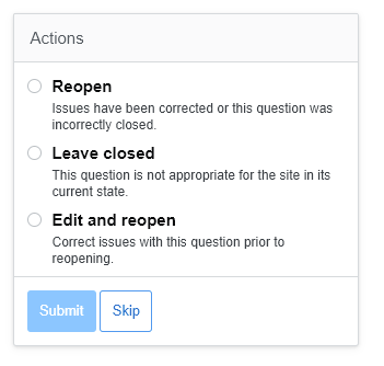
In Reopen votes queue actions are not ordered in logical way.

"Reopen" and "Edit and Reopen" actions should be grouped together. "Leave closed" should be first action on top or last action on the bottom.

Current layout is rather confusing.

Actions Image

1
  • 2
    Good catch, this was largely accidental, and these will be reordered back to their original order in the next build, coming today or tomorrow.
    – kristinalustig StaffMod
    Commented Mar 9, 2021 at 18:51
13

On screens with widths less than 640px (e.g. my iPhone 11) the daily stats are hidden:

enter image description here

There seems to be enough space; this is how it looks like a few pixels wider:

enter image description here

1
  • 5
    Thanks for this - we'd originally done this because the filter summary that appears next to the filter can get really long. I adjusted the review progress so that it stacks at narrow widths and the filter summary adjusts a bit more naturally. Should be much better now!
    – kristinalustig StaffMod
    Commented Feb 2, 2021 at 15:22
13

Increase the max-width of the review screen to include the width of the left-nav bar

Here is a screenshot of both the regular site, and the review page at full width, 100% zoom. As you can see the screen real-estate used for content of the review page is smaller. Both the review-page and the contentblock (including the right sidebar) of the mainpage have a max width set of 1100 px.

Seeing there is no left-nav on review screens can we please increase the width of the review screen with the width of the left-nav.

enter image description here

4
  • 1
    Agreed; seeing a page with less than 1200px at least of used space is very irksome... basically half the page is unused right now and there's a massive amount of scrolling required to see most questions.
    – TylerH
    Commented Feb 24, 2021 at 16:52
  • Thanks for considering at least @kristinalustig
    – Luuklag
    Commented Mar 1, 2021 at 19:38
  • 2
    After talking through this request with the design team, we've determined that no pages across the site get any wider than this 1100px mark. Therefore, making this change is a bigger undertaking, both technically and philosophically, and for now we're going to status-declined it. I do appreciate the report, and we'll possibly revisit this sometime in the future.
    – kristinalustig StaffMod
    Commented Mar 9, 2021 at 18:48
  • 2
    Thx for your reply, although I wholehartedly disagree @kristinalustig. I'll be raising a separate Meta discussion about this stance in the coming days when I find the time.
    – Luuklag
    Commented Mar 9, 2021 at 19:40
12

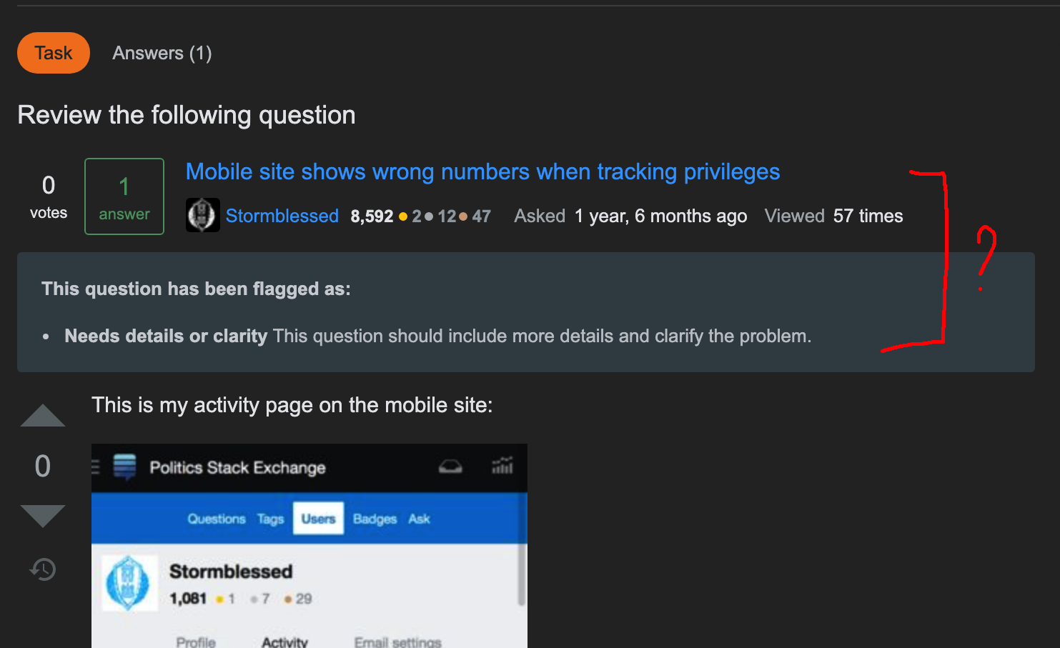
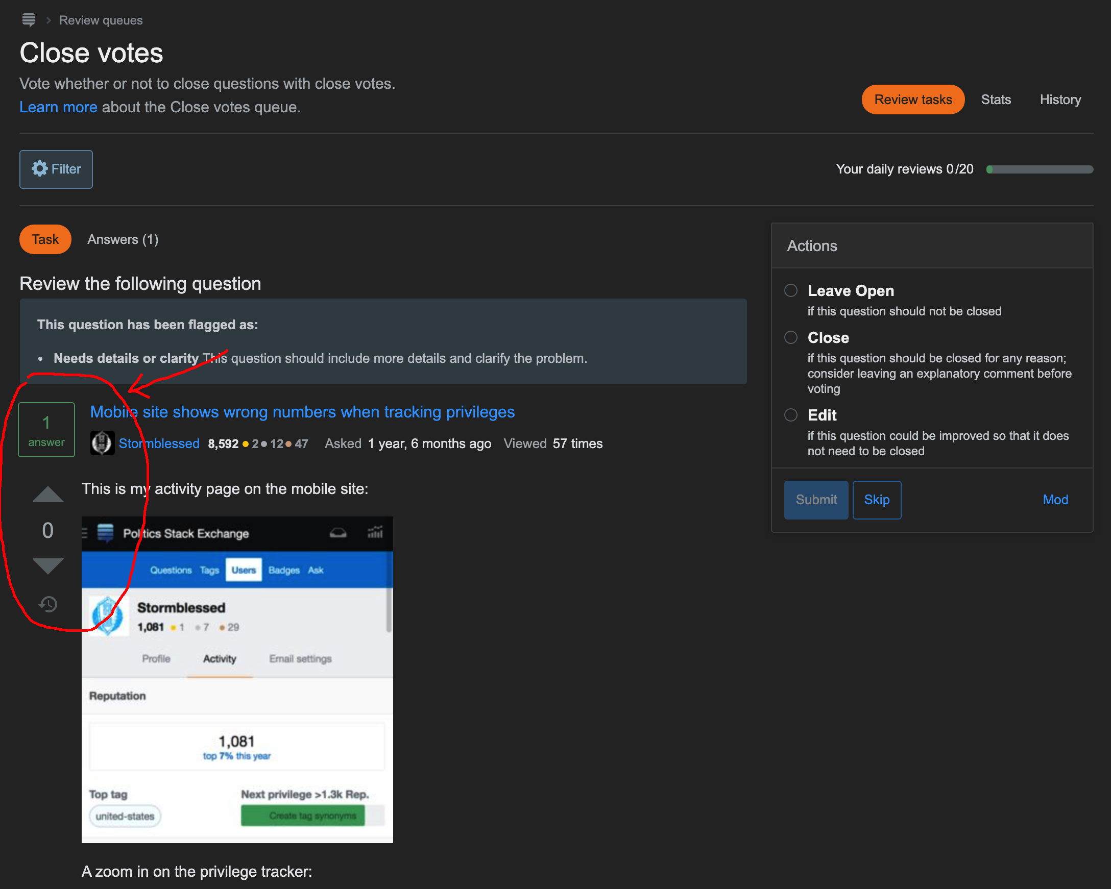
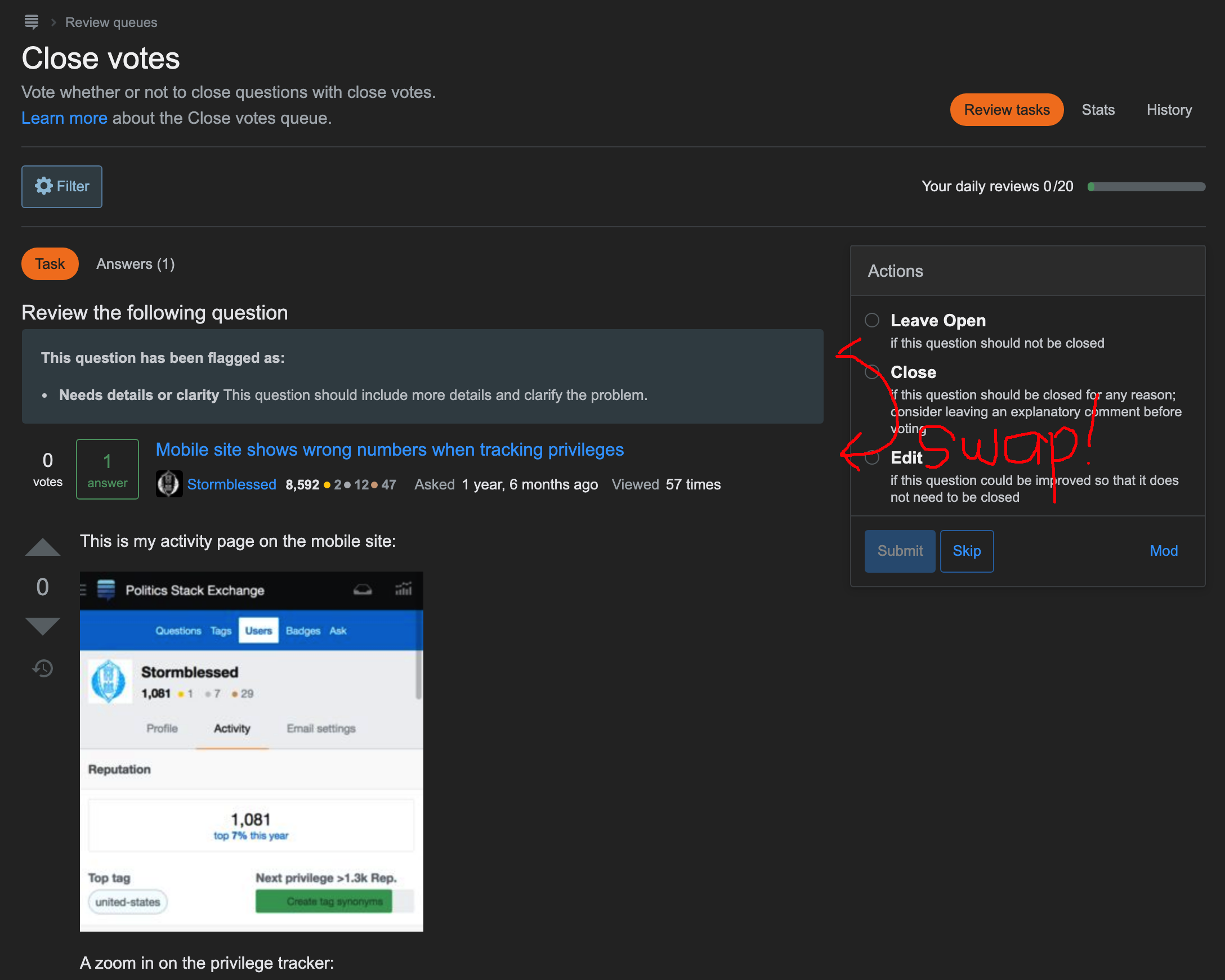
We have come full circle on this. The notice has been moved above the question metadata, and the tab buttons (Task/Answer/Revision, etc) are now below the question metadata, directly above the area that the affect.

Based just on this UI mockup in the question, the box at the top with the "This question has been flagged as" message seems out-of-place:

mockup in question

Wouldn't it be better to swap that box and the post title? Right now, the post looks disjointed, with the post title and body/details separate from each other.

Can it be like this instead?

swap reason and post title

In the previous mockup in the post "Improving Review Queues - Design overview I: Onboarding and updating workflows, that's how it was shown. Was there are reason for the change in this current mockup? I think swapping it back would result in a more coherent read: "This is your review task, this is why this post is in the queue (because it was flagged as reason), then here is the post title and body/description."

Furthermore, after I mocked-up this swapping, it now looks like the vote counter is redundant, and could possibly be simplified into:

remove duplicate vote counter

7
  • 2
    Thanks for the suggestion. We are going to be switching the position of the notice. The vote count will stay as-is. Even though it is redundant in this view, the question header is used in many other views within reviews, a good number of which show things like answers, revisions, and other things that would not include the current question score. We want to keep this section consistent, even at the cost of redundancy in this one instance.
    – Yaakov Ellis StaffMod
    Commented Feb 3, 2021 at 9:15
  • @YaakovEllis I haven't had the chance to see the other views (just this screenshot). It makes sense to keep views consistent across the different reviews. Commented Feb 3, 2021 at 9:20
  • 1
    You can see one of the views by clicking on the link for [Answers] above the "Review the following question" link.
    – Yaakov Ellis StaffMod
    Commented Feb 3, 2021 at 9:24
  • After further consideration, we are not going to go ahead with changes here. Currently, that notice section serves as a nice visual separator between the question metadata on the top, and the content section below. Moving it above the question necesitates further redesign work that we would like to avoid right now. And this also might be more of a case of something to get used to. Can potentially be revisited later, going to stay this way for now.
    – Yaakov Ellis StaffMod
    Commented Feb 4, 2021 at 10:16
  • 6
    @YaakovEllis I consider the title to be part of the content, but it’s separated. Visually, this feels quite messy, to be honest. Commented Feb 4, 2021 at 10:33
  • 3
    Agreed w/ Gino and Sebastian, the title is part of the question, and it's already how the queue is organized. There's no reason to change this and split the question into two different areas of the screen, displayed from different data sources to boot.
    – TylerH
    Commented Feb 4, 2021 at 18:52
  • 1
    The fix is in. Please see note in the post above
    – Yaakov Ellis StaffMod
    Commented Feb 9, 2021 at 15:39
12

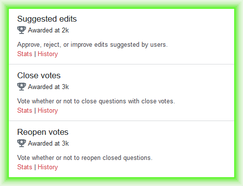
With the new UI / visual design, when you go to a review page and there are queues that you aren’t allowed to access yet, it says “Awarded at 3k” (or whatever number is appropriate), with the trophy icon (the same one that’s used for the “Recent Achievements” dropdown):

     new review queue visual design

This seems to be very peculiar and inappropriate language.  Nothing gets “awarded” when you reach and exceed the threshold for admission to a review queue.  The old wording, “You need at least 3k reputation to review close votes.”,

     old review queue visual design

was perfectly fine.


P.S. In the announcement (i.e., this “question”), you say

Changes

  • Only the queues available/earned by the user are clickable
  • Includes additional text about necessary reputation to earn access to new queues
  • Available queues are prioritized to the top and then sorted by the number of tasks in each queue

The first and third bullets are not changes — it’s always been that way (at least as far as I can remember).  And the second one, as shown above, seems to be outright false; the new design has less text about reputation necessary to ‘earn’ access to queues than the current design.

5
  • The privilege is awarded at 3k reputation. "Awarded" seems like fine language to me. "Privilege awarded" could be clearer (but longer.) Commented Feb 13, 2021 at 10:43
  • 3
    It is more confusing not to have units on the "3k". "3k" what? Penguins? It should be "3k reputation" or "3k rep." Commented Feb 13, 2021 at 10:43
  • More likely unicoins or Zorkmids.  Or perhaps waffles.    :-)    ⁠ Commented Feb 15, 2021 at 20:50
  • I understand the reasoning behind using the wording but I agree with Scott that this is making it sound a bit like a superlative when it's really a janitorial duty.
    – TylerH
    Commented Feb 23, 2021 at 19:50
  • 3
    Thanks for the report - I added back in the word "reputation" at the end so it's clear that you do not have to make 3000 waffles to get access to the queue. :-)
    – kristinalustig StaffMod
    Commented Mar 9, 2021 at 18:58
10

Can we have the View Count show a shortened version (e.g., 190K), instead of all these numbers:

And then have a tooltip to show the exact number, to be more consistent with the look on the actual post? It’ll look better for posts with 1M+ views.

10

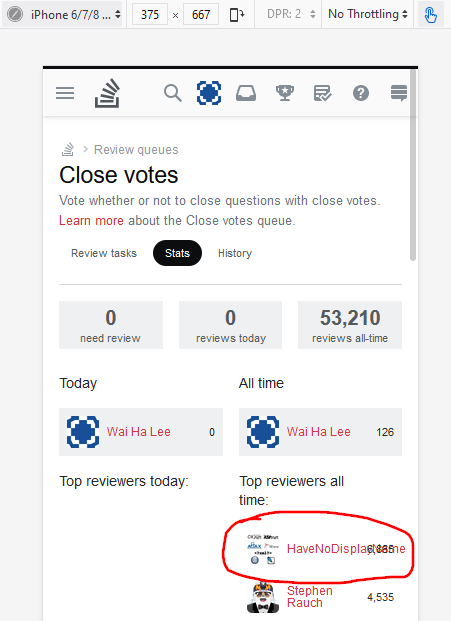
On narrow screens, the user names and their review counts on the review stats (e.g. on Meta Stack Overflow) occupy the same space:

3
  • 1
    This has been fixed
    – Yaakov Ellis StaffMod
    Commented Feb 9, 2021 at 15:39
  • 2
    Aha! You even fixed the issue on the daily stats too!
    – Wai Ha Lee
    Commented Feb 9, 2021 at 15:43
  • 2
    Yes, they use the same user profile control, so this fix will be in effect wherever that is used in a narrow width.
    – Yaakov Ellis StaffMod
    Commented Feb 9, 2021 at 15:44
10

The 'Next' option and the 'Edit' option have rather useless tooltips. The other options (at least in the Close Votes review queue) don't. Can they be removed?

enter image description here enter image description here

0
10

Let us vote on answers as well (they need some love, too)! Here's how an answer looks like from the "Answers" tab:

2
  • 4
    Since current Phase 1 is strictly about Close Vote (questions) review, I'm not sure voting on answers is relevant. Later on Phase 2 and 3, answers should already be possible to be voted while being reviewed. Commented Jan 28, 2021 at 19:32
  • 1
    We've implemented voting across queues and post types, so you should be able to vote as soon as the next build is out, either today or tomorrow. Thanks for the report!
    – kristinalustig StaffMod
    Commented Mar 9, 2021 at 19:00
10

In the Suggested Edits queue, when looking at a review task, the link to the post will always route to the parent question even if the suggested edit applies to an answer on that question.

As an example, on this review, clicking this text:

Takes me to the parent question instead of taking me to where I expect it should take me, the answer that the suggested edit was proposed on.

Could this link be changed to point to the answer instead?

0
9

This may not pertain to the intent of the current review queue makeovers. But I have been longing to see some functionality to enable a reviewer to directly link to a moderator, particularly in the suggested edit review queue. (What I am about to request, can be disabled for audit reviews).

I review primarily on [math.se], and occasionally on [matheducators.se]. I have encountered efforts to "edit a post" to threaten the OP of the post, including vandalism and outright hostile name-calling and threats, particularly offered from "anonymous user". Also, I notice a username repeatedly making exceptionally trivial edits. It would greatly simplify matters if there were a mechanism, within the review, to flag for moderator attention.

Currently, to contact a mod, I have to flag the post on which the attempted edit was made, and in my flag description, copy the review (requiring me to go to review history to get the link) into the description, etc, often multiple times for ongoing problems.

I very much like the changes thus far described, and do not want to ask too much of developers now, but I would be ecstatic if such a "flag moderator" functionality were added to the suggested edit review queue.

2
  • 1
    This is a fundamentally good idea, but out of scope for this project. It would be a good idea to repost this as its own question so it can get broader discussion and attention.
    – Brian Nickel StaffMod
    Commented Feb 17, 2021 at 17:14
  • Sure, @Brian. Thanks!
    – amWhy
    Commented Feb 17, 2021 at 17:16
9

Allow opt-in for sites that haven't rolled out the new UI to everyone

I'd love to be able to help test this out in the earlier phases, but there are virtually never any questions in the queue on MSO and MSE, and I don't have 3k rep on Ask Ubuntu or Super User.

Could it be possible for users on other sites to opt into the new UI (similar to the opt-in for the new editor) before their site is converted over for everyone?

4
  • 4
    We're not planning to offer opt-in on the review queues, as the functionality will be rolled out networkwide in a few short weeks.
    – Anita Taylor StaffMod
    Commented Jan 29, 2021 at 0:09
  • @AnitaTaylor Makes sense, fair enough. Thanks for the reply!
    – Ryan M
    Commented Jan 29, 2021 at 19:05
  • 2
    @AnitaTaylor It would be nice if the February 16 launch to some sites was pre-poned, though, so there's more time to test the system out on a site with review audits enabled. The current system means there's only one week for us to report issues with audits before it's launched network-wide. Commented Feb 2, 2021 at 10:23
  • 2
    @SonictheCuriouserHedgehog The goal is to roll this out networkwide as soon as possible vs. having a prolonged review period where some sites have it and some sites don't. There will be a full month after it launches networkwide where we will be logging and fixing bugs
    – Anita Taylor StaffMod
    Commented Feb 2, 2021 at 18:24
9

(Before I was aware of this announcement post, I already posted this as a meta bug question here: Submit button not working anymore in new review queue layout)

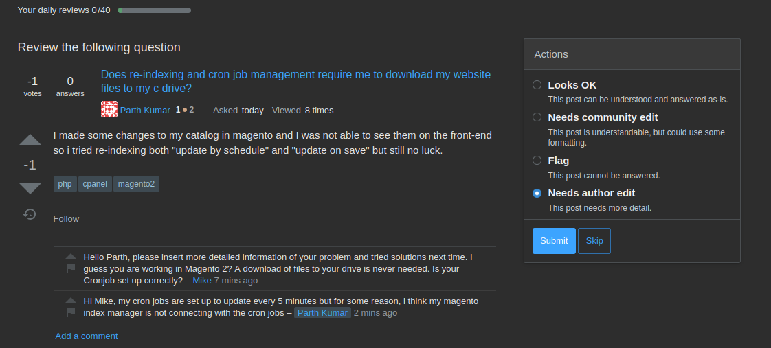
I encountered a bug in the Triage review queue. I can click the Submit button when I select one of the options "Looks OK" or "Needs community edit" (which do not have suboptions) but not if I select "Needs author edit". In the past, a dialog opened in which I was asked to specify the detailed reason (e.g. "Needs details or clarity" or "Needs more focus"), but now, I am stuck at this point. So either the dialog is not displayed or it is located somewhere off-screen, I guess.

The only thing that happens is that the Submit button is enabled, but when I click it, nothing happens (both in Firefox on a Linux desktop PC as well as on Chrome on Android).

enter image description here

Some other users apparently do not encounter this behavior and have speculated that it might have something to do with their privileges (see comments under the linked question above).

Edit: Before, I reported that the same behavior occurred when selecting the "Flag" option. After double checking, I found that this is in fact not correct. When selecting "Flag", the dialog to specify the type of flag correctly appears after clicking Submit. So, the problem only occurs for the option "Needs author edit".

10
  • Have you run out of flags?, that's the only cause I can think of Commented Feb 24, 2021 at 2:40
  • 3
    @Nick I'm running into the same bug on SO, and I still have around 90 flags left for the day. The "Flag" option still works fine, it's just the "Needs author edit" option that's failing. Commented Feb 24, 2021 at 2:48
  • Check the browser console and Network inspector. Anything interesting there? Commented Feb 24, 2021 at 8:16
  • @SebastianSimon There is no activity at all in console or network inspector when I select one of the options.
    – buddemat
    Commented Feb 24, 2021 at 9:41
  • @buddemat Including clicking Submit? Commented Feb 24, 2021 at 10:26
  • @SebastianSimon I just double checked. If I click Submit after having selected the Flag option, the dialog to select the type of flag appears correctly (I could have sworn that wasn't the case before, but maybe I'm mistaken here. Will edit the post). For the Needs author edit option, nothing happens at all, when I click Submit.
    – buddemat
    Commented Feb 24, 2021 at 10:33
  • 4
    Thank you for reporting this bug! We've figured out why this is happening and are working on a fix right now - I'll post here again once the fix is shipped with more of an explanation.
    – kristinalustig StaffMod
    Commented Feb 24, 2021 at 16:58
  • 1
    Same here with Chrome and Firefox on Win10. Nothing happens with Needs author edit and submit ... observed already yesterday, retested today
    – MarkusEgle
    Commented Feb 24, 2021 at 17:43
  • 2
    I put this in the original post as well, but: in order for Recommend Close (or Needs Author Edit) to function properly, the js relies on a (hidden) close link in the post menu to be present on the page. However, we only included the close link for users who had close permissions. So when you tried to perform that action, it just failed silently because it couldn't find the button to click. I fixed this by including the close link for both users who can close questions as well as users who can recommend closure. The fix will be in the next build, which probably won't go out until tomorrow.
    – kristinalustig StaffMod
    Commented Feb 24, 2021 at 21:31
  • Just confirmed that it is now rolled out and indeed fixed. It works now. Thanks!
    – buddemat
    Commented Feb 25, 2021 at 19:56
9

In the suggested edits queue, the username of the person who proposed the edit is written with tiny letters. Their reputation is also hidden.

This is some important piece of information and you should give it more emphasis by placing it somewhere in the top - perhaps here?

(after renaming "the following question" to "the following edit" - )

1
  • The "the following question"/"the following answer" bug was also reported here.
    – Wai Ha Lee
    Commented Feb 26, 2021 at 7:35
9

I think this would be the perfect opportunity to enhance the automated "review testing" system by adding a "minor" new button.

Right now, when the system thinks you made the wrong choice, it tells you that you messed up, and to do better in the future. Then there is a single button I understand that you have to click to continue on the review queue.

I suggest to add a button:

I understand, but object the automated decision (wording to be improved), with a text field to provide a comment why that is.

Rationale: we all know that the automated system is far from perfect, and it is really annoying when it presents you questions that it got wrong. When that happens, it frustrates the reviewers, and worse, it leaves a "stain" on their resume. The later might matter or not, but when it matters, it is on the reviewer to remember when the system messed up to be able to "prove innocence" (and when you really do A LOT of reviews, that is a real problem).

So, giving the reviewer an opportunity to object would enable:

  • the system to "drop" bad test questions faster
  • the system to keep track of objects, so in case there is ever a need for a human moderator to check the review history, those objections are more prominent

Addendum: the aspect of "this is a bad test question" might even be worth a button when the user passes the test. Happened to me repeatedly, too: to figure "this is a test question, and I should react that way, although the specific question at hand actually should have been treated in another way".

9
  • 1
    That "stain" matters more than one might think: if one's been suspended from review in the past 30 days, and they fail a single audit, they'll immediately be re-suspended. Commented Feb 16, 2021 at 22:23
  • 1
    This is a bigger feature than the scope of the project, and probably deserves to be its own question/discussion. I'll try to put in some time this sprint to see if I can measure how pervasive an issue this is (e.g., # of seasoned reviewer failing audits, audit templates with multiple failures, etc).
    – Brian Nickel StaffMod
    Commented Feb 17, 2021 at 16:54
  • 1
    @BrianNickel I understand that part, but then: the deficiencies of the auto-testing system are really annoying, so anything that helps with that would be good!
    – GhostCat
    Commented Feb 17, 2021 at 17:38
  • 2
    This. For a long time I have wanted some sort of "appeal audit decision" or "flag bad audit example" mechanism. Commented Feb 17, 2021 at 23:31
  • 2
    @BrianNickel For reference: a feature request I filed a while back with some more info. Commented Feb 18, 2021 at 0:25
  • 1
    Holy mackerel 150% this. It's so tedious to have to go to a question's normal page and up/downvote it and close vote/delete vote it when I encounter a bad audit item to try and remove it as an audit item.
    – TylerH
    Commented Feb 24, 2021 at 16:32
  • 1
    We're not going to have time to dig into audits more right now, but I've added this to the team's backlog and we're going to do a more thorough look into it when we're addressing workflow changes a bit later on in the project. Thanks for bringing it up.
    – kristinalustig StaffMod
    Commented Mar 9, 2021 at 18:57
  • 1
    We were hoping to address this issue as part of the last phase of our Review Queues overhaul. However, it quickly became apparent when diving into this request and others related to audits, that improving audits is its own project that's going to require more user research, as well as potential Community Manager/Moderator process changes. We see the merit in this suggestion and have marked it as status-deferred. Improving audits is not on our Q3 2021 roadmap and won't be prioritized in the near future, but we have added it to our backlog.
    – Anita Taylor StaffMod
    Commented Aug 5, 2021 at 20:50
  • That is unfortunate, but not surprising. As the audit system is one big project if change is wanted to be helpful!
    – GhostCat
    Commented Aug 6, 2021 at 4:08
9

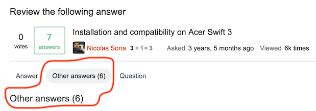
When reviewing answers in the First Posts review queue, sometimes there's a tab 'Other answers (x)'. When you click it, the tab heading is repeated, while it's not for the other tabs ('Answer' and 'Question'). I don't think it's necessary and it's eating away a bit of screen real estate. Can it be removed please?

enter image description here

You must log in to answer this question.

Not the answer you're looking for? Browse other questions tagged .