9

Just a small suggestion...

I thought it would be interesting to see a graph of how the scoring for a question (and its answers) has changed over time.

I guess for most questions, the bulk of the scoring would be within the first day after it was asked, but many good questions continue getting votes over time.

I guess the real reason for this suggestion is just to feed my appetite for statistics; it's probably not that useful most of the time.

That said, I can see how it could show some interesting trends -- for example, a spike in the graph might indicate that an older question suddenly got some fresh attention; maybe because it got linked somewhere, or maybe because it gained a fresh relevance.

Anyway, just a suggestion. I'm sure you've got plenty of other exciting new features to be developing, but it seems to me that this wouldn't be too much of a project.

Thanks for listening. :-)

5
  • Couldn't you just hit the SE Data Explorer? (Never used it, though it looks like it might fit the bill.) Commented Oct 24, 2012 at 21:00
  • well, yes, I'm sure I could (does it do graphs, though?), but I thought it would be nice to have a button on the question page to show a chart on the page for a question.
    – Spudley
    Commented Oct 24, 2012 at 21:05
  • If you really love data and statistics, you'll take the raw stuff and make it prettier than anything anyone else could think of. Heck, even a quick graph in Excel looks good these days. Commented Oct 24, 2012 at 21:07
  • Related: meta.stackexchange.com/questions/148445/…
    – Tim Stone
    Commented Oct 24, 2012 at 21:19
  • @TimStone - yes, that is quite similar to what I was thinking of. I would have multiple lines for the question and for its answers on the same graph, but other than that, yes, the answer on that question is pretty much along the lines of what I had in mind.
    – Spudley
    Commented Oct 24, 2012 at 21:22

2 Answers 2

9

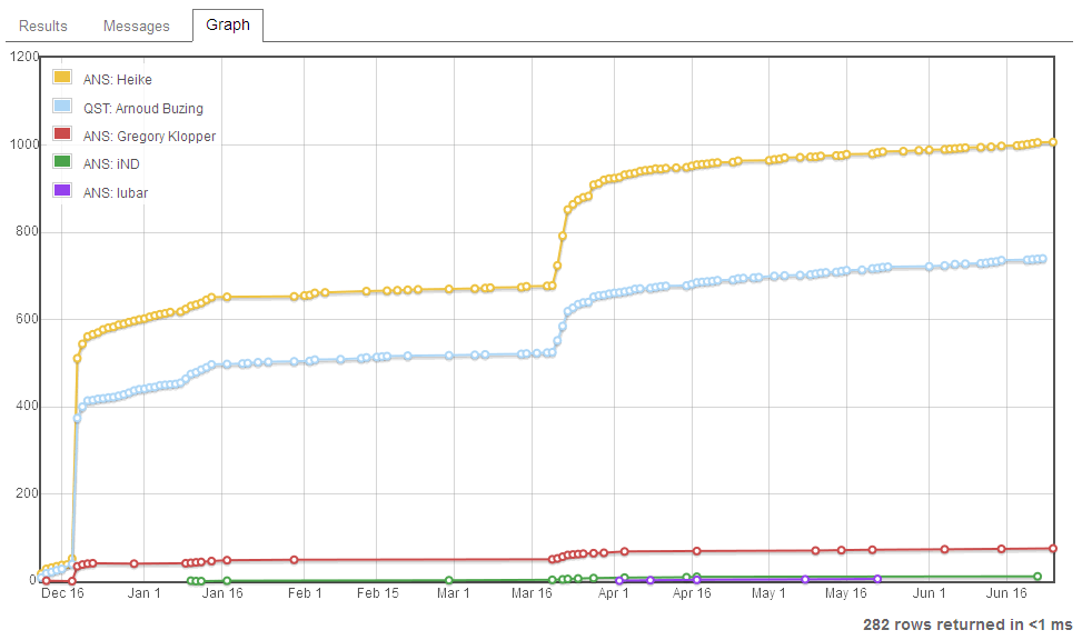
Okay, here is a Stack Exchange, Data Explorer query for that. See Votes over time for a specific question and its answers.

For example, for this question, it outputs this graph:

(Click for larger image) Sample plot


Notes:
  1. The question and answer legend is ordered by which got voted on first. This seems to be a design artifact of the graph engine.

  2. SEDE data is currently 4 months stale, but is promised to go to weekly updates around November-ish.

4
  • 3
    +1 Oh this is nice...
    – Mysticial
    Commented Oct 25, 2012 at 3:53
  • Oh yes. That is exactly what I was thinking of. Definitely Awesome! Now all we need is a link on the page for each question so I can get to this graph at the push of a button. ;-)
    – Spudley
    Commented Oct 25, 2012 at 6:27
  • You can add that button with a not-too-difficult userscript for your browser (unless it is IE). You could probably get this data/plot live (SEDE is a snapshot) using the API, but that's not quite as easy. Commented Oct 25, 2012 at 6:38
  • Super fun. Here's a slight modification that also lets you include anonymous feedback (set IncludeFeedback param to non-zero to include it, you can also set IncludeVotes to 0 if you only want to see anonymous feedback).
    – Jason C
    Commented May 25, 2017 at 19:26
4

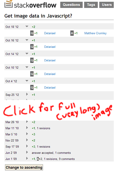
It's not a graph, but you can see how a question's and its answers' score evolves over time by looking at the Timeline.

For example, see this timeline:

(Click for larger view)
Sample timeline


You can see, that for that question (and its answers), the votes came in steadily, in ones and twos.

1
  • 1
    +0.5 for showing an integrated solution and +0.5 for cutting the image in such a nice way :]
    – Nippey
    Commented Oct 25, 2012 at 5:37

You must log in to answer this question.

Not the answer you're looking for? Browse other questions tagged .