104

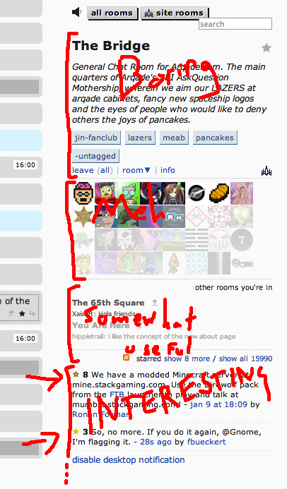
Here is how the chat sidebar looks, annotated with how interesting/useful stuff is:
enter image description here

On my monitor, I can usually only see the top two or three starred items, but I want to see more. Could something be added so that I could:

  • Reorder chat sidebar items?
  • Collapse chat sidebar items?
  • Scroll the sidebar so I can see more stars?
10
  • 47
    Now this, is a fine example of what every meta-post should look like.
    – Mysticial
    Commented Jan 16, 2013 at 16:10
  • 14
    @Mysticial It's taken years to refine my craft
    – fredley
    Commented Jan 16, 2013 at 16:11
  • All your up votes are belong to you
    – thecoshman
    Commented Jan 16, 2013 at 16:14
  • 1
    Related: Adapt the chat sidebar for displays with limited height. And the problem is much worse on my tablet, I can see at most the first room I'm in, and never any starred messages. Commented Jan 16, 2013 at 16:59
  • 2
    You forgot another option: "Get a wider screen" ;)
    – ThiefMaster Mod
    Commented Jan 16, 2013 at 17:01
  • 2
    @ThiefMaster Width is not an issue.
    – fredley
    Commented Jan 16, 2013 at 17:01
  • github.com/rlemon/UserScripts/tree/master/StackExchange/Upbar "kinda working maybe not really" userscript to free up some space by moving the users list to a auto-hide-able top bar. Could be useful?
    – rlemon
    Commented Jan 16, 2013 at 17:02
  • 3
    I prefer a hardware solution for this problem.
    – Pops
    Commented Jan 16, 2013 at 22:40
  • 3
    @PopularDemand Laptop
    – fredley
    Commented Jan 16, 2013 at 22:41
  • Optimal solution: Get a taller screen.
    – Luke_0
    Commented Jan 20, 2013 at 20:00

5 Answers 5

46
+100

I vote for collapsing items. All of them.

I think that having scrollable things will just make it feel more messy. Just a User Experience thing. Collapsing feels more "organized" and you can choose what you want to see without having to scroll; just click et voilà.

On a lower priority, the "other rooms you're in" list could use some improvement; for example, removing the "last message" preview. If there's a new message, we could have a +1, +2, etc., somewhere on the side, so the list gets shorter.

By the way, that's the longest room description I've seen until now.

4
  • 1
    Collapsing would be ideal, and work well with tablets. I never need the room description to be there, and the list of users is only occasionally useful.
    – fredley
    Commented Jan 16, 2013 at 17:02
  • Even collapsed, in the example shown above, you would only be able to see at most 7 starred posts collapsed. Moreover, you would really only be able to view 1 or 2 open at the same time (depending on which were collapsed). In other words, if you were to want to review all 8 hidden, you still couldn't. And to review just a few of them would require 2 clicks, per item, to expand and then collapse. By the 3rd one examined, the next ones would start to get truncated. This doesn't seem very user friendly to me.
    – Travis J
    Commented Dec 23, 2013 at 16:22
  • @TravisJ Well, 7 is still a lot better than 2. But I agree, there are probably better solutions (I just upvoted your bookmarklet solution). Commented Dec 23, 2013 at 17:16
  • @jadarnel27 - 7 collapsed ones though (as in only 1 line of text - or whatever the collapsed version is). If it were 7 full fledged ones then I would think that would be pretty decent. But there is nothing like wondering what the next part <cutoff>. Basically it would require 2 clicks for each of those items to deal with. Personally that seems tedious. And if you expanded the 7th item, the rest would still be hidden. The 6th would only show 2 lines and hide the rest. The 5th would.. well you get the point :).
    – Travis J
    Commented Dec 23, 2013 at 17:20
28

Please oh please make the user list collapsible to one line. It takes up far too much real estate on popular rooms.

2
  • 2
    gist.github.com/4549488 your wish is my command (there could be so much more done to this script... I got it started for you all :P)
    – rlemon
    Commented Jan 16, 2013 at 18:29
  • well, I can't fault you for trying, but that is one ugly hack right there :P Still, it is a good start.
    – thecoshman
    Commented Jan 17, 2013 at 8:32
10

I got you guys covered :) This bothered me for a really, really, long time. So, I recently decided to write a surprisingly simple script for it that I use as a bookmarklet. Bookmarklets code can be saved as a bookmark and ran while at the current page, or it can be ran by entering it in the url as

url input field [javascript:pastecodehere();             ]

Here is the script:

javascript:(function(){var $s = $("#starred-posts");var h =$s.height(); $s.css({height:h+"px",overflow:"auto"});})()

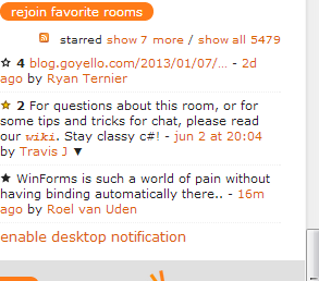
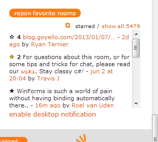
Pretty simple right? It creates a scroll bar for the starred area as seen below (Note that this even works if you expand the "Show More Stars" link without rerunning the script).

Before

before

After

after

6

HodofHod wrote a userscript, linked from here, to add scrolling to the right panel to be able to see more stars. I've been using it for months and would never go back to the old, limited way.

5

While this would be a nice inherent feature, in the mean time you can use the More Stars script by Sterno.

You must log in to answer this question.

Not the answer you're looking for? Browse other questions tagged .