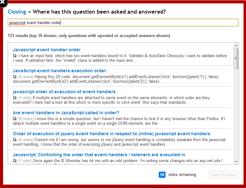
As you may have noticed, Jarrod's been hacking away at some design changes to the "close as duplicate" UI. These are the first fruits of some discussions we've been having internally regarding the "close" UI as a whole, with the goal being a smoother, easier-to-understand experience for all involved.
Streamlined UI

The new pop-up provides four different functions:
Allow input of a specific possible duplicate (as it has done for nearly four years)
Display suggested duplicates (as originally implemented by Marc Gravell)
Display search results for keyword-based searches (in the same fashion as the new suggested duplicates list)
Allow previewing the selected question with answers.
The search field reacts as you type, and there's visible, bread-crumb style navigation near the top of the dialog that allows you to quickly preview different potential duplicates (or back out of the dialog entirely).
Answered questions only
The search results include only answered questions (per the usual SO definition of "answered", where the question must have an accepted or up-voted answer). Additionally, close targets are restricted to answered questions even when specifying the ID or URL directly (with the exception of questions from the same author, and meta posts). Moderators can override this last restriction if necessary.
The rationale here is that it can be fairly hard to discern whether or not an unanswered question is actually a duplicate, and even when it is closing doesn't really accomplish very much. When searching for a "canonical" answer in particular, duplicates without answers (or with bad answers) are just noise in the results.
I think this makes sense in theory - so how is it working in practice?

it's to encourage linking to answered questionsHmm, I understand the principle there. Perhaps an alternative approach would be to send answered questions to the top of the "Related" list, from which duplicates are usually chosen.