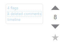
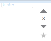
I'm utterly conditioned to expect the moderator post links (flags, deleted comments, timeline) to be right next to the vote buttons and post score bits of the UI.
Now that the vote buttons remain visible even on scrolling please keep the position of the moderator bits fixed in relation to the vote button. That would be nice and consistent and the same arguments in favour of the new vote button behaviour seem to apply to the moderator links.
Nice:

Not what I expect:

