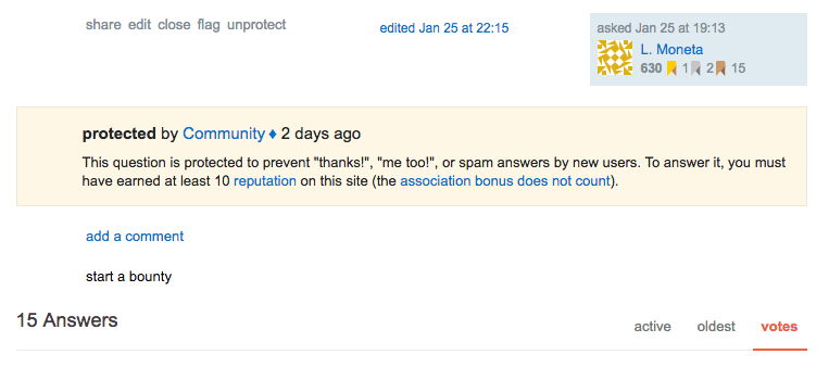
I use quite a few sites and I'm really used to seeing the protected questions banner where it's "supposed" to be... right before the answers:
According to Jon Ericson in an answer from a few years ago, the appearance of the banner at the bottom of the page for the users who are prevented from answering it is intentional.
Eeeek! Something stole the protection! (Why is this protected question unprotected?)
This is an intended behaviour because if you don't have enough site reputation to answer (and since association bonuses don't count, I don't even with a diamond) the banner explains why. Generally speaking, this probably makes more sense than putting it at the top of the page and confusing new or drop-in users. But for those of us who are used to seeing it upfront and know for other reasons that a question is protected, it's strange.
That's fine. I don't mind it replacing the answer spot if I can't answer but it'd be nice to be able to see that I can't answer ... sooner. Earlier today I was looking for protected questions asked by a specific user - on sites I don't have the reputation to see the normal banner - and wasn't able to find them because I was expecting the banner to be in the normal place, not all the way down at the bottom of the page.
As a moderator, I would also like users who are new to my site to know that a question is protected before they start scrolling through the answers to see if one says what they'd want to say and planning out an answer they can't write. If they see the warning first, they may still look at the answers but they won't be surprised by the protection status and their inability to answer after scanning through five, ten, or even twenty answers.

