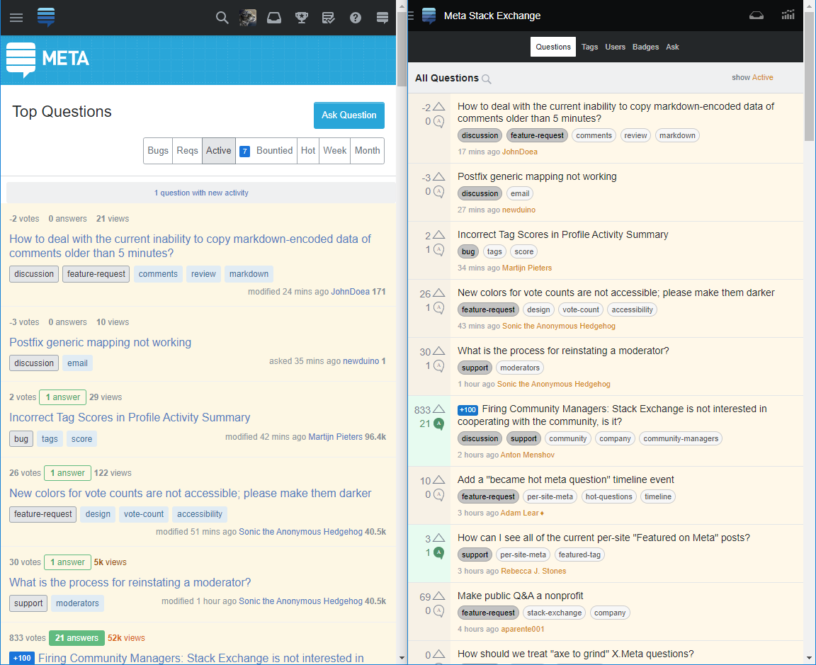
If I understand correctly, the current mobile version of the site is obsolete and is no longer updated, the official mobile app is officially dead, and the full version of the site with adaptive design is to be used instead.
My biggest problem with the responsive design is the massive difference in how much information fits on the screen, compared to the old mobile design. This is most noticable in long lists without big paragraphs of text.
Not only titles use a font a bit larger than necessary, but there's a lot of wasted empty space. A whole line is dedicated to votes, answers and views, where old mobile version packs all information on the side.
This is important on small screens of mobile phones. Old mobile version can fit almost twice the number of questions on the screen.
Furthermore, I'd question the wording of "−3 votes" and "0 votes", especially considering the numbers displayed are scores, not number of votes.

