24

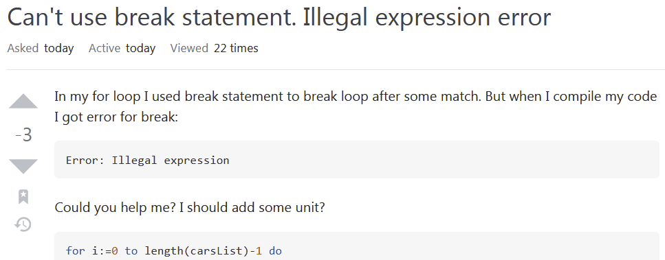
The recent UI update which changed Stack Overflow's fonts to system defaults makes negative vote counts very hard to read on Microsoft Windows (in its Segoe UI font):

Screenshot of current design

How could Microsoft chose such a bad system font, you might ask. Well, it's not Microsoft's fault. It's Stack Overflow's fault. Because the character to the left of the number is - (U+002D: HYPHEN-MINUS), not the semantically and typographically correct minus sign − (U+2212: MINUS SIGN).

If we change the character to the true minus sign (U+2212), the indicator becomes much more readable:

Screenshot of proposed design

This feature request has been made previously and it was declined. However, back then it was mainly a matter of aesthetics: now (as of 10 May 2021, with Segoe UI) it's also about readability and accessibility.

When I first saw the question in the screenshot above, I thought to myself, "Why does this Q have three upvotes?".

6
  • 1
    A prior request to change to the minus sign was declined. Commented May 10, 2021 at 17:51
  • 5
    @SonictheAnonymousHedgehog: Well, but today with Segoe UI, it is no longer merely a matter of aesthetics: it's about readability and accessibility. Commented May 10, 2021 at 17:53
  • 1
    I'd edit this to link to the earlier declined request and explain why its rationale is wrong today. Commented May 10, 2021 at 17:53
  • @SonictheAnonymousHedgehog: Done. Commented May 10, 2021 at 17:56
  • I guess you'll get better results if you configure ClearType properly. I'm not seeing anything wrong with Chrome, Edge or Firefox, I'm also on Windows 10 20H2. Commented May 10, 2021 at 18:23
  • 3
    @iBugsaysReinstateMonica: I'm on Windows 7, 64-bit, Firefox 88.0.1. But irrespective of platform and browser, the minus sign is different from the hyphen minus (much longer, different vertical position, possibly different thickness). Commented May 10, 2021 at 18:24

0

You must log in to answer this question.