101

As you may be aware, we’re deprecating our mobile views, so with that in mind, it would only make sense to try to reduce the page weight in the responsive views that’ll be replacing them.

Currently, our footer is a bit bigger than it ought to be, and since it appears on every page, it is very overwhelming. Therefore, we came to the conclusion that something’s gotta go.

We’ve decided to reduce the number of links in our footer under the Stack Exchange header.

Before

Current footer, before clicking anything

Current footer after "Technology" is clicked, showing links to each site in that category

  • Clicking individual categories opens up a large menu of links to some (not all) of our sites within a category. And if you agree with us, that is an overwhelming amount of links in just one section.

After

Revised footer, showing links to categories on stackexchange.com as well as API and Data links

  • Instead of showing all these individual links, we’re going to link to individual categories on the Stack Exchange website. We’ve also added links to the API and Data (SEDE) pages under the Stack Exchange Network header.

Why are we doing this?

  1. We looked at some data and found that these links aren’t used very often. Those categories are clicked about 600 times a day. Individual sites are about 200. We know that for discoverability, we need links and we are not getting rid of them, we are just optimizing the space, reorganizing things, and making it less crowded.

  2. Our marketing folks are advising that removing these links may actually increase our search engine optimization, since having so many links dilutes the overall quality. There are diminishing returns there.

  3. We want to reduce the page weight of the footer. Ripping out those links saves about 4 KB of data per request even after gzip. It's a win-win!

  4. We have way more sites than the footer can reasonably accommodate.

  5. There’s still lots to discover in the Stack Exchange menu on the right side of the top bar.

20
  • 26
    If the mobile views are being deprecated, why is "Mobile" still there in the "After" view, but "Disable Responsiveness" missing? That seems precisely backwards to me. Also, I suppose you are deprecating the "Salary Calculator"?
    – Cody Gray
    Commented Nov 18, 2021 at 19:24
  • 5
    Re #5: There is no right menu in the top bar for anonymous users on Stack Overflow. (I find it annoying because I sometimes browse logged out.)
    – Laurel
    Commented Nov 18, 2021 at 20:11
  • 1
    @Laurel last time I logged out was before registering my account...
    – bad_coder
    Commented Nov 18, 2021 at 21:05
  • 8
    @CodyGray Mobile and Disable Responsiveness are going away in due time. We didn't want to remove those before our mobile deprecation work is done.
    – Aaron Shekey StaffMod
    Commented Nov 18, 2021 at 22:07
  • 70
    There's a page footer? 😛 Looking at before/after it doesn't appear as though there was any size reduction, the given premise being "our footer is a bit bigger than it ought to be". Visually it looks just as cluttered. Not sure what the improvement is here.
    – Drew Reese
    Commented Nov 18, 2021 at 22:57
  • 7
    Yes, it reads as if it hasn't been rolled out yet (something only in the planning stages). Perhaps add a statement to that effect (e.g., "This was rolled out network wide at 1400 hours UTC 18th November 2021")? Commented Nov 18, 2021 at 22:58
  • 1
    What is meant by "Ripping out those links saves about 4 KB of data per request even after gzip. It's a win-win!" ? gzip is being used for browsing a website? Commented Nov 19, 2021 at 4:42
  • 17
    @user1271772 Yes, many websites use gzip when sending data requests. Google 'gzip content encoding' for more info if you are interested (it is not just a form of file zipping like .zip or .rar)
    – TylerH
    Commented Nov 19, 2021 at 6:27
  • 15
    @DrewReese We ripped out hundreds of links and reduced the page weight. Page weight means the amount of stuff you have to download for a footer you jokingly weren't aware was down there. Less stuff to download means the site loads faster, especially on your phone.
    – Aaron Shekey StaffMod
    Commented Nov 19, 2021 at 15:40
  • 3
    @AaronShekey the footer loads quick enough. Its the JS that is often too slow, making me visit my global inbox instead of the dropdown I wan't to see (on my phone, on good WiFi)
    – Luuklag
    Commented Nov 19, 2021 at 19:11
  • 4
    Still way too BIG (and hidden off the page) - most new users don't even know it is there. Far better would be ONE link "Links" at the top.
    – Milliways
    Commented Nov 19, 2021 at 23:42
  • 3
    What's the point of this being written down? Crowd sourcing for bugs? I use footers for one thing about once a year: name, copyright, and date of questionable websites, which this is not, and it only means something if it's not there.
    – Mazura
    Commented Nov 20, 2021 at 4:49
  • 4
    "We looked at some data and found that these links aren’t used very often. Those categories are clicked about 600 times a day. Individual sites are about 200." - those numbers are way higher than I expected. Commented Nov 22, 2021 at 15:09
  • 1
    @Milliways it would be a bit unusual if the footer wasn't off the page, it is the footer after all. Why would users not know a footer exists, unless they're new to browsing the internet? Keep in mind that footer navigation is not intended to be the primary form of navigation, it's just for some potentially useful tertiary links.
    – rooby
    Commented Nov 23, 2021 at 23:06
  • 3
    @Vikki Because that is not more simple than deleting a ton of markup and JS. I prefer to not add any JS to defer the loading, whether on scroll or whatever.
    – Aaron Shekey StaffMod
    Commented Nov 25, 2021 at 21:26

16 Answers 16

47

If you'd reduced the footer like this years ago, I wouldn't be here.

I'm against this change on principle, as you're getting rid of the thing that made me realise there's a Stack Exchange network and ultimately made me a prominent member of several communities. Yeah yeah, I'm only one person, and maybe an outlier if these links are clicked as rarely as you say, but I'm here to represent all the people (surely I'm not the only one) who discovered the network through those footer links.

This is literally my SE origin story:

I saw [Science Fiction & Fantasy] on the list of SEs at the bottom of the page, back in 2012 when I used to ask occasionally on Maths.SE. Lurked for a couple of years, eventually signed up in 2014.

It was from a footer link that I discovered the first SE site that I signed up for (where I now have 130,000 reputation). Later I discovered other SE sites from the HNQ list and signed up to them too, but my lurking on Science Fiction & Fantasy SE, and ultimately my membership and moderatorship, began with a footer link.

TL;DR: I has a sad. I'm sure you're not going to let this affect your decision, and frankly nor should you - I'm just one person, even if I do have 350,000 network reputation and two moderator diamonds. (But I'm interested to see if anyone else will comment on this post to say they also arrived on the network via the footer. Fellow footer explorers, speak out now!) On a more practical note:

Footer links show the site's topic, not only specific question titles.

The HNQ list is probably the main way that most people find "other" network sites after the first one they started browsing. But if I'd only been exposed to SFF through HNQ titles, maybe I wouldn't have been interested enough to click through. I'm a fan of fantasy novels, but not of Star Wars or Star Trek or Marvel or DC, not particularly of Harry Potter or Game of Thrones / A Song of Ice and Fire. So the name "Science Fiction & Fantasy" jumped out at me as something I'd be interested in, which most HNQs from that site (except Lord of the Rings ones) wouldn't have done.

So that's why the footer link was more attractive to me than HNQ links (which I think didn't exist back then, but anyway). My constructive suggestion to you would be: please think about how to promote the many network sites other than by promoting their popular questions. People who have knowledge/expertise about a general topic but not in the "popular" parts of it, "hipsters" if you like - those are exactly the people that many sites really want and need! I know several sites have a problem with being too weighted towards some specific subset of their scope (e.g. Dungeons & Dragons on Role-Playing Games SE, Magic the Gathering on Board & Card Games SE, etc.), and promoting sites via HNQ is only going to exacerbate that problem.

Promoting sites by the site name, which includes all of the site's scope, is a better way of bringing in people interested/expert in that topic without weighting them towards the parts that are already popular. If you're getting rid of those links in the footer, at least try to promote network site names somewhere else. For example, maybe the "Featured Site" thingy here could actually become a more visible feature rather than something hidden on a page that hardly anyone goes to check?

10
  • 4
    The changed footer still includes links to the categories on stackexchange.com corresponding to the categories under which those sites are listed in the current version of the footer; it just doesn't list all the sites within the footer itself. Could you clarify how/why this aspect of the change would make it harder to find sites you're interested in? (Also, thank you for the feedback!)
    – V2Blast Staff
    Commented Nov 18, 2021 at 21:07
  • 72
    While that is certainly a unique experience, what you say is diminished greatly by all the other design changes that have occurred since then. Back in 2012, the footer was a much slimmer list of a few dozen sites with brightly colored squares next to each one that made them stand out much more. There were no hot network questions in the sidebar yet, and the list of all sites in the menu was hidden behind a sub-option of the HNQ drop-down. At the time, the footer was the only good method of discoverability.
    – animuson StaffMod
    Commented Nov 18, 2021 at 21:13
  • 5
    "For example, maybe the "Featured Site" thingy here could actually become a more visible feature rather than something hidden on a page that hardly anyone goes to check?" - This also seems like a great idea, though I think it should probably be fleshed out and proposed as a separate post (if you or anyone else has ideas on where/how it could be promoted). :)
    – V2Blast Staff
    Commented Nov 18, 2021 at 21:21
  • 3
    @V2Blast Really this is just the final nail in the coffin on a long-ongoing process of reducing discoverability of network sites via the footer. As animuson's screenshot shows, back in 2012 (before HNQ), the site links in the footer were much clearer and prettier, as well as there being fewer of them. Reducing the list of sites to a list of topics has already greatly reduced discoverability: I don't even remember whether SFF is in "Life & arts" or "Culture & recreation", and neither of those are topics I'd describe myself as interested in, whereas "Sci-fi & fantasy" is. Commented Nov 18, 2021 at 21:43
  • 3
    @V2Blast Your wish is my command :-) Commented Nov 18, 2021 at 21:56
  • 34
    No matter how you implement it, there is no way around the fact that discoverability of individual sites in the network is inversely proportional to the number of said sites, which grew by almost an order of magnitude since 2012. Commented Nov 19, 2021 at 9:58
  • 1
    Nostalgia? I got active on the site this year and idk what the footer even looks like I had to check. Commented Nov 28, 2021 at 4:28
  • That's really interesting. I've never paid any attention to the footer, I've never read it or never clicked on it. Yet I have reputation greater than 101 on 51 networks. I mostly switch to other networks via HNQ or Google. Commented Nov 28, 2021 at 14:50
  • 1
    I also have discovered new sites via the footer, so I see some value in retaining those in some more-concise form. All the other links, though, would be better if moved to a different page (the sub-links under "company", the site-specific left hand column, etc). Essentially, keep the headers but axe the link tree below them.
    – bta
    Commented Dec 8, 2021 at 5:31
  • I think the Hot Network Questions are rightly a bigger driver than the footer. I've discovered lots of sites through that. In fact I've never even noticed the contents of the footer in these 8 years. As @animuson mentioned, earlier there was something catchy on the footer to get some attraction, now it's just boring minimalistic plain text. Better remove it.
    – Neerkoli
    Commented Dec 13, 2021 at 10:17
30

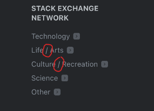
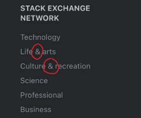
The categories with two words in them are now separated with an ampersand & and the second word is uncapitalized, instead of a slash / and capitalization, as before:

Old:

old footer with slashes circled

New:

new footer with ampersands circled

The page they link to ("All Sites" tabs) uses slashes and the second word is capitalized:

tabs on "All Sites"

Could this be restandardized?

8
  • 28
    Hopefully the final solution to this is to just upgrade stackexchange.com to also use ampersands. I always hate the use of slashes there, because it made no sense. They're traditionally use to indicate an "or" but these are two separate categories that have been combined together, so "and" is the only thing that makes sense between them.
    – animuson StaffMod
    Commented Nov 18, 2021 at 20:40
  • 10
    Per this guidance, sentence casing is used for all headings and "calls-to-action", including buttons and links (in which case the real issue here is that stackexchange.com doesn't abide by that.) ...That said, the guidance on ampersands also says: "Don’t use ampersands (&) unless it’s part of a branded term. Spell out the word “and” instead."
    – V2Blast Staff
    Commented Nov 18, 2021 at 20:41
  • 2
    Considering the examples, this doesn't seem to fall into the first one - this isn't a random usage of an ampersand, it's in a title, which I would say falls into allowed use. But... I didn't write the rules so... ¯\_(ツ)_/¯
    – Catija Staff
    Commented Nov 18, 2021 at 20:53
  • 17
    I don't really care how it ends up either way, I just dislike that the link leads to a place with different orthography.
    – bobble
    Commented Nov 18, 2021 at 20:56
  • 24
    Sentence case should be used for... sentences, not for two distinct words of equal importance.
    – Cody Gray
    Commented Nov 18, 2021 at 21:49
  • 6
    I'd like to modify Stack Exchange to be consistent here. In this case, I think the ampersand is clear even if our guidelines generally recommend the use of "and". In this context I'll take 2 fewer characters 😛
    – Aaron Shekey StaffMod
    Commented Nov 18, 2021 at 22:14
  • 10
    The union (∪) symbol seems like an obvious unambiguous replacement for both. Commented Nov 19, 2021 at 14:59
  • 1
    @animuson: The categories are merged, but the things in the categories (i.e., what those labels really refer to) might fall under one label, or the other label, or both. Using an ampersand would imply (wrongly) that each of the things in the category falls under both. Is it possible you're inadvertently reading the slash as an xor rather than an or?
    – Vikki
    Commented Nov 25, 2021 at 4:25
25

The "Life & arts" link leads to the list of "Technology" sites.

HTML source code showing that "Life & arts" has an href attribute leading to #technology

7
  • 91
    Oh, of course it's live already. Why was I silly enough to think this was merely an announcement of a pending change, soliciting feedback?
    – Cody Gray
    Commented Nov 18, 2021 at 21:51
  • 30
    @CodyGray As a member of the community, I don't want the developers to feel they have to lead by referundum on every little change.
    – Flimm
    Commented Nov 20, 2021 at 5:44
  • 16
    I think that is a bit of a straw man argument, @Flimm, especially when you add "every little change".
    – Cody Gray
    Commented Nov 20, 2021 at 6:22
  • 5
    Technology is our style for life & arts, isn't it? :) Commented Nov 21, 2021 at 17:50
  • What was the software used in the screenshot? Commented Nov 27, 2021 at 9:06
  • @VScode_fanboy The Inspector of the browser console (dev tools). Hit the F12 key. Commented Nov 28, 2021 at 11:21
  • @SebastianSimon I know, I use chrome, what browser lol? Commented Nov 29, 2021 at 5:47
20

If they're used that sparingly indeed, it will slightly reduce the page size and marketing says they're actually in favour of removing them, I see no downsides.

Perhaps replacing them by a single link would be of benefit to the few people who do still use them, where the single link goes to the list of all SE sites? That page already has categories and filters. No need to re-invent the wheel.

3
  • 14
    I like the categories listed so that people can see the diversity of the sites. A link to "all sites" doesn't entice me to click it. A link to Culture/Arts makes me wonder what kind of sites there might be in that category. I'd be more inclined to collapse all of the legal/policy links first.
    – ColleenV
    Commented Nov 18, 2021 at 20:02
  • 4
    I actually forgot the footers even existed. Years ago, I removed them using custom CSS as they just added noise and added unneeded scrolling. Commented Nov 19, 2021 at 7:48
  • 6
    The Stack Exchange title is a link to all sites.
    – Aaron Shekey StaffMod
    Commented Nov 19, 2021 at 16:08
15

While you're at it, the readability of the links against the background image (at least on this site) is pretty poor.

enter image description here

It varies a bit depending on exact screen size, but those text bubbles clash with various links - "Legal" and "Privacy Policy" in this example. The contrast gets very low.

11

Currently there are two links duplicated in the footer. I suggest we remove those duplicates as well.

About and Company link to the same page, and so do Legal and Terms of Service. I'd suggest removing the About and the Legal links, as they are redundant.

Screenshot of the footer with arrows pointing to the links that are duplicates

9
  • 3
    Wait, those headers are links? Never knew…! Commented Nov 19, 2021 at 8:56
  • Technically they are footers?
    – Journeyman Geek Mod
    Commented Nov 19, 2021 at 10:03
  • 4
    Very tightly scoping this work to just the Stack Exchange network column. Plenty of improvements elsewhere. Not touching those other columns ✌️
    – Aaron Shekey StaffMod
    Commented Nov 19, 2021 at 15:45
  • 1
    So you are only doing 1/3d of the work @AaronShekey? Seeing the minute changes that were made writing this MSO post could well be double the work then the actual code changes.
    – Luuklag
    Commented Nov 19, 2021 at 19:08
  • 3
    @Luuklag Messaging changes on Meta is always a bonkers amount of work, big or small, but we wanted to make our case for reducing all those links in the footer. The other columns can change and grow and not have as big effect as the hundreds of links to the individual network sites we've removed. A drop in a bucket. We didn't want this to fly under the radar and be perceived as us not caring about the network. We care about the network, and wanted folks to have context, historically. If it were just me in a vaccum? Heck, I'd have just shipped the change—to be fully candid.
    – Aaron Shekey StaffMod
    Commented Nov 19, 2021 at 19:58
  • 3
    I was going to post the same issue. Additionally, it would make sense to combine "Privacy" and "Cookie" policy, wouldn't it? If you want to make the footer "lighter" to the eye as well as the ISP, then you have to find something to cut in the longest column of links. Commented Nov 20, 2021 at 20:37
  • 1
    "Our lawyers did not allow us to change their links." Commented Nov 22, 2021 at 19:12
  • @AaronShekey You use "make a case" differently than I've ever heard it. I've always understood it to me something you do before you act. I personally think that's the better way to do it, even though you are going to do it anyways. Not only does it help with community relations by making us feel included, but, if you do a testing version first and show us, you get some bug testing and possible ideas for improvement before you go live. It just seems win-win all around. The only cost is maybe a week of waiting.
    – trlkly
    Commented Nov 23, 2021 at 17:08
  • 7
    @trlkly We don't have the infrastructure to cheaply ship a testing version. The effort to do so far outweighs the scale of this change. A/B testing this would take months because of the long tail of Google results. There are changes that you just make and don't bother talking about. Some changes you make and let people know. Other changes you build, then get feedback on. And then there are changes that you get feedback on then build. Each step gets far more expensive in engineering time and attention. ❤️ We chose to make the change and explain our rationale this time.
    – Aaron Shekey StaffMod
    Commented Nov 23, 2021 at 17:56
11

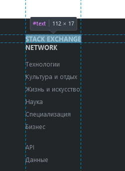
I did the translations for the updated footer in Stack Overflow in Russian, but I can't translate "STACK EXCHANGE NETWORK" like "СЕТЬ STACK EXCHANGE". For some reason there is explicit <br> inside the string:

Explicit br

So there is no full sentence visible in Tradicir related to that footer's text:

SE Network

Could you please fix that issue and make full sentence "STACK EXCHANGE NETWORK" translatable for non-English Stack Exchange sites?

9
  1. Our marketing folks are advising that removing these links may actually increase our search engine optimization

Can someone briefly explain how a footer with fewer links is expected to improve search engine optimization?

12
  • 40
    No, no one can explain SEO. It is VBD (Voodoo By Design).
    – TylerH
    Commented Nov 19, 2021 at 6:33
  • 3
    @TylerH well that explains it then...
    – bad_coder
    Commented Nov 19, 2021 at 9:08
  • 11
    According to some quick googling, Google tends to penalize sites that put loads in their footer without any obvious use to those links, i.e. people put them there for the keywords. I don't think that really applies here, but you could distil the downside of having a massive footer from that.
    – Luuklag
    Commented Nov 19, 2021 at 11:29
  • 1
    @Luuklag I wanted an article that's considered authoritative and someone knowledgeable can confirm applies to the SE footer change. (Googling gives articles with contradictory info, so unless you're a SEO expert one pick is as good as the next.)
    – bad_coder
    Commented Nov 19, 2021 at 11:34
  • 2
    @bad_coder I read a few, and this was the main message I distilled from it. But I think Tyler's comment answers this question best. There is no way to know for sure.
    – Luuklag
    Commented Nov 19, 2021 at 11:35
  • @Luuklag reading a few, a lot, or quick googling doesn't make your comment more significant without authoritative references confirming it. TylerH's simple comment introduces a relevant concept, but beyond that what I inquired about were published guidelines (to that end your comment is vague, the sort of hearsay that doesn't add much and is better avoided).
    – bad_coder
    Commented Nov 19, 2021 at 11:52
  • 31
    @bad_coder SEO is always hearsay and "authoritative references" simply don't exist, because the relationship between sites and search engines is not a collaboration, it's an arms race. Sites are trying to game the system to get hits, and Google is trying to prevent the system being gamed. There are a few exceptions where Google use their dominance to change the market, e.g. promoting HTTPS; but mostly, their algorithms are a closely guarded secret which SEO "experts" are attempting to reverse engineer.
    – IMSoP
    Commented Nov 19, 2021 at 11:57
  • 18
    I personally agree with y'all on SEO stuff. I don't know if it's snake oil, but it certainly feels snake oil-adjacent to me. However, we do routinely talk to an agency we trust on matters like this and their recommendation was to remove the links. A lot of times work like this is tough to A/B because you just have to commit and hope Google's black box doesn't penalize you.
    – Aaron Shekey StaffMod
    Commented Nov 19, 2021 at 20:02
  • From a PageRank perspective, it will hurt the pages you are removing because they will suddenly have WAY fewer links to them. But it will help EVERYTHING ELSE just a little bit because the remaining links on the site will be less diluted giving them more link juice to pass. Commented Nov 25, 2021 at 0:45
  • Footer links have little impact at all on SEO these days because Search engines have been discounting footer links for years now. I would expect that changing the footer in any way is not going to have any measurable impact on SEO. Commented Nov 25, 2021 at 0:48
  • Better usability and site speed are SEO ranking factors. So any change that makes positive changes in those areas has the potential to boost SEO slightly. Commented Nov 25, 2021 at 0:50
  • 2
    BTW, this is the type of question that would be appropriate to ask on the Webmasters stack (where I am a moderator.) Commented Nov 25, 2021 at 0:52
9

Not sure why you switched the order in the footer compared to the order of the list on the network site. The "Life & arts" and "Culture & recreation" are swapped on the footer below.

I had noticed that some sites were missed, this certainly saves updating the list and lightens the pages weight.

8

?

Licensing link in the footer refers to https://stackoverflow.com/help/licensing for all SE sites:

licensing

I'm not quite sure about the link before, but every SE site has it's own page in the Help Center about licensing. E.g. here on Meta SE https://meta.stackexchange.com/help/licensing

So why does the link in the footer refer to Stack Overflow instead of the current site?

More over non-English sites have translated help and that may be a little bit confusing.

1
  • IDK, but that's what a footer is supposed to look like. If I scroll all the way down literally half the page disappears into look-at-all-these-cool-links over this neat-o blue graph paper.
    – Mazura
    Commented Dec 8, 2021 at 20:34
6

Regarding the footer changes

Perhaps on smaller / mobile screens the entire footer could be collapsed into a single bar (revealing the rest via CSS on mouseover/mobile touch)?

Why? Well…


Regarding the removal of the ‘mobile’ site

Before you go ahead with the switchover, please try and make sure the responsive view on mobile has parity with the existing ‘mobile’ site.

Example:

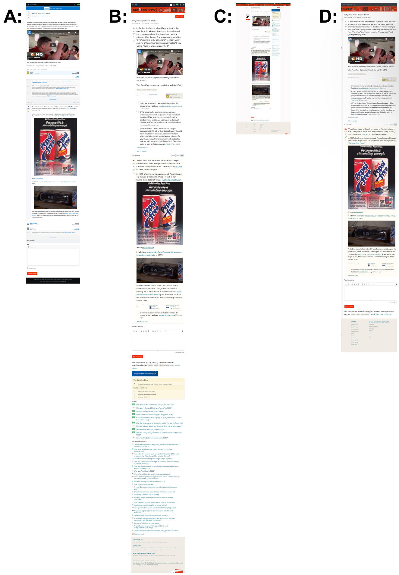
Here is a page found at random:

These are screenshots from my iPhone of that page as it appears (as of earlier today), in the deprecated ‘mobile’ view (A) and the ‘full-site’ view in both ‘responsive’ (B) and ‘non-responsive’ (C)/(D) modes (higher-resolution pdf version):

Overview (low resolution due to Imgur 2MB limit)

Notes:

  • Screenshots taken at about 2120 UTC on 2 December 2021
  • (If the links in the images seem small, that is because my little iPhone’s browser is set to to default all sites at 50% zoom.)

Legend (and links to individual screenshots):

* as if a user ‘pinch-zoomed’ until the main content column filled the width of the screen for reading


Differences of note*:

* (besides the obvious and excessive difference in length)

In the existing ‘Mobile’ view:

  1. the answer submission form is at the very bottom of the page
    • is therefore easy to find / navigate to (a touch-screen analogue to “Fitt’s Law”, perhaps?)
  2. the page title is shorter (category excluded?),
    • which makes reading browser tabs
    • or a list of browsers bookmarks / history entries on a narrower screen much easier,
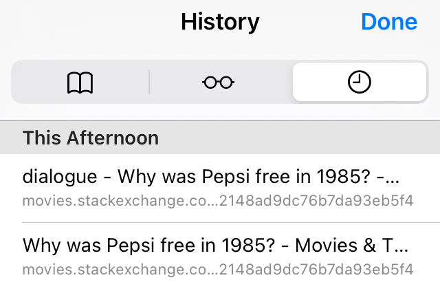
      • especially for longer category names; example browser history with a relatively short category name: browser history snippet
  3. The comments on both question and answers are not optimized for space nor ease if reading
  4. it’s just much shorter and less visually cluttered

Page title variations:

  • A: Why was Pepsi free in 1985 - Movies & TV Stack Exchange
  • B: dialogue - Why was Pepsi free in 1985 - Movies & TV Stack Exchange
  • C: dialogue - Why was Pepsi free in 1985 - Movies & TV Stack Exchange
  • meta.stackexchange.com auto-formatting: Why was Pepsi free in 1985?

Summary

As I understand*, the current plan is that A and the footer link to C will be going away soon.

(I assume that ‘C’, or at least something like ‘C’, will continue to be available by selecting the “Show Desktop Site” option in a mobile browser.)

Is that correct?

* based on what I read elsewhere on this page and on the links below


Related:

2
  • 1
    "Show Desktop Site" will show the exact same thing, the responsive site is the same site on any device, the CSS just renders differently depending on the screen width. If you make your desktop browser very narrow, it'll look like B. The only difference between B and C is that the second column is rendered at the bottom instead of to the right. You could make a case for the Hot Network Questions list to be collapsed on small displays. Commented Dec 9, 2021 at 21:34
  • Agreed - I’ll try to make that more clear next time I edit the answer. (Originally I only included ‘A’ and ‘B’ as that comparison is the key one here; ‘C’ was added later for completeness). Commented Dec 10, 2021 at 1:12
5

Just have one link to a page of categories, and then the categories lead to their links.

5
  • Like this?
    – Cody Gray
    Commented Nov 18, 2021 at 21:50
  • 1
    Also suggested here
    – bobble
    Commented Nov 19, 2021 at 1:54
  • 6
    You can click that Stack Exchange header to go to all the sites.
    – Aaron Shekey StaffMod
    Commented Nov 19, 2021 at 16:26
  • 1
    Guess we don't need a footer then. site design / logo © 2021 Stack Exchange Inc; user contributions licensed under cc by-sa. rev 2021.12.8.40943 < that's a footer.
    – Mazura
    Commented Dec 8, 2021 at 20:22
  • That's supposed to be flat across the bottom of the page and also flat above it is your links that nobody clicks. And not so big that the important part is in a side bar (?!!). Status: no, we're going to do it the way we're going to do it. Thanks for playing.
    – Mazura
    Commented Dec 8, 2021 at 20:26
4

Please make footer links easier to tap on the mobile site

I often need to go to the Full Site in order to see a question's View count, which is hidden on mobile:
Cannot see number of views for question on mobile?

The "full site" link in the footer is very difficult to tap with a fat finger on mobile without zooming in.

enter image description here

I would say that all of those links should be easier to tap, but "full site" is the one that I use a lot. Please make it, or all of them, easier to tap on the new mobile footer.

2
  • 7
    This view is deprecated and will go away soon, so I doubt this will be directly fixed. (If you have a problem with the footer links after you tap full site, you should report that. That's the footer that's being changed, not the mobile one.)
    – Laurel
    Commented Nov 19, 2021 at 20:36
  • 2
    Our goal is to be wrapped up with this mobile deprecation by the end of 2021. With holidays and such, it might slide into the earliest bits of 2022, but these views and having to move between mobile and full site are going away soon. Sit tight!
    – Aaron Shekey StaffMod
    Commented Nov 22, 2021 at 22:48
4

As a moderator, the expandable links were really helpful to me and I miss them a lot. They made it easy to point to sister-sites when a question was OT but would fit there, helping to find the link to the fitting one. While this still can be done after following the link to, say, "Technology", that means another browser tab and a full page load. And there, those 4k saved turn into how many k wasted?

2
  • 1
    You can find the full list of sites also in the hamburger menu in the topbar.
    – Luuklag
    Commented Dec 9, 2021 at 8:44
  • Nice theory. As pointed out in what you edited out of my answer, those drop-downs no longer work for me (and several others). Apart from that, there is no hamburger menu. Assuming you mean the Stack icon, that only shows a small selection – and when clicking on "more", that again opens another page replacing the one I have opened (unless I choose to open in a new tab) – even more inconvenient as it does not even filter by eg. "Technology", so that requires yet another click and load. If you meant something else by Hamburger, I didn't find it.
    – Izzy
    Commented Dec 9, 2021 at 10:28
2

Wouldn't hurt to cut more. Websites are often overweight nowadays. All you really need is the copyright notice, IMO.

There are links to the other sites on the network in the right sidebar, and the site draws attention to them in various other ways. People can nose around the site easily enough to find out more.

Don't be afraid to cut the bloat.

2

S/O Dev: Woohoo! We managed to 4K to our page footer!

S/O Marketing: Great! now can you add this 400K javascript advertising tracker for us ?

Sometimes, links are like smoke alarms ... they are hardly ever used, most people don't really think about them that often, they may occasionally be annoying, but every now and the, you're really glad they're there.

You must log in to answer this question.

Not the answer you're looking for? Browse other questions tagged .