So much web development these days is intended to improve the experience for mobile readers. It's certainly more comfortable to read the Top Questions page on an iPhone:

The basic flow at this size is:
- Meta data (answers, votes and views)
- Title
- Tags
- Most recent activity
Turning the phone to landscape shows a similar flow, but with the navigation moved out of the hamburger and into the left bar:

You can start to see the flow fall apart, however. With more horizontal space to work with, the recent activity line floats off to the left and out from under the vertical flow. I'm pretty sure this isn't new. What I'm trying it illustrate is that the flow changes based on screen width.
The difficulty on desktop is two-fold, in my opinion:
- The information flow didn't survive a transition from vertical to horizontal.
- Desktops have different affordances than phones.
The flow problem is easier to point out. when the page is sized for a desktop, the flow goes from left to right:
- Meta data (answers, votes and views)
- Title and tags
- Most recent activity
Only the most recent activity sorta floats off on its own since it's flush right and everything else is lined up on the gutter between the meta data and the title. That happens on the mobile view too, but since the flow is vertical, the activity line has a clear place in the story: associated with the question, but tucked out the way.
It reminds me a bit of chapter 4 of Scott McCloud's Understanding Comics. He shows how the individual frames in a comic naturally read from left-to-right and up-to-down because that's the way other media (in English at least) flow. Responsive design breaks the page into boxes, not unlike frames in a comic and gives the browser hints on how they should be arranged on different sized screens. On mobile, the flow works up-to-down, but on the desktop, it's disjointed with a bit of vertical flow (the three meta data lines), over horizontally (title and tags) and then sorta diagonally (the recent activity).
In both views the title and the tags are clearly the center of focus. The title is bold and colored as a link. The tags have prominent boxes around them. But on mobile, there is a clear introduction (meta stats to give the question context) and conclusion (recent activity gives a snapshot of history). Meanwhile the story is confused on the desktop because the flow isn't as clear. It seems entirely possible that this layout wasn't strictly intended, but just sorta the way the browser interpreted the hints in the context of a larger canvas.
We can get an idea of what the intention was from this Figma design:

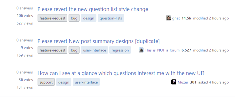
This summary also includes the post excerpt, which helps provide context. But it also includes icons and colors for the meta data. It seems the idea is that questions with a lot of answers, votes and views will stand out from the typical question with no answers, no votes and a handful of views. But when you look at a typical page of questions, the numbers will typically be grey right down the screen with the occasional green box if there are answers or heavy green box if an answer has been accepted. (Or, if you foolishly watched a tag, you'll get aggressive yellow "Watched" boxes.) Subdued text doesn't get in the way on a small screen, but on a large screen text isn't enough to tell the story.
The previous view wasn't perfect, but it had been refined over years to highlight votes and answer counts with large, prominent numerals:

To borrow a term I learned from The Design of Everyday Things, the problem is one of affordances. Low contrast numbers purposely de-emphasize answers, votes and views if they aren't large. Perhaps for a casual reader that's appropriate. We want people to focus on useful questions. But for people hoping to find questions to answer or vote on, the affordances are all wrong. The difference between 0 and 1 votes (well, technically score) is large as is the difference between 1 and 3 answers. But these differences are difficult to discern at a glance. Indeed these low numbers (relative to the site as a whole rather than the current view) disappear into the background.
I wonder if part of the problem was focusing on Greatest Hits, which is an atypical view of the site. While it remains hard to find the votes (at a glance), my eyes are drawn to the view and answer counts that have clear and distinct colors and iconography. Obviously the fire icon would be inappropriate for a question with 6 views.
At any rate, I'm not a designer. Usually I feel the shock of the new and that subsides after a week or so. Maybe that'll happen for me this time too.


