34

Tl;dr

We are redesigning our post summary component and would like your input before the design process begins. The post summary component appears on most pages that show a list of posts, including Home, Questions, and search results.

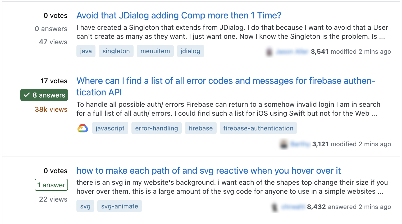
Three questions on the questions page with post summaries. One question is without answers, the second has many answers including an accepted answer, and the third has a non accepted answer. (Detailed description is below.)

Three examples of the post summary component in a list of questions. They all show the question’s stats (votes, number of answers, and views) on the left and the question title, excerpt, tags, and user card (which contains an avatar, username, reputation, and timestamp) on the right. The first example shows a question with 0 votes and answers and a low view count. The second example shows the same elements but the answer stat has a green background and checkmark to show there’s an accepted answer, and the view count is orange to show that the question is “hot.” There’s also a Google Cloud logo to the left of the tags indicating that this question belongs to the Google Cloud collective. The third example shows what a question with answers looks like when none have been accepted: the answer stat appears in green with a green rectangle surrounding it.

Background

As part of the larger updates to the design of the site, which so far has included updating colors and increasing the border radius of corners, we are updating individual components of the network to match the new design direction while making usability improvements. Last week we also posted asking for input on redesigning the user card component, which appears at the bottom right of the post summary component.

When we last redesigned the post summary component, you gave us a lot of feedback. Most significantly, the component makes it harder for you to quickly scan the “stats” of a post and decide whether you’d like to click. That is the primary issue I’m hoping this redesign will solve, though I certainly welcome additional feedback on the current component.

This component has an important job

The purpose of the post summary is to give users a sense of a post’s content at a quick glance so they can decide whether or not they’d like to read that post.

It appears in a variety of contexts:

  • Homogenous lists of content (e.g.: a list of questions or a list of articles)

  • Mixed lists of content (e.g: the search results page displays questions and answers together)

  • Present on Stack Overflow, the SE Network, and Stack Overflow for Teams

And has many necessary requirements (in no particular order):

  • Must work for all content types, including questions, answers, articles, and bulletins. When multiple content types appear in the same list, users should easily be able to tell which content type the post is from the post summary.

  • Easily scannable for the elements users care about most in that context (more on that below)

  • Supports different types of metadata, depending on the content type and the context (e.g.: number of views, score, length of read)

  • The watched and ignored states draw (or don’t draw) the appropriate amount of attention

  • Can show bounties, if applicable

  • Can show content status, if applicable (e.g.: closed, pinned, archived, etc.)

  • Can show when a post is part of a collective or multiple collectives

  • Works well regardless of screen size

  • Supports different excerpt lengths, including no excerpts

  • Supports different layouts, including minimal and child content previews

  • Supports an action menu (seen in the Saves feature, for example)

The process

Here's an outline of the design process for this component:

  1. Information gathering and initial input (this post)

  2. Gather feedback on design explorations

  3. Showcase final design

After that, the component will be developed and pushed live.

What we need from you

Your input will heavily influence the design, and we have some specific questions for you:

  1. When scanning a list of post summaries (e.g.: on the /questions page), what information is most important to you and why?

  2. How, if at all, does the information you’re looking for change based on your specific goals on the network? Can you provide an example?

I’ll be waiting one week (until August 23) to begin the design process so as many people as possible have time to give input on this post. I’m looking forward to reading what you have to say and improving this component so it better enables your contributions on the Network.

4
  • 24
    I will never not appreciate this sort or early engagement over feedback. You're doing awesome work! Thank you. Commented Aug 16, 2023 at 20:00
  • 1
    I would suggest reading New post summary designs on site home pages and greatest hits now; everywhere else eventually thoroughly before making us restate all the frustrations with the already implemented 'improvements'. You might also want to read through How much research effort is expected of Stack Overflow users?.
    – pilchard
    Commented Aug 26, 2023 at 15:00
  • 3
    @pilchard I've read it thoroughly (and linked to it in my post) and taken notes, so I've done my research. That post, and the others like it I've read, will be helpful as I start the redesign. I'm not asking anyone to restate frustrations with the current design—my two questions in the "what we need from you" section relate to your goals as contributors to the network.
    – Chloe Staff
    Commented Aug 26, 2023 at 16:21
  • @Chloe I did note that you'd linked to it and I'm glad you've read through it. I'm sorry if my comment came with some negativity, past design posts have generally come with a great deal of defensiveness and an unwillingness on the part of the design team to back down or revert changes even when met with considered and invested critique from the community. Revisiting the design of this component is welcome and I will put together answers to your questions, but honestly just reverting to the prior incarnation would be a welcome start (and probably a better starting place for the redesign).
    – pilchard
    Commented Aug 26, 2023 at 17:02

13 Answers 13

38

When I'm scanning through the homepage, I'm often looking for either content in need of moderation, or content that I can contribute to (i.e. answer).

In that context, I'm looking at the post score, answer count, and view count. Unfortunately, with the change to make those numbers smaller, I find it difficult to read these, particularly as someone with poor vision:

The home page with a list of questions. On each question, the score, answer count, and view count are displayed on top of each other for each question.

To that end, I use a userscript to restore the old look, with much larger numbers, which I'm able to read and scan through much more easily without pausing to squint at each question:

The home page with a list of questions. On eachq uestion, the score, answer count, and view count are displayed side-by-side in a font size comparable to the question title.

When I'm searching for something to answer, I can then just scan down the middle line there to find unanswered, recently active questions. When I'm looking for stuff that needs moderation, I can scan down the score counts or view counts, and choose to look into the post depending on those. (I also tend to keep an eye on the most recent activity - being able to see that a 1-rep user posted an answer or asked the question is helpful, for instance.)

In either case, being able to scan through each metric individually, quickly, is key. The larger font size is also much better for me as someone with poor vision, and it's frustrating when I'm navigating on a device without my scripts and I'm forced to either zoom in to a level where I can't see other content easily or squint.

5
  • 3
    This is helpful, thank you! I have two follow-up questions if you don't mind. When you're looking for a question to answer it sounds like you're scanning the answer stat to find a post with 0 answers. Is there any reason you do that instead of using a filter so you're only seeing unanswered questions? And when looking at view count, does the color indicating hotness (yellow, orange, red) help you out at all?
    – Chloe Staff
    Commented Aug 15, 2023 at 17:50
  • 7
    I'm generally looking for either questions without an answer, or questions without an accepted answer, @Chloe - and also generally keeping an eye open for something interesting even if it's not what I'm actively looking for. To that end, the view counts and the hotness indicator is helpful, yes - when scanning through, the color difference helps to call attention to it, and I might click through if it looks interesting even if it's not what I'm actively searching for at the time.
    – Mithical
    Commented Aug 15, 2023 at 17:53
  • 11
    @Chloe "instead of using a filter" - I think quite a lot of 'regular' users, especially on sites smaller than SO are parked on the front page. At this point, I'm don't super regularly answer or ask questions but I do skim/read my sites a lot.
    – Journeyman Geek Mod
    Commented Aug 15, 2023 at 23:21
  • 8
    My experience aligns with what you say, as a non-SO user, @JourneymanGeek . :) Most of the sites I frequent have few enough active questions per day that it's not necessary to filter them. Additionally, for moderation purposes (including editing and closing), limiting what I see means posts will be missed. When I'm looking for something to answer I may do what Mith describes but when it comes to the home page, I want to see it all. I also recognize that my needs aren't the same as everyone's so it'd be really cool if we could be responsive to that - will be interesting to see what's next!
    – Catija Staff
    Commented Aug 16, 2023 at 13:42
  • 2
    @Chloe Adding on to what the other comments say, I'm rarely doing one task at a time when viewing the list of questions. Viewing only unanswered questions means I'm missing other content that is interesting or needs attention. If I would, say, separately scan active questions and new questions (or active and unanswered, or whatever combination), there will be a lot of overlap in those lists that wastes my time if I view each way consecutively. Commented Aug 21, 2023 at 16:36
18

Besides what @Mithical said, the vertical density of the post summary is also extremely important for quickly browsing a large amount of posts.

The introductory post where you showcased some screens of new design shows that you have introduced larger amount of vertical whitespace, compared to the current design. This makes quick browsing much harder.

As a side note, I am personally using 50 posts per page.

17

When scanning a list of post summaries (e.g.: on the /questions page), what information is most important to you and why? How, if at all, does the information you’re looking for change based on your specific goals on the network? Can you provide an example?

For questions:

  • Whether or not the post is answered - this isn't the most important, but I think it's generally good to know as part of the state of the question.
  • Whether or not the post has been voted on - this is very important as if the post is already -2 and my first impression given the title and summary is the post is likely low quality, there's not much value in me spending time on that post.
  • Whether or not the post has a bounty - since many bounty posts are low quality and similarly attract eloquent bs answers, having a bounty indicator is a note that maybe this post could use a little more attention, given the above bullets.
  • How long ago the post was made and when it was last updated - Knowing that a post is one from 8 years ago that community bumped rather than a 0 rep question that may have someone that actually needs help is very useful information that saves time.

For answers:

  • The summary itself is the most important piece for me here as the summary is often great at indicating whether or not it is an answer that likely either needs work or is low quality without needing to visit the post first.
  • Secondary here would be the answer score, as if I find that the summary indicates a quality that matches with the score, there's no reason to visit and pile on votes.
3
  • 1
    Thank you—I appreciate the distinction between what you're looking for in questions vs. answers. Where are you typically skimming lists of answers? Primarily the search results page or somewhere else?
    – Chloe Staff
    Commented Aug 15, 2023 at 20:14
  • 3
    i usually go to is:answer for specifically looking at answers
    – Kevin B
    Commented Aug 15, 2023 at 20:15
  • 3
    +1 for "how long ago the post was made." Especially on sites like Meta where there are highly active curators, it'd be nice to quickly identify posts that are actually new.
    – LShaver
    Commented Aug 17, 2023 at 14:21
16

When there is enough horizontal space, a question's tags and activity summary appear on the same line. This is an economical use of space, which is good.

But, the activity summary does not have a constant width, because the time passed since activity occurred changes every minute. If the page width is set just right: as the clock ticks over (e.g. from 9 to 10) this can cause the line to spill and more or less vertical space is used to display the post summary.

The size of a post summary changes with time.

Example:
At a given page width, this post has a certain vertical height:

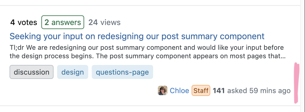
Post summary with tags and activity summary (59 mins ago) on separate lines

1 minute later this height has changed:

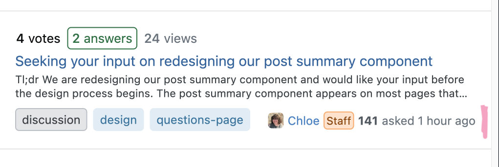
Post summary with tags and activity summary (1 hour ago) on the same line

This displaces all posts below and is necessarily jarring — especially given that nothing significant has actually happened. The lower down the page of questions, the more likely a displacement is to happen above, and displacement can even compound when several posts suddenly take up more or less vertical space.

If the space allocated to the recent activity time were static (rather than dynamic) this wouldn't happen.


It's not a big problem really, but I think it's worth considering at if you are redesigning post summaries.

2
  • 5
    Absolutely—this has always bothered me. It's tricky because both the tag group and the user card can take up different amounts of space which causes that row to wrap inconsistently and a bit unpredictably. But as you said, putting them in the same row is an economical use of space in a component that people want to take up as little space as possible. I'm hoping we can make an improvement there without compromising too much on a good use of space.
    – Chloe Staff
    Commented Aug 15, 2023 at 20:10
  • 1
    @Chloe What if the user card moved above the excerpt? Tags can eat up a lot of space and so can user cards. The post statistics are a bit more compact. The modified or created time is part of the statistics I scan, and while the new position would take getting used to, it might end up being better. It does introduce an inconsistency with where the user card is on the full post though.
    – ColleenV
    Commented Aug 16, 2023 at 11:13
10

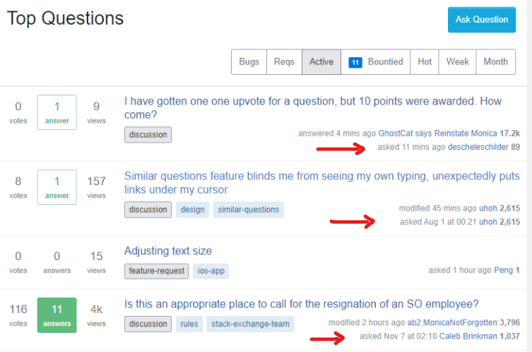
Could you please always include the date on which the question was asked?

Currently, the 'ask date' is not shown on the homepage or the Active tab and is replaced with the date of the latest activity. But I believe the ask date is important and should always be shown on question lists.

I couldn't tell you how many times I clicked on a question thinking it was a recent one, just to realize it's been asked months or years ago (sometimes after reading half the question even the entire thing) and any of the following is true:

  • I've already seen the question before.
  • It's no longer relevant/interesting given its age (happens often on meta sites).

In the past, I used CertainPerformance's script Ask Dates Everywhere which solved this problem by adding ask date wherever it's not shown. Here's a screenshot of what it looked like:

Screenshot of the Ask Dates Everyehere script result

Unfortunately, it stopped working a while ago. I could potentially create my own version of it but I think having this as a native feature would benefit a lot of users.

9

Search should not take sentences out of context and misrepresent an answer as saying the direct opposite of what it's meant to say.

The other day (link requires mod access), I was searching for this answer of mine, which begins like this:

Yes, in general, Meta.SE is an appropriate place to post bug reports, feature requests, and discussions about moderator tools.

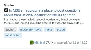
What came up in search was this:

Search result showing the title "Is MSE an appropriate place to post questions about translations/localization issues for mod related features?" and a snippet of the answer: "Posts about those, including about localization, do not belong on Meta.SE, and instead should be directed towards the private Stack..."

I'd assume this happened because I searched for user:me is:a Team, and the sentence that includes the word "Team" is therefore singled out. However, since it's towards the end of the sentence, it gets cut off in the search result and not displayed. The end result is that the snippet shown in search both a.) directly misrepresents the answer, and b.) doesn't show in the result the word that I was searching for directly.

I'm not sure what the solution here is, but when I'm scanning through search results it'd be nice not to worry about sentences being taken out of context and displaying the opposite of what is meant in the post.

4
  • 10
    Lack of context for excerpts is a bigger problem than just with site search. Google also does crap like that, so your only real solution is to rewrite everything in a way that nothing can be taken out of context. (The problem with Google also has potential solutions, but nothing has been done yet.)
    – Laurel
    Commented Aug 15, 2023 at 17:44
  • @Laurel I'm curious about those "potential solutions". Which Stack Exchange site would this question be most appropriate for? (I don't know enough about the topic to ask a good question.)
    – wizzwizz4
    Commented Aug 15, 2023 at 21:48
  • 1
    @wizzwizz4 Probably Webmasters if you're looking to learn how a site can opt-out of Google snippets. Also, I posted a suggestion related to this on MSE which has some more info: Prevent downvoted answers from appearing as Google Snippets
    – Laurel
    Commented Aug 15, 2023 at 21:53
  • 1
    It could at least put an ellipsis at the beginning of any excerpt that isn't the beginning of the post. Commented Aug 18, 2023 at 4:41
8

Show close/reopen votes?

I know this project isn't for backend-inclusive changes, but I'll put out this wish anyway: It would be nice to see the number of close-votes on questions from the post summary (to users with the close-vote privilege). I think that can help with getting things closed more quickly that should be closed. There is the review queue, but I think it would be much more convenient to see inline in post listings. Seeing a flag count for close-reason flags would also be a plus for the same reason. If this isn't the right place to put this feedback, I can make a dedicated feature-request post.

Misc personal use-case things

The post body excerpt isn't particularly useful to what I do except in looking at search results, where it's essential.

The score and view count are useful as a weak proxy for quality and how many others have a similar question when I'm looking at questions. Can help me prioritize what I want to look at answering first.

When looking for things to answer, when I was newer to the network I used to avoid questions with accepted answers or a certain number of answers, but I've come to realize that I often can and want to write a better answer than those that have been posted. But it's still nice to have the answer count indicator there. It can be useful on meta to see how much discussion something is getting.

2
  • 3
    I almost suggested seeing the number of comments, to indicate if other curators are already active on a given post, but, yea, that's a backend thing and likely to never happen
    – Kevin B
    Commented Aug 15, 2023 at 19:15
  • Or just show a flag icon if there are any close votes. The exact count isn't that important. Commented Aug 31, 2023 at 15:31
8

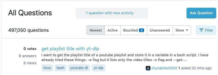
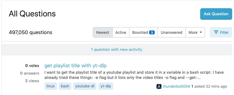
An addendum to what Elements in Space said elsewhere about not re-aligning things based on some small element such as the 'since' timer.

Would it be possible to also not allow the '1 question with new activity' header to displace the question list?
You'd think a race condition would be rare on that, but 'million-to-one chances crop up nine times out of ten'* and so frequently I click a page element at the precise moment the page jumps & end up somewhere unexpected.

Maybe something like this…

enter image description here

instead of this…

enter image description here

Note: I do like the indicator itself, mainly as it allows me to see what's been deleted, for flushing out spammers etc. & it also reflects in the tab title. I just don't like the jump.

*Terry Pratchett, Mort.

1
  • 4
    As additional information - the indicator is extra annoying because it pushes down content about the same amount of height as is the title. And if you want to open the top question, yet the new activity indicator shows up, you usually click on it. The layout should just never jump around.
    – VLAZ
    Commented Aug 16, 2023 at 15:04
4

Just a few thoughts:

  • Except on the search results page, the excerpt adds little value. However, writing a good title and making sure the right tags are on the question is hard, though. I'd suggest removing it. There could be some good uses for AI/ML technology, for future projects, for things like suggesting titles and tags or putting posts through a review queue to have curators verify tags and help write titles.

    • The only advantage to showing content on the search page is that it has the contents highlighted. However, even then it's not always enough to give enough context. It could be useful to rethink how much content is shown there or how the content is selected for that preview.
  • The number of views isn't relevant to me. Votes, answers, and the presence of an accepted answer can be useful hints. I don't know what I'm supposed to do with the number of views, though.

  • I'm not sure if the user cards are relevant here at all. It could be useful to see when a question was asked (and edited) and the last time an answer was updated (created or edited), but I'm not convinced by the need to see who the author is or who the last answerer is. In fact, switching between those can be confusing - sometimes it shows asker, sometimes it shows answerer or editor.

    • Quassnoi brings up a good point. It could be interesting to show multiple cards. Consider the original asker, the most recent question editor, the most recent answerer, and the most recent answer editor. If I was in a "pick two" scenario. I'm still not sure how useful this would be, though, and could just be visual clutter. The dates of asking, most recent change, and what the type of change is (new answer, question edit, answer edit) is the most important.
  • I like the results of Mithical's user script with the bigger votes and answer indicators. I'd just drop the views and use some additional width for the title and tags, plus considering what could happen with the author/editor card.

2
  • "I don't know what I'm supposed to do with the number of views, though." a disproportionately high number of views compared to score could indicate a need for a better title (people clicking on something in google search results only to find that it is not the question they are searching for). that has usually been what I've experienced.
    – starball
    Commented Aug 21, 2023 at 16:33
  • @starball That seems to be a good heuristic for putting a question through a "question title and tag review queue". I don't think it's relevant on the homepage, questions page, a search page. Commented Aug 21, 2023 at 17:03
3

Can we please show both the asker and the accepted (or most upvoted) answerer in the question list?

enter image description here Source

Also, it would be nice if we had a checkbox to mark minor edits as "copyedits".

We have a lot of edits that make cosmetic improvements to the questions (like fixing grammar, formatting etc.) but don't add any new information.

Such edits should not overwrite the post author's name in the question list.

The full proposal (covering both issues) is here:

5
  • I just saw your answer after posting mine and realized that we're both more or less asking the same thing. Hmm, I don't know if I should delete mine or keep it since it focuses mainly on the ask date whereas yours focuses on the asker's card being displayed.
    – 41686d6564
    Commented Aug 21, 2023 at 15:39
  • "Also, it would be nice if we had a checkbox to mark minor edits as "copyedits"." This initiative is not for backend changes. Basically style changes only as far as I understand.
    – starball
    Commented Aug 21, 2023 at 16:04
  • 2
    @starball: Yep, pretty much. It's worth proposing separately (as I see they've already done), but adding new features is outside the scope of this particular set of changes.
    – V2Blast Staff
    Commented Aug 21, 2023 at 20:45
  • 1
    I'm pretty sure features for non-bumping minor editing have been made ad nauseam. Exhibit A: is:q [feature-request] bump minor [edits]
    – starball
    Commented Aug 21, 2023 at 20:49
  • @V2Blast: ours is a small site and it would be especially important for us (see the linked post for the reason why). We've actually had people leave over this (not just over this, but I strongly suspect it has contributed). Sure it's probably not the right place, but I'd use any chance to draw attention to it. Thank you!
    – Quassnoi
    Commented Aug 21, 2023 at 22:37
3

Sorry I'm late responding, but as part of this work, please consider bringing back the New Activity Indicator when using Custom Filters:

enter image description here

My understanding is that one of SE's major goals is to increase interaction, especially in the number of questions being answered.

The removal of this indicator has certainly reduced the number of questions I answer in the tags I watch, since it's no longer clear to me which ones have been added/updated since my last visit. I'm simply not spotting as many questions which could use an answer as I used to be able to when this indicator was present.


Related MSO post

2
  • yeah I'm also kind of bugged that this has not gotten attention. but at the same time, I've realized that I don't really need it. browsers show what links you have visited (the only rub being that if the URL changes, then obviously it says you haven't visited the new one, which is annoying because the URLs contain the question title, and I often edit question titles)
    – starball
    Commented Sep 3, 2023 at 19:54
  • @starball the difference between a visited and unvisited link is very poor. I have a userstyle to make it more distinct, and yet it does not transfer between machines. For me removing the indicator destroyed almost all use I had for custom filters where I wanted to watch for new questions. The majority of time I'm using a single custom filter where I watch all incoming questions, so the indicator doesn't play a role. And recently I've been "bookmarking" tag pairings to examine later - again not something where an activity indicator would help but also not exactly what a filter is for.
    – VLAZ
    Commented Sep 4, 2023 at 10:09
1

When the tags and user information can fit together on some number of lines, fit them on that number of lines. Currently if the tags take multiple lines the user information appears on its own line.

0

Hyphenate titles only, besides when a word is longer than a line, when it would save lines. Currently many pointless intrusive hyphenations occur.

You must log in to answer this question.

Not the answer you're looking for? Browse other questions tagged .