52

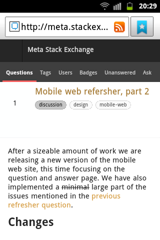
After a sizeable amount of work we are releasing a new version of the mobile web site, this time focusing on the question and answer page. We have also fixed or implemented a minimal large part of the issues and requests mentioned in the previous refresher question.

Changes

Question and answer page

  • SVG icons for upvote, downvote, favorite, comment upvote
  • white background color for legibility
  • general styling issues with notices (they actually exist now)
  • bounty link is now in question menu (next to flag)
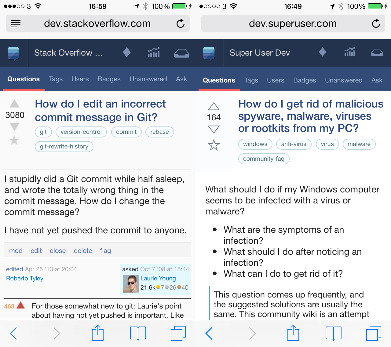
Question and answer page

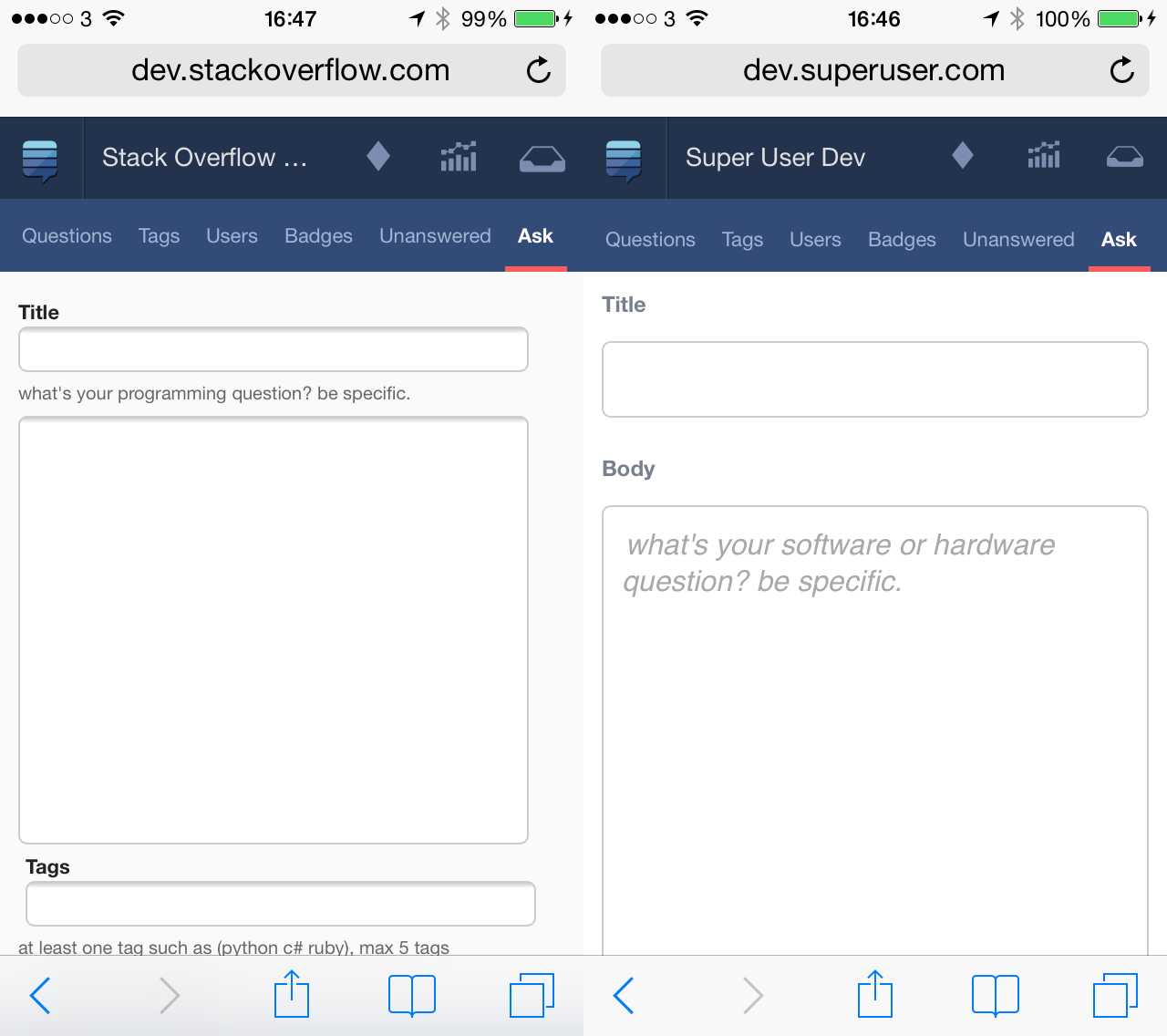
Ask question page

  • general styling and sizing of element
  • use of placeholders where appropriate instead of page text
  • styling of error messages

Ask question page

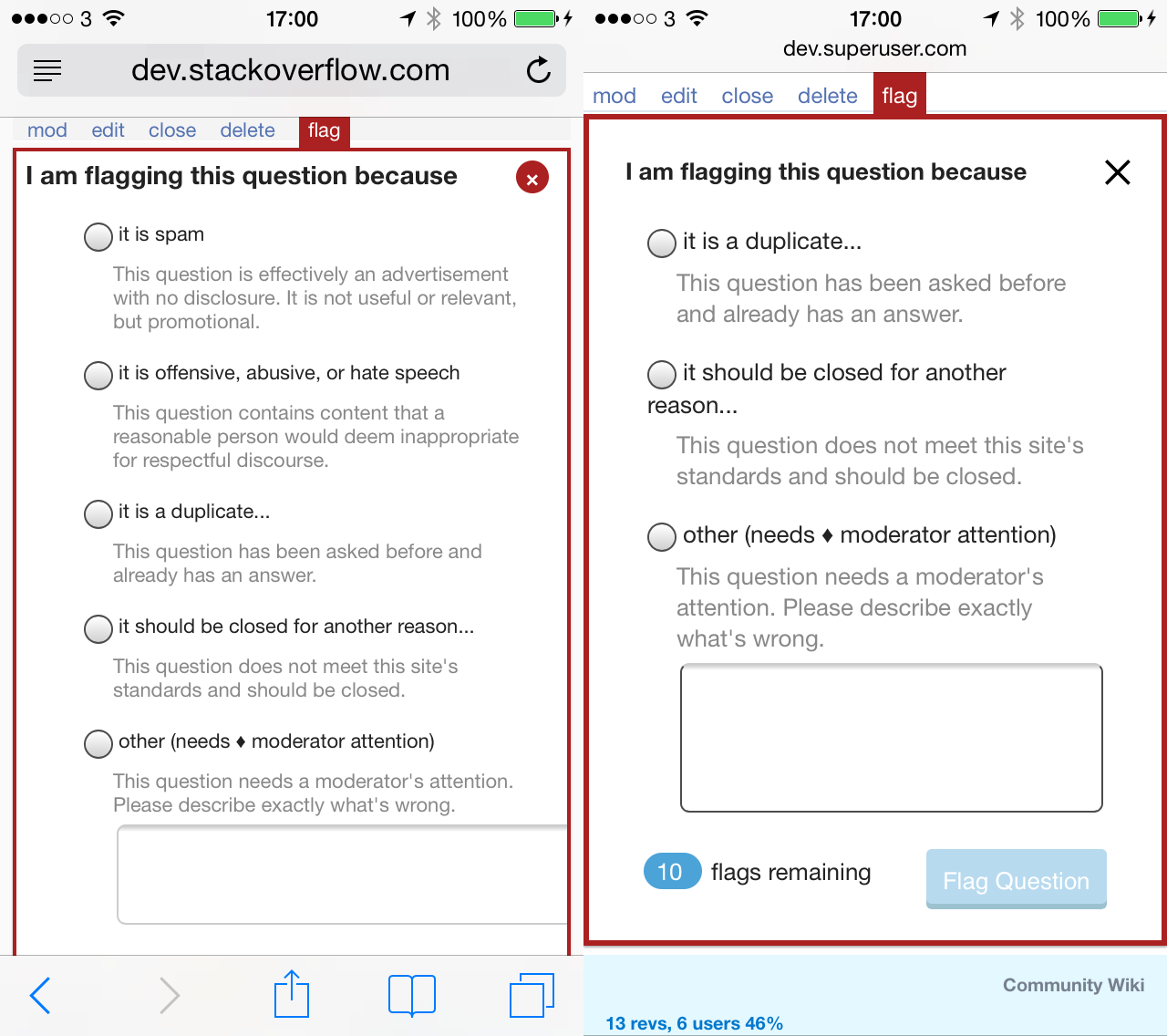
Pop-ups

  • Popups are now inlined in the page instead of being sometimes floating and draggable
  • Many overdue styling issues
  • Close button is SVG
  • Flag indicators are readable
  • Buttons

Pop-ups

Misc pages

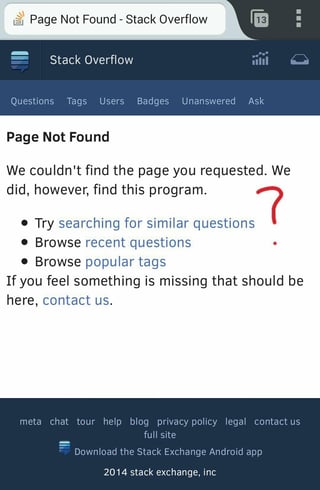
  • 404 page did not exist. Now it does.
  • Login, logout are formatted
  • Pre-ask and pre-answer warnings are now formatted

Bugfixes

  • made search magnifying glass bigger
  • fixed language in user timeline so it's consistent with the desktop site
  • added login link on top bar
  • made topbar icons ever so slightly smaller

Restating the obvious: send your <3 to Pawel and Jin for the most excellent design!

Feedback , bugs and suggestions while we move to the next iteration?

Please mark bugs with

14
  • 11
    Popups are now inlined in the page instead of being sometimes floating and draggable. \o/ About time! Commented Aug 4, 2014 at 17:09
  • 2
    Warning: this site is for Stack Exchange developers and staff - it is used for development and testing. To log in, you must have received an invitation email. Click the invitation link in the email to log in! I want to see the latest and greatest :( Commented Aug 4, 2014 at 19:01
  • 16
    You made it nice and shiny, but didn't address the massive amount of scrolling one has to do to close as a duplicate?
    – Makoto
    Commented Aug 4, 2014 at 19:57
  • FYI: If you aren't using bluetooth, you can turn it off in control center to preserve battery life.
    – bjb568
    Commented Aug 4, 2014 at 20:41
  • 5
    You might want to take another look at how deleted answers are rendered―the whole thing looks like a normal answer until you scroll down past it and find the reddish "deleted" indicator at the bottom, which is a little unfortunate.
    – user215040
    Commented Aug 4, 2014 at 22:36
  • @Sklivvz: This may be a silly question, but here it goes anyway... is there a way to load the mobile version in a regular desktop (even if it's not built for that currently)? In case it's possible, what is the URL?
    – ricmarques
    Commented Aug 4, 2014 at 23:30
  • 2
    @ricmarques See the link mobile in the footer.
    – user259867
    Commented Aug 4, 2014 at 23:31
  • @900sit-upsaday: Ah, got it! Thanks :-)
    – ricmarques
    Commented Aug 4, 2014 at 23:35
  • 15
    I find it very ironic how a 404 page didn't exist.
    – Andrew
    Commented Aug 5, 2014 at 0:01
  • I just edited a answer to fix the formatting and such, then realized when I was done I'd forgotten to upvote it. I went back to the page and clicked the upvote arrow, but it told me I couldn't upvote because the post had been deleted, apparently a few days ago. Failing to vote was the first indication I was given that it was deleted, which was a little frustrating. This time there didn't even seem to be a red section beneath the answer. (Are you in the midst of updating the UI?)
    – user215040
    Commented Aug 5, 2014 at 0:49
  • 1
    @ricmarques You'll love the Emulation tab in the Webkit WebInspector.
    – Schism
    Commented Aug 5, 2014 at 4:38
  • For UI consistency in the future, I would like to suggest against making unneeded placement changes. For instance, the username could really go on the right, where people expect it, not the left. Moving it doesn't serve a purpose, and requires users to adapt. It's not really worth changing at this point, but a future note.
    – user206222
    Commented Aug 5, 2014 at 6:11
  • 1
    You've implemented issues? Well, that's one way of keeping yourself busy... :P
    – gpgekko
    Commented Aug 5, 2014 at 7:19
  • @Schism Thanks for the info about the Emulation tab in the Webkit WebInspector :-)
    – ricmarques
    Commented Aug 5, 2014 at 13:25

19 Answers 19

27

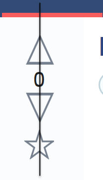
This is a slight nit-pick but the numbering doesn't seem to be aligned with the voting arrows:

Alignment of zero with up and down arrows

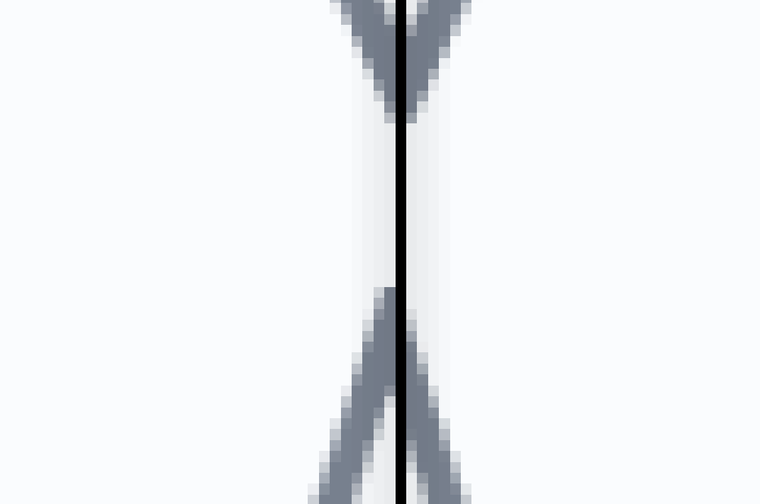
The star is out of alignment as well (by 1 pixel):

enter image description here

2
  • I think the star might even be a little off.... not sure though. Commented Aug 4, 2014 at 22:18
  • 4
    +1. I picked up on that too haha. Nitpicking ftw. Commented Aug 4, 2014 at 22:27
14

Please fix the scrolling bug for duplicate voting.

Close as a duplicate on mobile: Lots of Vertical Scrolling

8
  • 2
    ...Not being a frequent mobile close-voter, I never knew it was this bad. Commented Aug 5, 2014 at 8:11
  • 1
    Aw, why edit out the pretty screenshot? :(
    – slhck
    Commented Aug 5, 2014 at 20:56
  • @slhck because scrolling? Commented Aug 5, 2014 at 22:31
  • 3
    @ShadowWizard The scrolling is arguably somewhat necessary to comprehend the sheer scale of the problem. Commented Aug 5, 2014 at 22:40
  • @michaelb958 if it was a new bug caused by the recent changes, I would have agreed. But it's an old bug and this question here is an introduction of new features, asking to report new bugs, not bump old bugs. Commented Aug 5, 2014 at 22:43
  • @ShadowWizard They talk about fixing styles for dialogs and making them inline etc. They should have fixed this one, too. That's why I'm posting it.
    – slhck
    Commented Aug 6, 2014 at 0:28
  • @slhck I know and can understand, but no need to make us all suffer just to prove a point. Commented Aug 6, 2014 at 6:46
  • @ShadowWizard I felt poking a little wouldn't hurt. (Also considering the "bug" was turned in a feature request in the meantime)
    – slhck
    Commented Aug 6, 2014 at 6:51
12

Wonderful change - with one little irritation.

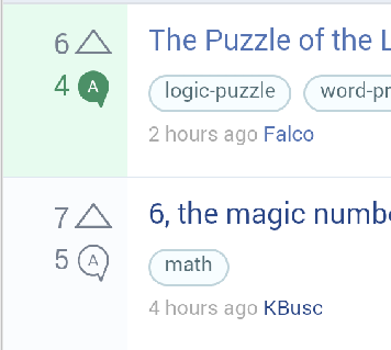
When an answer is accepted, the answers counter appears in green on the questions page.

However, the question also has a green background.

enter image description here

(It looks far, far better in the screenshot than it actually does on mobile. It's significantly darker green on mobile, and it makes it harder to read/look at.)

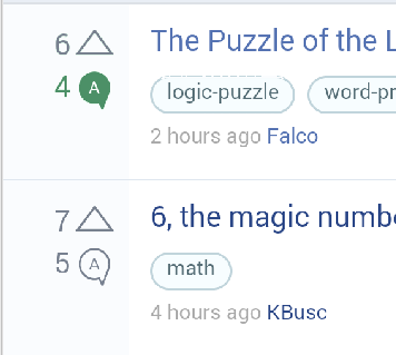
I know I'm nitpicking, but I personally think the green background is a) not really needed, and b) looks a little ugly, since the answer counter is already green. For instance, this is just as effective, but is much quieter:

enter image description here

If the green background could be removed, that would be great. Thanks!

2
  • I too find the green background very ugly. Commented Aug 5, 2014 at 7:15
  • So do i it`s horrible
    – theAlex
    Commented Aug 5, 2014 at 10:39
12

(Firefox for Android 31.0)

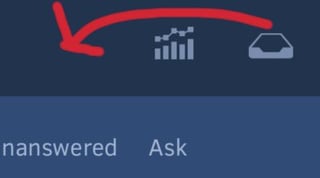
  • That "log in" link looks like it's truncating Ask Question, even though it isn't (it's just Ask). Try moving that up to where the inbox and achievements normally are, or something?

  • On that subject, the inbox and achievements are round the wrong way. Inbox goes to the left. (Or, at least, it always has, and I'm disconcerted.)

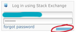
  • Where's my log in?!

  • Ugliest. Arrows. Ever. The ones on U&L are less anemic, and they have a thematic excuse.

  • Nice 404 page; shame about the program.

Also, while you're reworking mobile: mobile revisions page? Pretty please?

8

Deleted answers show up ... and it's hard to tell they are deleted. The only clue is the line with the comment link is red.

1
  • 1
    This will be fixed in the next build
    – Sklivvz Mod
    Commented Aug 6, 2014 at 10:34
8

The position of the post Author and Edited links are inconsistent. For questions, the edited link appears below the OP and for Answers, the edited link appears above the answer author.

On the question:

enter image description here

And on answers:

enter image description here

I think these should be consistent. Personally, I would go for the author first, and the last editor second as that seems more "chronological" and places the author of the post in the top billing so to speak.

1
  • 1
    This is done and live
    – Sklivvz Mod
    Commented Aug 6, 2014 at 9:46
6

Text is cut off when trying to search:

Might be just a small CSS bug. Safari under iOS 7.

0
5

I don't know if anybody else is experiencing this issue, but all icons don't appear:

screen shot

It used to be similar in the previous version and that was ok for me. But now the vote buttons have disappeared and it is really annoying.

19
  • What browser/version are you using?
    – Sklivvz Mod
    Commented Aug 4, 2014 at 17:43
  • 1
    I'm using the default built-in browser version 2.3.6
    – Mohammad
    Commented Aug 4, 2014 at 17:47
  • 29
    Figures. Android 2.x browser is the new IE6. Commented Aug 4, 2014 at 18:00
  • 2
    Same issue here, latest Firefox on Android 4.4.
    – Caleb
    Commented Aug 4, 2014 at 18:33
  • 5
    Stock Android browser in 2.3.6 is not supported -- we only support Android 4.0 and up. It's a little stranger that Firefox on Android isn't working for @Caleb, since caniuse.com/svg says it should work. Commented Aug 4, 2014 at 19:00
  • 1
    Mozilla Firefox doesn't show the images either. This is desktop browser viewing the mobile site. Commented Aug 4, 2014 at 19:03
  • @KronoS I found a fix for that, deploying very soon.
    – Sklivvz Mod
    Commented Aug 4, 2014 at 19:16
  • 1
    @DavidFullerton Same problem in IE11 in Windows Phone 8.1 Update 1 (developer preview) launched today. Commented Aug 4, 2014 at 21:29
  • @Caleb the firefox issue should be fixed now.
    – Sklivvz Mod
    Commented Aug 4, 2014 at 21:57
  • @KronoS see above.
    – Sklivvz Mod
    Commented Aug 4, 2014 at 21:58
  • @DavidFullerton well previously everything worked fine. What happened to graceful fallbacks? Commented Aug 5, 2014 at 7:56
  • 1
    @DavidFullerton meta.stackexchange.com/a/71208/256282 says 2.3 is supported. Commented Aug 5, 2014 at 7:59
  • @curiousdannii: Edited. Commented Aug 5, 2014 at 9:39
  • @curiousdannii that page says, explicitly: "We support current and previous versions of all browsers with some reasonable amount of market share" - android is many versions back and its browser has really marginal usage, so, it's not supported.
    – Sklivvz Mod
    Commented Aug 5, 2014 at 12:10
  • @Sklivvz How do you define "reasonable"? On many sites it's above 10%. And even so, no one expects it to be perfect, just to have graceful fallbacks. Maybe you could use font icons rather than svg icons? Commented Aug 5, 2014 at 12:23
5

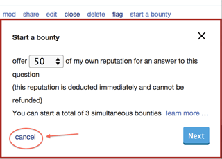
Overall I love it, but I noticed one thing. When I click the 'start a bounty' button, then click 'cancel', the page jumps to the top:

enter image description here

1
  • This also happens on the desktop site and is apparently by design.
    – Sklivvz Mod
    Commented Aug 11, 2014 at 12:52
5

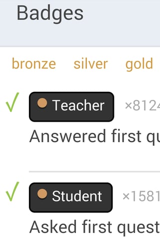
Badge circle is misaligned:

enter image description here

0
4

I'm guessing this only got tested on mobile webkit because Firefox is more than just a lieele rough around the edges, its unusably messy. Almost nothing lines up, there are odd blocks of space that obviously were not intended as part of the design, and some elements have overlap issues and completely obscure themselves.

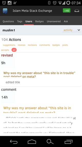
The activity page of user profiles is one example of the latter. Something about the background and spacing of lines has been overridden and the result is you only get the top half of the lines.

overlapping lines

2
  • We haven't looked at the user profiles, yet.
    – Sklivvz Mod
    Commented Aug 5, 2014 at 10:47
  • A partial fix is going out soon. This is a Firefox rendering quirk, btw.
    – Sklivvz Mod
    Commented Aug 6, 2014 at 10:57
3

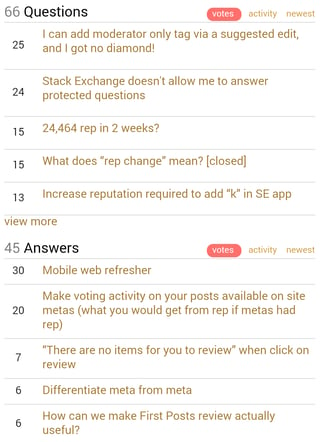
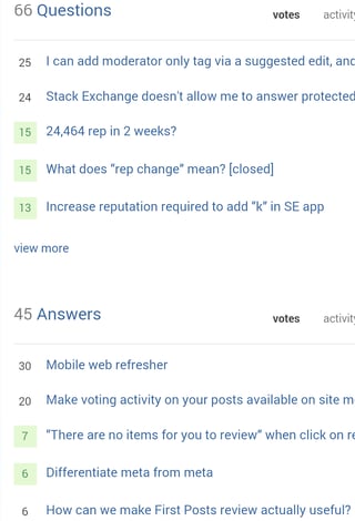
How to understand if my post is accepted or not from my profile?

enter image description here

However some of my posts are accepted, what can be seen on the full site:

enter image description here

1

No need to show the answers banner if there are no answers

enter image description here

1

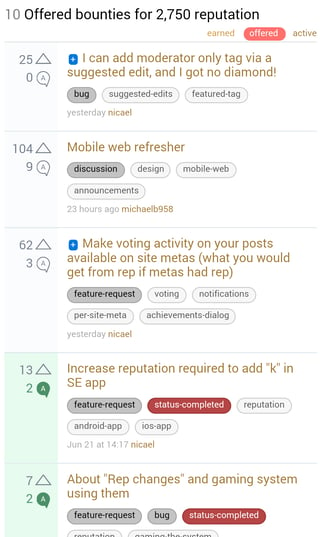
Bounties list in the profile is a mess, somewhere I can see pluses and somewhere nothing at all instead of bounties indicators:

enter image description here

1

Votes aren't grouped per post (maybe arrange them as a dropdown?), upvotes and accepts are black instead of green.

enter image description here

1

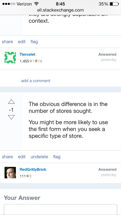
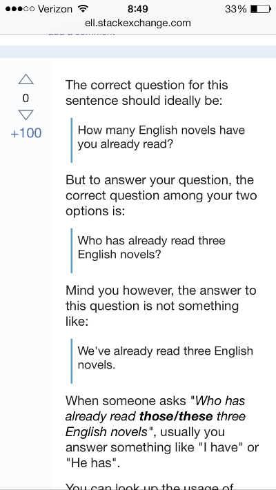
Problems on my iPhone with the stock browser:

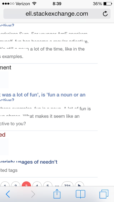
  1. The page now scrolls horizontally. There's some empty white space to the right of most pages (every page?), which makes scrolling annoying, because every third or fourth time I end up going diagonally, and sometimes I can't seem to scroll back left.

    Since scrolling is practically a habit of mine, this is getting pretty frustrating.

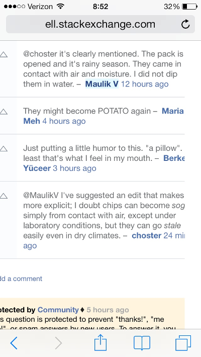
    By the way, the space to the right is usually blank, but sometimes stuff is cut off even if I scroll:

    screen shot


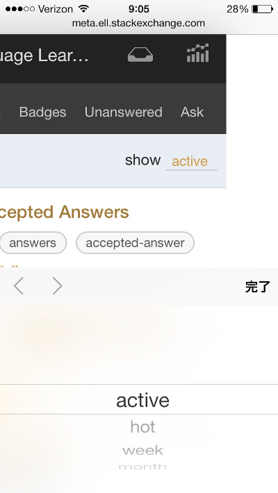
    You can see the full space to the right when you click a drop down:

    screen shot

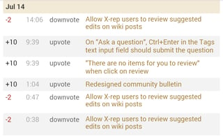
  2. My activity page has weird bizarrely rendered text.

    Here's a screen shot showing both problems so far together:

    screen shot

  3. It's hard to tell an answer is deleted. They used to be colored red, but you got rid of that. Now the only indication is the two letters "un" in the "undelete" link, and the failure that occurs when you try to do stuff like voting:

    screen shot

    When an answer is tall, there may not be any visual indication unless you scroll all the way to the bottom. This answer is deleted, but you can't tell:

    screen shot

Apart from these and other bugs, the design changes are mostly harmless and only cost me maybe five minutes of re-learning.

There seems to be a problem with getting old versions of the page when I click back at the moment (e.g. I post a comment, click a link, click back and am presented with a version of the page from before I posted my comment), but that seems to happen on all platforms / browsers, so I suppose it's unrelated to the mobile web refresher. Although it's a problem most of the time, it has the happy side effect of eliminating shuffling of Hot Network Questions that occurs when you click back :-)

0

Forward and back buttons are invisible (at least for me on Galaxy S5, Chrome)

enter image description here

1
  • I can't repro on a S4, Chrome.
    – Sklivvz Mod
    Commented Aug 6, 2014 at 10:39
0

User avatars are of low resolution even if screen is of high:

0

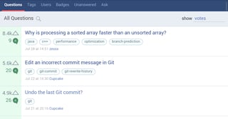
Not necessary to shorten vote counts for wider screens:

enter image description here

Not the answer you're looking for? Browse other questions tagged .