84

In the last few hours, the search box has taken on a new behavior: if you click on it, the toolbar blanks out, and the search text field expands, moving a few hundred pixels to the left. This causes the text cursor to jump a few hundred pixels to the left, as well.

This is—for lack of a better or more tactful word—crazy, and it violates the principle of least astonishment.

That is, one expects the search box to work like nearly every other search box in existence: when one clicks on it, it shouldn't move, it shouldn't expand, and unrelated things shouldn't disappear.

Edit

Brandon pointed out Apple.com's use of a similar behavior for their search box, but it differs in a few ways:

  • It only expands by a fraction of its original size
  • It continues to be clearly designated a search box (see update)
  • Unrelated elements don't disappear: they move slightly to accomodate the new search box size

While still not ideal (the text cursor moving is perhaps the worst part of this), modifying the behavior of Stack Exchange's search box to be more like Apple.com would help to mitigate the problem.

Rebecca Chernoff and Kate Gregory had two other suggestions that would also help make the search box less of a jarring experience:

  • Don't expand until you need the room
  • Leave the position of the text cursor alone, and don't expand to the left: expand instead to the right.

Edit 2

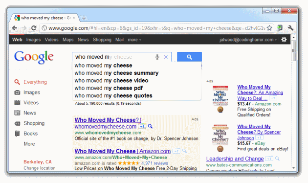
Jeff points out that Google moves the search box when you search. However, there are several key differences between Google's search box and Stack Exchange's search box:

  • Google's search box doesn't move the moment you click on it. It moves after you start typing (suggested above) (see update)
  • There is no animation involved in the movement.
  • The search box doesn't move to the left or expand, it jumps upward
  • The movement has a specific purpose to offset its usability problems: it immediately provides search results
  • It doesn't hide unrelated elements.

The most important difference, however, is that you can turn it off:

Off!

So, if the new Stack Exchange search box is an attempt to be more like Google, it should go whole-hog and provide search results instantly and provide a way to turn it off.

0

9 Answers 9

23

We just deployed some changes that heavily tone down the way it works.

  1. Auto expand ninja thing only shows up after you start typing (something real ... not tab or arrows)
  2. We use html placeholders so the word "search" does not prefix your search if you click on the box too early
  3. We have a big FAT search box in the search results page.

These changes, imho, make the change digestible. If we still believe this is not good enough please open a separate request asking to totally remove the super-mega-expando.

2
  • 6
    FWIW, I definitely prefer it to auto-expand when it gets focus rather than once you start typing. It's very jarring to start typing and watch the UI suddenly zoom around. It's jarring when Google does it too. iOS got this one right. Commented Aug 26, 2011 at 20:32
  • 1
    But what if I want an NTFS search box =c
    – Zelda
    Commented Dec 9, 2011 at 17:27
46

I have a headache now from trying to search for stuff. Click, type the first few letters, look up - huh? what? where's the - oh, why did it move over there? Where was I?

Assuming this is solving a real pain, could it move a little more slowly? Say, after I've typed 20 characters, move over about 2 characters worth, and continue to move 2 characters for each character I type? That way, the text will not be far from where it was before, and if I type short keywords, I'll never notice any difference.

5
  • 15
    I'm having the same problem. I start to search and the box expansion pulls what I'm typing right out of my view. If it expanded only a few pixels (leaving my letters next to where I looked) or expanded slowly as I typed, that would be much better. I'm guessing with time I'll learn to click and wait, but any UI that arbitrarily forces me to wait is terrible.
    – freiheit
    Commented Aug 8, 2011 at 23:14
  • 2
    A headache? Really?
    – Veger
    Commented Aug 9, 2011 at 2:00
  • 5
    @Veger, actually, yes. Moving my eyes quickly across the screen repeatedly (I was using SO for its intended purpose and trying to solve a problem, which required multiple searches) gives me a headache. Commented Aug 9, 2011 at 2:02
  • See greasemonkey implementation below.
    – Alconja
    Commented Aug 9, 2011 at 3:07
  • 10
    Seems they've been trying to tell us to use Google instead of the site search for quite a while. Looks like they've finally found a good way to make that happen. I sympathize with the headache; this feature is really disorienting to me, too.
    – Cody Gray
    Commented Aug 9, 2011 at 10:58
28

Perhaps all would be happy if we could search upside down...that way the cursor can start at the right and not jump once the box has expanded...I think we'd all fairly quickly get use to reading like this as well :P

Search screenshot

6
  • 2
    This is brilliant! SE is just wasting all that potential directionality (Only using 1, out of 4, 2-D directions, and not even thinking about 3-D). Commented Aug 9, 2011 at 3:49
  • @Brock, so true...you could type out wikipedia on the z-axis in the same amount of 2D space to display the typing cursor :D Commented Aug 9, 2011 at 3:51
  • ...and render to texture with WebGL for the win! Commented Aug 11, 2011 at 3:24
  • 3
    SO won't let me use javascript in links here, but here's the bookmarklet: javascript:(function() { $("#search input").css({ "-moz-transform": "rotate(180deg)", "-webkit-transform": "rotate(180deg)" }); })();
    – Alconja
    Commented Aug 11, 2011 at 5:30
  • 2
    I like this suggestion. It completely breaks the users expectations, unlike the current change which merely frustrates.
    – Ghost User
    Commented Aug 11, 2011 at 17:17
  • @Brock, you're not using the 3D search capabilities yet? But they're so awesome! Get a more advanced monitor ASAP, man!
    – Pops
    Commented Aug 11, 2011 at 17:41
15

I think I'd like the auto-expansion better if the word Search: is placed in front of the text box when it auto-expands. As it is, the expanded text box, all by itself, looks a little bare.

Also, tapping the escape key twice causes the word "search" to be entered into the search box, which is probably not intended behavior.

7
  • Seconded, that would make it less surprising. I'm still not sure expanding the search bar like this is a good idea, though. Commented Aug 8, 2011 at 22:34
  • 13
    Adding this wouldn't help in my opinion. The jarring experience for me is that the beginning moves. If it expanded right or to the bottom then my eye doesn't have to move from where I start to find where the text starts.
    – Rebecca Chernoff Mod
    Commented Aug 8, 2011 at 22:42
  • @Rebecca, my guess is that expanding it to the right would break the layout or cause scrollbars. Commented Aug 8, 2011 at 22:49
  • 5
    @FrédéricHamidi, that doesn't really make going left any less jarring. (:
    – Rebecca Chernoff Mod
    Commented Aug 8, 2011 at 22:56
  • 3
    Expanding to the bottom might be an interesting idea... Search terms are usually well-suited for word wrapping (since they consist in many short words rather than few long ones), and it's probably doable with something as simple as a properly styled <textarea>. It would cover the Ask Question button after a while, but people usually don't ask and search at the same time. Commented Aug 8, 2011 at 23:01
  • 2
    Yeah, I agree with adding search:, too - next push this will happen. Commented Aug 9, 2011 at 5:20
  • 2
    Wait, so now we have even more things changing on the page? Not only is the search box growing to twice it's normal size, but you're adding words, too. The point is to make things less intrusive and annoying, not more.
    – Cody Gray
    Commented Aug 10, 2011 at 3:57
14

Here's a greasemonkey implementation of Kate's suggestion:

(function() {
    function GM_wait() {
        if (typeof unsafeWindow.jQuery == 'undefined') { 
            window.setTimeout(GM_wait,100); 
        } else { 
            $ = unsafeWindow.jQuery; letsJQuery(); 
        }
    }
    GM_wait();
    function letsJQuery() {
        $(window).load(function() {
            var search = $("#search input").css("max-width", "none");
            var temp = $("<span></span>").css("font-family", search.css("font-family")).hide().insertAfter(search);
            var width = search.width();
            var max = $("#header").width() - $("#portalLink").outerWidth(true) - ($("#topbar").outerWidth(true) - search.width());
            search.unbind().bind("keydown keyup", function() {
                temp.text($(this).val());
                var w = Math.min(Math.max(width, temp.width() + 10), max);
                $(this).clearQueue().animate({width: w + "px"}, 50);
            }).bind("focus", function() { if ($(this).val() == "search") { $(this).val(""); }
            }).bind("blur", function() {  if ($(this).val() == "") { $(this).val("search"); }
            });
        });
    }
})();

Basically grows the box as you type (minimum size is as the search box currently is & maximum size is set to 400px, which seems enough to still fit in all the normal header stuff for me at least). will take up as much space as is available in the header.

2
  • @waffles - That's what my script is doing. It copies the search text into a hidden span & measures that. Works accurately (after a minor bug fix to make sure I was measuring with the right font) for me in Firefox 5 at least...
    – Alconja
    Commented Aug 9, 2011 at 3:51
  • +1 You could consider adding this here
    – Benjol
    Commented Aug 9, 2011 at 5:30
6

Since there is blank space underneath the search box,
how about just expanding it to a larger textbox with the same width?

Of course there's a lot of space between the Global Inbox and the Profile Name, so you could just make it slightly larger to start with, or when widening it just move the elements to the left instead of eliminating them.

New Search Box

1
3

Search box to the left and the Inbox to the right.

enter image description here

This way the search box will expand to the right.

5
  • 13
    Only problem with this is that most people look for the search box on the right. That's a pretty common place for it in site design. I think this substitutes one UI design violation for another.
    – Cody Gray
    Commented Aug 9, 2011 at 10:56
  • 2
    @Cody: We are so far beyond "what most people look for". Nick's idea is just a far less intrusive/annoying way to bust good UI design principles -- which are already shot to Hades with this search-box debacle. Commented Aug 9, 2011 at 23:11
  • @Brock: It's not as if I think that the current design with the obnoxious search box behavior is acceptable or good UI design. It's just that this doesn't fix the problem. As I said before, it trades one egregious violation for another.
    – Cody Gray
    Commented Aug 10, 2011 at 3:56
  • 1
    @brock except Google does it.. Apple does it.. See my answer. Commented Aug 11, 2011 at 0:27
  • 4
    @Jeff, I'm sure I don't have to bust out the, "If Apple jumped in front of a truck.." Proof of this fallacy! ... Apple blows chunks in a lot of ways, and Google's new animation is not good. BUT, at least in Google's case the cursor does not move as much horizontally (we are better able to handle vertical scrolls). ... If big companies didn't do stupid things all the time, little companies wouldn't be able to eventually replace them. Commented Aug 11, 2011 at 0:40
2

The best possible way is the searchbox must remain in the rightside itself. Let it expand too, as its useful to many. Let the cursor start from the rightside. While typing, the word moves character-by-character towards the left. Thus the expanded searchbox problem, rightside or leftside problem, and the problem of shifting our eye focus from one place to another can all be avoided.

2
  • So you're advocating that the search box expand outwards to the right? As opposed to sliding to the left, as it does now? I could definitely get behind that design.
    – Cody Gray
    Commented Aug 21, 2011 at 7:23
  • not really, i was saying let the expansion be to the left itself but the text alignment in the searchbox is to be to the right. It would solve all the above mentioned problems i guess.
    – Anoop K P
    Commented Aug 23, 2011 at 21:08
1

Google itself does this.

I go to http://google.com and I start typing...

google.com homepage

Suddenly my search box moves as I am typing! Notice it's no longer in the middle of the page but has been forcefully moved to the top of the page without my prior written express consent!

google.com homepage with some typing in the search box

Ditto for the new Twitter design. Before:

twitter.com homepage

twitter.com homepage with some typing in the search box

Who moved my cheese, man?

6
  • 1
    [status-norepro] outside Chrome, and anyway this is different: the search box moves to make room for results, not by mere virtue of being focused. Commented Aug 11, 2011 at 9:33
  • 1
    that's how ours works too, Gilles; there is no movement on mere focus. Additionally I get the same behavior on google.com in Firefox 5 and IE9, so I really have no idea what you're talking about. Commented Aug 11, 2011 at 9:38
  • There is movement on typing, but typing is passive on SE, unlike Google with ultramodern browsers (not FF 3.5 or IE7). There is also movement on onfocusing, which is rude. Commented Aug 11, 2011 at 10:23
  • 10
    Yes, and I immediately turned that off. If I couldn't have turned it off, I would have switched to Bing. I can't find the option to turn this off here.
    – Cody Gray
    Commented Aug 11, 2011 at 11:18
  • 1
    But Google's search box only moves when you start typing, not when clicking. SO's box (used to) move when merely clicking, making it impossible to place the cursor precisely in an existing search.
    – squelart
    Commented Aug 11, 2011 at 22:56
  • 4
    At least Google does something useful with that : provide search results. I think it's annoying regardless. Commented Oct 7, 2011 at 0:43

You must log in to answer this question.