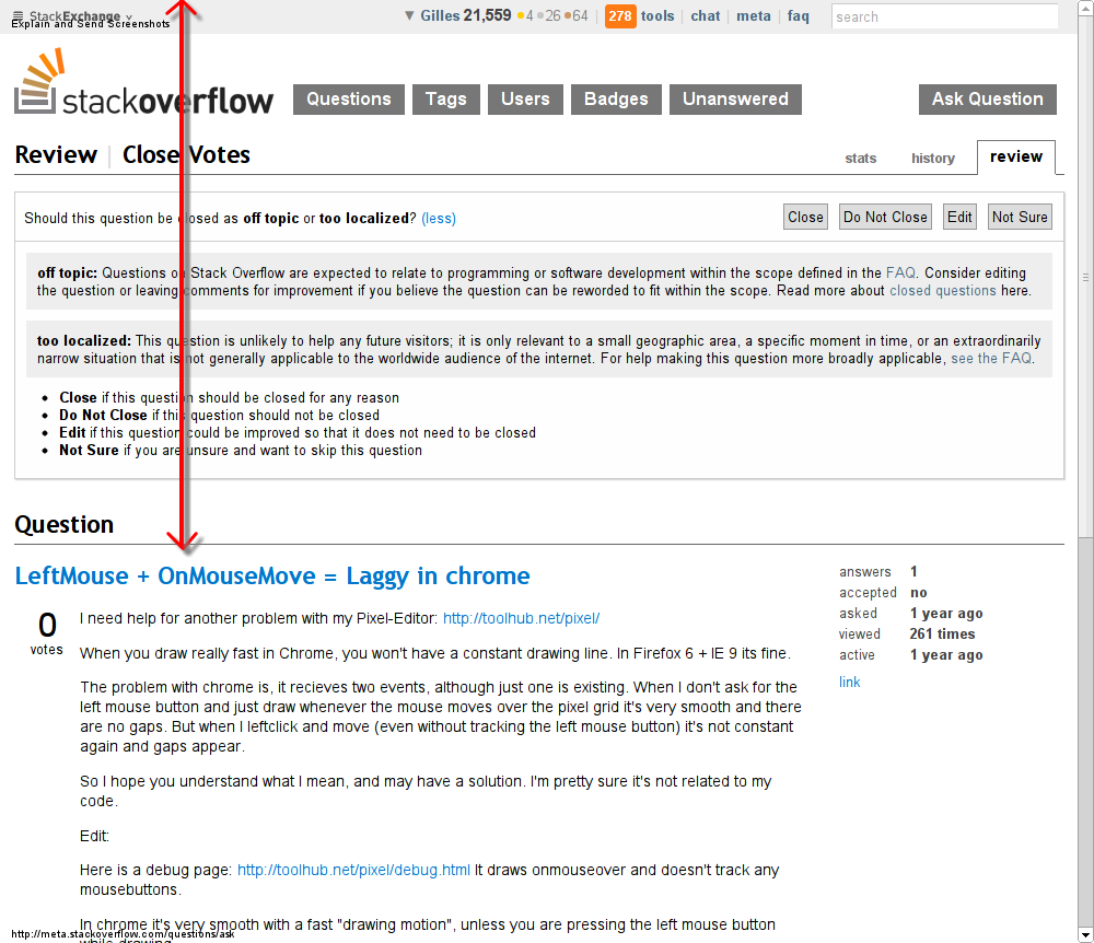
In the review queue for close votes, about half my screen is devoted to things other than the text of the question. On my setup, I count a whooping 500 pixels lost to the SE header bar, the generic line with the huge buttons, the review tab header, bar with the task buttons, and the detailed explanation of the task.

Ok, so let me scroll down to have the question title at the top, so I can see the question and its comments.

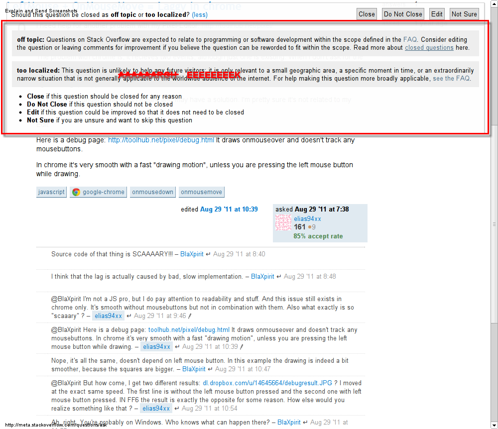
Still a waste of over 200 pixels for the task explanation alone, plus about 50 for the task button bar. I can see the point of having the task buttons permanently visible is good. Keyboard shortcuts would be better, but I'm willing to sacrifice 5% of my screen height. It's that additional 20% that really rankles.
Please do not include the task explanation in the part of the page that's permanently visible. (Yes, I know I can hide it by clicking “less”, but it's yet another click in what's already a mouse-heavy task.)
And, more generally, not wasting so much screen real estate all the time would be nice. Scrolling down by a few lines is required when entering almost every Stack Exchange page.
