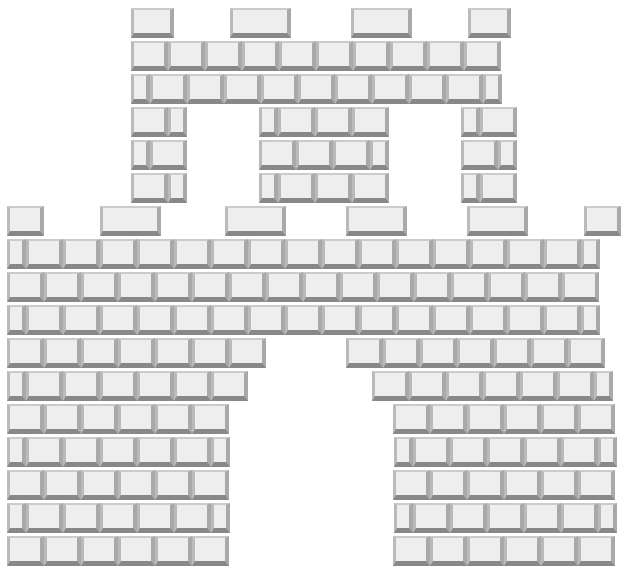
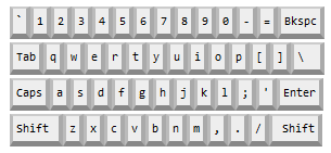
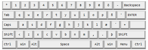
<kbd> is a great way to mark up text to be entered. But when you use it on Stack Exchange sites, it's really difficult to read. For instance, say I typed this sentence by starting with a Shift+F, then used o, followed by r, then space, you can see that it quickly becomes an unreadable mess of boxes and smashed-together type.
Whoever is in Ctrl of the visual design should probably fix it.
Also, I'm so very sorry. Please don't let the silly answers below discourage you from fixing the styling.


jQuery('kbd').click(function(){alert('On your keyboard, idiot!');});