After using the queue for a couple of weeks now, I keep wishing it did more.
Here's feature request 1.
Scenario:
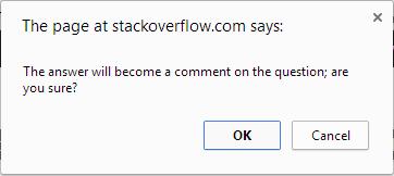
When clicking "convert to comment" on a flagged answer, if there are no comments a simple confirmation "alert" dialog is shown:

Which is OK, but breaks basic UI design rules IMHO, because it's inconsistent with the flow when there are comments.
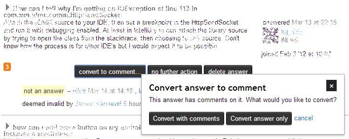
If there are comments on the answer, instead of the alert, a custom popup is shown:

Problem 1
This unnecessary difference in dialog box style is a small UI problem that on its own isn't enough to warrant a change, but the proposal below addresses it as well, so I'm counting it.
Problem 2:
In order to make a decision on which button to press, you have know what the comments are. For example, often there's a comment saying "this answer should be a comment" (worthless for conversion purposes) or "I tried that but it didn't help" (worthy of conversion), but to see the comments, you have to open a new window by clicking the answer link (an anchor rendered as the question title). This in itself slows down the process, consuming extra time - one thing mods never have enough of.
Problem 3:
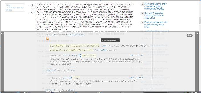
However, it can get worse, because the window that opens has an extra "moderator action bar" at the bottom, and sometimes it obscures all comments. Here's a real example:

The chances of this happening at greater than you might think, because there's an entry in the mod bar for every flag anywhere on the question, not just the post you're opening it for - ie the link just opens the page at the answer anchor, but the mod bar doesn't have this level of discrimination.
This event further delays the process, because the page must be scrolled, or (especially if the target answer is the last answer on the page), the mod bar must be dismissed. All of this consumes that most precious of moderator resources... time.
Problem 4:
The decision to include comments in the conversion is an all-or-nothing decision, but not all comments are worthy of conversion. This leads to a further step(s) of having to delete any moved comments that are unworthy of being moved.
Proposal:
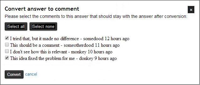
Instead of having to open a new window/tab (and instead of having two separate UI styles depending on flow), bring the comments into the custom popup. Also, display a check box next to each comment, plus the usual "Select all" and "Deselect all" buttons, so any comments to be included in the conversion process can be easily, and correctly, selected.
This is how I think the popup dialog box should look:

The key functional requirements are:
- displays all comments to the answer (ideally with ability to edit in-place too)
- can select which comments go with the conversion
- same popup component if there are no comments (but with empty comments section and suitably changed message, maybe "No comments were posted to the answer")
- a single action button with the straightforward name "Convert"
The mock up is just one way to achieve this. It would likely be implemented using ajax on popup render, since this action is not that common and it would keep the traffic/load down for the flag queue page load.
