68

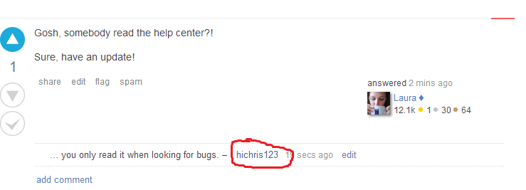
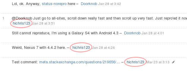
When the owner of a question comments on their question or an answer to their question or self-answers their question, they get a special color for the box around their username.

The problem is, you can't see the box:

Can you please make this not white on white?

5
  • 29
    And if you love us in the slightest, please make it a red freehand circle instead of just a highlight.
    – Servy
    Commented Apr 18, 2014 at 18:43
  • 7
    How did you discover an invisible box? Are you a superhero?
    – A.L
    Commented Apr 18, 2014 at 19:07
  • @n.1, if you hover over the comment, the background of the comment turns a light blue. You can then see the author's name in a white box.
    – gunr2171
    Commented Apr 18, 2014 at 19:09
  • 4
    Man...things must be going really smoothly on the SE network for this to have a bounty. Commented May 12, 2014 at 1:48
  • Haha, I agree that it should be fixed. I just disagree about the urgency. Commented May 12, 2014 at 1:59

6 Answers 6

13
+100

Jin has just pushed a fix for this. In a few hours, the OP's name should be highlighted in blue, as was always intended.

7
  • "A few hours" -> now. Thanks!
    – hichris123
    Commented Jun 26, 2014 at 19:00
  • with 40 minutes to spare on the bounty!
    – mhlester
    Commented Jun 26, 2014 at 19:00
  • @mhlester actually 20 hours, there's a 24 hours grace period. :D Commented Jun 26, 2014 at 22:11
  • Good work! Why Jin became so shy of late? We don't bite! Commented Jun 26, 2014 at 22:12
  • yeah yeah, but the auto award doesn't happen in grace period. or does it? anyway, this makes me sad. Pops is a thief!
    – mhlester
    Commented Jun 26, 2014 at 22:12
  • @mhlester indeed, auto award happens only when grace period end. The new favicon makes me sad. Commented Jun 26, 2014 at 22:28
  • yeah what's with that? there's no reason it shouldn't have just stayed the SE logo
    – mhlester
    Commented Jun 26, 2014 at 22:32
21
+100

If I may suggest:

enter image description here

Please note the following:

  • The amazing quality of the freehand red circle
  • The skill with which it is applied to the username
  • The exact dimensions, in concordance with Atwood's Law of Freehand Red Circles
  • The amazing dark-colored background behind the freehand red circle, which is an artifact of my stupidness when it comes to image editing.

Kudos to Servy for the inspiration.

6
  • 1
    Ewwww. Much much too in the way.
    – ɥʇǝS
    Commented Apr 19, 2014 at 20:18
  • 4
    But it's not red.. it's a sort of orange!
    – 3ventic
    Commented Apr 19, 2014 at 20:20
  • 2
    -1 for what @3ventic said.
    – Braiam
    Commented Apr 19, 2014 at 20:21
  • +1 Why downvote a good idea based on a minor colour inconsistency? Commented Apr 20, 2014 at 5:12
  • 15
    Is it bad that I actually really like this and would be happy if it got implemented? (Actually it kind of seems to fit best with the theme of Programmers, with the whiteboard thing and all, but still...)
    – WendiKidd
    Commented Apr 24, 2014 at 22:57
  • 2
    Was I only the one who searched for Atwood's Law of Freehand Red Circles? Commented May 23, 2014 at 11:14
19
+200

Beta sites use a darker shade that doesn't seem out-of-place with the theme but is still easy to spot:

enter image description here

Perhaps something similar could be added here.

17
+100

The closest I can get to Undo's suggestion with pure CSS (no images) is:

a.comment-user.owner {
    border: 3px solid #faa;
    border-radius: 53% 47%;
    padding: 0.4em !important;  /* override existing padding style */
    margin: -0.4em;
    background: transparent;
}
span.comment-copy {
    position: relative;  /* keep username border from overlapping text */
}

which looks like this:

Screenshot of red circled usernames

It's not quite a red freehand circle, but it's close...

3
  • 7
    So heartless... Where is your feeling? That is like a robotic kiss. I will forever have nightmares about these soulless ellipses!
    – Luke_0
    Commented May 9, 2014 at 0:11
  • 1
    Userscript? Pretty please? Commented May 12, 2014 at 1:35
  • 1
    @michaelb958: You could just use the CSS above directly as a user style, but since you asked nicely... gist.github.com/vyznev/944e0ac962790bcc97d0 Commented May 12, 2014 at 6:08
4

As of today, version 1.16 of SOUP now includes the following minimal CSS fix for this issue:

a.owner, td.owner { background: #eef }

This causes the question poster's user card and username in comments to be shown on a light blue background, like this:

Screenshot

Per the SOUP inclusion guidelines, I deliberately kept this fix as neutral and minimal as possible. If you want something fancier, you can always install the user script I posted in my other answer (which, yes, should be compatible with SOUP).

4
  • Eh, they did it while you did yours! Commented Jun 26, 2014 at 22:29
  • @ShadowWizard: Huh... if that was a coincidence, it's a pretty impressive one, considering that I've been sitting on this fix for almost a month. (Release schedule? What release schedule?) Commented Jun 26, 2014 at 22:39
  • Well, check the source... if it's your code demand a salary. :-) Commented Jun 26, 2014 at 22:40
  • @Shadow Well, kinda a coincidence... this answer reminded me so I just poked a helpful CM cough Pops cough. ;P
    – hichris123
    Commented Jul 9, 2014 at 3:03
1

Insert standard story about getting tired of waiting for a fix and deciding to DO something.

Shamelessly ripping off Totally copy/pasting from Incorporating Ilmari Karonen's comment markup, here's a slightly more reasonable style:

td.owner{
    background-color:#E1ECF9 !important /*Same colour as on beta sites.*/
}
.owner
{
    background-color: #E1ECF9 !important
}

/*strip these next two if you plan to copy/paste and just want highlights without pretty shapes.*/

a.comment-user.owner {
    border-radius: 53% 47%;
    padding: 0.4em !important;  /* override existing padding style */
    margin: -0.4em;
    background: transparent;
}
span.comment-copy {
    position: relative;  /* keep username border from overlapping text */
}

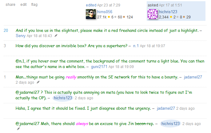
I also modified the OP signature to show up more nicely on the question. It ends up looking like this:

OP usercard and comments are now visible

4
  • For the record, I don't actually know CSS. The copypasta bit is mostly true. My first attempt was an interesting mutation. "NOW WITH NON-FREEHAND NON-CIRCLES." Commented May 14, 2014 at 15:37
  • Must... resist... urge to burninate... Comic Sans....
    – Pops
    Commented Jun 26, 2014 at 18:59
  • It's all Balpha's fault. Commented Jun 26, 2014 at 19:22
  • For just a second I thought those were the actual comments to this post...
    – totymedli
    Commented Jun 26, 2014 at 21:20

You must log in to answer this question.

Not the answer you're looking for? Browse other questions tagged .