We are rolling out a revisited version of our mobile web sites with the following aims:
- A navigation and look-and-feel more consistent with our desktop UI in a mobile friendly way.
- Better usability
- Equal or better functionality
Since there’s a lot to do, we will be deploying this iteratively. Our current deployment contains changes to:
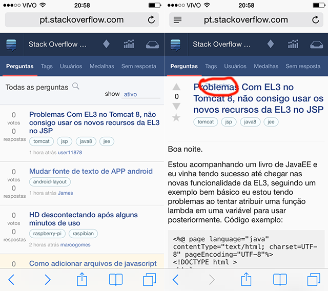
- Top Bar - We have beautiful new svg icons that scale perfectly with different mobile devices
- Nav Bar - It now sports better typography and a more visible “current section” indicator
- Search - Each section has its own search, accessible with the magnifying glass next to the title; the search is contextual: post list searches return… posts and user list searches return … users.
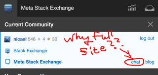
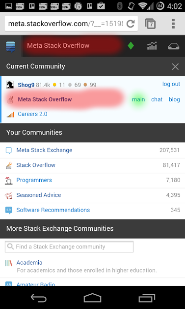
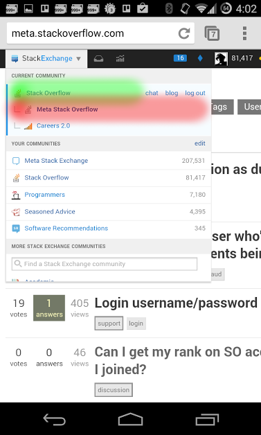
- User flair - Moved away from the “magic drawer” in the previous version, it now resides in the bubble “site switcher”
- Main colors and typography - moved towards less saturated blues and larger, lighter fonts. The site should now appear with each platform’s preferred sans-serif form (Arial, Helvetica Neue or Droid Sans)
Here is screenshot of before and after:
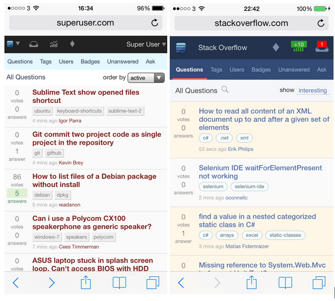
Send your <3 to Pawel and Jin for the most excellent design.
Feedback , bugs and suggestions while we move to the next iteration? Please mark bugs with mobile-web

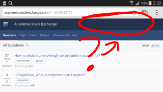
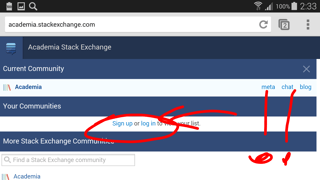
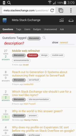
moved towards less saturated blues? The old one on the left is the one that looks desaturated to mewe only support the two latest versions of mobile browsersI guess backward compatibility is over-rated? Only the two latest versions?! And after that the icons just vanish? Nice