Tag wikis are important
Tag wikis are awesome, and I like their format. However, I think it can be counter-intuitive for users to get there.
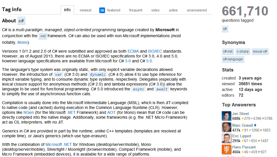
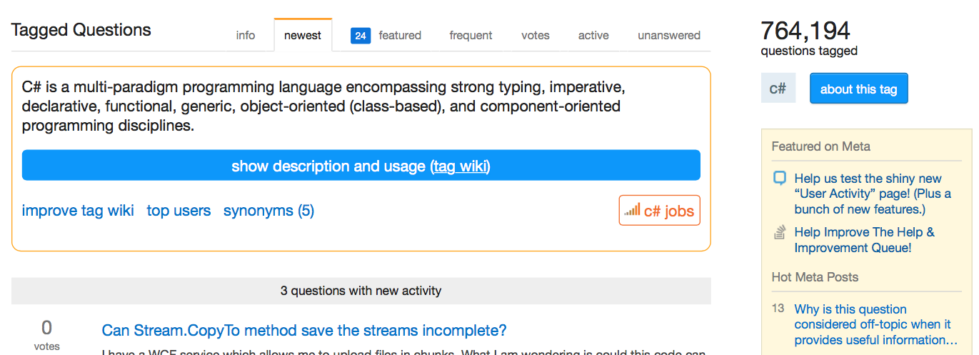
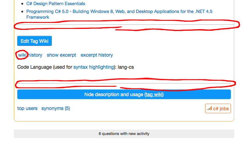
Often there is a vast amount of useful information in the tag wikis when they cover large topics. Looking at the tags sorted by popularity and clicking through to some of the first page will yield a good example of the amount of information available in these tags.
Figure 1 For example, the c# tag wiki
Getting to the tag wiki from tagged questions
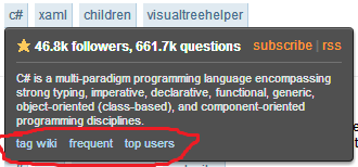
Unfortunately getting there can be kind of an ordeal if the user is not aware of them. The entire top-bar renovation removed all hover actions to navigate. Tags still have the hover feature in order to access. Hovering the tag is the fastest way to access the "info" section. If hover is not an option, there is a series required to click through in order to access the information, and at each point the click through name is changed.
From a meta standpoint, all issues related to the tag wiki are tagged with tag-wiki. There is no tag-info tag. In general there is no reference in conversation made to "tag-info", and especially not for the "about" section (which shows as a link next to the tag in the side bar "about >>").
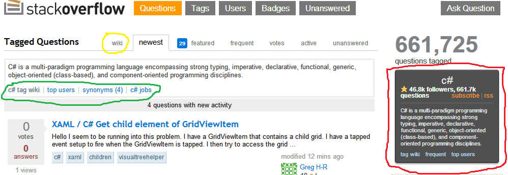
Figure 2.1 Highlighted links to the tag wiki
Reviewing figure 2.1, there are 3 highlighted areas that will give access to the tag wiki. None of them mention the word "wiki". Standardizing the naming will increase the chances users find these tag wikis.
Yellow "info". When going from the basic "Questions" link to the more specific "
[c#]" tag questions, the info tab barely shows up. When first clicked,newestis still the selected tab, and because many users are looking for questions (since that is the main format) their eye focuses on the list of questions and not the small tab which appeared marked "info". The user may give a cursory glance to the tab, so it should at least be more descriptive of what it represents.Green "learn more...". This seems to be the common click through link as it resides just below the abstract. Again it does not follow a naming convention, and it is hard to tell from the small abstract how much actual information is really going to be present. Moreover, right next to it is "improve tag wiki" which in my opinion is out of place. There is a link to edit once the tag has been read, and the link to edit here, and also in the hover popout, are just noise.
Red "about >>". Before researching this a bit and gathering information on the tag-wiki workflow I had never noticed this link. About is rather vague. More than that though, is the placement of this link. It is on the sidebar and there is available space there to actually place another blurb for getting the user to the tag wiki aside from just a single word.
The abstract. The blurb is nice as an intro to the tag wiki. Perhaps it would be possible to include a similar down arrow as is being used in the new profile page, and then have that expand the entire tag wiki there in the box.
I think these areas could be benefit from having the highlighted changes from figure 2.1 changed to have a more standardized naming convention as shown in figure 2.2.
Figure 2.2 suggested improvements to current design
Figure 3.1 Hovering a tag
Figure 3.2 Hovering a tag suggested modification
Getting the word out in the 2 minute tour
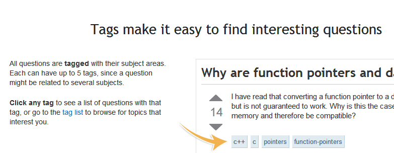
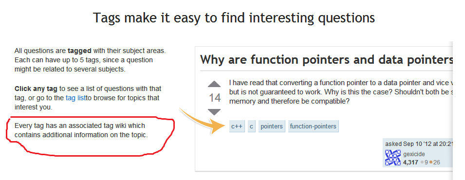
Users are really never pointed to tag wikis from the walk through either.
Figure 4.1 lack of any mention of the tag wiki
Figure 4.2 Brief note towards the tag wiki inside of the 2-minute tour
tldr;
Standardize the naming convention for the tag wiki (which is currently either "info", "about", "learn more...", tag-wiki, etc). Include some tip of the hat for the tag wiki in the 2-minute tour. Perhaps add a lazy load arrow to expand the abstract. Perhaps include the popout as a sidebar widget.

