7

When flagging a question as duplicate, I had this dialog:

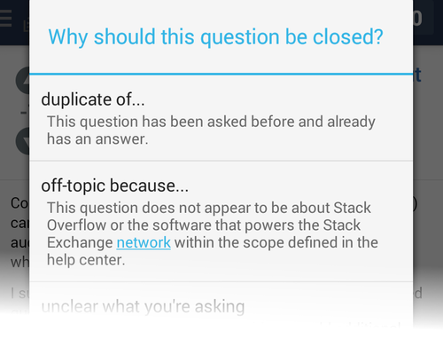
List of closure reasons, titled "Why should this question be closed?"

This presents a list with 5 items (choices).

I clicked on duplicate of... and I had a list of questions to choose a duplicate:

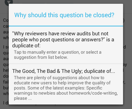
List of suggested duplicates, titled "Why should this question be closed?"

The label of the dialog is still Why should this question be closed?, the first item is a hint but it's not differentiated from the other items. It has the same style than the question below. In fact it didn't see it on first look and thought it was a proposal of question to mark as source of duplicate. I think it should have a different look or background color to inform the user that this is not a choice but an information box.

Update: I closed my own question so the label is different when flagging some content from another user, it's I am flagging this question because on the main and sub menu.

5
  • 1
    I get confused in the same way each time. (It's long enough apart that I have to dupe-close on a mobile that I haven't gotten used to it yet.) Commented Oct 28, 2014 at 6:19
  • 2
    The top icon actually is an option, if you tap it you can manually enter a question URL or ID to mark as a duplicate of that. This entire dialog is really hacky right now on both client side and server side. I'll see what we can do about it.
    – Kasra Rahjerdi StaffMod
    Commented Oct 28, 2014 at 16:02
  • 1
    @KasraRahjerdi: I think I'm not the only one to have missed it was a button.
    – A.L
    Commented Oct 28, 2014 at 17:17
  • I the review queue changes I don't recall anything about the flagging dialogue. I just tried searching through those posts but found nothing relevant to this.
    – bad_coder
    Commented Sep 7, 2021 at 17:55
  • 1
    @bad_coder This has to do with the android app, hence the android-app tag.
    – Spevacus Mod
    Commented Sep 7, 2021 at 18:25

0