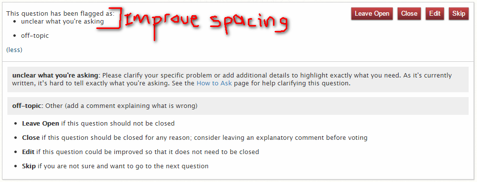
When voting to close a question that has multiple reasons the spacing between the preamble and the list of possibilities doesn't look appropriate:

Understandably the unordered list in the top and the bottom (when clicking the (more) button) is the same, and that's good. However, I'd suggesting adding more space between the "This question has been flagged as:" and the first item.

