26

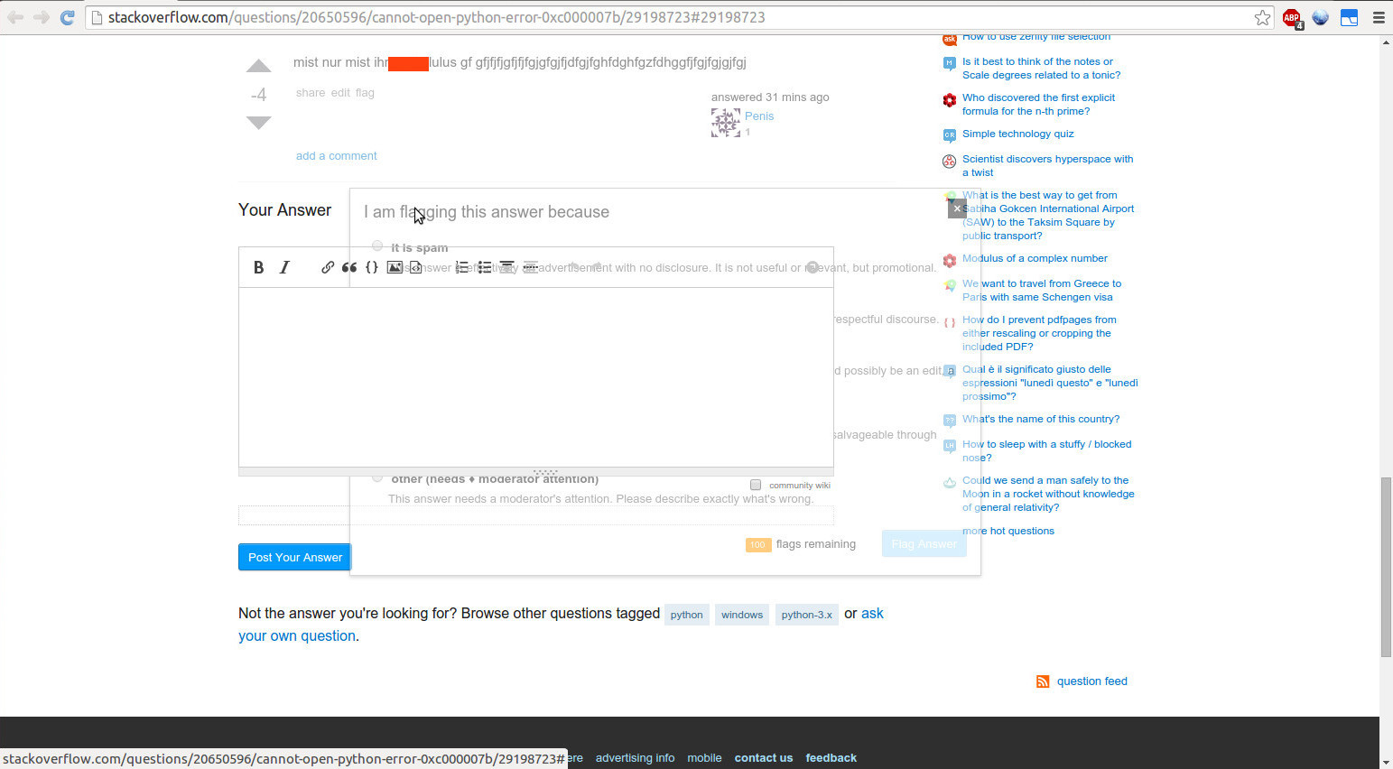
When flagging an answer that is grayed-out because it has a score of -3 or lower, the flag dialog is also grayed-out. If you drag it over a non-grayed-out answer, it appears semi-transparent. The same is true when you flag a comment on a grayed-out answer.

semi-transparent grayed-out flag dialog

This looks like a regression of The flag pop up on heavily downvoted answers has grey text, perhaps due to this recent bugfix.

10
  • 2
    (and also "share" popup)
    – nicael
    Commented Mar 20, 2015 at 21:26
  • 2
    And also edit :) Maybe this was by-design?
    – Travis J
    Commented Mar 20, 2015 at 22:09
  • Came here to report the same issue.
    – Jason C
    Commented Mar 21, 2015 at 4:39
  • Looks like it's fixed for posts. Not yet for comments though.
    – epimorphic
    Commented Mar 30, 2015 at 18:48
  • @epimorphic Looks like comments are like that by design. See Jin's comment about the fix that was deployed this morning: "The fix was, instead of setting .5 opacity on .downvoted-answers div, I limited the opacity to its .post-text, .post-signature, .votecell, .comments divs only. So this way it doesn't affect the popup div." Commented Mar 30, 2015 at 18:51
  • It's about as by-design as the problem with posts, no? Both are due to (1) CSS selectors not being as fine as is necessary and (2) flag dialogs residing within semi-transparent elements.
    – epimorphic
    Commented Mar 30, 2015 at 19:05
  • @epimorphic It's by design because the dev who just fixed the problem with the dialogs this morning specifically and intentionally left it that way for comments. Also note that two previous feature requests to make comments easier to read on grayed-out posts were declined. Commented Mar 30, 2015 at 19:26
  • @epimorphic I completely misunderstood you. I thought you were talking about comments, not the flag dialog for comments. You're right, this is still broken for the comment flag dialog. Good catch. Commented Mar 30, 2015 at 21:42
  • That's what I meant. Apologies for the vague wording.
    – epimorphic
    Commented Mar 30, 2015 at 21:48
  • @epimorphic I don't know what I was thinking...considering that the screenshot in my question is of the comment flag dialog, I should have known right away what you were talking about. Commented Mar 30, 2015 at 21:52

2 Answers 2

7

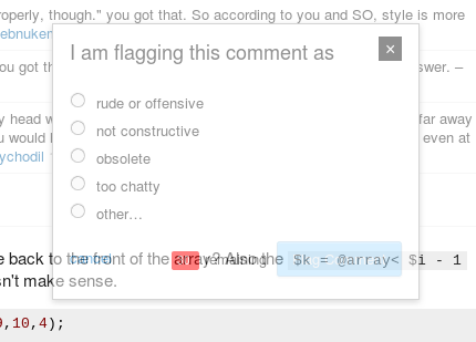
In its current state it is very hard to use. In addition to the screenshot I gave in a comment earlier, I ran into this just now (Chrome on Ubuntu):

enter image description here

Earlier example was (Chrome on Windows):

enter image description here

Workaround is to move the flag dialog to somewhere that makes it visible.

4

This is a result of the modal dialog "#popup-flag-post" being opened as a descendant of the answer, which in this case has class ".downvoted-answer" giving that element and all of its descendant elements opacity : 0.5.

It does not seem necessary to nest the dialog in the answer because the position seems to be positioned relative to the page anyway with position:absolute and exact top and left values set.

The nesting comes as a result of the code inside of full.en.js, specifically where StackExchange.question seems to refer to this jQuery selector in order to use appendTo with it

var i = e.closest(".post-menu, .help-menu");

Which will essentially take the clicked element from the set, find the relevant container, and place the absolutely positioned dialog as a child in it. This could be changed by altering the append to be to the body of the page as opposed to the .post-menu, .help-menu.

However, Is this really a bug? To me it seems like it could also be [status-bydesign].
4
  • 1
    I'd say it was a bug. The dialog is very hard to use in it's current state.
    – ChrisF Mod
    Commented Mar 20, 2015 at 22:48
  • The first time this happened it was fixed and marked as status-complete, so I highly doubt it's by design. Commented Mar 20, 2015 at 23:21
  • 3
    Only by-design if it was designed to be impossible to use.
    – Jason C
    Commented Mar 21, 2015 at 4:41
  • 1
    In the older design, the fading out was applied to .downvoted-answer .post-text. Specifically because of this. So yeah, a regression due to "simplified" CSS.
    – user259867
    Commented Mar 21, 2015 at 22:42

You must log in to answer this question.

Not the answer you're looking for? Browse other questions tagged .