43

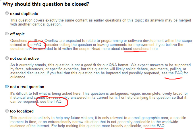
Over the time I've been able to vote for closure on SO, I've gotten into the habit of clicking on the reason itself in order to select the radio button corresponding to it. Since the reasons have changed, there are also now links in the middle of the text, which I also happen to accidentally keep clicking on. More annoyingly, these links don't open in a new tab so I have to click back and redo it. This happens most often with the "FAQ" link in the off-topic dialog, which is right there in the top left corner where I normally click.

Annoying links in close dialog.

Basically, those pieces of text now have two functions. One function of it is selecting the corresponding radio button and the other function is loading a new page. Obviously loading the new page trumps simple selection.

This has become even more painful now with the new off-topic messages, where a large portion of the message is a link:

obnoxious links in off-topic close reason

A simple feature request: can the vote-to-close dialog itself not render the links?

6
  • 4
    Needz moar freehand circles.
    – user102937
    Commented Jun 15, 2012 at 18:21
  • 12
    If you've got the rep to close-vote, you probably don't need extra links to the FAQ...
    – yoozer8
    Commented Jun 15, 2012 at 18:30
  • 5
    I see your point, but exercise some discipline, man. Just don't clicky the links. :P
    – user102937
    Commented Jun 15, 2012 at 18:36
  • 9
    It's tricky on mobile where tapping isn't exactly precise. Commented Jun 15, 2012 at 18:52
  • 3
    It's like a minesweeper game! Commented Apr 10, 2013 at 14:13
  • 2
    If the links will not be disabled, the text should not be a label for the radio button. The current behaviour encourages users to click on the text (because the majority of the time it is an easier/faster target to click), but randomly punishes them for taking advantage of this convenience. If you need to take the extra time to precisely target your cursor then you may as well be aiming for the radio button. Going either way (all clickable or none clickable) would be less frustrating than the current behaviour.
    – Jeremy
    Commented Jun 17, 2013 at 7:01

3 Answers 3

11

We're not going to disable the links entirely because they are useful to people looking for more information on which close reason to use. Especially in the custom off-topic close reasons; people should know what information they're pointing the OP to.

However, I feel your pain. We've made the links in the close dialog open in a new tab so you don't have to go back and repeat any actions.

It's not exactly what you asked for, but I think it will help.

6
  • So status-declined? Commented Jul 29, 2013 at 15:12
  • ..and this one should be tagged status-completed. :) Commented Jul 29, 2013 at 15:13
  • @ShaWizDowArd Done and done.
    – Laura StaffMod
    Commented Jul 29, 2013 at 15:15
  • Cheers! Surprised that you (i.e. the team, not you personally :)) acted against the community on this one meaning declining a popular request and accepting a downvoted one but I'm fine with that. :) Commented Jul 29, 2013 at 15:16
  • +1 for not disabling (we need to be able to see what we're pointing the OP at, as you said), but -1 for taking away user control by forcing things into a new tab. I sometimes use the close dialogue not as a way to close but as a way to get to those links so I can use them in comments, and this change breaks that. Commented Sep 30, 2013 at 15:50
  • 2
    @MonicaCellio If you're using the dialog as a way to get the link addresses, you can still right-click the link and hit "copy link location" or "copy link address", depending on whether you're on a PC or Mac. You don't have to open them to get the address, so this change shouldn't make things more difficult in that regard.
    – Laura StaffMod
    Commented Sep 30, 2013 at 17:13
13

I don't know why I never thought of this before, but frustrated one night I actually realized that there is a simple pure CSS solution to this problem (that I can apply as a custom user style). The best thing is that this element isn't visible by default so it doesn't really slow down the page while you "wait for the style to load." It's my good friend, pointer events.

#popup-close-question .action-list a { pointer-events: none }

This will make any links inside the action list non-clickable. The hyperlinks will still technically be there, but your clicks will literally go right through them and only apply to the label behind. This includes the main list of close reasons, as well as the sub-list of reasons for the off-topic close reason (but doesn't affect the duplicates list).

Supported in all major browsers except (shocker) Internet Explorer 10 and below.

Now I can click those links all I want!

2
  • Wonderful! Now to figure out how to use custom style sheets on mobile.
    – Undo
    Commented Jul 15, 2013 at 3:46
  • Cute how you pointed out the bit about not having to wait for it to load. Commented Jul 15, 2013 at 4:14
5

Edit: the proposal below has now been implemented.


This would be less of an issue if this proposal for bigger clickable areas gets implemented. To summarize:

Current situation:
Current situation

Proposed situation:
Proposed situation

Except for your last example, it gets you a big, lovely stretch of white space you can safely click on to make your selection.

You must log in to answer this question.

Not the answer you're looking for? Browse other questions tagged .