3

The problem can be easily found while using the Android app and mobile web. Just find a question with a close vote on it and you will see this:
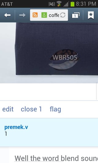
screenshot-of-close

close 1

is what it says there. Can we fix it so we can have the parentheses around the close vote count so it can look like the way it is supposed to look?:

close (1)

5
  • Is this perhaps intentional because there's less screen space on phones? (I dunno, just speculating)
    – James
    Commented Apr 23, 2015 at 23:21
  • 4
    pretty sure the mobile view does the same - which suggests it is not a bug, just a "feature" Commented Apr 23, 2015 at 23:47
  • @psubsee2003 it does, and having used the mobile app almost exclusively for months now, it still looks extremely silly Commented Apr 25, 2015 at 17:28
  • 2
    @raptortech97 not taking a position in one direction or another (doesn't really bother me), but making the point that it is probably a designed behavior, hence is not likely a bug. Commented Apr 25, 2015 at 18:05
  • Not relevant to android app, it doesn't show the pending close votes at all. Commented Apr 26, 2015 at 14:24

0

You must log in to answer this question.

Browse other questions tagged .