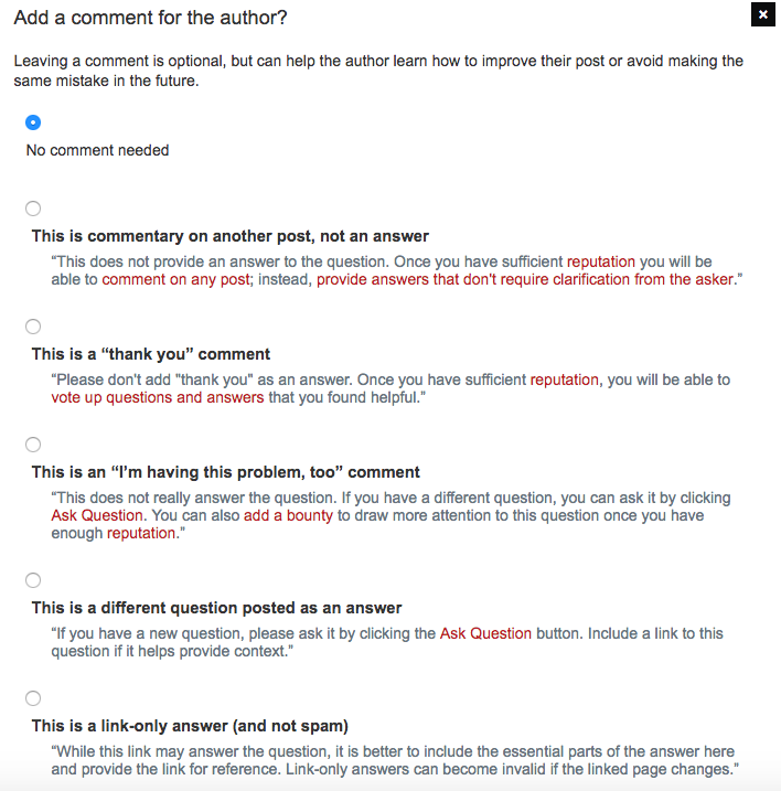
As you can see, the text is not on the same line as its radio button:
This makes the entire dialog too big vertically and doesn't make sense from a UX perspective.
It was not like this before. (I could only find this really old screenshot, but you should get the point.)
(In case it's relevant, I'm on Mac using Chrome "Version 61.0.3163.100 (Official Build) (64-bit)".)

