36

One of the more common bits of feedback when we changed the review queue indicator was that some sites would prefer to have an indication when there are any outstanding reviews available. So we are trying an experiment with an "inbox zero" review indicator. This would mean:

  1. The review indicator lights up whenever there is at least one item in any queue.

  2. There's no concept of the "danger threshold"; if there's even one item in a queue, it's marked with a red dot.

Inbox Zero review indicator

Clearly, this logic would be annoying for Stack Overflow's Close queue, so we've made it a site setting. We're going to test it out on a handful of sites to see how people respond to it:

One final thing: you will be notified even when you cannot complete a review task (for anyone who can see the review queue - 500+ reputation). In particular, people who do not have enough reputation to handle items all the queues will be notified of items in queues they can't access. This is the next thing we are working to fix. If too many people are frustrated by this situation, we'll pause the test until that problem is fixed. It'll also light up even after you've finished all the review tasks available to you, which is a much harder problem for us to fix. The goal of this experiment is to test whether aggressively notifying users can make "inbox zero" a possibility for sites that are close.

16
  • 2
    The review indicator has been broken since the day I joined. I'm guessing it's not a high priority item
    – Richard
    Commented Dec 13, 2017 at 18:35
  • 6
    @Richard: Broken how? Whether or not it's high priority, it's something we are working on now. You might as well be clear about what problem(s) you see.
    – Jon Ericson Staff
    Commented Dec 13, 2017 at 18:37
  • 5
    Sounds good. I'm in. Currently I'm just irritated by a seemingly random indicator.
    – Helmar
    Commented Dec 13, 2017 at 18:51
  • 2
    Broken in the sense that it has always shown the wrong number. Now it's differently broken which is progress of a sort.
    – Richard
    Commented Dec 13, 2017 at 18:56
  • 1
    @Richard We are always trying to improve our brokeness. ;) Seriously, we have several fixes planned that will slowly, but surely improve the accuracy. It is more complicated than you might think.
    – Joe Friend Staff
    Commented Dec 13, 2017 at 19:55
  • 2
    @JoeFriend - I'm sure it'll be working in 6-8 weeks time.
    – Richard
    Commented Dec 13, 2017 at 20:03
  • 1
    I'm guessing the answer is "yes" but is the one-hour delay still in effect?
    – Catija
    Commented Dec 13, 2017 at 23:55
  • 1
    @Catija: It should be. That way you won't be bothered by the notification immediately after you finish work on the queues. We can adjust the timing if needed, but an hour seems about right to me.
    – Jon Ericson Staff
    Commented Dec 13, 2017 at 23:59
  • 1
    Yeah, I like it. I was checking how obnoxious y'all were trying to be. ;) The old indicator (from what I can remember) didn't have that... so I think being able to just click on it to dismiss it for an hour will actually do a lot to combat the fatigue side of the equation.
    – Catija
    Commented Dec 14, 2017 at 0:00
  • The bad review indicator detracted the Anonymous Editor from editing posts here because the reviews were taking too long. Commented Dec 14, 2017 at 1:10
  • What is this "one-hour delay"? I heard that the dot goes away for an hour after you've finished reviewing (or is it after you click?) but that doesn't seem to be mentioned in either of the relevant meta posts (here and on U&L) I checked. Could you clarify that please?
    – terdon
    Commented Dec 15, 2017 at 15:38
  • @terdon Jon mentioned it in his answer here: meta.stackexchange.com/a/302277/284336 ... I think I found out about it in the TL but I'm not sure. Though, it says half hour because it's a half hour on SO.
    – Catija
    Commented Dec 15, 2017 at 17:08
  • 3
    @terdon: It should be cleared for an hour after you click on it just like the previous logic. But there's always a chance for bugs.
    – Jon Ericson Staff
    Commented Dec 15, 2017 at 17:50
  • 1
    This is still broken -- on sustainability.se I see the red dot most of the time, regardless of what's in the review queue.
    – LShaver
    Commented Oct 22, 2018 at 19:51
  • @LShaver: I suspect the problem is that tasks are still waiting for you after the grace period expires. This is a problem that smaller sites tend to run into, unfortunately. We could extend the grace period to some longer time period. If you would like to try, could you post a question on Sustainability's meta and ping me here?
    – Jon Ericson Staff
    Commented Oct 22, 2018 at 22:32

6 Answers 6

25

One final thing: you will be notified even when you cannot complete a review task. In particular, people who do not have enough reputation to handle items all the queues will be notified of items in queues they can't access.

Please don't do this. You know when you go to some random website that you don't even have an account on and it's got a fake bar at the top with a "notification" lit up to make you click on it, and it doesn't really go away or do anything?

I know you don't mean it to be, but this is like that — but for logged-in users, even! Over time, it will simply teach people that those notifications are frippery and should be ignored.

6
  • 2
    If you don't have an account, you don't see the review drop down at all. Un-logged-in users and users with low reputation (under 500) see the help menu, not review.
    – Catija
    Commented Dec 14, 2017 at 13:17
  • 6
    @Catija I know — I'm not saying that this is that. I'm saying it's bringing the same frustration to logged-in users of Stack Exchange.
    – mattdm
    Commented Dec 14, 2017 at 13:27
  • 1
    Jon already said they'e working to fix this point, so it will just be a temporary annoyance.
    – Kendra
    Commented Dec 14, 2017 at 15:14
  • 5
    @mattdm Kendra is correct. We already have this on the list of things to fix. It's actually a bit complicated to get right across sites and needs to factor in two things: 1. review categories enabled for you, 2. whether you've hit your limit for one of those categories. We are focused on getting #1 in place and then will tackle #2. Plan is to not roll out this change broadly until we get at least #1 addressed.
    – Joe Friend Staff
    Commented Dec 14, 2017 at 17:33
  • 1
    @Kendra Makes you wonder why they didn't fix it before starting the experiment, now the focus is on the bug instead of what it may or may not solve.
    – Mast
    Commented Jan 4, 2018 at 8:34
  • 2
    +1 Sending false positives is a guarantee that people will start ignoring the indicator.
    – Jan Doggen
    Commented Jan 5, 2018 at 19:19
19

Early results

In my opinion, the top bar indicator works best when it:

  1. Minimizes the time it takes for review tasks to be handled and
  2. Minimizes the cognitive impact (to borrow a phrase from this answer).

Unix was the site with the most reviews in the experiment. It's clear that tasks did get done more quickly:

epoch  reviews max minutes pending avg minutes pending
------ ------- ------------------- -------------------
before    2165                7931                 168
after     2553                1690                  56

I won't go through all the sites, but each one saw similarly positive decreases in review time. But meta feedback noted:

As in inveterate queue clearer, the behavioural impact is negligible. The cognitive impact, however, is unwelcome. The red dot immediately signals dread: "Oh, there are a heap of these things to deal with now..."

Save the red for when you really need it (ie., when the queue really is backed up: 10 or more, or whatever the old threshold was). Bring back the grey so the site feels less like it is on fire all the time.

Meanwhile on RPG:

I'm appreciative of the change: if I see no indicator, I now know there's no reviews.

It used to be there could be 1-2 sitting there and I'd just have nothing telling me.

It's a bit over-tuned in that it shows me everything I can't even work on, as mentioned in the question, but over-tuned is a nice departure from under-tuned, and I appreciate there's further work to tune it just the right way.

Reviews on that site also got a lot faster:

epoch  reviews max minutes pending avg minutes pending 
------ ------- ------------------- ------------------- 
before     465                1058                 112
after      437                1012                  58

But notice there are a lot fewer reviews. In the last 9 days, they've had about 2 review tasks per hour compared to Unix's ~15. (If you are doing the math with me, note that RPG started the experiment on the 13th and Unix started on the 15th.) Presumably Unix has more reviewers too, but since the average review hangs around for an hour, it's quite likely the indicator will come back each time the hour-long grace period expires after clicking on it. That's clearly too much and a long way from our (somewhat arbitrary) warn 10% of the time criteria.

So I think it's probably reasonable to turn on the new logic for sites with only one or two reviews in an hour. It's not at all reasonable for sites that get double digit review tasks an hour.

False negatives

Several people have noticed that sometimes the indicator doesn't light up even when there are tasks in one or more queue. After you click on the review queue icon, you get an hour-long grace period from being notified about new items. But the reports generally take that behavior into account. It looks like there's another reason for the occasional false negative: caching. So there's a potential delay of a few minutes between when a task enters review and when the indicator might first light up. When someone clicks the review icon, the number of pending tasks for each queue is recalculated and the grace period starts for that user.

Given that reviews are getting handled more quickly, this doesn't seem like a critical problem. The indicator does come on eventually, so it avoids the main criticism of the danger threshold version on small sites. Obviously, it would be nice to have a consistent mental model. On the other hand, it does reduce the potential for overwarning.

False positives

We did get one report of a false positive. In this particular case, it seems the user addressed all the review tasks but they didn't get cleared from the queue within the hour. We are addressing another potential problem: being warned of review tasks when you don't have enough privileges to see the queue. (The work has been completed, but it's probably not a good idea to deploy just before vacations.) False positives are certainly discouraging, so we'll want to eliminate as many as possible, if not all.

11

copied over from https://unix.meta.stackexchange.com/a/4724/246819

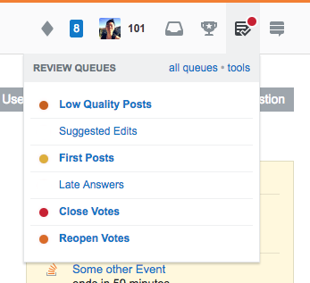
I definitely agree the review queue indicator needs to be more aggressive, but it's neither a good idea nor necessary to sacrifice the urgency indication feature just for that. Instead of setting the whole site on fire, how about a yellow-to-red transition?

first version

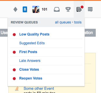
One could even think about always having a dot on every queue, maybe green for empty ones – those traffic light colors are quite unambiguous.1

second version

Of course the color of the review button dot should always match the darkest yellow/red, and there should be no dot only if every queue is green.

1: “Red” meaning „Stop! Don't add any questions to this queue before you did your review duty!“ ;-)

4
  • 3
    This will not help users who have color vision impairment and may actually make things worse for them. The most common type of color blindness makes it so that you can not discern a difference between red and green... The site needs to be as accessible as possible, which, I'm guessing is why the current system using grey vs red with very different color values. Try viewing your images here: color-blindness.com/coblis-color-blindness-simulator
    – Catija
    Commented Dec 15, 2017 at 16:52
  • 1
    @Catija Then there should simply be an option in the settings for that. Do you say this network is currently accessible for people with red–green color blindness? I beg to differ…
    – dessert
    Commented Dec 15, 2017 at 16:59
  • 2
    SE - before the SO top bar stickiness option - seems to be somewhat allergic to user-configurable settings. They'd much rather make a single system that works for most people than have to constantly update several. They have limited staff and time for that sort of thing... as to the latter... I'm not color blind, so I don't know whether they have or not but I don't think that them failing in that regard in the past implies that they should continue to do so.
    – Catija
    Commented Dec 15, 2017 at 17:32
  • 5
    +1 I like the idea of transitioning from yellow to red. However, I wouldn't add green dots, not only because it is inaccessible for color blind people, but also because it makes it more difficult for me to find out which queues need attention at a glance.
    – TuringTux
    Commented Jan 5, 2018 at 9:29
7

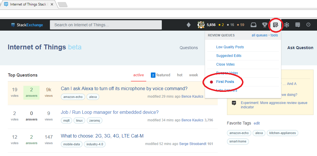
We're taking part in the experiment with IoT.SE, but I'm not sure it's working as intended. I would have expected an overall indicator up there. It was directly after I loaded the page and I clicked more out of habit on the review button.

No Indicator in top bar

3
  • Had you checked the queue within the last hour? See the discussion in the comments on the question about the one-hour sleep that's applied after you click on it?
    – Catija
    Commented Dec 16, 2017 at 15:00
  • Link? @Catija, but I don't think so. I just opened the page. Or rather reloaded it after 3+ hours doing something else
    – Helmar
    Commented Dec 16, 2017 at 15:06
  • Last three comments... but it's point two listed here: meta.stackexchange.com/questions/302226/…
    – Catija
    Commented Dec 16, 2017 at 15:13
3

Can the Suggested Edits be excluded from the one-hour-sleep? That queue always had some sort of special handling in the past, even in the old system. Now it doesn't. Today I clicked—by total chance or habit—on the review item while it was in sleep mode with the soothing gray check mark, and there was a suggested edit pending.

The indicator should always light up if a suggested edit is available.

1
  • This is an interesting suggestion, but note that the grace period is for you only. Other people will still see the indicator (unless they've also recently clicked it). So suggested edits can still get handled by someone even if you don't see the indicator yourself. In any case, this system is an improvement for small sites since even one suggested edit trips the indicator.
    – Jon Ericson Staff
    Commented Jan 8, 2018 at 23:49
0

This will not have much impact on me so long as it doesn't notify me about reviews on other sites. The problem is less that I'm doing something else on Politics.SE and don't see that there's items in the queue. It's more that I'm currently on Skeptics.SE and don't have a single step way of checking whether there's action on Politics.SE.

If you really want me to process more reviews, consider offering some sort of combined queue notifier. Notify me if there are any queues that I could process that have open items anywhere. I occasionally review queues on seven sites: the five that appear at the top of my sites menu; Arqade (my normal entry point to the site); and more rarely Economics.SE.

As is, I can't find out that a site needs attention until I get around to visiting it. It's not so difficult to check queues at the beginning and end of my visit to a site, which catches everything that this indicator would. It is difficult to know that just after I left, Politics.SE had a high priority review develop.

I don't know how common my usage pattern is, but I don't believe that I'm unique. I see others on multiple sites and see people talking about their activity on other sites.

1
  • 2
    I don't think your experience is unique, but I think the current system is somewhat by design. Sites are best moderated by people who are organically participating in other ways. Showing the indicator across sites would encourage people to drop into communities they are less involved with and (potentially) act in ways contradictory to the local culture. By the way, for outright spam Charcoal does a good job protecting the network.
    – Jon Ericson Staff
    Commented Dec 26, 2017 at 21:38

You must log in to answer this question.

Not the answer you're looking for? Browse other questions tagged .