2

On this question, I have a 200-reputation bounty active. To reward it, I would click here next to the answer:

Arrow points to the lighter blue, bolded button to reward the bounty

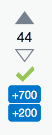
However, it looks like this on mobile:

Voting and bounty buttons on mobile

Unlike on desktop, there isn't a color or bolding distinction on mobile. Can this be changed so that it looks like the desktop version? It's weirdly inconsistent and not as good design for being as clear as possible.

5
  • Just to check, is the behaviour the same on the mobile-web as on the responsive view?
    – Luuklag
    Commented Aug 14, 2019 at 13:57
  • Strongly related, possible dupe, since it boils down to the "award" button's color being the same as the "awarded".
    – Jenayah
    Commented Aug 14, 2019 at 13:59
  • @Luuklag no. The responsive design and desktop both have the different shades. Commented Aug 14, 2019 at 14:09
  • @Jenayah ugh that one is so confusingly cryptic and a bad dupe target. Commented Aug 14, 2019 at 14:09
  • @Stormblessed well true but it's already the dupe-target (of the dupe-target) of this one
    – Jenayah
    Commented Aug 14, 2019 at 14:45

0

You must log in to answer this question.

Browse other questions tagged .