19

Apparently the code highlighting colors were recently changed.

Given that we've had a few coloring bugs recently, I wonder if the change is intentional or not.

If it not intentional, I suggest rolling it back. The old colors look a lot better to me.


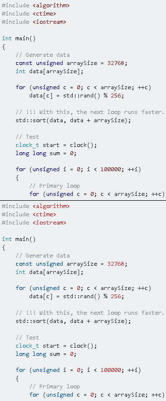
Compare this (old theme) and this (new theme).

Or, as a screenshot. The top image is the old theme, the bottom one is the new one.

pic


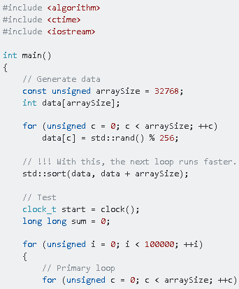
UPD: The theme was updated again, this is how it looks now.

pic

7
  • 2
    I noticed the change earlier and I hope I get used to it. Right now, I don't like the (new) color(s). Commented Feb 26, 2020 at 17:01
  • 7
    I think that the new color scheme makes it much more readable, but that's probably a matter of taste. Commented Feb 26, 2020 at 17:50
  • 1
    Not a fan of the bright red, but - I think I'll pick my battles.
    – einpoklum
    Commented Feb 27, 2020 at 20:04
  • @einpoklum Btw, they've changed it to be less bright after I've posted this. Commented Feb 27, 2020 at 20:49
  • @HolyBlackCat: If you can add the newer change to your post, that would be nice.
    – einpoklum
    Commented Feb 27, 2020 at 20:50
  • @einpoklum Sure, done. Commented Feb 27, 2020 at 23:19
  • @HolyBlackCat: Now it's fine by me.
    – einpoklum
    Commented Feb 27, 2020 at 23:26

2 Answers 2

35

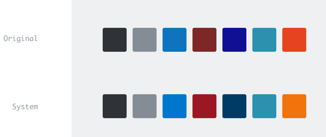
Yep, these changes are intentional. We had to move some variables around to clean up our CSS. These were matched with the closest re-usable color values we have in our design system. 👋

Color shift

15
  • 10
    I think this is, on balance, an improvement. I'm glad you worked hard to keep the closest colors to the old scheme as possible. The effort shows. My primary concern here is with the fifth color from the left. It used to be a very saturated deep blue, closer to purple than to green. Now it's a very desaturated dark blue, closer to green than to purple. That would be fine in the abstract, but in practice it is too close to the color right next to it. Since these colors get used for keywords and user-defined types in code, which often occur adjacently, being able to distinguish them is important!
    – Cody Gray
    Commented Feb 26, 2020 at 19:28
  • The Stack Exchange SVG icon available for download uses #f48023 as opposed to --orange. The logo and the talent logo's both have the correct color. Seen a lot of changes in color popping up. figured I would bring it up here, rather than make a question over such a minuscule lack of blue.
    – JFoxx64
    Commented Feb 26, 2020 at 20:17
  • Interesting, why is .typ not using a color variable though? It's still the original #2B91AF, or was it reverted in response to Cody's feedback? Commented Feb 26, 2020 at 20:23
  • 1
    The middle red is not in the stacks: stackoverflow.design/product/base/colors/#red Am I wrong? The red is now red-600, but it would be better if it was red-700 or red-800. Could it be changed?
    – Dharman
    Commented Feb 26, 2020 at 20:26
  • 1
    @AaronSkekey it seems fair to remove the actual hex values so long as you also remove/update the image here any time the colors change.
    – TylerH
    Commented Feb 26, 2020 at 20:37
  • @Dharman: the color image is a little darker from the actual CSS colours. Commented Feb 26, 2020 at 20:39
  • @TylerH: the image is not actually accurate; the middle swatch is #8f2629, not the actual red-600 (#c02d2e) color used, for example. But it is consistently darker. Commented Feb 26, 2020 at 20:41
  • 1
    I created a codepen comparing old and new, as well as a few alt styles using the same Stack colors. Commented Feb 26, 2020 at 20:47
  • @MartijnPieters That's part of the reason I added a list of the actual hex values; so people could look at what was objectively true for the design at a given point in time. Without that, the colors image in the post is even more useless/inaccurate than it is now as soon as the colors change again.
    – TylerH
    Commented Feb 26, 2020 at 20:48
  • 3
    And the colors are lighter than I thought would be used at first. I agree with Dharman here, red-600 is too light. red-800 would be a lot easier on the eyes. Commented Feb 26, 2020 at 20:58
  • Ah, and .prettyprint is also left at the original #393318. Any reason not to have used --black-800 there? Commented Feb 26, 2020 at 21:05
  • Have you by any chance messed up some of the link colours with this fix? On sites where the link colours are starkly different from the button colours (like Movies & TV or Worldbuilding) the visited and hovered links suddenly have a very different colour (namely a tint similar to the button colour but evrry different from the normal link colour). Commented Feb 26, 2020 at 22:04
  • 1
    @ChrissaysReinstateMonica There's a follow-up PR to fix that particular bug. Lots of moving parts today!
    – Aaron Shekey StaffMod
    Commented Feb 26, 2020 at 23:30
  • Ah, good to hear it's on the radar, though. Thank you. Commented Feb 26, 2020 at 23:31
  • The mobile and desktop versions seem to use a different colour palette, this is now extremely low contrast for VB languages on mobile (although they are fine on desktop)
    – Greedo
    Commented Feb 29, 2020 at 11:25
6

I believe the red and orange are too bright. I would propose the following colors to be used.

.prettyprint {
    color: var(--black-800); /* was #393318 */
}
.str, 
.lit, 
.tag {
    color: var(--red-800); /* was --red-600 */
}
.kwd,
.dec {
    color: var(--blue-800);
}
.com {
    color: var(--black-400);
}
.typ {
    color: var(--powder-600); /* was #2B91AF */
}
.pun,
.pln {
    color: var(--black-750);
}
.atn {
    color: var(--orange-600); /* was --orange-500 */
}
.atv {
    color: var(--blue-600);
}
4
  • powder-600 is quite close to the blue-800 used for keywords and declarations. I find powder-500 to provide better contrast there. Anyway, added to my pen. Commented Feb 26, 2020 at 21:16
  • 2
    I can dig these changes. I've implemented them, @Dharman. Sticking with the aqua for now to ruffle fewer feathers. There's a way bigger opportunity to revisit syntax highlighting entirely, but not today.
    – Aaron Shekey StaffMod
    Commented Feb 26, 2020 at 23:30
  • 2
    What's better than a Codepen—especially one with production Stack Overflow CSS? Nice work.
    – Aaron Shekey StaffMod
    Commented Feb 26, 2020 at 23:33
  • @AaronShekey: now with even more reliance on the production SO CSS, by just including https://cdn.sstatic.net/Shared/stacks.css and https://cdn.sstatic.net/Shared/primary.css into the pen. Commented Feb 27, 2020 at 12:49

You must log in to answer this question.

Not the answer you're looking for? Browse other questions tagged .