72

After rolling it out to the International Stack Overflow sites last week, we're rolling out the new ask page to the whole network today.

The new page was designed with the goal of helping new askers by more readily presenting them with tips on how to improve their question. This is a combination of the "Ask a question wizard" (that was tested on Stack Overflow) and the current standard "ask a question" page. You can read more about it in this blog post.

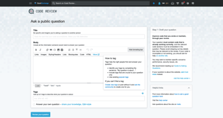
The /questions/ask/advice page has been replaced by a new modal for first-time askers, and the flow is now broken down into two steps: drafting the question, and reviewing the question — so no more random warnings triggering when you switch from the tag to the title field, while others only show up if you actually try to post. And as the blog post notes, there's also an informational modal at the end, so new askers know what to expect once they've asked their question. Enough words, here's what it looks like... (click on the images to see the larger versions)

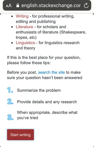
Welcome modal for new askers:

"Asking a good question" modal for new askers

Drafting a question:

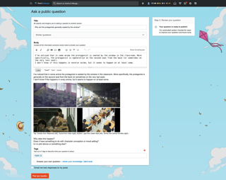
Drafting stage on Anime & Manga, showing expanded tag popover with custom guidance, default "draft your question" guidance Drafting stage on Code, showing expanded tag popover with default guidance, custom "draft your question" guidance

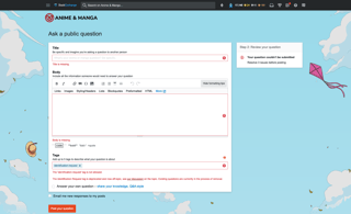
Reviewing a question, with errors (shown inline) and warnings (shown on the right side):

Review stage on Anime & Manga, showing custom inline tag error message Review stage on Code Review, showing custom title warning message

Reviewing a question, without errors:

Review stage on Anime & Manga, showing no errors or warnings

What's per-site customizable, and what's the procedure to get it live? (more recent guidance here)

As you can see, any existing custom guidance on "How to ask," "How to tag," or any custom error or warning messages your site may already have in place will still be there, and will still be customizable with the same restraints (basic HTML, using paragraphs, lists, links) as before:

  • The "welcome modal" for new askers (seen with the default text in screenshot 1), everything between the title and "Before you post..." (this is only custom on 4 sites at the moment, such as EL&U).
  • The full contents of the "Draft your question" sidebar (seen with the default text in screenshot 2, and with custom text in screenshot 3).
  • The text in the tag popover, between "Tags help the right people..." and the bullet points (seen with custom text in screenshot 2, and with the default text on screenshot 3).
  • The above three have no character limits, aside from "within reason."
  • The placeholder text in the title field (text only; seen with the default text in screenshot 2, and with custom text on screenshot 3).
  • The warning text shown in the "Review your question" sidebar, regex-based (seen with the default text in screenshot 4, and with custom text on screenshot 5).
  • Tag-related error messages and warnings, regex-based (seen with custom error text in screenshot 4, with the default text on screenshot 5, and with a tag warning here).
  • The warning and error messages described in the two bullet points above have a limit of 1000 characters.

These can only be edited by staff, so the process to get them live is as described here:

  • Create a Meta post on the appropriate Meta site, and discuss it with your community.
  • Once a consensus is reached, a mod should escalate it to the CM team. Generally speaking, the "contact us" form is the best way to go, though a ping in chat can sometimes work too (the most that could happen is we ask you to use the form).
  • Unless there are any outstanding issues, the CMs should be able to get to it Soon™.

This has been live on Stack Overflow for a while now, and like I mentioned at the beginning of the post, we're rolling this out to the rest of the network now.

If you have any questions or see anything that has broken on your site, please let us know — we'll be actively monitoring and responding to this post until March 10th. After that, if you have a bug or specific request, start a new post and tag it with and or :)

17
  • 4
    Well, it looks good! Commented Mar 3, 2020 at 19:22
  • Why is this not implemented on Meta Stack Exchange? Commented Mar 3, 2020 at 19:25
  • 13
    @SonictheAnonymousHedgehog Fixed. I forgot to clear the override that was allowing me (and only me) to see it there.
    – Brian Nickel StaffMod
    Commented Mar 3, 2020 at 19:37
  • In the review stage, when there are things to do still, shouldn't the button still read review not post question? Commented Mar 4, 2020 at 13:53
  • 1
    @Trilarion: I assume you mean after you've reviewed the question and it displays errors? (Since if there are no errors, it should be ready to post...)
    – V2Blast
    Commented Mar 5, 2020 at 0:39
  • @V2Blast Yes, as long as there are errors it should not be ready to post. Commented Mar 5, 2020 at 8:11
  • 1
    Also it seems to show one error after the other. Couldn't it show more than one at the same time? My simple experiment only runs into simple things like title too short, body too short, but it saves a bit of time to see all these things at the same time. Commented Mar 5, 2020 at 9:34
  • 1
    @Trilarion The current behavior is that once you're in the review stage the button is actually gonna try to post the question. If you still have errors, it'll fail; but if you don't, it goes through. Feel free to post an answer here if you have a feature request on how it should work instead :)
    – JNat StaffMod
    Commented Mar 5, 2020 at 20:43
  • @JNat Done. :) Commented Mar 6, 2020 at 8:46
  • 2
    I'm a bit unclear what the limits of "regex based" tag warnings are. Of specific interest: would it be possible to show a specific warning if the question isn't tagged with one of a set of tags (or include phrases in the body)? (I'm thinking of system tags for RPG.SE, which are often missing from new askers.) Commented Mar 8, 2020 at 1:00
  • 1
    Guidance like the example you're suggesting, @Someone_Evil, should go in the "how to tag" dialogue, shown in screenshots 2 and 3. Checking for the absence of tags isn't, as far as I'm aware, something we do anywhere (other than Meta sites).
    – JNat StaffMod
    Commented Mar 11, 2020 at 11:07
  • @JNat If answers posted here before March 10 did not receive a response, should they be posted as a separate feature-request?
    – E.P.
    Commented Mar 27, 2020 at 14:58
  • 1
    No need, @E.P. — I'll pass all the feedback here internally. Was out all of last week, otherwise it'd be done by now.
    – JNat StaffMod
    Commented Mar 30, 2020 at 11:49
  • @JNat Thanks for the ping here. I look forward to the feedback! If the priority you guys assign it doesn't seem to match the level at which the proposed feature (specifically, math formatting) is actually required by technical sites and their communities then I'm happy to take on a campaign to pile support on a separate feature-request --- but I hope it won't be necessary ;-).
    – E.P.
    Commented Mar 30, 2020 at 13:40
  • I see that the last paragraph mentions a recommendation to use the (ask-page) tag. This tag was removed add some point (additions, removals, deleted). Is (asking-questions) recommended instead?
    – Martin
    Commented Jun 12, 2020 at 18:15

17 Answers 17

48

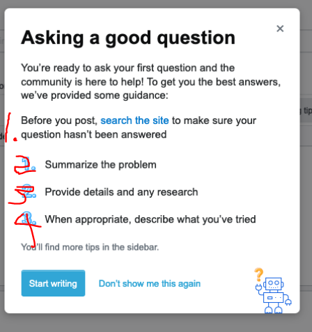
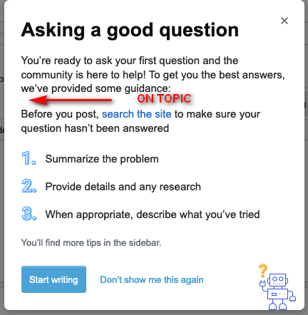
I suggest a renumbering on the opening screen

We really do want new users to search the site first. Make that step 1.
I have some experience with training manuals and procedures that used numbered list.
Making the first thing you want done be number one is a great use of a numbered list. We do want the new user to first search for an answer, and then if they don't find it, to ask the question.

The embedded "search the site" is a good idea.

I roughed my suggestion out here visually.

enter image description here

Lastly, a word-smithing suggestion:

"... to make sure your question hasn't already been answered."

Add in 'already' there.

As well (thanks @V2Blast), bolding the "Before you post" would be a good visual cue.

11
  • 5
    To be fair, I disagree with this in a sense, because "search the site" isn't part of what needs to be included in the question itself. Perhaps it could be "0." instead ;)
    – V2Blast
    Commented Mar 4, 2020 at 4:10
  • 15
    I disagree with your disagreement, but I understand the point that you are trying to make. My intent is to allow this to be a coaching toward desired process in engaging with the site. Commented Mar 4, 2020 at 12:17
  • Individual sites can already modify that section completely. And some question types don't need prior searching. Might be worthwhile leaving as is and changing where needed. Commented Mar 4, 2020 at 14:39
  • @TheLethalCoder Can you give me an example of one? some question types don't need prior searching Commented Mar 4, 2020 at 14:41
  • 1
    I mainly sit on SFF, we get a lot of [story-identification] questions. Of course we want the user to research beforehand, covered by point 2 already, but they don't have to search SFF first before asking. In fact in a lot of cases, where different details are remembered, it would be hard to find "the same" question on the site. So for our case, in my opinion, it would be best to leave it un-numbered. Commented Mar 4, 2020 at 14:43
  • 1
    @TheLethalCoder I participate on SFF sometimes, but since it's noise-to-signal ratio is very high, I don't find it a good example for SE sites - but your example of a question is perfect. (And those are some very useful/helpful questions, as a class, for that site) Thanks! Commented Mar 4, 2020 at 15:08
  • 1
    As the first comment here notes, the reasoning is that that's something that should be done in preparation for writing a question, whereas the steps outlined there are the actual steps to drafting the question.
    – JNat StaffMod
    Commented Mar 5, 2020 at 21:09
  • 3
    @JNat SE has spent about a decade with "you should" as a hope and a policy and it is not succeeding to the level desired. The feedback from engaged users should tell you that. My own experience with SE *question quality is all over the map, however it has gotten worse in review queue experience in the last two years. The core similarity I see across six sites as I hit the review queues, particularly among new users, is the blatant lack of effort put in; the lack of prior research is a common thread. Commented Mar 6, 2020 at 12:53
  • Maybe the sentence could be bolded?
    – V2Blast
    Commented Mar 9, 2020 at 20:53
  • 1
    I was talking about the "Before you post, search" line in the "Asking a good question" box itself, not any line in your answer. Sorry if that was confusing :)
    – V2Blast
    Commented Mar 9, 2020 at 23:21
  • @V2Blast We once again demonstrate the correct use of comments. :) Commented Mar 9, 2020 at 23:30
16

First of all, I like the gist of this feature, to let users know of potential issues with their questions in a more friendly manner. It's important that users know of these issues and are given more personalized advice as opposed to having to sift through a bunch of generic advice.

However, I feel like the current experience diminishes the importance of the warnings, which appear in the sidebar to the right. They're located in a place where users often don't see them, and in cases where they do see them, it's possible that users may decide, "I've already typed out my question, they won't mind, right?".

To quote from a famous micro-study:

Many sites' scopes are not immediately obvious. That's not a bad thing, it's just a product of the system that a site can't take absolutely all questions about one topic. However, it seems that we do need to make sure the guidance is available.

On the Ask Question page (/questions/ask), there's an info box on the right-hand side of the page.

[...] my test group didn't notice, or didn't fully read this information until after they'd typed their question into the box.

At that point, if the guidance makes the question they've just typed off-topic, the majority reaction was "but I've already typed it out... they won't mind, right?". Clearly, that's not the reaction we want. If this guidance could be moved to the left hand side of the page, in consistency with most people's reading direction of left-to-right, I think more people would read the guidance before posting an off-topic question.

Can we please make the warnings more prominent, or at the very least move them to the left side of the page, where people's eyes are more likely to look at them?

3
  • 7
    (From Lisa:) A large part of the redesign was to focus users on question-writing. We removed the left navigation so that the editor would be the focal point. The sidebar is secondary component that keeps potentially distracting errors and warnings in one place. We are considering different placement of other elements that may make the side bar more noticeable.
    – Catija StaffMod
    Commented Mar 3, 2020 at 23:55
  • 15
    @Catija Genuine suggestion: What if the sidebar is put on the left side of the question panel instead of the right? People are very thoroughly trained into a convention that things have a left->right order of importance, that narrow bars on the left hand side are pretty important and useful, and that narrow bars on the right hand side are completely tangential, unimportant, and optional. Commented Mar 4, 2020 at 11:36
  • 1
    @doppelgreener Good point on where peoples' eyes go and how they go there. Commented Mar 5, 2020 at 21:48
15

I see no link to /help/on-topic -- don't you think there should be one i.e. isn't that very important?

The default text is for example:

Step 1: Draft your question

The community is here to help you with questions about aviation. Provide details and share research with your question.

So I suggest:

  • You could add a sentence:

    Please read What topics can I ask about here? before you write the question.

  • Or if you can't or won't add a sentence, then make a hyperlink of the current text:

    The community is here to help you with questions about aviation. Provide details and share research with your question.

  • Or something like that.

But /help/on-topic is community-authored i.e. it can be edited by a site moderator -- your linking to that might reduce the need to customise this new text for/by each site.

Your not linking to it seems like an important mistake -- that community-authored topic is not easy to find in the forest of other help topics.

8
  • 3
    Could be solved if we're allowed to customise the Helpful links section. Commented Mar 4, 2020 at 12:40
  • 4
    Yes but here I was suggesting a change or addition to the default text.
    – ChrisW
    Commented Mar 4, 2020 at 12:43
  • FWIW I think this would be better to be a default in the Helpful links section than the Draft your question part but I do like the idea. Commented Mar 5, 2020 at 14:23
  • @TheLethalCoder I think it's more important than a Helpful link: it's a prerequisite.
    – ChrisW
    Commented Mar 5, 2020 at 16:03
  • 2
    The idea of adding this link to "Helpful links" seems reasonable, yes. Passing that along :)
    – JNat StaffMod
    Commented Mar 5, 2020 at 21:46
  • 1
    @JNat Thank you. Why wouldn't you put it in Step 1 though? I like to read what's on-topic before I write the question, it's indispensable not just helpful.
    – ChrisW
    Commented Mar 5, 2020 at 22:55
  • @JNat Was this suggested change rejected for some reason?
    – ChrisW
    Commented Mar 12, 2020 at 14:27
  • Not that I'm aware of, no. I'm juggling a few things at the moment, but all the feedback from here was passed along to the dev/design team who worked on this :)
    – JNat StaffMod
    Commented Mar 12, 2020 at 15:24
14

Do we have stats on how well this performed on Stack Overflow? Thinking that this form performed "well enough" to merit being rolled out to the wider network isn't quite enough data to satisfy my curiosity/concerns.

sigh

8
  • 4
    I don't personally have the stats you're interested in but I have some thoughts... I don't know that the performance on SO is necessarily going to carry over to SE. The basics of the form is similar but there are some differences so the results of this change on network sites may be quite different.
    – Catija StaffMod
    Commented Mar 3, 2020 at 22:56
  • 3
    I don't believe it would either @Catija, but I would be keen to know the difference in performance between the old question form and the new question form, and to what degree that was. I have the distinct impression that it definitely did do well enough to merit the wider distribution, but I don't know what "well enough" is, which is kinda gnawing at me.
    – Makoto
    Commented Mar 3, 2020 at 23:03
  • 1
    Have you seen the blog post from August 2019? Impact of the Ask Question Wizard Commented Mar 5, 2020 at 9:37
  • @Trilarion: I've made my position on this adamant, even back before it was fully launched. All I'm seeing are high level numbers which don't tell me what measure of "good enough" was being used to suggest that this was working. For instance, the numbers show an overall improvement. Does that mean it did well in tags we've had issues with (e.g. Java, C#, PHP, Python), or not? If we're looking at the amalgam of all questions, it's no quantum leap to suggest that there was some modicum of improvement across the board.
    – Makoto
    Commented Mar 5, 2020 at 16:55
  • @Trilarion: I'm not interested in hearing about "across the board". I've wanted to know specifics from Day Zero, and I haven't got them. I've wanted to have a discussion about how this feature could be improved, what it was lacking, where it was coming up short, but I lack the actual data to hold such a conversation since everyone can point to the generic set of generic data and generically come to the same generic conclusion that's being pushed out here.
    – Makoto
    Commented Mar 5, 2020 at 16:56
  • 1
    @Trilarion: This only caps off a major frustration I've had. Yes, there's data. No, it's not complete data. I don't feel like I'm asking for much now that I've just decided to acquiesce and ask for "what is the measure of 'good enough'".
    – Makoto
    Commented Mar 5, 2020 at 16:57
  • Sorry. I would like to have the data too, but it's buried somewhere within the company presumably. What we maybe could do is compare question quality in the month before the wizard went live with the question quality in the month following it and if there isn't a significant improvement, recommend scraping the new ask page again. We could do it even by tag. Commented Mar 5, 2020 at 17:06
  • 1
    @Trilarion: It's too late. We can't make that recommendation anymore. It would've been nice to talk about it then, but all I can do is just scratch my itch of curiosity and keep my opinions to myself at this point.
    – Makoto
    Commented Mar 5, 2020 at 17:07
14

(as it's been confirmed in a comment that it isn't part of the current behaviour)

Can the regex for the "Review your question" sidebar handle combinations of tags? For instance:

Tags: (only)

"Review your question" prompt: looking for a story? Make sure you indicated:

  • when it was published, or at least when you read/watched it
  • the language it was in, and if it was a translation (etc)

...

Tags: (and maybe others)

"Review your question" prompt: looking for a novel? Make sure you indicated:

  • when it was written, or at least when you read it
  • what the cover looked like (etc)

...

Tags: (and possibly others)

"Review your question" prompt: looking for a video game? Make sure you indicated:

  • when it was published, or at least when you played it
  • the console you played it on (etc)
3
  • If it can't assess combinations of tags, a workaround is to have a bullet point for each type of media (e.g. "- for novels: X"). Alternately, you could have each bullet point indicate a single type of info to include (as in your examples) but have parentheticals indicating which types of media certain bullet points apply to (e.g. "(for video games)").
    – V2Blast
    Commented Mar 5, 2020 at 0:33
  • 1
    It can't, no. Like noted in the comment above, though, there's other ways to convey the message.
    – JNat StaffMod
    Commented Mar 5, 2020 at 20:52
  • 1
    @JNat thanks for the answer. I'll be editing that answer into a feature-request then.
    – Jenayah
    Commented Mar 5, 2020 at 21:05
13

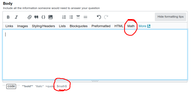
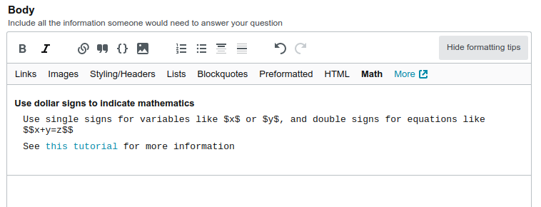
Please make math formatting more discoverable

One common problem for new users on technical sites is that they don't know that they can use LaTeX syntax to type their questions and/or they don't know how to use it. The current improvements look like they probably do a lot to put help in the right places for coders looking to ask questions about code, but they also need to be adapted for math in the sites that rely on it.

  • There should be indications on the top and bottom of the formatting tips:

    enter image description here

  • The pullout should have a brief description of how to invoke math as well as a link to a suitable tutorial:

    enter image description here

    On Physics we use the Mathematics SE tutorial as the standard resource; presumably that link direction could be freed for other sites to choose as they see fit.

  • There should be a link to the tutorial at least somewhere on the page even if the formatting tips have been collapsed by the user. It used to look like this on Physics before the change; equivalent functionality should be retained.

Streamlining this discoverability could go a long way towards making the technical sites more accessible and welcoming. (And conversely, the current status, which removes pre-existing functionality, goes a fair way towards making the technical sites less welcoming and presenting a rather higher barrier to entry to new users.)

1
  • I would suggest also adding a prominent message (in bold ?) indicating that Mathjax is preferred for equations on SE sites that use it. It's a pretty frequent issue with newish users on Physics SE. Commented Apr 24, 2020 at 0:27
11

This is pretty cool, and I believe will be quite useful. I do have one question however; are there length limitations on the sections we can customize? Most all of the written fields on the site have some character limitation including close reasons, tag excerpts, etc.

If we are going to be creating them, then getting them ratified on our local meta sites, we should probably make sure they meet any length/other requirements before asking a CM to update it for us.

I assume an FAQ/Guidance post for what can be customized, and what limitations there are will eventually be made?

3
  • 2
    Yes, this is one of the questions I asked about customizability/limitations earlier, but was one of the few that didn't get addressed in this MSE announcement. It seems useful to know. A centralized place to check these limitations in the future would be nice.
    – V2Blast
    Commented Mar 3, 2020 at 21:15
  • 3
    Second the request for FAQ/guidance on customization... on many of the sites I'm involved in, the "regulars" are mostly curators and answerers, rather than askers. Some guidance on what can be customized and how will be especially useful for those folks to be able to suggest ways to help guide our askers, particularly for the sites that have question guidelines that differ from other sites on the network. Commented Mar 3, 2020 at 21:22
  • 3
    The warnings and errors are limited to 1000 characters. The rest of it is limited to "within reason." I can add that to the post for clarity.
    – JNat StaffMod
    Commented Mar 5, 2020 at 20:48
10

Can we customise the "Helpful links" section?

Right now it has some helpful links but I can think of others that specific sites would want to add, maybe some stuff from their .

3
  • 1
    I think sites can customise the bit above that (i.e. Step 1) by following the same procedure as for What's the protocol for requesting a tag warning?
    – ChrisW
    Commented Mar 4, 2020 at 12:41
  • 1
    @ChrisW Sure we can customise the "Draft your question" section but some things fit better into "Helpful links" than the former. For example, /help/on-topic as you, yourself, have mentioned. Commented Mar 4, 2020 at 12:44
  • 2
    This section is not customizable, no. As noted, though, "draft your question" is customizable, and should be able to accomodate most of you needs there. Here and here it's been pointed out that there are no pointers to the on-topic guidance, as you note too — checking on why that is.
    – JNat StaffMod
    Commented Mar 5, 2020 at 21:00
8
  • Tag-related error messages, regex-based (seen with custom text in screenshot 4, and with the default text on screenshot 5).

I dwell on Science Fiction and Fantasy and enjoy the tag a lot, but it gets tiring to always write the same stuff about when this or that was published, if it was in English, and linking further to the guidelines for story-ID questions.

I would love to see the exact opposite of the popup in screenshot 4, namely something that links to our guidelines when someone uses the tag. Arguably it could go in the "Draft your question" sidebar, but would have much less visibility, and visibility seems really essential for this one.

Before I go and put that on SFF's meta for discussion, can you clarify whether these necessarily have to be errors? Or any further policy that applies.

6
  • 2
    The ones that'll show right below the tag field like in screenshot 4 need to be errors, yes. Warnings will show up on the sidebar instead, as in screenshot 5.
    – JNat StaffMod
    Commented Mar 3, 2020 at 19:37
  • 3
    I believe we do what you're asking on Stack Overflow. If you go to stackoverflow.com/questions/ask?tags=regex and click "Review your question", you'll see guidance appear explaining what to do when using that tag.
    – Brian Nickel StaffMod
    Commented Mar 3, 2020 at 19:42
  • 1
    @BrianNickel can't see that without making an account, which I won't right now. Could you please provide a screenshot?
    – Jenayah
    Commented Mar 3, 2020 at 19:43
  • 3
    Sure thing. i.sstatic.net/2VrTS.png
    – Brian Nickel StaffMod
    Commented Mar 3, 2020 at 19:44
  • 2
    @BrianNickel thanks, I see. I still think it would get better visibility right below the post instead of in a sidebar, but if it's reserved for errors then it's for errors :) thanks for the clarifications.
    – Jenayah
    Commented Mar 3, 2020 at 19:47
  • 6
    Have a look at Movies & TV, @brian - they've disallowed identification questions for a while now, but prior to that there were two separate warnings with instructions: title and tag. I believe Anime and Graphic Design may also have examples.
    – Shog9
    Commented Mar 4, 2020 at 1:24
8

Is the, or can the, "What to expect" modal be customisable per site?

The What to expect dialog

I mainly participate on Science Fiction and Fantasy and lurk some of the related sites to it. A lot of the time questions aren't posted to find answers to specific problems and as such the third bullet point doesn't really apply. It would need some form of minor tweaking to make sense in the majority of cases.

It would also be nice to add a quick explanation of how to accept an answer, the amount of times new users don't know how to do so may surprise some.

4
  • 1
    About the accepting bit, I'd suggest showing a grey checkmark followed by a green checkmark ✅ -> ✔ (not enough colors in my phone's symbol set)
    – Jenayah
    Commented Mar 4, 2020 at 12:38
  • 3
    The email notifications may also be untrue, since this is visible on a per-site basis, a user can have email settings disabled so they won't get any updates. Good catch on this for the third bullet.
    – Catija StaffMod
    Commented Mar 4, 2020 at 22:39
  • @Catija I thought about that but seeing as this is for new users, I think, they’re not as likely to have changed their preferences I’d imagine. Would be good to alter it depending on user settings though if possible I agree. Commented Mar 4, 2020 at 22:42
  • 2
    This modal is not customizable at all at the moment. It replaces an email that used to be sent out to new askers (which I don't believe was customized either). Will ask around about future plans.
    – JNat StaffMod
    Commented Mar 5, 2020 at 20:56
8

First: it is great that you roll these updates for the whole network, and I especially like the efforts made to enable each community to customize key aspects of "their" specific wizards.

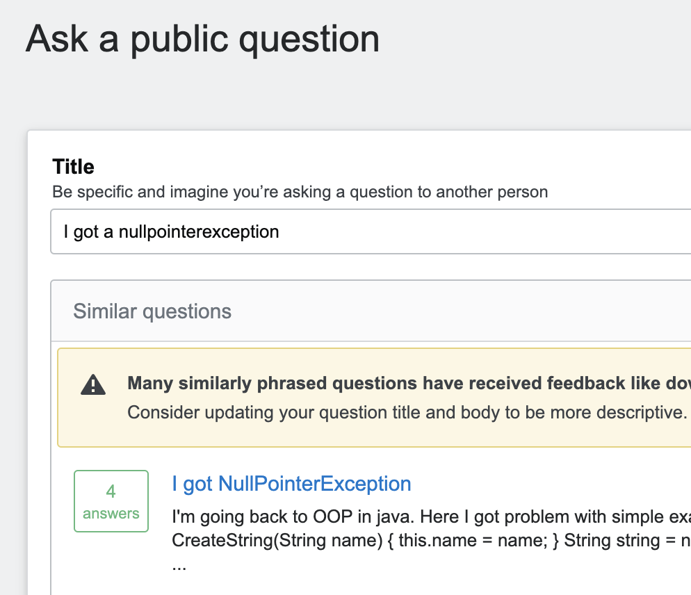
Unfortunately, one of the big problems (which I reported back last year already) is still there: broken search.

Example: I just started new question on stackoverflow, and put in the java tag and used the evil word NullPointerException in the title. See what happens:

npe

When I go to the suggested question, "of course", nothing points me to the mother of all questions that a newbie with a java NPE problem should be pointed to.

Sorry, it doesn't help to tell users to search the site, when searching the site is still "broken" in such fundamental ways.

One possible fix: allow each community to have a list of "keywords" that point to existing questions. When the built-in search doesn't work, and you can't fix it, then give us meaningful ways to override it. But of course, that is rather a dirty workaround. So as annoying as it is: try fixing search.

1
  • 8
    Everyone with nullpointerexception in the title should be required to visit that mother question, before being allowed to post their own question. Commented Mar 5, 2020 at 9:45
7

I cannot speak about other sites, but this kind of guidance is not enough on Stack Overflow. Maybe it is just me, but amount of poor questions asked on SO is growing.

Some latest greatest hits from front page:

I want to show alert notification in my app if any app using a camera or microphone running. Does anyone have an idea?


I want a function which takes thread name and returns if it is running or not. I have tried isAlive function of java but it did not work.


Which is faster to load date like this or through include function in PHP?

like this or include('clients-to-load.html');

Note: i have some other code as well like header and footer code would the first method work on that as well ?


Following questions are from long time users 2+ years (no visible questions), so this guidance should be shown to every user that does not have undeleted questions, regardless of the reputation or membership longevity.

I am attempting to spy on the serial com port connecting between a software on a PC and a device connected to a RS-232 serial com port. My thinking is that I could duplicate the com port connection to the device and simply read out the duplicated version. Is this feasible and can this be done?


How to convert decimal into integer in a sentence of character in C#?

EX: string str = "i have rs 12.55" and i want to print this as "i have rs 12" ignoring .55 in sentence.

Besides having searching for existing answers having more prominently shown (as suggested by Korvin Starmast) I would add gentle (maybe even not so gentle) nudge to check what is really on topic for the particular site.

enter image description here

Additionally, I would add warning that asking poor and off topic questions can lead to question ban (I would also add similar warning for posting answers).

I know this is not so friendly, but it is way better than misguiding people into asking anything and then banning their account from asking.

Also, I would add such warning for users that have previously asked poor (last few) questions and those that are approaching the ban. Even if warning for asking first question is not an option (too unfriendly) IMO adding warning for people that have poorly received questions is mandatory.

10
  • 5
    "Additionally, I would add warning that asking poor and off topic questions can lead to question ban (I would also add similar warning for posting answers)." I don't like this, at least on non-SO sites, it approaches the issue from a "you're likely to be banned" approach which isn't great. That said I do think the warning shows up for people approaching the ban... or at least used to IIRC. Commented Mar 4, 2020 at 11:04
  • 4
    I.e. we don't want to start people off on a negative assumption of their question, it's more likely to turn people away with good questions than stop someone from asking with bad ones. After all the former are more likely to read things you throw at them than the latter. Commented Mar 4, 2020 at 11:05
  • 3
    @TheLethalCoder I can understand that starting from negative assumption is not highly preferable, but from experience people that do want to follow the rules and are potential good long term users quite often start with negative experience because they didn't know the rules because they were hidden and obscured. I have seen too many "I wish someone told me so before I asked" comments, so not knowing the rules is real problem. While I didn't start by asking questions, I was well over 3K in reputation when I first learned about ban (not for my account, but from other people) Commented Mar 4, 2020 at 11:15
  • 2
    Sure people should know about the question ban but I don't think it should be one of the first things they see. Instead, as you said, only show it when/if they are approaching it. Commented Mar 4, 2020 at 11:17
  • 2
    This question doesn't apply to SO at all - the two are pretty distinct and SO has a lot of additional help. There's a discussion about it on MSO: meta.stackoverflow.com/questions/389438/… I'm not sure if we had an official feedback post for this.
    – Catija StaffMod
    Commented Mar 4, 2020 at 22:33
  • 2
    @Catija Thanks for the link. While I am addressing this question from SO user perspective, "on topic link" and additional warning before posting for people that have already asked poor questions are universal features. I cannot say for other sites, but on SO, this wizard and all additional help are simply not enough. Commented Mar 5, 2020 at 8:13
  • 1
    @TheLethalCoder Yep, not presenting rules works marvels... Stackoverflow is the most unfriendly and hostile site I use to know Commented Mar 5, 2020 at 9:49
  • @ResistanceIsFutile I'm talking specifically about question bans here, as are you. That's not something someone needs to know upfront. Question closure on the other hand, as in that case, should be shown upfront or at least shown somewhere. Commented Mar 5, 2020 at 9:54
  • 2
    @TheLethalCoder I disagree. Question closures and question bans are related. Commented Mar 5, 2020 at 9:59
  • I'm not saying they aren't related, of course they are, one influences the other. I'm saying one doesn't need to know about one (question bans) but should know about the other (question closures). And even if one should know about question bans it shouldn't be right there as the first thing they see with the implicit message of "you're new, you're asking your first question, you're probably going to get question banned" - it just sends the wrong message. And of the few that will read it, the ones you want to keep around, they're more likely to not ask than to carry on. Commented Mar 5, 2020 at 10:03
6

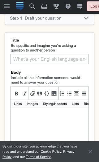
I immediately went to try it out (on my phone) and as soon as I tap the ask question button I see this:

Ask interface initial guidance on mobile

Shouldn’t it start out at the top of the pop up, not the bottom?

(Also is there a reason that “don’t show me this again” isn’t shown? Not sure if it’s a bug.)

I’m also noticing other phone-related things such as “What’s your English language an” being the title placeholder, the undo/redo/hide help buttons being hidden, and the question box being un-resizable.

Ask interface mobile interface

1
  • 5
    You've caught a few edge cases... most of them tied to the simple fact that you're using a small screen. To start off, EL&U's welcome modal is way longer than any other sites'. Then the "don't show again" link is not present because you're not logged in. Finally, the focus on the button is for accessibility reasons: we need to make sure the modal is focused, and to do that we focus on the button. I don't know if we can focus on the modal itself, even if it's untabbable, but will check.
    – JNat StaffMod
    Commented Mar 5, 2020 at 21:03
6

Current behavior is that in the review stage the "post question" button is trying to post the question. If there are errors, it'll fail, otherwise it goes through.

People could be afraid that clicking on "post question" actually posts their question in the actual state instead of failing.

Maybe better display "review question" unless you are sure that there are no errors anymore, only then display "post question" and only then post the question, but then also guarantee that the question will be posted.

If the error check is actually done continuously, you can change the "review question" to "post question" text also on the fly without an additional click necessary.

4

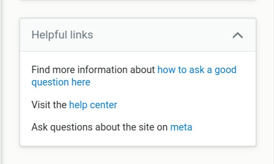
Small UX tweak: change the way the /help/how-to-ask page is hyperlinked to. Currently, it goes:

Find more information about how to ask a good question here

current "Helpful links" look

This looks weird, because the linked text is "how to ask a good question here", which makes no sense as a standalone sentence/group of words. Furthermore, "here" in links has been outdated for longer than some SE users have even been alive.

Related reading on UX.SE:

Suggestion, just drop the "here" entirely. It's not on the other links after all.

Find more information about how to ask a good question

3
  • No mockup of the suggestion​, as it's unhandy on mobile; if someone wants to fiddle with the page's HTML to produce a visual, be my guest
    – Jenayah
    Commented Mar 4, 2020 at 21:39
  • 7
    Depends on the referent of "here". If it means "look here [on the target of this link] to find out how to ask a good question," I'll probably agree. If it means "find out how to ask a good question here [on this website]," that's a bit different. Commented Mar 4, 2020 at 22:28
  • 1
    I read it as “how to ask a good question here [on this website]”, not as [at the target of this link]. Commented Mar 5, 2020 at 9:04
2

Can this be hidden for high-rep users? In theory, once you've been around the site long enough (5K rep? 10K?), you know how to ask a good question, and there's no reason to annoy the user with this.

Also: Old functionality used to be that if your post has errors like this it won't be submitted. It's confusing when a dialog shows up saying that no errors have been found, yet the post still refuses to be submitted. Can something be done with that?

9
  • 6
    If this was to be implemented it shouldn't be reputation-based. Overall question score would be a better metric. Some folks gain lots of rep by answering questions, but suck at asking them.
    – Jenayah
    Commented Mar 5, 2020 at 6:09
  • 1
    It's maybe a bit annoying for high rep users, but even for them it could be a bit helpful and supporting different types of a question asking dialog might increase the maintenance costs. Maybe just make sure high-rep users don't get slowed down. One additional review click would be okay for me. Commented Mar 5, 2020 at 9:42
  • -1 I don't see what's annoying about it -- it's just one extra click when posting a new question.
    – ChrisW
    Commented Mar 5, 2020 at 12:45
  • 3
    The idea is that you have a final pass at your question, even if you don't have any errors — that way you can correct that typo you'd try to get in in the grace period window, so it doesn't show up on the edit history ;)
    – JNat StaffMod
    Commented Mar 5, 2020 at 21:06
  • @Jnat Then perhaps an opt-out button which unlocks once you reach a certain threshold? (Also, if that's the idea, why not for answers also?)
    – DonielF
    Commented Mar 5, 2020 at 22:00
  • In practice for me this woupd be really helpful. I know how to ask at least a decent question, so in practice I end up scrolling past the review to hit the post button, without ever checking what is in the review screen. @JNat
    – Luuklag
    Commented Mar 6, 2020 at 15:26
  • 1
    Frankly, reviewing your question is always a good idea and you already should read about 5 times through what you've written and then 7 more times through what you just posted. And no reputation in the world can relieve you from that responsibility. Commented Mar 6, 2020 at 17:30
  • @Chris Sure, but you'd think that high-enough rep users would do that anyway.
    – DonielF
    Commented Mar 6, 2020 at 19:23
  • 2
    @DonielF In which case it makes zero difference if they're forced to do it either. Commented Mar 6, 2020 at 19:32
2

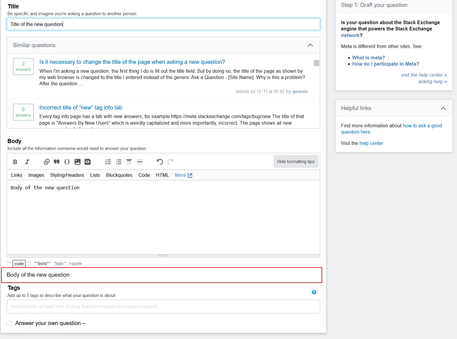
Render title above rendered body and more clearly separate rendered output from the rest.

Just asked a question and was partly blown away by all the offered information. Especially, the similar questions box takes away lots of space. I constantly adapted the title and the body content and looked at the rendered output of the body and for that I had to scroll up and down, up and down.

Please insert a rendered title at the top of the rendered body to simulate how the question will look like. Consider drawing a bounding box around the rendered output.

Consider moving tags above the rendered output.

Maybe move similar question to the side bar or try to save a bit space there.

enter image description here

You must log in to answer this question.

Not the answer you're looking for? Browse other questions tagged .