-267

Update 2 - December 8, 2021: We’ve shipped a bunch of refinements over the last 24 hours or so. We’re going through the bugs and design requests and marking them with the proper tags. There’s a lot here, so it’ll take us a minute. We’ve done the following to address your design feedback in the near term:

  1. Switched to the smaller version of questions / answers from the Profile page, thus changing the font size.
  2. Reduced the padding on individual items while maintaining this newer aesthetic.
  3. Grouped questions, answers, tags, and reputation as columns again.
  4. Upstreamed a smaller font size to our design system’s post summary component.
  5. Various smaller visual refinements.

Update 1 - December 7, 2021: This was rolled out on Stack Overflow and all Stack Exchange network sites.

After receiving and incorporating feedback the community (thank you!) we’ve launched the responsive Activity page! The most common feedback we received was that we’re straying too far from a summary for the summary view. This feedback was not only valuable but also correct!

We reconsidered the value of information shown on post summaries and condensed them significantly from our initial redesign. We also made tons of little tweaks and fixes along the way. We’ll be triaging bug reports as they come and we know there’s still room for improvements, so suggestions are welcomed and encouraged! Thank you in advance!


Original post - November 19, 2021:

In our continued effort to deprecate our mobile views, we’ve turned our attention to the Activity page. We’re planning on shipping the changes next week sometime soon and wanted to show it off first.

Check out this 5 minute tour of the Activity page and let us know what you think. The feedback we’ve received so far has been invaluable, not only in identifying bugs, but also in helping us reflect and be thoughtful about the changes we’re making.

What’s new?

Horizontal navigation turns vertical

The navigation includes all the same items but is now placed vertically to the left of the column of sections to fix moments like this. It’ll allow us to add more functionality in the future without breaking the layout or introducing any wrapping.

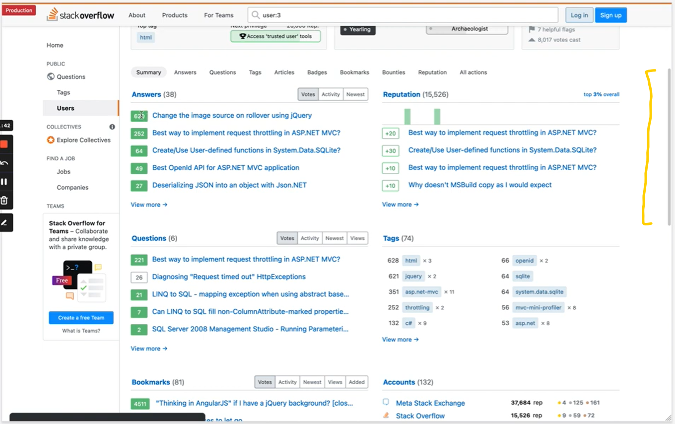
horizontal navigation on the activity page

Two columns become one

The most obvious change might be the switch to a single column for Activity sections. All of the same (and a little additional) information is here, but now it’s within a single column that squishes comfortably all sorts of browser widths.

Post summaries

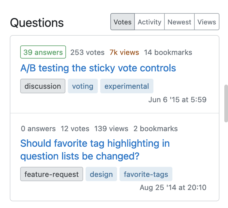
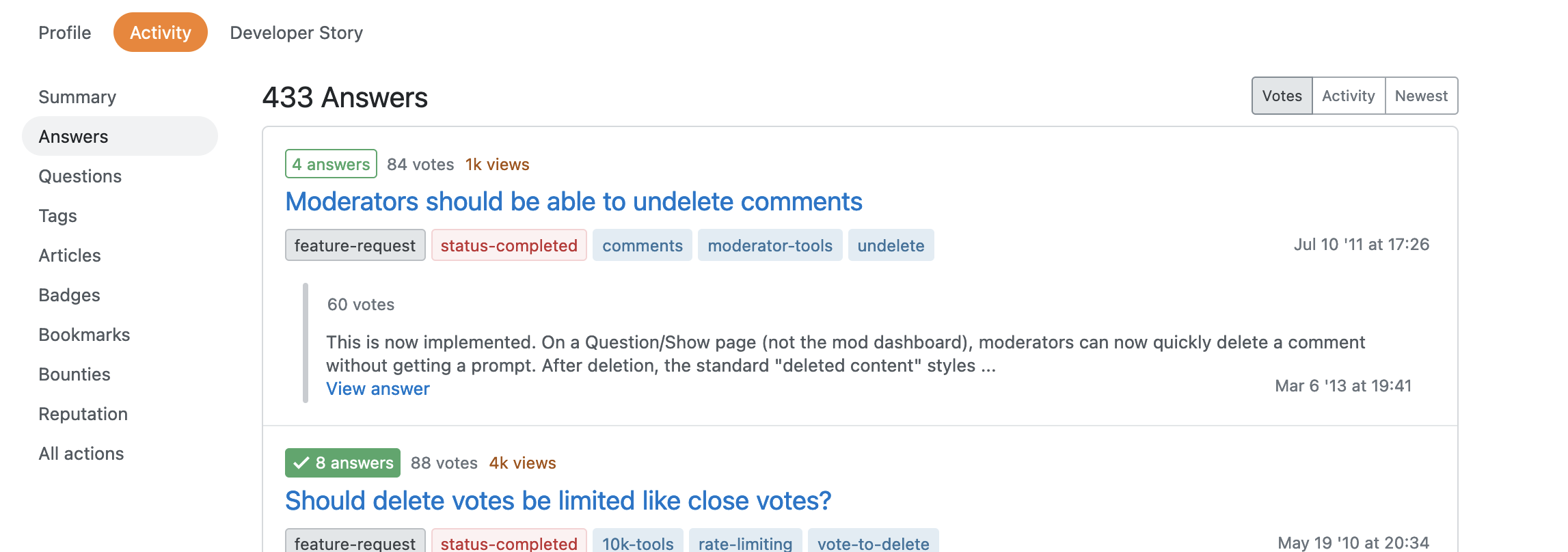
We’ve switched post summaries to use the post summary component in our design system. In the process, we’ve added more details about each post such as views, answer counts, tags, and an answer excerpt on answers. This component has been designed to be responsive and show information in a compact but digestible format.

new post summary component in wide browser window new post summary component in mobile-width browser window

Summary stays on “Summary”

Quick reference information will only be shown on the Summary page (which is the base Activity page). It made sense to show “Summary” on Summary and to not show it elsewhere. Less stuff to scroll past to get to the stuff you want to on other Activity pages.

activity answer page without summary section

A handful of other changes

In this process, a lot of little things were tweaked and polished. This includes empty states, improvements to the reputation changes view, accessibility improvements, and much more. No functionality has been lost so if you find anything broken, missing, or out of place, please let us know. We appreciate it!

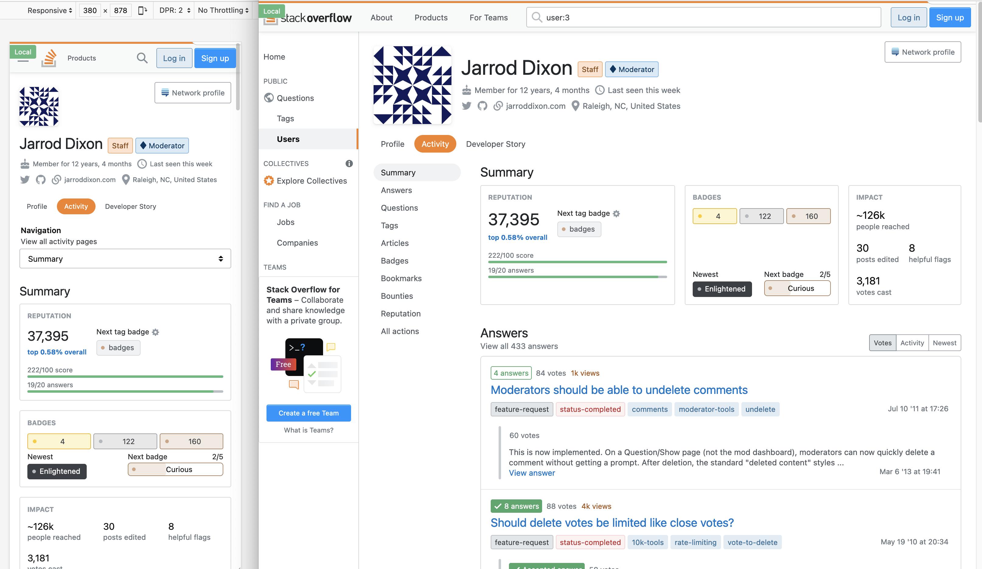
redesigned activity page shown in both wide browser window and mobile-width

59
  • 218
    Somehow I missed this thread entirely until just now. With features like flexbox and grid solidly supported for a few years now, can you speak to why desktop users are forced into this one column layout now? It probably works great for mobile users, but it's a clear and huge regression for people with bigger screens, like laptop and desktop users. I mean, here is a comparison (granted, MSE vs SO, but still): i.sstatic.net/QNRcM.png On the old layout, I can see 6 full sections. On the new layout, I can see... 1 section and a little bit extra.
    – TylerH
    Commented Dec 7, 2021 at 19:29
  • 34
    In addition to the tablet optimized size of objects which alone makes this a horrible experience, most of the summaries are now presented to the right on my desktop screen instead of in the middle. Why?
    – Ted Lyngmo
    Commented Dec 7, 2021 at 22:18
  • 34
    I use the all actions view to look at the comments I've made so I can check questions that interested me and see if there was a resolution. This new view is much less usable for me than the old one. Everything is way too tall. Why does the time need it's own line? Put that next to the type of action. The votes view is also full of wasted space. I don't see a way to see individual flags I've raised either, just the number of helpful. Not a fan of this new layout. Commented Dec 8, 2021 at 2:22
  • 119
    Man, I read this whole thread several times a few weeks back, and somehow it had never dawned on me that any of this would affect me on desktop. It was framed as improving something about mobile users, so I didn't worry about it too much. Now that it's been deployed to SO...yeah, I hate it. It feels big and clunky and mobile-like, even though I'm on a 4K monitor. So much less information :/ Commented Dec 8, 2021 at 5:38
  • 31
    The fonts, size, proportions, positions gives much strain on eyes. Is there any way to bring it back to normal? atleast to someone who opts to? Commented Dec 8, 2021 at 6:00
  • 84
    What is responsive on a page with the whole content in one column? WIde screen, narrow screen - all looks the same. The same unusable.
    – Neumann
    Commented Dec 8, 2021 at 6:53
  • 92
    Late for the party, but I'll explain my downvote: you made awesome work with the view for mobiles and small screens, but in the process made it appear way worse than before on PC with big screen, which is what I happen to use. Enormous amounts of whitespace, and overall feeling it's a page designed only for mobile. Commented Dec 8, 2021 at 10:06
  • 65
    Everything is way too big, when I open a profile page I practically see nothing of interest to me because everything is big enough to read it from across the room, but nothing is really shown! This doesn't make anything more clear or less cluttered, it just adds to scroll wheel wear! (this is on a 1600x900 14" screen)
    – Skillmon
    Commented Dec 8, 2021 at 10:34
  • 89
    I downvoted because: (1) The new design is, at first glance at least, terrible: vastly less information per unit area, to no apparent benefit. (2) The oblivious disconnect in tone between "We implemented this awesome new feature we're sure you'll love, isn't it great?" versus the nearly unanimous actual feedback the feature is receiving. Commented Dec 8, 2021 at 12:33
  • 59
    This design is perfect... for vertically oriented screens around 3 inches wide. The problem is the bulk of use on this site isn't on mobile devices, it's on desktop. People are asking questions and seeking help while coding. The old design was far better on desktop screens - this one takes up too much space, uses too large of fonts, and requires a lot of horizontal eye tracking and vertical scroll to read anything - not to mention much of what was on the page is lost, like seeing more than 5 tags or accounts.
    – Andrew
    Commented Dec 8, 2021 at 19:43
  • 37
    Like others said, this is a major turn off. Horizontal goes vertical? But I am using a 16:9 screen. Exclusively. Horizontal is a desirable. And I thought responsive means roughly the same is easily configurable by the user. Commented Dec 8, 2021 at 20:21
  • 40
    As someone who typically spends hours a day in stackoverflow and a lot of time watching activity in my reputation page (609k reputation), the newest changes are way less usable. I work on a 36" screen and it feels like there's only about 1/3 the amount of information on my screen now and things always start out collapsed, causing more clicks to see less information. This is a worse UI in all regards on the desktop with a decent size screen than what we had before - please put it back. I actually thought some setting must have been accidentally changed, but no, I'm stuck with this.
    – jfriend00
    Commented Dec 8, 2021 at 22:03
  • 43
    When this plan was first announced why was it not PROMINENTLY explained that it applies also to users others than those on mobile devices? I'm sure you would have gotten most of today's feedback in due time that way rather than having to face today's critical sh*#¤%storm. I feel bad about airing my displeasure in a non-constructive way, but I cannot help it. This update is simply awful on my laptop. Even before the update there was too much whitespace on the sides, and now it is much worse. Commented Dec 8, 2021 at 22:24
  • 37
    I have changed my upvote to a downvote. Initially, it looked like you were going to provide improvements, but after it went live and I saw how bad it looked like I change my vote. I think the majority agrees that more whitespace is a bad thing. We want to see as much information as quickly as possible. We don't want to scroll or press secondary buttons to load more content.
    – Dharman
    Commented Dec 9, 2021 at 13:03
  • 45
    After years being on SO, I joined Meta SE today to request: please rollback. Please. I had no complaints about the old layout. While the new design looks nice, it's difficult to use. Great on phones, but consider, how many people are coding on their phones? So again, please rollback. Please. Thank you.
    – pylang
    Commented Dec 9, 2021 at 22:26

217 Answers 217

1
2 3 4 5
8
89

Summary of bugs / feature requests posted as answers

Want to contribute? Great! But please read the notes at the bottom of this post first.

Type Summary Status
Negative reputation changes show as "+-[x]" instead of as "-[x]"
No vote counts in the "questions" and "answers" section
Summary Overflow™ in tooltip description of "people reached"
Unexpected word "pretty" when expanding reputation history
Add back the numbers indicating how much reputation changed or how many responses were received on the tabs
Downvotes are green, not red on the reputation page
Missing closing parenthesis in the bounty expiration message
Expand 'Today' in reputation history by default
Unclear what the green bars above the reputation history are meant to represent
Random paragraph-returns in post titles
Attempting to expand reputation history entries for specific posts expands the wrong one, or outright fails
Not Every Element Needs Its Own Line
Sorting Questions by Views no longer actually shows the views for each question
No bar highlight on hover in reputation graph
Deleted answers don't show up in red anymore
Answers tab has a wider table than the rest of the tabs
Columns in Reputation graph are highlighted upon clicking but no function is performed
The text of the "Track the next one" button is hardly visible
Answer text hard-wraps on "answer" tab
Timestamps in All actions tabs align by end of title
Followed posts start with an empty line if the post title is long
+2 for Wiki Tag Edit does not show text
Answer text shows HTML escapes
Posts edited lost precision in impact section
Badges page has a single badge in last row
Answer section shows votes and acceptance state of the question
Change "up votes" to "upvotes" and "down votes" to "downvotes"
Expand comments in all actions
"next badge" badge icon out of place
Wheels to track next privilege and badge are vertically misaligned
Select Next badge modal not usable in mobile devices
Numbered changes are not centered in blue badge
"next badge" block displaced after selecting another badge to track
After sorting reputation history by post, no posts are displayed
'x prior review suspensions' overflows on smaller screens
'Follow post' functionality is FUBAR
"Next privilege" messed up for some users on mobile
After switching to "track a tag badge", the badges popup doesn't show
Wrong pluralization: "1 answers"
Questions on many tabs are shown as having '1 bookmarks'
Entries in the list of tags on the Summary page and the Tags page say "1 posts"
Lost indication of closed / duplicate question
On some sites, the graph in the reputation widget is pushed down
MathJax wraps awkwardly on the activity page
The font size and padding in the lists for the Summary are enormous
Choosing a new tag badge to track is not possible
Bring back color difference for visited links
Inconsistency in punctuation between sections without items in activity summary
Insufficient contrast between text and background on chip for questions with accepted answers
Poor information architecture on the Answers page
Reputation graph does not load on Area 51 Discussions
Profile is showing the question score for my answers, not the answer score
Expansion and contraction of posts in votes tab leaves a bigger box
Color inconsistency in reputation sorted by post and time
Answers and Questions section misalign when one of them is more than summary
Answers in are all show as being accepted
Rows between tags and reputation sections are misaligned
Bottom row in Tags section has too much height
Changes from votes that don't affect reputation no longer show in the reputation history (?)
Tag-badge cog leads to wrong badges pop-up
No full stop on subtabs in Votes tab
Bookmarks of deleted questions don't have a deleted background colour
Differing label alignments in tabs of a All actions
A post's score is shown as "votes" instead of "score"
Summary page no longer shows scores of answers and questions
Redesign looks weird on bigger screens
Left and right arrows from a scrollbar appear under expandable content
Question count total should include hidden questions for mods/self
Bar spacing in reputation graph not uniform
Labels in All actions page are misaligned
Suggested edits' results are in the wrong tense
Bookmarks page doesn't link to most recent activity when sorted by Activity
Answer timestamp overflowing container
The only part of the activity that isn't responsive
Missing tooltip and tooltip style inconsistency in impact section
Research Assistant can line wrap in badges
Reputation graph disappears at lower resolutions
Dot in badges is misaligned in summary
Dot in badges is cut off - "the bling" does it again
Columns in Votes cast stop being aligned at lower resolutions
Followed answers are shown as their question instead
The reputation graph's selection feature is broken in Safari
Posts background on different listings do not change when the post is deleted.
Tooltip for tracking rep / privileges is too narrow
Badge names are too low in badges section
Newest title is misaligned with Next Badge title
Locked icons in impact section misaligned
Fonts misaligned in section titles and View all
First line in rep mini graph is shorter than the others
Recent tag rep gain in summary has low alignment
Next tag badge counters have different alignment
Fix the faint yellow coloring of the new reputation events when sorting by Post
Descenders are cut off in Navigation drop down list
Reputation box doesn't list reputation increases for accepting answers as correct
In Activity / Reputation changes of questions vs answer are not distinguished
Tab separators in post sections are slightly thicker sometimes
Reputation gained since tooltip has empty space in right margin
Different alignments between scores and button text in Summary and Badges
View all activity pages title has small margin
Y-axis label of reputation graph has insufficient letter spacing
Next badge dialogue scrollbar doesn't have margin
In reopen votes cast timestamp is out place if user has only cast 1 vote
A single answer doesn't align with the center of the section.
Tooltips in impact section have different levels of alignment
# of votes not vertically aligned in list with deleted questions
Highlight of Track next tag badge close button gets stuck
The requested tag does not exist in choose next badge dialogue
Choosing a new regular badge to track is not possible
Badges and rep are misaligned with site name in Accounts
Top tag and Next privilege bar misalign in smaller resolutions
Awarded badges aren't centered in the boxes of select tag badge
Navigation title font too small at very low resolutions
Remove bookmark tooltip has too much margin
Unfollow tooltip has too much margin
Tag badges for tags with long names overflow their container in Next badge dialog
Deleted posts are no longer highlighted in the "Following" tab
Missing space between bounty amount and opening parenthesis in the 'Bounties' tab in my profile's 'Activity' tab
Reputation change indicator activity page doesn't include reputation restored from deleted posts, causing it to show an inaccurate number
Bring back the highlitht of deleted posts in Following tab
Status of Review and Suggestions under "All actions" are too action-y
Add vertical separator between daily bars in the reputation graph
Reduce height of unused sections
Badges icons are not perfectly aligned if group is empty
Include code blocks inside table
The "summary" page is too information-rich to be a summary anymore
Summary requires too much scrolling
Tags tab has too much empty space
More contrast in expand arrow on hover
Site icons and names could be center aligned consistently
Make check mark green in positive question record
Make cross mark red in negative question record
Make distance between cogs and labels consistent
Larger fonts and 3 columns in "Select your next badge" dialogue
Rows in Votes cast have too much spacing
Can labels in All actions have more color
Correct spacing between rep/badge/impact sections
See votes on recent questions in the summary tab
Re-add link to network profile in case of hidden accounts
Make it clear that most statistics in the Impact box are hyperlinks
Bring back UTC timestamp when hovering over the time field in the Reputation tab
Show last activity date/time at the bottom right of the bookmark entry
Duplicate date entry in reputation history
Timestamp is isolated on the far right
Various issues with the new design of the reputation history
Timestamps on Answers tab should line up between the questions and answers
Remove repeated "revised" heading from Revisions tab
Navigation title/subtitle is clickable, but it doesn't link to anything
Daily bars in the reputation graph touch the top, please add margin
Remove considerable amount of empty space below the User feed
The only useful link in the review history is tiny
New order of badges in Recent badges is hard to follow
CSS tweaks to fit more posts into Summary tab
Wasted vertical space in reputation history
Condensed activity summary
Better information density on reputation change
Link headers in summary to their subpages
Wrap Answers and Questions on Summary if two columns view is engaged
Reputation link should point to Reputation tab, not league
Remove dangling "unhelpful" flags raised in IMPACT box
Remove duplicated bounty number in box title
The amount of whitespace on the "All actions" page is extreme
Voting corrections/reversals for votes on questions only, when you are the one who cast the votes, don't clearly indicate what happened
Any reason upvote has green background, but downvote/closure only red text, so upvotes stands out more?
(?) Reputation summary wastes enormous amounts of space
Is the check mark centered in the circle of the badge congratulations message?

Notes

  • Anybody is welcome to contribute to this post; it's a Community wiki after all.
  • Sorting order: > > , then > > > > > no status tag.
  • Comments can be used to discuss the structure of this post, e.g. whether the sort order above makes sense or needs to be improved.
  • I haven't included some of the (mainly pre-launch) posts yet, mainly because they were 'too broad' and I'm not sure they will get a status tag. I'm happy to be proven wrong!
  • On a similar note, posts which pertain to something else than the Activity tab (example) are not included either.

Credits

Original idea: here, further refined here.

4
  • 2
    What's going on with the edit history here? i.sstatic.net/tpfFg.png
    – user312421
    Commented Dec 10, 2021 at 13:55
  • 2
    @Camilo can't reproduce it, but you could check whether that bug is already reported elsewhere on Meta.SE and if not, create a new bug with some details (OS version, browser version, device).
    – Glorfindel Mod
    Commented Dec 10, 2021 at 13:57
  • 1
    @Camilo It could be this ancient bug report: Revision diff columns overflowing. This happens when there’s a lot of whitespace removed and it seems to be the same cause as Comment Overflow?. I can only reproduce this in Chrome, but not Firefox. Commented Dec 10, 2021 at 23:03
  • 2
    @SebastianSimon It does seem to be the same as meta.stackexchange.com/questions/142420/…. I can repro on Chrome latest on Windows but not on Edge latest.
    – user312421
    Commented Dec 10, 2021 at 23:19
141
+100

The padding in the Summary is still enormous

And the font size is still larger than it needs to be.

Summary page after applying “compact” styling

I still can only see 1 section. That means the old page was still 4× as useful, which means this improvement didn’t actually add any value until you start scrolling. Seeing that there is another header doesn’t do a whole lot for me when I can’t see anything under it.

The font size is 15% larger than regular text; don’t see why it should be. The padding is still very large, both around list items and also between sections.

Update: now that we have side-by-side sections—which I’d honestly not dared to request—problems are considerably lessened. Still, before scrolling I see 2 sections—with the changes suggested below, it could easily be ~3.6, and probably could get all 4 by messing with the space between sections (which I didn’t in that mock-up). As noted in several comments, we can do even better by ditching the unnecessary borders and such altogether...


(Partially) :

The font size and padding in the lists for the Summary are enormous

This is what I can see of the “sections” below the “summary widget.” The black bar on the bottom is my OS taskbar.

Summary view from Answers down to the bottom of my viewport

The font size for the hyperlinks is very nearly the same size as for the h3 header above it for “Answers.” To make matters worse, there’s a gigantic amount of padding around it. On my screen, you can’t even see your Questions from the top of that page, because the 5 Answers already fill it up. In contrast, with the old layout, I could see 4 of the sections in full. That to me literally means the old page was 4× as useful.

These literally do not need any padding, at all. They look fine with none. The cutesy little vote box gets a little tight, but distributing their 6px of bottom margin to 2px above and 4px below solves that. The font size could trivially remain normal size rather than over 40% larger. Then at least you get 1.8 sections instead of just 1. Which is still bad, but much less bad.

Altered Summary page with no padding and normal font size

14
  • 32
    Yes, yes, yes, the padding is huge atm, on pretty much every page with the new table view.
    – zcoop98
    Commented Dec 7, 2021 at 20:11
  • 13
    Ditto for the reputation page. Huge font, huge padding, tiny information.
    – miken32
    Commented Dec 8, 2021 at 0:02
  • 6
    @miken32 It's especially bad once you start drilling down, then you've got padding within padding within padding. I really liked the ability to see multiple days of reputation at once, and the ability to drill down and still see a concise summary of the data.
    – M. Justin
    Commented Dec 8, 2021 at 7:17
  • Yes, the font sizes on the Activity tab are killing me. I cannot read that page. Top Questions on the Profile tab are way better. The whole Profile Tab is better. Commented Dec 8, 2021 at 8:32
  • 1
    I just checked, twice if I was zoomed in to 150% while looking at the Summary tab. 19px for a 1080p screen is far too big! It looked like everything was a title
    – user312421
    Commented Dec 8, 2021 at 10:08
  • 7
    I don't understand why most of the sites today throw these huge designs in our faces... For people having some difficulties seeing the old design there is an option in any browser called "page scale" (which can be applied per site in some good browsers). The CSS can also differentiate between device types and show different layouts to them. There's absolutely no need to ruin desktop users' experience in favor of mobile ones...
    – EvgenKo423
    Commented Dec 8, 2021 at 12:44
  • I actually hit Ctrl-0 to try and reset scaling, which I assumed I had messed up with a finger fumble at some point.
    – isherwood
    Commented Dec 8, 2021 at 13:45
  • 9
    This has been mitigated a bit by switching to the same compact layout from the profile page. More to come 👍
    – Aaron Shekey StaffMod
    Commented Dec 8, 2021 at 15:59
  • 19
    @AaronShekey I’ll be honest, I would not apply “completed” to this work. My complaints remain almost exactly the same—now I can see the Questions header, but absolutely nothing under it (the tail on the Q even gets cut off a little), which means that the page remains exactly as woefully value-sparse as it was when I posted. More to come, you say—perhaps “pending” would be the more appropriate tag, then.
    – KRyan
    Commented Dec 8, 2021 at 16:04
  • 16
    @AaronShekey It seems this reduced the enormous font size, but all the excessive padding is still in place. Commented Dec 8, 2021 at 16:25
  • 7
    The real question is: do we really need a table for questions, answers and tags? The container around is enough.
    – pinckerman
    Commented Dec 8, 2021 at 22:24
  • 6
    @pinckerman Indeed, the root of the problem is that each line is put in a box of its own for no good reason. The layout could be made much tighter if these dividing lines were discarded. Commented Dec 9, 2021 at 11:20
  • @AaronShekey What "compact layout" are you talking about? I can't find anything like that option on the profile page. Commented Dec 16, 2021 at 15:22
  • @IvanShatsky My understanding was that it was an option for them, as the designers/developers of the page, for how they want the component to display. That toggle isn’t exposed to any user-facing control. Also, the current form is the “compact” version—the non-compact version was the one shown in the middle image of my answer, with the giant font size.
    – KRyan
    Commented Dec 16, 2021 at 15:24
121

Author's note: This critique was posted prior to the go-live of the redesign, and references screenshots from the mock-up video rather than the released layout.


I really like the improved responsiveness, and I think you've nailed the layout for small screens! My main critique is just that the "summary" page now has way too much detail on it – it's too information-rich to be a summary anymore.

For its faults, I feel that the current summary page does what it says on the tin pretty well overall: it provides a "summary" of a user's content – the "30,000 foot view". It's not super detailed, but it shows a lot of key metrics: recent posts and their scores, recent reputation bumps, tag contributions, bookmarks, and vote totals, among a few others.

The new view, on the other hand, kind of throws "summary" out the window – so much detail has been crammed into this one page that it's as tall as a skyscraper, and getting a broad overview from it no longer seems feasible.

I took some screenshots of your video to illustrate what I mean. Here's the current layout:

Current user profile activity summary page layoutEven scrolled to the top, we can see four full sections, and the edge of #5 and 6. From this one single view, I can see answers, questions, posts associated with positive reputation changes, and a user's top tags. I'm also only a short scroll away from the rest (note the length of that scrollbar).

In contrast, here's what we can see on the same screen size in the new layout:

New user profile activity summary page layout

We can see... just answers. Instead of those 9-10 summary sections being a quick scroll away, I'd have to scroll for miles to see anything other than the first section. We can't even see the full answers section all at once here.

In my opinion, sections of this detail should really live under their respective tabs instead of the summary page. I would really love to see this much detail for answers under the answer tab!! This new layout is way more useful than what the answers tab currently provides. Ditto for questions and the other dedicated tabs likewise.

A final note I'd add to this is that, while I think this single-column layout looks really great on smaller screens, I don't think it'll look quite as good on larger, desktop-sized ones (which, personally, is how I browse Stack Exchange 99% of the time). Something the current two-column design does well is spread out the information laterally, and reduce the need to scroll, which is something I think this new layout could really benefit from.

Regardless of the final product, thank you for releasing a mock up a week or so early, and leaving the door open for comments. The better communication is greatly appreciated and hopefully will lead to an even better product too!

7
  • 37
    Couldn't agree more. We don't need all that information on the summary tab. We need to be able to evaluate several things about the user's activity by looking at one screen.
    – 41686d6564
    Commented Nov 20, 2021 at 6:28
  • 13
    Yup, we should just go back to titles only for posts and answers here.
    – Luuklag
    Commented Nov 20, 2021 at 8:40
  • 28
    Thank you for the thoughtful feedback! I'm inclined to agree that we've strayed too much from a summary view. This view is the product of prioritizing building a responsive layout over making the decisions of what information should and shouldn't be shown. This issue seems most apparent with the "Answers" section, where it's furthest from a summary. We'll be reconsidering how to strike the balance between this view being detailed and being easy to digest.
    – Dan Cormier Staff
    Commented Nov 21, 2021 at 19:28
  • 3
    @DanCormier Except you're using a perfectly private meaning of "responsive". I want to see a profile, that's the highlights, the skyline, the, you know, profile of what a user's up to, and asking for the profile used to be responsive: it showed me that. Now it's not responsive. Seriously, trying to hijack characterizations? Stop..
    – jthill
    Commented Dec 7, 2021 at 22:17
  • 2
    @jthill No malice or deception intended. I'm using responsive in the sense of "responsive web design" en.wikipedia.org/wiki/Responsive_web_design
    – Dan Cormier Staff
    Commented Dec 7, 2021 at 22:18
  • 36
    @DanCormier I didn't think, and I'm sorry I left that as a reasonable read, you'd come up with the notion yourself. But that's a beautiful example of what I meant by hijacking characterization. "A responsive design adapts the web-page layout to the viewing environment", and rather than adapting the web page layout to the viewing environment, you've adapted the web page layout to a mobile phone display regardless of what anyone's actually using. It's the opposite of responsive.
    – jthill
    Commented Dec 7, 2021 at 22:26
  • 1
    Capital-R Responsive design is often not actually responsive in much the same way that capital-A Agile is often not actually agile.
    – Caleb
    Commented Dec 9, 2021 at 17:33
117

Tag view has become unusable. I can only see 6 tags at a time (in 1920x1080). I see more empty unused space than information. When I'm done scrolling I can't remember what I was looking at just one screen ago.

Please make the information more compact visually by removing useless empty margins.

It's said horizontal eye movement is the most tiring. I have to move my eyes across the whole screen to see 1 single tag score. This is unsustainable.

The announced

Horizontal navigation turns vertical

Turns out to be a lot more horizontal than was said. (To the detriment of the users eye sight health.)

enter image description here

5
  • 23
    +1, there's also way too much horizontal white space imho
    – pinckerman
    Commented Dec 7, 2021 at 20:33
  • 9
    @pinckerman it's said horizontal eye movement is the most tiring. I have to move my eyes across the whole screen to see 1 single tag score. This is unsustainable.
    – bad_coder
    Commented Dec 7, 2021 at 20:34
  • 17
    +1 "I see more empty unused space then information" good summary indeed, that's ridiculous. Commented Dec 7, 2021 at 21:56
  • 2
    FYI, feature request: Display density: how about a compact view? Commented Dec 8, 2021 at 5:06
  • 7
    +1 Back to showing at least 40 tags per screen, please. Commented Dec 8, 2021 at 20:26
111

The new reputation page is, in my opinion, the worst of the changes, and it seems like I'm not alone.

As others have pointed out, it wastes a very large amount of space. Before this change, it was very compact. Each rep change had its own small line, and it was a piece of cake to see the rep changes for the whole day.

One problem with the "multi-line" view of each rep change is that for users that have a lot of rep changes in one day, for many posts, the usability of the reputation page is severely degraded. Consider Jon Skeet's page, and expand a day there. There are a lot of different posts, and since each one takes up a lot of space, it's a total pain to look through them, especially having to scroll several page-lengths (even on my large screen) to overview them all.

Now try that on a more active day, such as February 29, 2016. There he had over 108 upvotes, each on a different post.

As @Dharman said, this makes it 100x harder to check for issues like voting fraud.

The new design keeps making me think the sun is shining on my screen — I keep shifting this way and that in an effort to evade the ugliness of the view, but I'm stuck with it.


There's a bug, where you can only see the time of a rep change event IF multiple rep changes occurred for that post. If only one change happens for that post, which is most common, e.g., an upvote, you can only see the day, and not the time.

On this post, I got multiple changes, so I can see the time that they occurred:

enter image description here

On this post, since I only got one event (an upvote), I can see only the day it occurred, but not the time:

enter image description here

6
  • 1
    You can't see the time for changes that happened yesterday at all. It just says x hours ago
    – Dharman
    Commented Dec 8, 2021 at 1:01
  • 9
    The reputation page is either extremely buggy by 1. Not showing the time and thereby grouping things into "3 hour ago" or 2. Its design needs to be completely reworked. It drops down on the wrong elements. Doesn't come back when asking the drop down to do back up and it outright refuses to give me a breakdown of for example two downvotes despite the fact that there's a little arrow on that, but it expands a completely different element! :O Commented Dec 8, 2021 at 2:01
  • 26
    It needs needs to be completely redone. It's the worst part of the UI right now. I'm not trying to be harsh, but I'm just exasperated by the fact that such a perfect UI in almost everyway has been changed in this manner.
    – user1091571
    Commented Dec 8, 2021 at 4:26
  • 8
    ^ what the above comment says, but for the whole page...
    – EvgenKo423
    Commented Dec 8, 2021 at 10:51
  • 4
    @EvgenKo423 I certainly prefer the compactness and optimization of space (the two columns especially) of the old page, but I have to admit I'm partial toward the clean, modern feel of the new components. The padding, of course, is a no-go. I think these people are throwing the baby (the usability, and therefore the desktop users) out with the bath water (the unresponsive design).
    – user1091571
    Commented Dec 8, 2021 at 15:08
  • 3
    Though I like the UI components' look and file, I very seriously doubt that that look and feel needs to come to the reputation page. If it's going to, it had better not mess up the ease of usage of that page.
    – user1091571
    Commented Dec 8, 2021 at 15:17
107

Why does the Reputation summary waste such enormous amounts of space?

Reputation used to default to having recent days expanded, but individual Questions/Answers in the list collapsed. This was the correct default state—which is to say, the current implementation that defaults to everything collapsed is the wrong default state.

And why is everything collapsed? Because everything takes up enormous amounts of space. Each Q or A is three lines long for absolutely no reason, the font size on the title/link is gigantic, and then there’s tons of padding on everything.

This is a simple list. It should be rendered as a list. All these boxes and padding and everything are not only unnecessary, they completely destroy any value or usefulness that the page may have had.

I would sooner recommend removing the page altogether—and eliminating the annoying blue dot indicating that the page has something of value to show me—than leave it in this state.

4
  • 10
    Because the spaces goes away on mobile, the view the design was designed for.
    – Kevin B
    Commented Dec 7, 2021 at 21:17
  • 31
    PLEASE, do something about whitespaces on the reputation page. It looks a little bit nasty at the moment. There's so much whitespace and it requires more scrolling. The button to expand is proportionally too small. And the difference between "time" and "post" view is really strange. Why have two different table designs for the same thing? Please unify it and remove the whitespace.
    – Dharman
    Commented Dec 7, 2021 at 22:24
  • 8
    As I said in an above comment, once you drill down, you have padding within padding within padding.
    – M. Justin
    Commented Dec 8, 2021 at 7:20
  • 11
    And why is everything forced to start out collapsed? This takes more clicks to see less, particularly on a larger desktop screen. To sum it up, you've now made it less efficient and less enjoyable to spend my time on Stackoverflow. One of my most visited pages is far, far less usable now. I can't find ANY improvements in the current design such that simply reverting back to what you had is the best recommendation I have.
    – jfriend00
    Commented Dec 8, 2021 at 22:07
87

Instead of useful features, layout update contained bobcat. Would not buy again.


The activity page used to look like this

good ol' summary pane

Note the efficient use of space, with nothing squished into an overly-tiny space or stretched out to fill an overly-big space. Note the ability to switch between the summary/answers/questions/tags/badges/bookmarks/following/bounties/reputation/all-actions/responses/votes panes from at or near the top of the page, without having to scroll up and down to see the whole switching menu.

this is neat, useful, and compact

Note the lightweight question/repchange/answer markers, showing where your highly-regarded questions and answers are and where you've been gaining or losing reputation lately, without cluttering up the page with information that can easily be had by following the provided links. Note how this allows lots of information to be compactly summarized in the summary tab without taking up an inordinate amount of space.


Now it looks like this

you've managed to create horizontal congestion on a wide screen; nice job, genius

Note how the three boxes of the summary segment of the summary pane have been squished into a space too small for them to comfortably fit. Note how the switching menu, now that it runs vertically down the side of the page in the column freed up by crushing the summary pane, runs off the bottom of the screen, necessitating scrolling down to see the whole thing. Note the oddity of putting more things side-by-side, producing cramping issues that will be even more severe on narrower screens, when the intent of the design changes is ostensibly to make the desktop site more mobile-(and-thus-narrower-screen-)friendly. Note also how the blue square on the bookmarks tab (and presumably the other tabs of the pane switcher) is now a smaller circle that crowds the edges of the number inside it and makes it harder to read.

where has everything gone

these are much too big

Note how the segments of the summary pane have grown ridiculously huge in order to ensure that there will only be room for a single column of said segments. Note the enormously-increased amount of scrolling that simply scanning the summary pane for some information found in one of the later segments now entails.
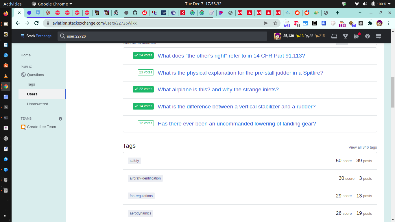
we haven't even scrolled halfway down the page yet

Note how the tags segment, in particular, now consists of a single column of tags on the left, some tag stats on the right, and a huge block of empty space in between. Note how, in addition to this, the individual tag entries have been blown up to match the size of the question and answer and repchange and whatnot entries - specifically, to match their new, inflated size. Note how, as a result, the tags segment now takes much more space to convey a little more than half as much information as it used to.
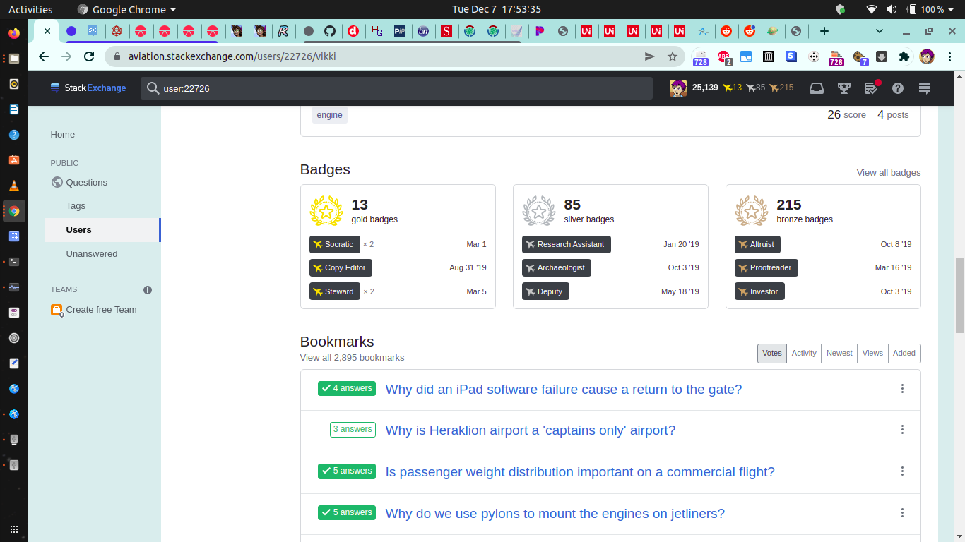
vacant white column, for sale by owner

Note how, due to the use of a sidebar to house the pane-switcher menu, we now have a whole column of blank space over on the left which does nothing but shove the segments of the summary pane over to the right, leaving them with too little remaining screen width to comfortably accommodate a second column of segments, yet still far more than needed for a single column. Note that width restrictions on mobile devices could have been better accommodated by leaving the pane switcher as it was before (thus freeing up precious screen width for the segments themselves), and dynamically shuffling the segments from two columns into one on screens too narrow to comfortably accommodate two side-by-side columns of segments, without ruining the page for desktop users whose screens could easily accommodate two columns side-by-side.

reputation chart breaketh

Note that, presumably as (yet another) bad effect of blowing everything up to hugeness, the repchange bar chart is now borked. Note, firstly, that the individual bars are now crammed tightly against each other despite having more room to spread out; without the thin whitespace that formerly separated adjacent bars in the chart, bars of the same or similar height next to one another could potentially merge in the viewer's eye, causing confusion. Note, secondly, that the taller bars are now whacking their heads on the gray border at the top of (and also surrounding) the segment in question.


Summary: 0/10, would not buy again. (Boo!!! Hiss!!!)

System: Chrome 96 on Ubuntu 20.04 LTS x86-64.


Update

Sometime in the past 20 hours, the layout changed slightly. Now the Questions and Answers segments are narrower and side-by-side, somewhat reducing the amount of scrolling needed, and it looks like some of the other elements may have been shrunken slightly as well. However, even at their smaller size, they're still bigger than they need to be; other segments desperately in need of side-by-sideness (tags, for instance) are still single-file; there are still unnecessary gray borders around everything that do nothing but take up space; and the new question-/answer-segment side-by-sideness further highlights the problems with the vertical pane switcher, as the width it takes up, and the resultant reduction in screen width usable by the segments next to it, causes the question titles in the question and answer segments to be cut off short enough to often make it impossible to figure out at a glance just what the question is. (Not helping matters is the completely-unnecessary question-date label at the far-right end of each of the question/answer bars. The date of a question I asked is easily found by going to its question page; the date of a question that I answered is completely irrelevant for my purposes, since what we're interested in here is the answer I wrote to the question; and, in both cases, it forces the question name to be cut off earlier than otherwise.)

half measures satisfy no one


New summary: maybe 1-2/10. Still awful.


Further update

Things have marginally improved, with the tag and reputation segments now also supporting two-column viewing; the narrowing from going back into two columns also seems to have incidentally unborked the reputation graph, which looks to be back to its old self:

at least the reputation chart is fixed

Note, additionally, how the question titles in the reputation segment now wrap instead of cutting off, which is a nice feature.

However!

  • The tags segment still has far fewer tags visible than it used to, and, thus, manages to still contain considerable whitespace despite its much-decreased width.
  • The space-wasting gray borders which force the entries in each segment further apart are still there; removing those borders would easily free up enough space to enable the question titles in the question and answer segments to wrap (as has now been done for the reputation segment), rather than being cut off.
  • The side-mounted pane switcher is still taking up precious screen width and making an entire (fairly-substantial!) column of the screen unusable by anything else. Just look at the huge vertical white bar on the left side of the screen:
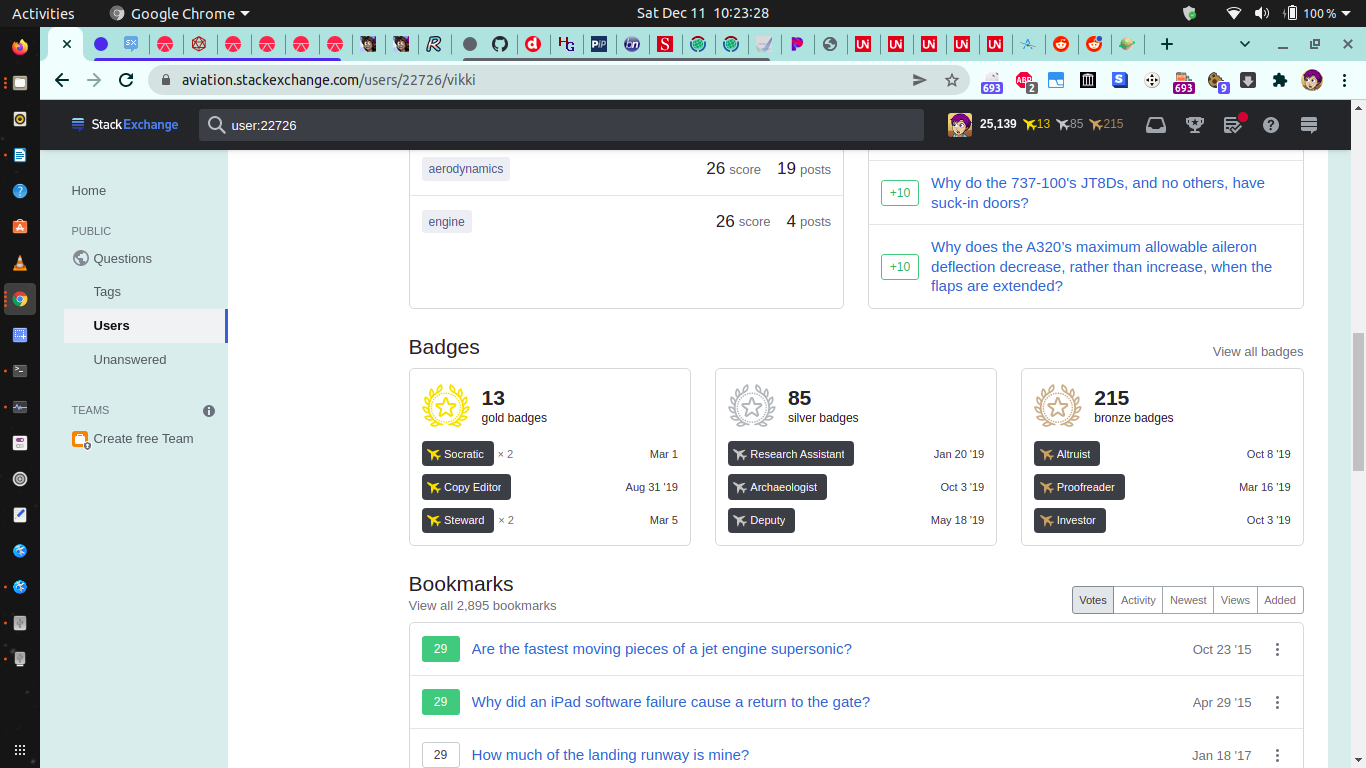
white column, still vacant

  • The side-mounted pane switcher also still requires vertical scrolling to reach its lowermost items on most screens. Although you said that you implemented the vertical pane switcher to avoid the need for wrapping the pane switcher if more panes are added to it in future, the cure is far worse than the problem; keeping the previous, horizontal, pane switcher and allowing it to wrap around onto two or more rows would have taken up a marginal amount of additional vertical room, while (unlike the vertical pane switcher) not requiring scrolling to see the whole switcher or crushing the rest of the page laterally.
  • The remaining segments of the summary pane (bookmarks, followed posts, accounts, bounties, and votes cast) are still single-file-only, and thus still horrendously space-wastey on wide screens:

c'mon, this could easily fit in two columns

stop wasting space, dammit

  • The new graphics in the badges segment are gorgeous... and belong on the badges pane, not the summary pane! A simple list of my latest few badges would be sufficient for the badges segment of the summary pane, while the badges pane would benefit enormously from the gold/silver/bronze graphics currently found in the summary pane. As a matter of fact, I'm not sure that the summary pane even needs the badges segment at all, given that there is, and has always been, a display of my total gold/silver/bronze badges right at the top of the summary pane, including both my newest badge and the one I'm closest to earning next!

it's beautiful, but this isn't where it should be

you couldn't've put it here instead?

  • And, even with the reputation events from more than a few days ago now being collapsed by default (like they used to be), the reputation pane is still horribly space-wastey - I'd like to be able to see more than just my past three or four reputation events without having to shell out 10 grand for an 8K monitor, peeps!

is someone getting paid by the pixel here?


Current assessment? Maybe 3/10, would still not buy again.


My recommendations at this point? Honestly, I'd say the best option would be to revert the layout update completely and go back to what the layout was on 6 December, except with the addition of summary-pane dynamic segment columning (segments automatically reshuffle into two columns on wide screens, and one column on narrow ones) and summary-pane question-title wrapping (question titles wrap instead of cutting off, like what the reputation segment currently does), as well as the ability to wrap the horizontal pane-switcher (if that hadn't already been implemented). EVERYTHING ELSE about the new layout is a net negative, ESPECIALLY for desktop users, and needs to go ASAP.


Note: I am aware of the irony of me complaining about (among other things) the need for a vastly-increased amount of scrolling... in an answer which requires a great deal of scrolling. :-p Nevertheless, I judged the multitude of screenshots to be necessary for illustrating the points made in my answer, unlike the necessary-for-absolutely-nothing whitespace and padding and added borders and single-columning added by the layout update.

8
  • 17
    I’d note that even on mobile, I preferred the old layout. Sure, everything was zoomed out, which wasn’t great, but zooming in on whatever interested me was easy enough. Navigating a drop-down menu, expanding list items, etc. are much more painful than that.
    – KRyan
    Commented Dec 8, 2021 at 19:18
  • 7
    I regret that I have but one upvote to give.
    – AJM
    Commented Dec 10, 2021 at 11:19
  • 7
    A bobcat would've been preferable, honestly.
    – Ian Kemp
    Commented Dec 10, 2021 at 13:55
  • What’s wrong with bobcats? Commented Dec 10, 2021 at 14:23
  • 7
    Just for those who don’t know, the “bobcat” thing is a reference to XKCD #325. Commented Dec 10, 2021 at 23:07
  • 4
    Note that the page is limited to a width of 1100 pixels. If you're logged out, the summary is always single-column. If you're logged in, your window needs to be wider than 1100 pixels (more if you have the left navigation on) for double columns, even though they look fine to me at a simulated width of 1000 pixels. Also annoyingly, only four areas are supported in double columns anyway.
    – Neil
    Commented Dec 11, 2021 at 12:27
  • 3
    @Neil: "Note that the page is limited to a width of 1100 pixels" - well, that's dumb, given that probably the vast majority of users have screens considerably wider than that and could comfortably accommodate a greater page width.
    – Vikki
    Commented Dec 11, 2021 at 17:17
  • 1
    Seems the date listing is now the answer date for answers. (When sorting by "activity", it's still the date of the answer's original posting. That might actually be a good choice, though.) Commented Dec 13, 2021 at 21:03
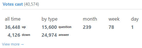
66

No functionality has been lost ...

Here is what the "Votes cast" section on the summary page looked like before the change:

"Votes cast" summary section before

However, here is what that looks like now:

"Votes cast" summary section after

One could "technically" determine the votes cast during the past month, week and day by manually counting from the overall list of up and down votes, but I consider this to effectively be functionality that has been removed.

Note I have sometimes found that extra summary information useful for myself, such as when I check how many votes I still have available for the day. Also, as Sonic the Anonymous Hedgehog's comment states, this information helped to determine and report a user for vote invalidation because they had upvoted every question on a site to earn a gold badge.

4
  • 14
    It's useful as an indication of activity, which... seems relevant given this is the activity tag
    – Kevin B
    Commented Dec 7, 2021 at 21:11
  • 6
    This is a terrible loss. I looked at this thing every day for myself, and often for other users. PLEASE bring it back.
    – user1091571
    Commented Dec 8, 2021 at 15:31
  • 5
    Ah, but it still looks terrible... It needs information density back.
    – EvgenKo423
    Commented Dec 9, 2021 at 8:06
  • 2
    I really wonder whether this was just oversight or someone thinking, "eh, who care about these numbers anyway?"
    – idmean
    Commented Dec 9, 2021 at 16:10
60

Not
Every
Element
Needs
Its
Own
Line

Others have talked about the whitespace in general, but I wanted to touch on one specific part: putting multiple things on the same line when they fit. Some pages handle this quite well; for example, the Following page has the tags and the date on the same line:
A post with the tags and the date on the same line
...unless it gets too narrow, in which case the date drops down to the next line: A post with the date on the line below the tags

This is great! However, many other pages unconditionally put elements on their own line, resulting in wasted vertical space and weirdly empty aesthetics. Part of being responsive is making good use of space on wider displays as well, and these just aren't.

For example, the close votes page:
First line: "closure", second line: "Some off-topic question [closed]", third line: "39m"

The votes pages:
First line: "upvote", second line: "A great post", third line: "Dec 2"

Various parts of the reputation page:
First line: "+20 2 events", second line: the post name, third line: "Oct 29"
"+10" and "Upvote" over top of each other, with "Oct 29 at 19:43" centered vertically to the right

In all of these cases, these elements could easily fit on one line on a desktop-sized display. Consider having them on one line for larger screens, and then break onto multiple lines for smaller displays.

1
53

I can only see downsides to this:

The navigation includes all the same items but is now placed vertically to the left of the column of sections to fix moments like this.

  1. In any normal sized screen (the kind developers actually work on) all the tabs fit in 1 single line, you just created an entire column (and the empty space beneath it) for what is 1 line.

It’ll allow us to add more functionality in the future without breaking the layout or introducing any wrapping.

  1. Creating a column to prevent hypothetical future wrapping of a line of tabs (because of tabs that don't yet exist - and haven't changed in a long time) doesn't seem like a good argument.

Two columns become one

  1. As zcoop98 said, I like my information at a glance, this only creates problems by compartmentalizing info that should be kept grouped. How many times do we have to click in the new layout to get an overview of activity? Instead of 1 click and 1 short scroll, we now need 10 clicks and 10 long scrolls.

Summary stays on “Summary”

  1. This is where I think the design goes seriously wrong. The expanded post summaries should not clutter the activity tab of the user profile. When checking a user profile I'm not interested in that kind of detail, and if I am I'll use search. This choice seems like a substitute for:
  • Having somewhere to click if you want that kind of detail.
  • Actually using search
  • Having a possibility to see expanded details in search

P.S.

Horizontal navigation turns vertical

When was navigation ever horizontal?

5
  • 6
    I actually like the vertical navigation. As said in the video, it “scans better”. And I really feel like I can read the navigation items quicker and click them easier. Commented Nov 20, 2021 at 3:01
  • 5
    Thanks for the feedback! For point 4, we agree. I’ve heard from a few people that the page strays a bit from feeling like a summary and this view could use tightening. On point 3, can you clear up what you mean by needing 10 clicks to get an overview of activity? The need to scroll is increased, but I'm not sure about clicking. For 1, 2, and PS, I want to make sure I don’t assume the screen or browser width a given developer (or any user) will use. I think the vertical nav is easier to use and worth the extra empty space created, but I’ll bring this up to my team and open it up for debate.
    – Dan Cormier Staff
    Commented Nov 21, 2021 at 19:26
  • 4
    @DanCormier by 10 clicks I mean the new column that replaces the tabs. Formerly the summary worked fine, now you either click or have to scroll endlessly. I'm not the first one to say that UX for typical 1920x1080 laptop users is degrading.
    – bad_coder
    Commented Nov 21, 2021 at 20:42
  • 7
    Agree with points 2 & 3, adding a column for "nav" that doesn't occupy the entire column's space is a waste. I'd much rather waste part of a row of screen real estate for content often scrolled off-screen than waste a column of on-screen real estate permanently. It's also actually still 2 columns, the first was traded for the vertical nav/tabs and would be mostly useless now.
    – Drew Reese
    Commented Dec 1, 2021 at 22:53
  • 5
    It is so frustrating how long it takes me to get from A to B.
    – Akixkisu
    Commented Dec 7, 2021 at 23:08
51

Everything that's on [the new] page includes everything on [the old] page. Right. We didn't lose any data. We didn't hide anything. We actually have additional information, like this answer and some of this data here. So it's just organised in a little bit of a different way.

2:50-3:10 of the video

I want to challenge the losing of data. The page is now so overloaded with information that looking for an overview of a user's activity is now instead a detailed look into what the user did recently. Yes, that is not "hiding" or "losing" data. However, to stretch a metaphor a bit - it has dumped a haystack on top of a needle.

The information about the tags of a post, the little snippet and similar are useful if I want to see them. If I instead want to see at a glance has the user posted questions and/or answers I now have to scroll what seems from the video at least two screens. The answer section definitely took up one screen:

Screenshot of the video where the page is filled with only answer information and has to be scrolled further up or down to even see the beginning or end of the section

Notice that the buttons for sorting these are still on top. Right now, the answers are sorted by votes - what if I scroll all the way down and realise I actually wanted the newest ones? I have to scroll back again just to switch the ordering, so I can go scroll down again. And maybe I find out I still do not see the information I want, so I have to scroll up again to click and view all answers.

5
  • 10
    I'm pretty much in agreement that the summary view can be tightened up by being more selective about the information we choose to show. The answer section is the best illustration of this. I think showing a snippet of the answer is nice and relevant, but we can probably stand to lose some of the other info shown the better condense and emphasize the what's most important. Thanks for sharing your thoughts. There's tons of room for improvement and your feedback helps us know where to best spend our efforts.
    – Dan Cormier Staff
    Commented Nov 21, 2021 at 19:28
  • 4
    Also there is so much space - lets please go back to two columns so we can see more instead of all the information we have lost - A summary page should not require scrolling
    – mmmmmm
    Commented Dec 8, 2021 at 17:30
  • 3
    @DanCormier I would even challenge that an answer snippet is not too useful. First off, a minor redundancy is that the question title and the "View answer" button are identical links. The snippet also breaks Mathjax blocks (e.g. on Math.SE), and are hard to read when it opens with code (e.g. on SO). More to the point, I don't think most answers are (or even can be) summarized in the first couple of sentences, so the utility is limited.
    – Elliot Yu
    Commented Dec 8, 2021 at 18:31
  • 1
    @DanCormier Fundamentally, I feel it's hard for a reader to skim the first couple of sentences from a dozen answers and get a feel for the quality or style of a user's contributions, so I'm not sure if it really belongs on a summary page.
    – Elliot Yu
    Commented Dec 8, 2021 at 18:31
  • 1
    @DanCormier Also I realize this answer is for the answer section of the summary tab, which is now much more condensed, but what I want to advocate for is a more condensed answer tab as well. I could move these comments to a separate answer, if that would make it easier for the purposes of keeping track of feature requests.
    – Elliot Yu
    Commented Dec 8, 2021 at 18:44
46

Wasted vertical space

This is a lot of wasted vertical space in the reputation history for what used to be a nice compact list conveying useful information at a glance. Please tighten it up again. (Ah, looks like that was raised elsewhere as well.)

enter image description here

40

Add back the numbers indicating how much reputation changed or how many responses were received on the tabs

When there's a reputation change or new responses received, earlier, the tab would indicate a number as to how much my reputation changed or how many new responses were received since I last loaded the respective tab.

However, this now seems to be gone, with it only showing a dot, but no number:

Dot, no number

Can the number of responses or amount of change in reputation please be added back?

I found these numbers really useful. As an example, when changes are made to my posts that don't trigger a notification (e.g. tag-only edits or really minor text edits), the system doesn't notify me of those, but those do show up as new Responses. I don't usually pay attention to that tab since I'm generally notified of all other activity, so it tends to stay with pending new responses for a long time. However, if I load up my profile and see that I suddenly have a lot of new responses that I didn't have earlier and wasn't notified of, I can see that mass changes were made to my posts, which I can report if they were improper. It's now harder to see that now, though, since I can't see the number anymore.

A similar thing also applies to reputation changes: users aren't notified of negative changes, but those (generally) do show up in the tab header. If I see a negative change, I'm implicitly prompted to see which of my posts were downvoted or what happened. However, it's now harder to see.

Also, to quote from my previous answer here:

No functionality has been lost

Pedantically speaking, that's not quite true.

The functionality to easily see your changes in reputation and responses, including those you're not notified about, has been lost.

2
  • 10
    This is definitely accidental lost functionality. It's coming back. Thanks for the bug report!
    – Dan Cormier Staff
    Commented Dec 7, 2021 at 22:03
  • Crap! that blue circle is the worst, looks like some terminator and a brand color had a baby, eeek. Now it shows the number but shit. 5/0 Commented Dec 23, 2021 at 10:26
38

Deleted answers used to show up in red (at least for moderators). They don't anymore, neither on the Summary tab:

enter image description here

nor on the Answers tab:

enter image description here

This used to be very useful, at least for me, to see whether a user is a repeat spammer, or somebody with just one deleted post and reasonable other contributions to the site. The red background is still shown on e.g. Questions and the Delete votes tab:

enter image description here

enter image description here

(test user)

5
  • 6
    They showed up in red for normal users too
    – TylerH
    Commented Dec 7, 2021 at 22:30
  • Indeed as @TylerH says; now they show up in red only in the respective tabs (Bookmarks & Followed posts), but not in Summary.
    – desertnaut
    Commented Dec 8, 2021 at 22:21
  • 3
    Dug into this one and deleted stuff should be highlighting as red. Sorry for the delay!
    – Aaron Shekey StaffMod
    Commented Dec 10, 2021 at 22:38
  • 4
    @AaronShekey great, I've fixed my Destroy Spammer user script for moderators which relied on that highlight being present. Thank you!
    – Glorfindel Mod
    Commented Dec 11, 2021 at 7:41
  • 1
    @AaronShekey they still don't, under several tabs (at least Reputation, Bookmarks, Following).
    – desertnaut
    Commented Dec 20, 2021 at 11:59
35

The "Answers" section of the summary is showing the score and acceptance state of the questions I answered, not the score and acceptance state of my answers. It appears to still sort by my answer score, activity and creation date appropriately though.

Screenshot of the answers section of the author's profile sorted by votes that shows the votes don't match the order of the sort

4
  • 7
    I can reproduce the issue. This one is... weird. Looking into it now.
    – Ben Kelly StaffMod
    Commented Dec 8, 2021 at 22:32
  • 13
    @BenKelly The scores seem to be fixed, but the acceptance states are still checking the question to see if it has any accepted answer, not if the answer itself is accepted. Commented Dec 9, 2021 at 0:32
  • 6
    Just a tickle, but the acceptance states are still showing whether the question has an accepted answer, not whether the answer is accepted (I know this is still status-planned). Thanks for fixing the scores quickly!
    – robjohn
    Commented Dec 16, 2021 at 20:15
  • 2
    Thanks for the update folks! I have a fix in PR that should be out today-ish. I'll update the status on this after it goes live. Sorry for the wait, there's a bit of a rush internally that leads up to our holiday code freeze and this dropped off my radar.
    – Ben Kelly StaffMod
    Commented Jan 3, 2022 at 16:31
34

This change drastically reduces the usability of this page for my most common actions. It's impossible to get a quick overview now, or to scan lots of information quickly. Everything takes up a huge amount of space, the information densitity is very low. It feels like standing directly in front of a huge screen, there is no way for me to get any overview.

It's bad enough for my use cases as a regular user, but as a mod if I needed to look into a user for patterns of problematic behaviour, I might just give up now. I really need high information density for that use case as I need to quickly scan the user activity. There is no quick scanning with this page, there's just lots and lots of scrolling.

Some parts are also hard to scan for me due to the layout, e.g. the question and answer lists. I generally need the title, the score and the deletion status for this, all the other stuff around it now makes it harder to focus on the important parts.

The list of accounts is also very useful information for me as a moderator, it tells me something about what kind of user this is. Now I either need to scroll down several pages worth until I see that or go to the profile page.

33

The redesign looks weird on bigger screens. The profile tab gives much strain to eyes. Here is the new design vs the old design on my 21:9 monitor.

New design

enter image description here

Old design

enter image description here

The fonts are tooooooo big..

way bigger than the stackoverflow logo..

enter image description here

sorry for visual disturbance, To illustrate what it feels like, is using h1s instead of p.

Also the top tags and reputation chart needs some refinement enter image description here enter image description here

5
  • 5
    status-review means a developer is looking into it; not 'please review this issue'.
    – Glorfindel Mod
    Commented Dec 8, 2021 at 8:54
  • Here is my post about the tags issue on a Profile page which was declined.
    – EvgenKo423
    Commented Dec 8, 2021 at 12:49
  • @Glorfindel Thanks for pointing out, I didn't knew this. First time in meta, just for my eye strain's sake. just curious how meta works.. never knew mods edit posts and add tag. Commented Dec 8, 2021 at 13:06
  • Well, it's basically the same for me. I think you should rather put this into your post instead of a comment and you actually comparing the tags on a Profile page with Activity page which confused me. ;-)
    – EvgenKo423
    Commented Dec 8, 2021 at 13:07
  • @AllІѕVаиітy sure, happy to educate you. We do know Meta is different :) Thanks for posting this bug report!
    – Glorfindel Mod
    Commented Dec 8, 2021 at 13:16
32

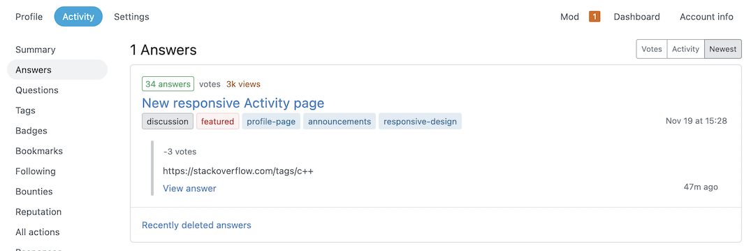
Poor information architecture on the Answers page

(or: my answers do not have answers)

The most prominently highlighted piece of information in each answer's box on a user's Answers page, with a bright green box in the top left is...the total number of answers on the question that it is answering, and whether any of them are accepted. The least prominently highlighted piece of information, buried in the middle in light gray text, is the answer's score.

This seems almost exactly backwards: the score is quite possibly one of the most important things about an answer, and the number of answers on the question and their accepted status (note: not the accepted status of the answer—only one of the two answers in this screenshot is accepted) is surely the least important thing about an answer: who cares how many other answers there are?

enter image description here

4
  • 2
    Thank you for reporting it. This was already reported here
    – Charlotte StaffMod
    Commented Dec 8, 2021 at 21:50
  • 9
    @Vanny Thanks for the reply, but I'm reporting a very different issue than that. That answer just says that "score" should be used instead of "votes." This is about the structure of the answer item: specifically the focus on the question's metadata rather than the answer's score. This asks for more than a wording change, it asks to put the emphasis on the answer's score. Please reconsider whether this is actually a duplicate of that answer.
    – Ryan M
    Commented Dec 8, 2021 at 21:54
  • 2
    Was about to post the same answer. This is unbearable. It's almost impossible to understand what is going on in the answers page at a glance. Content is irregularly splattered all over the place. The scores of the answers is barely visible in grey, and it's hidden in one hundred rows of overtly formatted and superfluous information. Also, scores higher than 1000 show as 1k/2k etc instead of the exact count, which is annoying. Please @Vanny consider highlighting votes, using full counts and removing unneeded info. Commented Dec 9, 2021 at 19:17
  • 1
    For reference, I'd keep the answers/questions page similar to this: i.sstatic.net/HJXhc.png (with full vote counts) and maybe add a button/checkbox to show extended info. Commented Dec 9, 2021 at 19:32
32

(later also requested in separate bug report: Don't hide the "closed", "duplicate", or "migrated" state of questions on user question lists)

Bring back indication of what questions are closed / duplicates. It was there in prior activity page and it was lost in redesign.

I use this information in my own and others profiles for closing and reopening purposes and its loss makes it harder for me to use the activity page.

As an example, below is a screen shot from my activity page questions tab here at MSE. Three of six questions marked red are closed (duplicates) but this fact is not displayed anymore.

screen shot from my activity page questions tab


On a further thought, this suggestion from discussion of prior profile changes seems to be relevant here as well:

...major flaw in profile redesign:

I can’t run every change by the Community ahead of time

Above is what makes things unreliable and unnecessarily difficult. Sorry if this may sound like a broken record but I would want to repeat advice from previous post on that matter: make it possible to deploy profile changes to one of (part of) sites in the network.

This would let you have it tested as thoroughly as it gets. Also, this would make things inherently safe: whatever bug occasionally slips into production, you would be able to easily roll it back if needed by a simple flip of the switch, by turning new profile off at the affected site(s)...

5
  • 1
    strongly related: When there are many answers already, help me check that mine won't repeat others "I would want that questions with 10 or more answers... have additional UI allowing me to review each of previous answers individually prior to posting my own... at this point it becomes way too cumbersome to check prior answers in regular UI." To say that checking prior 90 (that's friggin' ni-ne-ty) answers here was PITA would be a severe understatement
    – gnat
    Commented Dec 8, 2021 at 10:17
  • 3
    Yes, those status indicators in the titles convey essential information about the posts.
    – bad_coder
    Commented Dec 8, 2021 at 22:00
  • 3
    please bring the indicator back also for bookmarks/followed posts
    – blackgreen
    Commented Dec 9, 2021 at 10:47
  • 3
    It could even be an icon or an additional word next to the answer/votes/views data. But it needs to be something. Commented Jan 24, 2022 at 23:36
  • @Vanny - I just re-checked my profile page and page of some askers at SO and this issue appears to be addressed, I can see the [closed] and [duplicate] indications. Does that mean status-completed?
    – gnat
    Commented Mar 9, 2022 at 16:06
31

No functionality has been lost ...

Here is how a bookmark, of this post actually, now appears:

Current view of a bookmark entry

Previously, the date/time shown at the bottom right of the bookmark entry was of the last change, not of when the question was posted as is shown now. It also used to show the user (with a hyperlink) who made that change.

Note the date/time entry used to be a hyperlink to the last change. I often found this useful, especially for posts with many answers, so I didn't have to potentially do a lot of checking to find what specifically had been recently changed. However, the date/time shown now in the lower right corner is no longer a hyperlink, and I can't find any other place that has such a link or any other way to determine what the last change was.

Clicking on the three vertical dots at the top right side brings up a menu list with just one entry of "Remove bookmark". If you prefer to not change what is currently showing, including adding/changing any hyperlinks, then I suggest adding a link to the latest change in that menu list instead.

5
  • 7
    +1000 if I could. This is how I used to quickly check any change in past questions. Now, it is much more cumbersome.
    – VonC
    Commented Dec 8, 2021 at 0:07
  • 2
    You actually could, @VonC, it's called bounty. ;)
    – EvgenKo423
    Commented Dec 8, 2021 at 12:08
  • Actually the date used to depend on the tab selected; it was a date added for "Added" tab, for example. Also the "Active" date in question header also link to the last activity, so you could use that as a workaround.
    – EvgenKo423
    Commented Dec 8, 2021 at 12:09
  • 3
    @EvgenKo423 Nope, it's called two bounties ;-P
    – 41686d6564
    Commented Dec 8, 2021 at 13:25
  • @41686d6564 Wait, what, a rep cap? Such a shame you can't enter a custom amount...
    – EvgenKo423
    Commented Dec 8, 2021 at 14:22
31

Can we please get the UTC timestamp back when hovering over the time field in the Reputation tab? Both on the "Post", but especially in the "Time" submenu. Right now there's just the "Oct 7 at 13:22".

Showing the reputation for one post under the "Time" submenu

It would be nice to have a uniform representation in the DOM for people that creates user scripts. Some of us also like to know the time down to the very second.

I'm also a little confused as to why the -2 appears both in red and in green.

5
  • 3
    The timestamp is especially useful when relative time is shown, like "XX hours ago". And speaking of time, I would prefer to see it in my local time zone; it was like that some time before, but was later changed to UTC.
    – EvgenKo423
    Commented Dec 8, 2021 at 11:07
  • 3
    No, UTC is good as long as the time zone is specified. e.g. Z
    – Dharman
    Commented Dec 8, 2021 at 21:18
  • 1
    @Dharman It's fine in timestamp, but it's quite confusing when you look at some action time. The relative time is actually shown in local time zone, but the absolute time is now in UTC for some reason.
    – EvgenKo423
    Commented Dec 9, 2021 at 7:49
  • 3
    @EvgenKo423 What does "The relative time is actually shown in local time zone" mean? "5 hours ago" isn't local time. It's just 5 hours ago everywhere. Commented Dec 9, 2021 at 16:46
  • @Unconsidered It means if I'll take my local time and subtract X hours I will get the time when the action was actually performed in my timezone, but the server time will be different by timezone offset. I.e. it's relative within my or server timezone, not relative from my to server time (which is shown along older actions).
    – EvgenKo423
    Commented Dec 10, 2021 at 9:05
30

I find that each answer in the new summary is taking up way too much space on desktop devices and makes it much harder to get an overview over one's activity than before.

New layout:

enter image description here

I suggest increasing the information density by hiding the excerpt from the answer and by putting all the meta data on one line. The same three Q&A's shown above could be condensed into:

enter image description here

The black box around the "unaccepted" answer isn't part of the proposal. I'm just bad at editing images.

There could be a small "unhide" button, like ▶ or ⊞, first on each topic line to show an excerpt from that specific answer.

9
  • 6
    Better yet, go further and remove all of the question answer count, votes, and view: they're not relevant to the answer.
    – Ryan M
    Commented Dec 9, 2021 at 0:16
  • 5
    Happy to reduce the information density here by removing the row of meta data above the question. Gonna try it out!
    – Aaron Shekey StaffMod
    Commented Dec 9, 2021 at 2:11
  • @AaronShekey That sounds promising but I felt it necessary to clarify my suggestion so it's now updated.
    – Ted Lyngmo
    Commented Dec 9, 2021 at 9:10
  • 3
    I've reduced the amount of meta data on each question. I know it's not the exact thing you mocked up, but we think previewing the answer is important.
    – Aaron Shekey StaffMod
    Commented Dec 10, 2021 at 16:13
  • @AaronShekey Great! It's much cleaner now but now I can't see if the question has an accepted answer (unless it's mine). The line showing "Accepted answer" (and the votes for the answer) has plenty of horizontal space so it could fit in there. So could the view answer link. Everything to reduce the amount of vertical space each question takes up. Perhaps too many suggestions for a comment? Should I write a proper suggestion for it instead?
    – Ted Lyngmo
    Commented Dec 10, 2021 at 16:33
  • 1
    @AaronShekey The "View answer" link is not needed, the question title already links to it. The answer score and acceptance state could be placed to the left of question title in a box, like before.
    – EvgenKo423
    Commented Dec 11, 2021 at 10:44
  • @EvgenKo423 They are two different links though. One links to the question and the other to the answer. I would be happy with a link to the answer only if only one had to be shown since it's a link from a list of answers - but, there's plenty of room vertically to display both.
    – Ted Lyngmo
    Commented Dec 11, 2021 at 10:59
  • @TedLyngmo They both link to an answer for me, like before (and I don't want a question link there).
    – EvgenKo423
    Commented Dec 11, 2021 at 12:45
  • @EvgenKo423 Indeed. I could have sworn that they were two different links. Yes, then the View answer link could be removed.
    – Ted Lyngmo
    Commented Dec 12, 2021 at 20:44
29

The summary page no longer shows scores of answers and questions. It shows vote count and answer count, 2 pieces of information that are not very important. Especially when ordered by score or views.

Please show uniform size boxes with the post score inside them regardless of whether it's an answer or a question. Just a number would be enough. And make the text a little bit bigger inside of it.

4
  • 9
    This is particularly strange when sorting by votes, as you can't actually see the scores.
    – Ryan M
    Commented Dec 8, 2021 at 8:13
  • 12
    Update: now answers show question's vote count. Misleading.
    – pinckerman
    Commented Dec 8, 2021 at 18:37
  • 1
    @dan Thanks for the fix, but the accepted status is still invalid. It shows my answers as accepted but they are not.
    – Dharman
    Commented Dec 17, 2021 at 21:06
  • 1
    @Dharman We have a fix for what you're mentioning (related to this response). I think what's mentioned in your post has been addressed, but if I'm mistaken, let me know.
    – Dan Cormier Staff
    Commented Dec 17, 2021 at 21:45
26

While some aspects of new designs can be judged up front, the real issues show only when we are able to see the new design in full.

Based on how awful this new design looks, feels and how much it lacks already established features, before rolling out such drastic changes, you seriously need to consider having a test phase during which people would be able to switch between designs and give you more comprehensive feedback.

The current Activity page with its enormous fonts is completely unreadable for me. I have eyesight issues and adapting from huge to small sizes causes serious strain to my eyes. I cannot go to the Activity page, read something there, and then continue reading other parts of the site or continue to do my work.

So for now I have to avoid the Activity page, which will have negative impact on my participation, while I wait in hope you will fix the problematic areas.

Fixing an airplane in flight is not the best approach ever.

2
  • 6
    We worked to ship some design refinements that should hopefully improve things for you. No arguments on fixing an airplane mid-flight, but that's the reality of working on these pages. To put it kindly, we don't have great infrastructure for doing large A/B's and allowing people to opt in.
    – Aaron Shekey StaffMod
    Commented Dec 9, 2021 at 2:06
  • @AaronShekey Thanks for the quick fix. I can read Activity page now. Commented Dec 9, 2021 at 5:28
25

Make it clear that most statistics in the Impact box are hyperlinks

When I loaded up my profile, I was confused as to where the link to my flag summary was. After several attempts, I couldn't find it, until I eventually realized that the helpful flags number in the Impact box was a link, not just plain text:

Looks like plain text

Those labels definitely don't look like links to me. Also, the "people reached" text is not a hyperlink, but the rest of the text labels are, so I don't get why they're all still formatted the same.

Can the fact that those three labels are hyperlinks be made more clear?

3
  • 1
    This is fixed in high contrast mode. You will see that all links are underlined
    – VLAZ
    Commented Dec 7, 2021 at 20:02
  • 8
    In the old design the whole line was a link, so make the numbers part of a link as well.
    – EvgenKo423
    Commented Dec 8, 2021 at 11:40
  • 2
    And conversely, things that I'd expect to be links (like the Questions, Answers, Tags, etc.) section titles aren't, but instead have unnecessary, small "View all 97 answers" links below them (which also aren't obviously links). Except that in the mobile version, those section headings are links. What's actually lacking, I think, is some sort of discernible visual language that'd help us predict what is or isn't a link.
    – Caleb
    Commented Dec 9, 2021 at 19:47
24

On the All actions → Posts tab, the answers have a label 'answered' with a white text on a green background. This gives me the idea that they are accepted, even if they are not:

enter image description here

4
  • IIRC, it was like that before, but I agree.
    – EvgenKo423
    Commented Dec 8, 2021 at 11:53
  • @EvgenKo423 I'm not 100% sure, but I found this old snapshot which seems to suggest it wasn't.
    – Glorfindel Mod
    Commented Dec 8, 2021 at 11:56
  • This one indeed looks like an old snapshot, @Glorfindel. I think it was a recent change sometime in the last two years, as I seem to remember seeing both of them.
    – EvgenKo423
    Commented Dec 8, 2021 at 12:02
  • 3
    I am not sure if this is actually a bug. But, I think if an answer is accepted, it should show accepted in green instead of answered. But I can see the possible confusion because when it shows as asked, there are no colors, and doesn't show as a tag, just plain text.
    – Charlotte StaffMod
    Commented Dec 8, 2021 at 19:01
22

Expand Today by Default

(or ? removing useful behavior is usually considered a bug)

The "today" in the reputation summary used to be expanded by default. That was useful. Please restore it.

enter image description here

1
  • Thanks for fixing that! Commented Dec 9, 2021 at 8:09
22

Posts edit field has lost precision in the impact section.

I liked seeing how many posts I've edited and comparing that with the number of helpful flags and votes. These are usually around the same order of magnitude but now two fields use 4 digits while edited posts only uses 1 due to rounding.

enter image description here

4
  • 7
    The missing precision is the worst part of this. Editing a single post can be a nontrivial amount of effort: each one should be visible (at least within reason, but this is well within reason).
    – Ryan M
    Commented Dec 8, 2021 at 8:15
  • 11
    These 3 metrics should never round. They are meant to be precise.
    – Dharman
    Commented Dec 8, 2021 at 10:01
  • @DanCormier: After the update, it looks like the number shown is drastically different from what is shown when you click on the 'post edited' link (i.e., the all actions>revisions page). Does the number in the impact section show the number of unique posts edited or is this due to something else? (I seem to remember my edited posts being higher before all the changes).
    – Shaido
    Commented Jan 6, 2022 at 6:46
  • 1
    @Shaido when you click the "posts edited" link the list shows every revision to your own post and posts of other users. The number above "posts edited" counts only 1 for all the revision you made to 1 post by another user. That's not a bug, the metric was the same before the design changes and it's what the community wants, in short the number means: how many posts by other users did you edit.
    – bad_coder
    Commented Jan 6, 2022 at 13:19
21

The Review and Suggestions subtabs under "All actions" show the status of my past reviews, but they're styled as buttons that make it feel like I'm about to vote to approve, reject, etc. The link to the review item itself is valuable and good, but can these be restyled as something less... action-y, please?

2
  • 1
    This has been changed, but frankly into, IMO, something far worse, because it's now far less clear what the review action was when that is one of the useful bits of information for that view. Commented Dec 7, 2021 at 23:46
  • This has been fixed, but the only thing I would improve is make the background different color or maybe the text color brighter. In dark mode, it's barely visible.
    – Dharman
    Commented Dec 8, 2021 at 0:55
21

Here is one of my answers as displayed in the Answers tab:

One of my answers in the display tab

However, "score" should be used instead of "votes" for the question and answer. For the question, there are 70 up votes and 12 down votes (for a total of 82 votes) giving a score of 58, while for my answer there are 36 up votes and 2 down votes (for a total of 38 votes) giving a score of 34.

Also, as already stated in Alex Guteniev's answer, my screenshot displays the problem with the answer text showing HTML entity codes, in particular " here.

1
1
2 3 4 5
8

You must log in to answer this question.

Not the answer you're looking for? Browse other questions tagged .