10

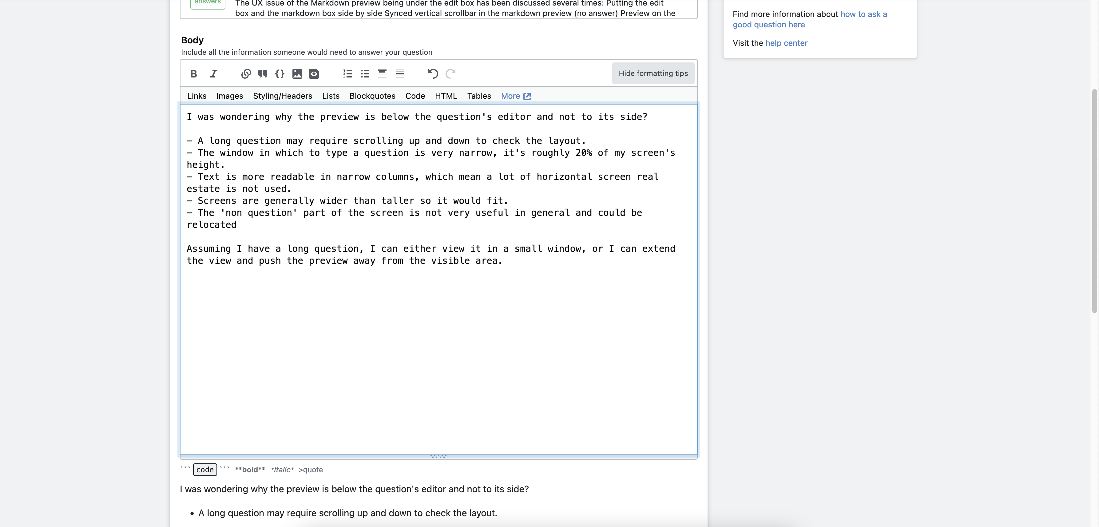
I was wondering why the preview is below the question's editor and not to its side?

  • A long question may require scrolling up and down to check the layout.
  • The window in which to type a question is very narrow, it's roughly 20% of my screen's height.
  • Text is more readable in narrow columns, which mean a lot of horizontal screen real estate is not used.
  • Screens are generally wider than taller so it would fit.
  • The 'non question' part of the screen is not very useful in general and could be relocated

Assuming I have a long question, I can either view it in a small window, or I can extend the view and push the preview away from the visible area.

This is not helpful:

enter image description here

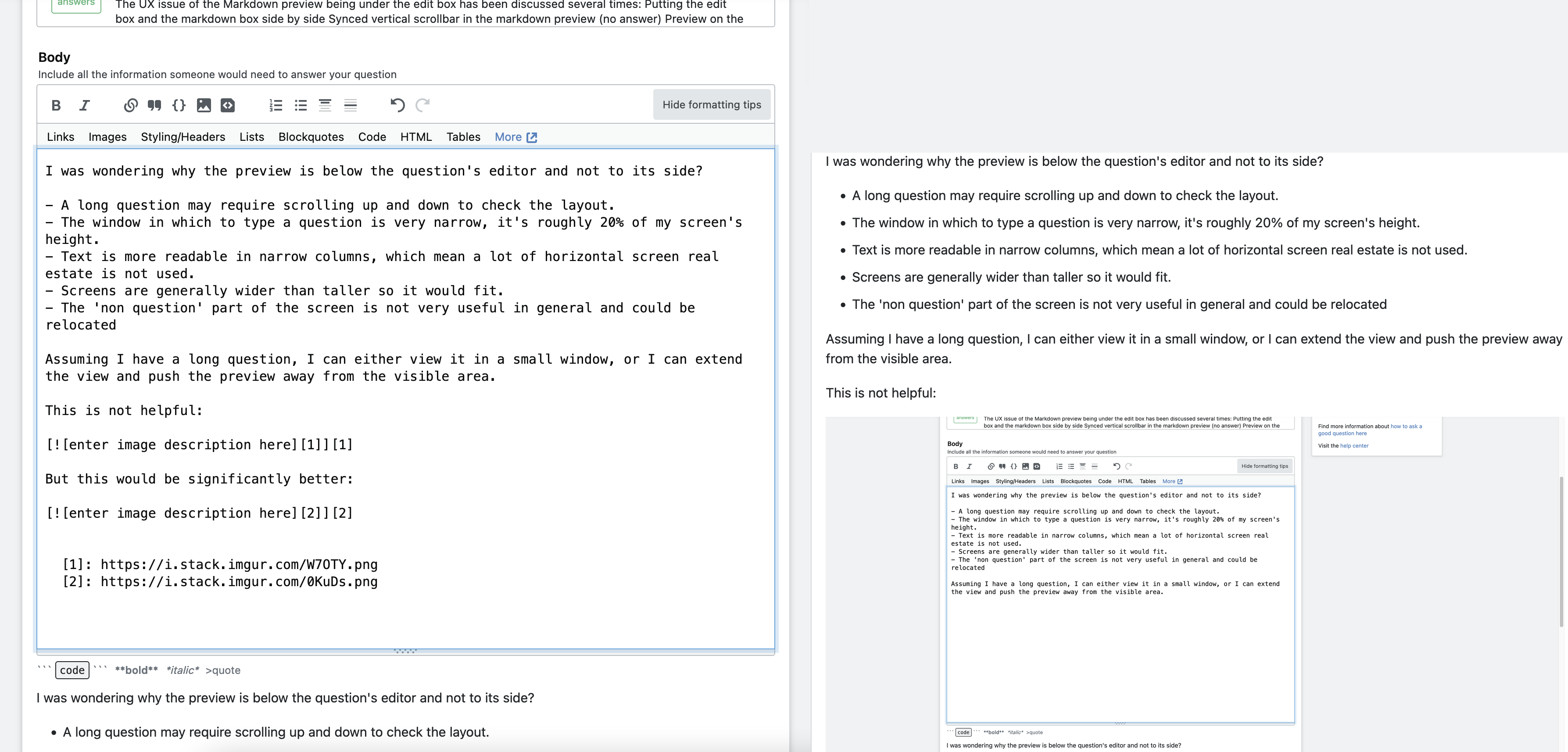
But this would be significantly better:

enter image description here

Has this ever been considered / discussed?

8
  • 5
    Apparently there was some similar functionality to what you suggest a few years ago, but it was phased-out. See: Here and an older one here. This seems to be a dupe of the last one.
    – W.O.
    Commented May 13, 2022 at 22:56
  • 1
    This is answered (or explained) in the Announcement about responsive design. On a mobile device, which many of our users use: in Portrait mode the page looks like this, but in Landscape mode the page is unusable. As you can see from those images my screen size is WQHD+ (2960x1440), larger than most laptops and many desktop screens. A double-wide editing area would have two too narrow viewing areas.
    – Rob
    Commented May 14, 2022 at 0:58
  • 3
    Because apparently SE decided (or, precisely, the UI team at the time) that the only devices that exist are mobile devices. Every concern about horizontal screen space could've been solved by media queries.
    – 0Valt
    Commented May 14, 2022 at 11:33
  • Recent comments on the mobile vs desktop size are here: meta.stackexchange.com/a/372740/282094 meta.stackexchange.com/a/372653/282094 - The mobile device width isn't correctly queried, leaving SE to believe that the device width is much less than it really is.
    – Rob
    Commented May 14, 2022 at 11:41
  • 1
    From what I gather, they concluded 10 years ago that desktop screen resolutions weren't wide enough and that nowadays only mobile exist :) So it looks like this hasn't been revisited in 2022. Personally I never use the app on my phone and use SE only when I work.. with a modern desktop screen where two columns fit. Maybe a solution to this might be a browser plugin
    – Thomas
    Commented May 16, 2022 at 15:29
  • Honestly, I've been thinking about writing a userscript for that for a while. Granted, a large portion of users these days browse from mobile (in fact, that's from where this comment is posted), but the negligence SE has consistently been displaying towards viewports with width larger than height is stunning. IIRC the upcoming new editor has a PR from one of the (former?) employees that adds a live preview, but the editor itself has too many unsolved problems ATM.
    – 0Valt
    Commented May 16, 2022 at 15:37
  • @OlegValteriswithUkraine it looks like that discussion has already happened: math.meta.stackexchange.com/questions/29941/… but I'm not sure what the conclusion is
    – Thomas
    Commented May 16, 2022 at 15:39
  • @starball, you are right, it is similar, doesn't have an answer and, from one of the comments, that idea was already 9 years old in 2019.
    – Thomas
    Commented Aug 2 at 10:39

0

Browse other questions tagged .