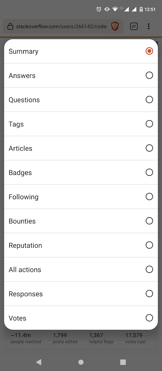
There's this list of Activity submenu options in my profile ("Summary", "Answers", "Questions", ...):
Which for some reason refuses to become muscle memory for me.
Every time I visit my profile or someone else's, I have to scan the list to find the "All actions" item (which I mostly use, please remember it) or whichever item I'm interested in.
It's been more than a year now since this redesign (or has it been two?), and I still cannot get used to it. I think this is partly because most of the words are of approximately equal size, they're very close to one another and they contain many of the same letters ("ion", "ions", "ons"), but I'm just an armature linguist, not a cunning one.
Can you like give the menu items some visual cues, or icons, or just make them horizontal again so I know whereabouts on the page they are?
Bonus question
While you're at it, could you pretty please stop abusing the <select> element for navigation on mobile? This is an abomination that is immersion-breaking, jarring, ugly and many more slightly unpositive adjectives:


