-564

Update

This experiment has been graduated. The new styling for vote arrows is now live across the Stack Exchange network.


About a year ago, the Product team, focused on improving the general experience, conducted an experiment to update the styling of the voting arrows on Stack Overflow in order to improve accessibility and meet Web Content Accessibility Guidelines (WCAG) compliance. We shared positive results from the experiment: a net 28% increase in overall votes.

At the time, we decided to not move forward for a few reasons:

  1. We wanted to take a broader approach to looking at the question page instead of one particular element and decided to roll this into a different initiative.

  2. Additional accessibility issues were raised that needed to be re-tested in dark/high contrast modes

We’ve decided to revisit our decision and to graduate the experiment on Stack Overflow and the Stack Exchange network. Before we proceed, we acknowledge there are still a few outstanding accessibility issues and bugs that we need to address first before we graduate.

Here is what the arrows look like before and after the change:

Before After
Screenshot of the voting buttons before the change (simple up and down arrows) Screenshot of voting buttons after the change (arrows with circles around them

Your feedback

We’ve heard your feedback from the previous posts about this change, and are not moving forward until we address them. We are prioritizing issues specific to accessibility compliance and bug reports. This might mean that any drastic visual changes to the styling will not be within the scope of this first iteration, but that does not mean we won’t iterate the design.

Moving forward, we are committed to:

  1. Prioritization of bug and accessibility reports to be addressed before we go live such as:

  2. Open communication

    • Any future iterations will be adequately communicated earlier in the process (i.e. designs, experiment plans).
  3. Monitoring accidental voting and other relevant data points

    • In the previous post, we saw feedback from users with >1k rep who flagged the risk of accidentally voting when checking the post score. We took a closer look at this report and pulled the following data:
    • Last month (Apr 2023), we saw 175k users who voted 870k times. Of those users, only 8% (14k users) had undone their votes.
    • The number of posts that had votes undone only accounted for 3% of total votes. This is the benchmark we will use moving forward.

We will continue to monitor these numbers to see if there is a noticeable uptick, and then determine if it’s a widespread issue to prioritize.

What's next?

This change is part of a holistic exploration of the voting mechanism and what it means for everyone. Voting is an essential part of the mechanics of the platform that makes this repository of knowledge so successful. It is how we acknowledge the good work of our contributors, and we want to really explore different ways in which we can make this process more streamlined and engaging for everyone.

Year over year, we are seeing 28% fewer votes (upvotes + downvotes) and 21% fewer users voting. During our research, we also found that voting is a pain point for new users as well. In April alone, we saw:

  • 72k unique users who attempted to vote 166k times (avg 2.3 votes per user).
  • Of those 72k users, 17k users were new users which is 24%
  • This means that 1 in 4 new users attempted to vote, but could not due to system limitations.

Because voting is one of the lowest barriers to participation, we felt that this was the best place to start to help users engage more on the platform. In the coming weeks, we have plans to roll out more ideas that we have to iterate on voting and it’s part of the user story of this site to increase engagement, so please stay tuned for those updates.

79
  • 107
    Do you have any theories, thoughts, etc, as to why the change caused a 28% increase over that period of time? Was the increase primarily from a specific group of users?
    – Kevin B
    Commented May 22, 2023 at 16:05
  • 51
    How did you A B test this?
    – Akixkisu
    Commented May 22, 2023 at 16:06
  • 77
    They're not particularly pretty, and they're quite big. This might be a problem especially on mobile. Edit: somebody already posted an answer about it Commented May 22, 2023 at 16:24
  • 59
    I also regularly vote by mistake on mobile (a few times per day). Making the buttons even bigger and more prominent, will make this even more of an annoying problem. Commented May 22, 2023 at 16:27
  • 228
    The new buttons are terrible. No offense to whoever made them, surely it's some fancy super popular design somewhere, that's just my personal opinion. There is no reason to enclose arrow with a circle. It makes the arrow itself smaller, and overall just looking bad. And no, it's not the standard "don't like moving my cheese", that's just a much worse design, and I'm really sad it went through all the levels without someone saying "Stop this now". Commented May 22, 2023 at 16:46
  • 98
    Does the increase in votes also mean that the votes are actually indicating quality (or lack of it, in case of downvotes)? Because wrong-voting is way worse than no-voting (and I've seen a lot of wrong, low quality posts getting some upvotes). Increasing the number of votes means nothing if the votes are used in the wrong way (as a social media's "like", instead of a quality indicator).
    – hkotsubo
    Commented May 22, 2023 at 16:52
  • 106
    What is graduating an updated button styling?
    – Quasímodo
    Commented May 22, 2023 at 17:26
  • 30
    @Quasímodo "Graduating" in this case means promoting the test of this change that occurred previously into active use on the main site. SE experimented with this change previously, decided not to make it permanent (not to "graduate it" to usage on the public site), but are now apparently reversing course.
    – zcoop98
    Commented May 22, 2023 at 19:35
  • 48
    It must be hard to push changes on a site whose users seem so paralyzed by changes. It's a small difference in the up/down icons, I'm amazed the amount of vitriol garnered by such an arbitrary change.
    – rob
    Commented May 22, 2023 at 20:56
  • 171
    @rob it's the mentality of changing things for the sake of changing them (see "seagull management"). Not to mention the lame excuses for metrics. "Hey guys, our research indicates that 42% more elevator floor buttons get pushed if we remove the labels so it's not obvious which one is your floor. So we're rolling out this change across all elevators. You're welcome. No, we can't put the labels back on - what if a blind person can't read them?" Commented May 22, 2023 at 21:26
  • 54
    @rob The problem is not the icon change itself. It's the waste of resources on irrelevant things, while other things like this (way more useful IMO) are completely ignored.
    – hkotsubo
    Commented May 22, 2023 at 23:36
  • 53
    Could the increase in voting simply be because they're different, and so they grab people's attention more, resulting in more upvotes because more people looked at them? If that is the case, then as soon as people get used to them, the upvote increase will decline back to what it is now, and we'll have to change the button design again to get back that upvote increase. At this point we might as well have a random button design each day! ;)
    – dwb
    Commented May 23, 2023 at 13:07
  • 34
    I'm surprised by the presence of this post on Meta. There was widespread opposition to this change in the past, and this post is yet-again heavily downvoted. I hope that the staff at Stack Exchange can "read the room" and recognize that that this unpopular change is strongly rejected by the community. And I hope that the moderators can see that we, the community, respectfully would like to make it clear that these downvotes and comments show clear opposition to this change. Commented May 30, 2023 at 14:48
  • 78
    I find it harder to see if I've voted or not. Also they're offensively ugly.
    – Oskar Skog
    Commented May 30, 2023 at 15:23
  • 32
    I can hardly tell when I've voted for something now. At least make the colours easier to read
    – FShrike
    Commented May 30, 2023 at 16:05

46 Answers 46

404

I don't really see how this is more accessible.

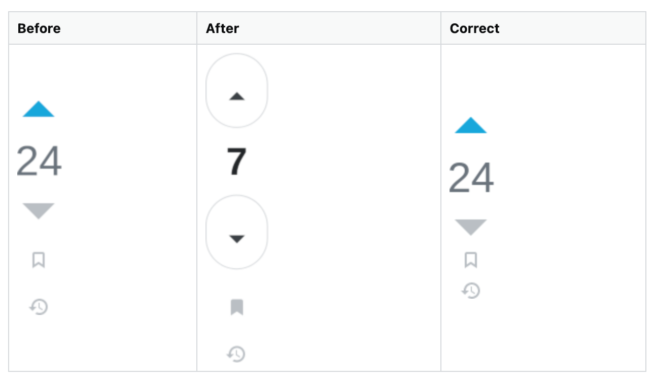
  • The new buttons become weird ovals in Zoom Text Only mode. (The old buttons behave correctly.) At 200% zoom:

    Before After Correct
    resizing only the text also resizing the voting buttons' circle border, making it a large oval as before, but the bookmark and timeline buttons aren't spaced out
  • The new buttons become indistinguishable splodges when blurred. (The old buttons fare better.)

    Before After
    blurry but distinguishable blurry and hard to see: it looks like the upvote has a down arrow
  • The old buttons only provide feedback via a colour change, but the new buttons are no different. You should be aiming for colour + shape at a minimum. WCAG 2.1 criterion 1.4.1:

    (Level A)

    Color is not used as the only visual means of conveying information, indicating an action, prompting a response, or distinguishing a visual element.

  • Changing things is inherently an accessibility problem. Some people find it much harder to cope with changes than others. (This is a much huger change than anything else you've changed over the past 7 years: make it count.)

    • Why does the layout need to change? It disrupts muscle memory, increases the minimum screen size required to use the site, and ruins perfectly-good clickjacking attacks.

The only obvious-to-me improvement is that it's more obvious that voting is possible, for people who:

  • have an account;
    • with enough reputation to vote;
  • didn't know they could vote;
  • are familiar with this design language.

A blue dot upon earning the privilege, as was used in Documentation, might suffice for this; and it wouldn't place "click me!" buttons in front of people trying to do other things1 who can't even click them. (The adverts are bad enough.)

For people capable of ignoring them, these buttons are just going to fade into the background, eroding the very design language that you're relying on in the first place.

1: Have some webcomics: one two.


That said, I don't understand what your goal is. You write:

Because voting is one of the lowest barriers to participation, we felt that this was the best place to start to help users engage more on the platform.

Your company isn't valuable because people want to go on a website and vote and edit and answer and re-tag: it's valuable because those actions result in a high-quality library. The vast majority of people aren't here to interact with the system: they're here to get answers to their questions, and the best possible outcome for them is that the question has already been asked and answered.

Everything else follows from that. Everything else is secondary to that. And you know this: to quote the new Code of Conduct (draft):

  • Answering - The knowledge sharing of the Community is the platform's foundation. To ensure the highest quality repository of information, we have adopted quality standards that apply to all answers on our network. […]
  • Voting - Our voting system is central to how Stack Exchange works. Votes are how the Community signals great content and rewards its members for their contributions. Improperly cast votes undermine the integrity of the platform. […]

There is no way that "engagement", how I understand the word, is actually your goal here. Voting isn't a social media ♥ 👍 😠: it's a curation activity. Stack Exchange is not supposed to be engaging: it's supposed to be useful. I've seen far, far too many companies chase the metric of engagement2 off a cliff, and destroy everything that made their offering valuable.

… which I don't believe you're doing here. But I still don't understand your goal, so it's hard to give useful feedback.

2: Have another webcomic: three.

25
  • 123
    This is just another step towards making Stack Exchange social platform, which appears to be the final goal of the current management. Commented May 26, 2023 at 8:28
  • 9
    You're thinking of WCAG Criterion 1.4.1: “Color is not used as the only visual means of conveying information, indicating an action, prompting a response, or distinguishing a visual element.” It's a level A criterion, which means it's part of the bare minimum low-effort stuff everyone should strive toward. Commented May 28, 2023 at 17:44
  • 6
    @ShadowTheSpringWizard StackOverflow stories and shorts when? Commented May 30, 2023 at 17:01
  • 45
    @AyxanHaqverdili that's the next level. First they'll remove the downvote option because it hurts the users feelings. Then change "upvote" to "like". Then give initial 10k reputation to each new users, along with removing all privileges. Then... [fill the gap] Commented May 30, 2023 at 17:30
  • 15
    Agree. After trying to vote up a question, which it turns out I had already upvoted, I remembered "hot meta network" had mentioned the change. Now, the state between "you've voted" and "you've not voted" is barely distinguishable with a slight difference on gray vs blue on very thin lines. Not impressed with the change in the least, UI people should leave well enough alone and not emulate Apple and its ever-changing Music app. Commented May 30, 2023 at 17:47
  • 16
    The color change is actually worse than "just" being color. I had no trouble distinguishing pressed vs non-pressed on the old buttons as the contrast between the two was pretty high, with the new buttons, however, depending on the site theme, I actually have to focus my attention on them to see the distinction :( Commented Jun 1, 2023 at 6:59
  • @ShadowTheSpringWizard, no: SO's developers are lazy but are focusing on fixing some other, more important features and bugs. So, they'll probably sell SE and SO to Meta so that S()ck∊rbErg can do these for them + ruin the existing APIs, etc. Commented Jun 2, 2023 at 5:02
  • 3
    @TheAmateurCoder haha. No. They are not busy fixing any bugs, they are working on the projects that give SE money, mainly Teams. It's confirmed several times by comments of staff, e.g. asked why they don't fix bugs in the new inbox, and other shiny features that now get dust and bugs. Was told by staff that "We're busy working on other projects". That was back in 2022, and I'm sure it holds true to this day, and to the last day of SE. Commented Jun 2, 2023 at 5:19
  • @TheAmateurCoder as for selling, the likely buyer would be Micro$ which will use the platform as their own support forum, and help them develop new projects for free, e.g. questions by "staff" with fat rewards (rep and badges, not real money) for those who solve their problems. Commented Jun 2, 2023 at 5:23
  • The goal is, as usual, to make it seem as if SE Inc. is actually doing something, when actually they're fiddling while Rome burns.
    – Ian Kemp
    Commented Jun 2, 2023 at 19:52
  • 2
    @ShadowTheSpringWizard: I have no problem at all with the company prioritising Teams for the sake of profitability. The problem is making ill-considered changes to SO, for post-hoc rationalisations, that undermine what make it successful.
    – PLL
    Commented Jun 3, 2023 at 10:53
  • "it's valuable because those actions result in a high-quality library" - no no, new user growth, that's the only value that exists
    – OrangeDog
    Commented Jun 6, 2023 at 15:39
  • 2
    Not really sure if I up-circled you already or not, but I know I smacked it once for each of your three all-too-relatable webcomics, so if my math holds true you just got another upvote. Note that I up-circled your answer for the content, not the improved experience these new buttons offered me... Commented Jun 8, 2023 at 3:37
  • 3
    Precisely: "Our voting system is central to how Stack Exchange works. Votes are how the Community signals great content..." Upvoting an answer means it's useful (which should only be done when one knows it's useful (by trial or experience). But upvoting a question is really more of a 'I have this question too' - a much lower criteria. If you want to increase engagement and/or address the "one in four" lacked voting privileges, then allow new users (rep 1) to upvote questions immediately. And that might help reduce duplicate questions.
    – Randall
    Commented Jun 8, 2023 at 15:52
  • 1
    @Randall It's a specific setting. In desktop Firefox, it's in the menu bar (can be shown by tapping "Alt"), and on Chromium-based browsers it's tucked away in the settings page somewhere.
    – wizzwizz4
    Commented Jun 8, 2023 at 16:23
190

A 28% increase is not necessarily a positive outcome. Perhaps more users voted without having read the content properly.

The "holistic exploration of the voting mechanism" similarly sounds like you are aiming for engagement, not quality.

How are you going to ensure that vote counts reflect post quality?

7
  • 29
    That I think is irrelevant to the post, there is no specification here if the users did make as you said perhaps as well. However, I think that more votes normally equate to a better quality experience on the site. There are much much more people who don't vote at all than people who vote incorrectly, so the prior is a bigger problem to fix at the moment. I really like Mad Scientest's answer in this case: meta.stackexchange.com/a/389367/790695 Commented May 24, 2023 at 7:15
  • 7
    @SyedM.Sannan I'm sorry, but I don't understand the first sentence of your comment. You then assert that "more votes normally equate to a better quality experience" without giving evidence; furthermore, I'm not talking about the quality of the experience, but quality assurance of content. Finally, it may be true that there are more people not voting than voting ill-informedly, but that simply does not mean that the former is a bigger problem. My answer is terse; if you need more details, perhaps see the final section of meta.stackexchange.com/a/389458/205264.
    – user65560
    Commented May 31, 2023 at 7:52
  • 3
    There are many posts across the SE network that go without votes of either kind and, as mentioned in the post, voting has been declining year over year. This makes it harder for users to find value on the platform because they are less able to quickly judge the quality of the content. Encouraging more voting supports curation across the network, making it easier for users to locate high quality questions and answers.
    – Sasha StaffMod
    Commented May 31, 2023 at 21:17
  • I'm agree with this. Currently, the voting button is much more larger, deeper, and more prominently than the post itself. So I think it does push people to give some random votes regardless of the quality of the post, simply because they would see the vote button first but the then the post content.
    – tsh
    Commented Jun 1, 2023 at 6:03
  • 2
    @Sasha that does not address the concerns I’m describing or the question at the end. Am I not making myself clear?
    – user65560
    Commented Jun 1, 2023 at 6:31
  • The justification of "a net 28% increase in overall votes" was deemed to be correlated and a desired thing. FYI this is how our paperclip-maximizing AI overlords will run the world too.
    – Wyck
    Commented Jun 1, 2023 at 13:49
  • 1
    @Sasha If I had to guess, I would suggest the decrease in voting may be because a lot of important questions have been asked and answered. Often when I use the site, if I find a good answer to my question that is already highly voted I just grab the answer and move on with my work. I often only vote if I find an amazing answer or if the good answer is in close competition with bad answers.
    – Cole
    Commented Jun 13, 2023 at 2:00
160

Looks like the new buttons were recently released fully. They look awful; this does not look like an improvement at all.

Screenshot of new vote buttons

...Yuck.

The preview showed they were ugly, but in the implementation, they look even worse.

They are big, they are obtrusive, the arrows seem too small for the circle, and they don't go with the rest of the page at all. There are too many circles now.

Increasing (thoughtful!) voting is a good idea, but this monstrosity is probably not the way to go. Maybe make more voting-badges, create Meta posts encouraging users to vote, or do something else constructive. But these buttons are the equivalent of ruining a skyline with one of those big, blocky, gray buildings, and... blech.

4
  • 34
    +1. In fact, at least you can note your vote (the color change). But in meta sites, it only appears as a thin dark circumference around the arrow (albeit with a mild contrast change inside) which is, at best, not distinct enough to be perceived. Commented May 30, 2023 at 15:42
  • 16
    They're also not centered, in more ways than one. the outline is too thin/light and difficult to see in some circumstances, making it appear as though we simply have smaller buttons now.
    – Kevin B
    Commented May 30, 2023 at 15:52
  • "Maybe make more voting-badges, create Meta posts encouraging users to vote, or do something else constructive" The most constructive thing you can do is to actually improve the buttons, which is what they did. If people don’t use your interface, the very first thing to do is to improve that interface, not to throw them a manual on how to use it. I personally find the new arrows way better because it’s easier to see they are actual buttons.
    – bfontaine
    Commented Jul 14, 2023 at 7:27
  • 1
    @bfontaine - I disagree with you on the 'way better' part, but thanks for explaining your downvote.
    – CDR
    Commented Jul 15, 2023 at 16:17
145

Maybe if you tried a community of 100,000+ UX specialists, you would gain some surprising insights. If only such a community existed somewhere...

PS: If these buttons serve as an accessibility solution, I wonder which accessibility guidelines you are following. It appears that those of us who actually work in accessibility use something different. Moreover, visual accessibility is not the sole type of accessibility that exists. I highly doubt these buttons pass most neurological accessibility tests and they will probably fail at quite common conditions like Autism and OCD. Show this

enter image description here

to someone with OCD (and many autist people) and see the world burn. (thank you @wizzwizz4 for the image)

EDIT: Any UX apprentice knows that the image below is a perfect example of cognitive overload. It is typically taught at the early stages of one's career.

enter image description here

with vote up

enter image description here

8
  • 73
    Fine words, pity they're thrown on a blank wall. (Yes they ask for feedback. No, they don't really do anything with it, when it's against their decision. Nothing will revert the decision to uglify the buttons, not even if every single UX expert in the world will personally tell them how horrible it is.) Commented May 30, 2023 at 14:44
  • 25
    yes I know, it's not my first rodeo with SE. But I felt the need to say it anyway.
    – Devin
    Commented May 30, 2023 at 15:08
  • 3
    Your post has me questioning whether or not I have OCD or maybe am developing it as a reaction to these new buttons. Commented May 30, 2023 at 16:12
  • 1
    I noticed that the "after" new vote button image in your screenshots does not have a vote arrow button voted on, unlike the "before" image. This makes it a poor comparison. I suggest changing the "after" image to be like the "before" image, which is of an upvoted post. Commented May 31, 2023 at 4:49
  • 7
    I genuinely don't believe the pixel pushers coming up with these changes actually use any of the SE sites.
    – MMM
    Commented May 31, 2023 at 7:56
  • 4
    At least this one is blue. On meta.so, it's grey, and a very light gray so that you have to peer closely at it to figure out which one has been selected.
    – aynber
    Commented May 31, 2023 at 14:22
  • 1
    I totally agree that making the arrow images smaller is ... stupid for those with impaired vision. But I do like the circle on the new arrows; make a button... look like a button. Yes, those who have been around a while know they are buttons, but a little hint helps everyone. Commented Jun 7, 2023 at 17:30
  • I'm afraid I don't understand the points about "neurological accessibility", and would need them spelled out to evaluate this properly. However, I do find the low-contrast circular outlines around the unclicked circles to be visually distracting/obnoxious, and I am pretty sure that I am... not entirely neurotypical; so.... Commented Jun 8, 2023 at 21:19
141

I agree with many of the other commenters here stating that the buttons are ugly and a strict downgrade. I find it hard to see how they are somehow more accessible, given that the arrow itself is much smaller and harder to see. I also take issue with changing something so fundamental about the SE experience, those buttons are arguably more iconic than the SO logo itself.

I also seriously question the 28% increase metric. Are you sure this isn't due to some other confounding factor (e.g. overall increased participation due to the pandemic)?

Edit: Given how significant of a change this is, I would also really appreciate an account wide option to revert the buttons to the old design when logged in. WCAG is fine, but if I personally don't need it then it seems reasonable to have an option to use the buttons that have existed since the inception of the site.

3
  • 7
    I think their experiment was flawed because it assigned existing users to the AB groups. The thought of an existing user when seeing a new button was probably: "Uh oh a new button, let's see what happens if I click it". Thus an increase in voting. A much fairer way to test it would be to only assign new users to the AB groups, i.e. users who have never been exposed to any voting button. Commented Jun 5, 2023 at 10:23
  • Are you suggesting that existing users would have no idea what the buttons do, despite them being in the same place and similar in appearance to the old buttons? I agree that users who couldn't figure that out probably aren't worthwhile collecting the votes of.
    – Stuart F
    Commented Jun 8, 2023 at 8:27
  • @StuartF no, I'm not suggesting that the existing users would have no idea what the buttons do. But they would clearly notice the new design and would be curious how the design responds to clicking the button. Commented Jul 2, 2023 at 10:40
101

We’ve heard your feedback from the previous posts about this change, and are not moving forward until we address them.

You've moved forward. Have you really addressed them?

🦆

1
  • 31
    For those wondering what the duck is for, it's a powerful-if-rather-tenuous metaphor, reflective of the fact that not everything in an SE post can be considered to have any weight.
    – CDR
    Commented May 31, 2023 at 14:39
73

I honestly did not have a strong opinion on this change until it was finally in effect on my devices. And now it is crystal clear that it is several magnitudes worse than what was previously in place.

  • If the intent was to make it clear that the voting buttons are buttons, then it is something that does not contribute to the experience of existing participants who already know about them and how to use them, which amounts to almost all users with an account. This is even explained in the tour, which we expect new users to see. It almost makes it sound like you want to signal visitors without an account to vote more often, which we know is not that useful right now... Right?
  • It's less usable, because it's now harder to grasp whether I already voted on a post. The original announcement showing how the button looks like when selected was only presented in the non-dark Stack Overflow theme, seemingly disregarding how it would look like in dark mode and in other sites of the network. I have the impression that the colors employed in the selected choice do not contrast enough with the unselected buttons, and it's a bit worse here on Meta Stack Exchange, on Meta Stack Overflow, and on the main Stack Overflow in dark mode. Even this particular announcement did not show how the buttons would look when selected, so it seems to me that a lot of folks out of the A/B selection wouldn't really be able to understand what would happen before it went live.

I have the sentiment that this roll-out will catch many people off-guard. Primarily from the part described above: we weren't sure of what we were getting. And also from the fact that we should expect better design from a company hosting one of the most important online platforms for programmers.

6
  • 4
    "It almost makes it sound like you want to signal visitors without an account to vote more often, which we know is not that useful right now... Right?" well, they can't currently, anyway, though i suspect that won't be the case soon.
    – Kevin B
    Commented May 30, 2023 at 16:50
  • 7
    I am constantly getting my attention drawn away from the user-posted content, and thinking "wait, did I already vote on this question/answer?". Having to look at and think about something that used to stay in the background isn't good.
    – JonathanZ
    Commented May 30, 2023 at 21:59
  • 13
    I have the same problem - it is hard to see whether I have already voted or not.
    – Martin
    Commented May 31, 2023 at 6:06
  • 1
    Not just difficult on SO meta, arqade meta has the same problem. Pretty much impossible to see if I've voted at a glance 🙄
    – GammaGames
    Commented May 31, 2023 at 18:28
  • 1
  • "you want to signal visitors without an account to vote more often, which we know is not that useful right now" - that's a separate issue; it would be useful, particularly to curators, if there were proper mechanisms to see that "anonymous feedback" readily. And ironically it may actually be higher quality: those votes on SO are typically only about 60% positive, while registered votes are over 90% positive. (Of course, the latter figure has a bias because users between 15 and 125 reputation can upvote but not downvote.) Commented Jun 8, 2023 at 21:32
71

Why ask the community for feedback if you are just going to ignore it?

As a protest, I will not be voting any longer until this change is reverted, or at the very least made optional.

5
  • 66
    I'm torn on whether I should upvote your post or not :D Commented May 30, 2023 at 16:28
  • 8
    @PixelMaster Even if you did, would you be able to see the vote?
    – E_net4
    Commented May 31, 2023 at 9:13
  • 1
    The protest the must be massive in order for it to work Commented Jun 2, 2023 at 9:27
  • 1
    @PixelMaster - I'm upvoting Foo's post by proxy of upvoting your comment since there aren't any circles around comment voting buttons... YET! Commented Jun 2, 2023 at 16:06
  • At least they left the comment upvote icon alone!
    – Troyseph
    Commented Jun 9, 2023 at 9:42
70

I appreciate the A/B testing. If the 28% increase in voting engagement is accurate, then it sounds like a big win.

However, the design is pretty "meh" in my opinion. The buttons are generic and lack branding, like something I'd see in a cheap hotel elevator or one of the dozens of knock-off SO sites. Maybe it's clearer that those are buttons, not just decoration, but I'm curious if any other designs were tested? Perhaps something that is a bit more uniquely identifiable with SO?

1
  • 1
    This was something I thought about too. The buttons don't match SO's design and branding at all; I don't like the direction this is headed...
    – code
    Commented Jun 4, 2023 at 3:06
61

I want to say that I think a big barrier to voting is that the place where the learning happens is not the place where the voting happens.

When I go to stack overflow from google I immediately scroll away from the question and into the answers. I will likely never return to the top of the page and will therefore never see the voting buttons. No matter what they look like. And when I am reading an entry (whether a question or an answer) it is frequently long. And even if the buttons are still visible on my monitor, my eyes are now at the bottom of the page and moving on to reading the next answer.

In these scenarios the voting arrows are no longer part of my view. There is no call to action for me to use them.

Perhaps it would be useful to add a supplementary upvote/downvote at the bottom of the question/answer, near to where the username avatar and rep appear. This way you would see them as soon as you finished reading and may be reminded to vote.

PS: I would like to add that I think a 28% increase in voting makes sense simply because the buttons are different. We notice things that are different and are therefore reminded to use them. I would theorize that changing the buttons in any way whatsoever will cause voting to increase temporarily, and then go back to baseline as soon as people become used to the new design.

8
  • 37
    I use a userscript to make the voting arrows sticky for this exact reason! Posts don't have to be that long to push the vote buttons out of view... I would be super interested to see what effect this would have on voting if it was tested on the real site.
    – zcoop98
    Commented May 25, 2023 at 19:05
  • 2
    I've used blog-ish sites that had this. The only downside on Stack Overflow is that it'd make big horizontal gaps on the page. zcoop98's approach helps with that, but then it's much harder to not-look at the post score.
    – wizzwizz4
    Commented May 25, 2023 at 22:59
  • 1
    @wizzwizz4 would you believe it, there's also a userscript for that... Commented May 27, 2023 at 7:36
  • @wizzwizz4 why would you want to not look at the post score?
    – Someone
    Commented May 31, 2023 at 5:22
  • 1
    @Someone If I want to judge based on the content, and I don't currently have the ability not to let the score affect my judgement.
    – wizzwizz4
    Commented May 31, 2023 at 11:39
  • "Perhaps it would be useful to add a supplementary upvote/downvote at the bottom of the question/answer" - But please don't have the top buttons just scroll down with the answer! I find that to be very distracting behavior, especially when the browser's screen updates bog down.
    – Randall
    Commented Jun 8, 2023 at 16:27
  • "When I go to stack overflow from google I immediately scroll away from the question and into the answers." Why would you not want to make sure that the question is suitable to what you're trying to figure out, before trying to parse the answers? Commented Jun 8, 2023 at 22:06
  • who cares if the question is suitable if the answer solves my problem
    – Kevin B
    Commented Jun 8, 2023 at 22:08
54

With the change, it feels like the buttons are more important than the actual vote count. They're humongous and the padding and roundness remind me of Material Design 3. Then somehow the vote count either is or looks a lot smaller; it's pretty confusing and the design seems counterintuitive.

From a (unqualified) designer's perspective this does not seem to match the look and feel of SE sites. I understand that the purpose is to increase voting interaction, but just because one design does what you need means you should definitely use it. I imagine alternative designs that may have the same effect.

Just an example of a random idea, what if the original design was used, but when not pressed you use an outline? This makes it more obvious that the element can be clicked.
vote btn

53

On the Meta for math.se, a vote doesn't change the arrow from black to blue, you just get the pencil-thin ring, and maaayyyybe a shade of grey - hard to be sure about that.

Is this intentional?

Edited to add: Yup, this is getting really irritating. It used to be that I could revisit an older post with recent activity, and just glance at an answer and see that I'd already voted on it, and move on to other parts of the page. Now, I just can't tell. You are wasting my time, and a lot of other people's time too.

The responses to the arrow change seem to be spread over multiple Meta posts. Does anyone know if there's even been an acknowledgement, like "Okay, we are aware of this, and are figuring out a fix"?

7
  • 6
    Same at CV meta and in fact all meta sites that I am aware of. This is really unrecognizable. Commented May 30, 2023 at 15:46
  • 3
    Thank you for bringing this to our attention. Our team is working on updating the colors of the button after voting on Meta sites so it will be much more visible.
    – Sasha StaffMod
    Commented May 31, 2023 at 21:16
  • @Sasha - Thanks for the reply.
    – JonathanZ
    Commented May 31, 2023 at 21:34
  • 3
    This issue should now be fixed for all the Meta sites across the network.
    – Sasha StaffMod
    Commented Jun 2, 2023 at 17:17
  • 2
    Thank you, Sasha. Do you know if there are any plans for any fixes on the main/non-meta sites? Math.se is still kinda hard to distinguish.
    – JonathanZ
    Commented Jun 2, 2023 at 17:30
  • 1
    @Sasha: why fix it on meta and not on all other sites? Commented Jun 5, 2023 at 23:52
  • 1
    @MartinArgerami more details on that here: meta.stackexchange.com/a/389771/1324540
    – Sasha StaffMod
    Commented Jun 6, 2023 at 16:13
52

With the new buttons live across the network, in my opinion, they look awful and distracting. Some observations:

  • As others have noted, the circles feel like added elements to parse. So whereas the "traffic light" of widgets next to each post used to be 6 things, now it conceptually feels like 8 things (just on the bad side of the magic number seven).

  • In the unclicked state, the circles are so thin and dim they disappear at certain angles of my eye to the screen, and re-appear at others. So as I scan the page there's a distracting shimmering effect as the circles come & go from visibility in the corner of my eye.

  • In the clicked state, the button colors match the site theme which may not provide contrast. For example, on English Language & Usage they're brick red which is pretty visible (to me), whereas on Mathematics Educators they're a dark blue, which is harder to distinguish from the unclicked gray (to me). In combination, I have to track a different feel as I browse different sites on the network. And I bet somewhere on the network there's a site where the theme matches the unclicked gray exactly (who knows)? I'm pretty stunned that the only distinction between on & off is the color; I thought that was a canonical bad practice for accessibility.

  • The appearance conflicts with the comment voting buttons on the same page. Previously all the voting buttons were synchronized, now they're not. The comment buttons are still solo-arrows that get darker when clicked. The new q/a vote buttons have these big circles, the arrows relatively smaller and swimming inside, with upvotes noted by a color change (which may or may not be a tonal change depending on the site theme).

The overall effect is actually much worse than I would have expected before the general roll-out, ouch.

2
  • 1
    I also want to add that because of the new buttons, it is inconvenient to view the total number of votes "for" and "against" Commented Jun 2, 2023 at 9:24
  • 1
    Re pt. 2 - I have the feeling this design was fathomed on a state-of-the-art color-callibrated 4K OLED monitor.
    – Neinstein
    Commented Jun 6, 2023 at 23:42
48

This is actually a total failure of accessibility on Stack Overflow.

Perhaps I am slightly color-blind, but for that very reason the new buttons are not accessible to me. I can no longer make out how I have voted, if at all, on the given item.

In the past, if I had voted up or down on an item, that vote arrow was drawn very differently in a way that was completely obvious and attention-getting. But in the new way of drawing, there is no discernible difference (to me) between, say, an up arrow where I have not voted on this item and an up arrow where I have upvoted this item.

1
  • 1
    If it's so then maybe I am colorblind too or maybe it's really everyone's issue. Things really have messed up. Commented Jun 2, 2023 at 5:24
43

I want to acknowledge everyone who has indicated that with the new buttons it is harder to tell whether you have already voted on something or not. This is an issue that makes it harder to engage on the platform, which we take seriously. We saw that this problem was especially prevalent on the Meta sites because they use grayscale.

We just rolled out a change across Meta sites on the network, making it much more obvious to see that you have voted on a question or answer. Now, after you have voted the whole button should appear dark, rather than just the outer ring, with the arrow inside appearing lighter.

Before After
enter image description here enter image description here

If you find a meta site where the updated style is not live, please let us know so we can address it.

On the network sites (excluding Meta) the coloration of the voting buttons varies based on the theme of the site, so they don’t look the same everywhere. If there are specific sites where you are finding the same problem of visibility after voting, please let us know in the comments here.

15
  • 12
    Every beta-themed site. You really can't address this by making incremental changes… but thanks for trying, I guess. It's better than not doing anything.
    – wizzwizz4
    Commented Jun 2, 2023 at 21:03
  • 7
    Oh, it's also a problem on Stack Overflow.
    – wizzwizz4
    Commented Jun 2, 2023 at 21:06
  • 4
    I browse almost exclusively using my Samsung phone's dark theme. Unfortunately, with these new buttons it's now almost impossible for me to see when I've voted on a greyscale meta site post. This is particularly problematic because it's very easy to accidentally vote when scrolling, and now I'm unlikely to notice such accidental votes.
    – PM 2Ring
    Commented Jun 3, 2023 at 12:31
  • 1
    A similar change is needed for Chess.SE and OR.SE as it is difficult to tell if one has already voted or not. Commented Jun 5, 2023 at 12:09
  • The same issue also applies to CrossValidated. Commented Jun 5, 2023 at 12:58
  • The "I voted" arrows on cooking.stackexchange.com have a pale pink background that is nearly invisible on TN screens (and is probably invisible to people with red-green colorblindness).
    – Mark
    Commented Jun 6, 2023 at 1:19
  • 1
    This might help, but I can't help thinking just how much more ugly it looks with this update. What was so wrong with the original vote arrows anyways...
    – code
    Commented Jun 7, 2023 at 22:37
  • Problem on biology.stackexchange.com main site, too. Please fix. Commented Jun 8, 2023 at 15:55
  • 2
    Using the dark theme on phones completely messes up the vote buttons and it's almost impossible to tell whether I have voted on something or not. A middle-ground design which would've highlighted the vote arrows instead of the circles around them (keeping the circles from the new design) would've worked better. But anyway...
    – M--
    Commented Jun 8, 2023 at 16:12
  • 5
    Pretty much everywhere needs a fix like Meta - e.g., diy.stackexchange.com retrocomputing.stackexchange.com electronics.stackexchange.com Commented Jun 9, 2023 at 2:28
  • 1
    That doesn't help on Stack Overflow.
    – matt
    Commented Jun 9, 2023 at 12:28
  • This is still a problem for music.stackexchange.com Commented Jun 20, 2023 at 7:20
  • 2
    Thanks everyone for reporting the sites where this continues to be an issue. We are keeping track of this.
    – Sasha StaffMod
    Commented Jun 20, 2023 at 15:14
  • 2
    @Sasha: A month later, this is still a problem — I have reasonable eyesight, and on multiple network sites (as linked in comments on this answer), it remains very difficult to see the button status.
    – PLL
    Commented Jul 6, 2023 at 17:18
  • @PLL Thanks for adding your thoughts, we are aware that this is an ongoing issue. I don't have any updates to share on this at the moment unfortunately, but we are keeping track of the concerns people have raised and which sites are affected.
    – Sasha StaffMod
    Commented Jul 11, 2023 at 20:15
42

No, things do not always look better when you put them in a circle.

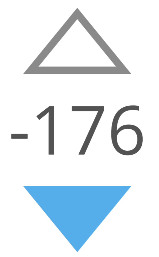
The new buttons are badly designed and other answers explained why pretty well. What's more disturbing is this appears to be a solution in search of a problem nobody asked for, whereas real issues with disappearing plus/minus signs when the vote count exceeds hundreds, or relentlessly requested literacy in using a proper minus sign in place of a hyphen - are ignored for a decade:

Before making superficial updates (which for many turn out to be downgrades), please make sure the site content is displayed competently and is in agreement with good typographic practices and standardized notations, and not with what is easy for your designer team to implement or is aligned with their current mood.

1
  • 2
    This answer needs better visibility!
    – Troyseph
    Commented Jun 9, 2023 at 9:44
39

For those who want it, I have once again made a user style to revert the vote buttons to an approximation of the way they were before. You can find it here. If I got anything wrong, don't hesitate to open an issue!

7
  • Maybe you could remove the .question prefix so it also works on answers? Commented May 30, 2023 at 15:50
  • @samcarter_is_at_topanswers.xyz Done.
    – Ginger
    Commented May 30, 2023 at 15:54
  • Seems to work great! Personally I'm using a lighter gray: i.sstatic.net/W1Nrx.png Commented May 30, 2023 at 15:58
  • 3
    Great work. I've made the following changes for myself: Added font-weight: unset !important; to the .js-vote-count, to get rid of the bold text, setting the --fs-subheading variable to 1.9em on the container to restore the font size, I've overridden --black-400 to #babfc4 to restore the gray color and finally I've set the arrow sizes to 34px.
    – MMM
    Commented May 31, 2023 at 8:10
  • Actually, I went through archive.org and discovered that the original font size was 1.61538462rem, so I've set it to that wonderful number instead :)
    – MMM
    Commented May 31, 2023 at 8:27
  • @MMM I've incorporated these changes into the main script. Hopefully it didn't break anything :p
    – Ginger
    Commented May 31, 2023 at 11:48
  • 1
    "Stylus failed to parse usercss: Could not find metadata." for your "here" link. I had to click your "open an issue" link, navigate to the file, manually copy-paste it into Stylus's editor, and then click "Overwrite Style" in the import dialog that popped up to parse out the "applies to site..." filters. Probably a good idea to point that out to Stylus users so they don't get confused at Stylus recognizing it as a style but failing to parse it.
    – ssokolow
    Commented Jun 1, 2023 at 12:06
37

Regardless of taste, if this is the final design of the buttons, personally I see some adjustments at the perceptual level that can be improved.

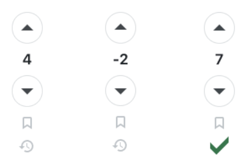
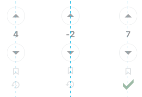
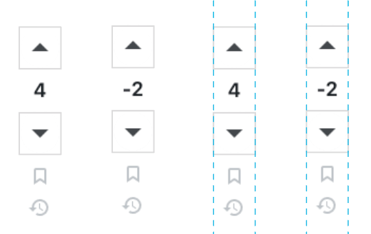
The contiguous circles perceptually emphasize the central axes where they are located. This causes that in centered alignments, elements with irregular optical areas, such as the numbers 4, 7, and negatives, seem to be off center.

enter image description here

enter image description here

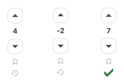
To avoid this, it would be enough to reinforce other virtual alignment axes. For example, in square buttons, the importance becomes of the lateral margins instead of the central axis, disguising the off-center effect:

enter image description here

The middle term between one option and another is explained in this answer, where the use of squircles (no circle, no square) decreases the strength of any kind of emergent virtual axis:

enter image description here

3
  • 9
    I was going to comment the same, Had even few screenshots ready. The last pair of buttons look much better IMHO Commented Jun 1, 2023 at 12:03
  • Even when circles are not used, there is still the line obtained by extending the height of the two triangles. In all the shown screenshots, I notice that negative numbers are off-center, but the effect is even more noticeable when squares are used, probably because the squares are more clearly delimiting a zone.
    – avpaderno
    Commented Jun 4, 2023 at 19:45
  • 3
    The effect is the most noticeable with squircles to me.
    – roundabout
    Commented Jun 13, 2023 at 12:39
32

The text showing the numeric score is now smaller. This matters not just for readability (it's one of the most important bits of data about a post!) but also because clicking on the number shows the breakdown of upvotes and downvotes.

It's highly unusual for "accessibility" to be cited as a reason for making important text smaller, or for making an interactable element smaller.

29

I've created a userscript for anyone who may want to revert this change. Lemme know if something goes wrong with it and I'll try fixing ASAP.

3
  • Mostly works, but sometimes this happens: i.sstatic.net/4xyMw.png Commented Jun 3, 2023 at 10:23
  • @Butthosenewbuttonsthough.. bro you changed your username for this😭 Commented Jun 6, 2023 at 8:50
  • I have a problem. I use Stack Overflow in high-contrast dark mode, but all the vote buttons have boxes around them.
    – CPlus
    Commented Oct 8, 2023 at 1:57
26

If this is about accessability, it could have been done better (refer to other answers).

If this is about generating votes, I suggest to create a new privilege: After giving fifty votes, you are allowed to return to the old button design.

24

While I realize that not everyone will like every change that's introduced, at the very least a new feature should be getting mixed reactions - ideally the majority should be positive. Currently, this post is the 11th 5th most downvoted of all time here on meta only a few days after rolling out the new buttons.

Please revisit the community's feedback and (at least temporarily) roll back this change.

1
  • 22
    Although I agree that this should be reverted, I'm afraid it won't. I mean, they didn't revert this, this and this (all in the top 15 all-time most downvoted), so there's no reason to believe it'll be different this time. We'd better stop wasting our time in Meta, because the company doesn't care about our feedback (they just pretend they do, but it's obvious that they don't)
    – hkotsubo
    Commented Jun 1, 2023 at 17:02
17

I think the update is pointless. And it will not encourage users to vote more. All that has changed is that the buttons have become larger (although they were normal size before), but they have become ugly and very poorly combined with the design of StackExchange sites.

And it also annoys me that I have to click on this terrible button to vote against this post.

Update:

You have seen a negative reaction from the community (+124/ -673). You have been pointed out a lot of shortcomings of the new buttons, of which you have fixed only one!

15

The change is live now and my first impression is that yes, the voting buttons are more obvious and I can understand more people using them but at the same time the score has become less obvious to decipher. For me as experienced user I already know where the voting buttons are, but I need to see the score frequently. That became harder. My association is two big balloons with something small squeezed in between. It may just be me being used to the old design but I find it more pleasing aesthetically.

Some concrete feedback:

  • the circles edges are too emphasized
  • the arrows are too small
  • the circles are too big
  • the colors are too similar

Hope that helps you in case you ever want to redesign the feature. Btw. just discovered again that it still says "X votes" instead of score but one can get used to a lot. I will need to come back in a month/year and recheck my impression.

I guess it could be that the novelty effect of these voting buttons has worn off by then. I also didn't understand why voting is/was a pain point. People missed the arrows? Maybe they simply would have needed to be reminded of the feature a few times if they didn't vote.

15

On locked posts, the new bold font hasn't been applied. Like on this question:

enter image description here

It still has the old font, not the strange, new one that we have now:

enter image description here

I'd say I wanted them to be consistent, but I really don't, because they're ugly. But it probably should be fixed.

Oh, and while you're at it, maybe you can fix this related issue, where high-scored lock-posts have un-centered scores.

6
  • 10
    Okay. The more we are noting, the more we are able to conclude the inevitable: the design implementation is a disaster. Commented May 30, 2023 at 16:03
  • 1
    In which way is the new font "strange"?
    – avpaderno
    Commented Jun 4, 2023 at 19:30
  • 1
    @apaderno - in that it is new and unfamiliar and that I, for whatever reason, don't like it. Hence, strange.
    – CDR
    Commented Jun 4, 2023 at 20:39
  • 1
    Why is bold even considered to be better here? Bold is used to offset a piece of text from the rest of its context. There's no context around the number. If you want it more visible, change the SIZE.
    – Randall
    Commented Jun 8, 2023 at 16:33
  • @Randall font weight (bold-ness) does impact on perceptual contrast, and therefore visibility. Being able to improve visibility while maintaining compactness is useful. Using bold text isn't just about context; there's a reason we have both boldface and italic (and other forms of emphasis, such as underline) as standard typographic tools. Commented Jun 8, 2023 at 21:24
  • @KarlKnechtel In the images CDR pasted, I find the '146' more readable than the '-139' (grey color notwithstanding). Maybe it's just the way he copied/pasted it. Bold can effectively reduce the kerning between characters, which was a significant part of what I had in mind. I'm no font wiz, but the fonttype might also make a big difference here.
    – Randall
    Commented Jun 8, 2023 at 22:01
15

What I specifically dislike about the change is the lack of contrast on many sites, for example https://scifi.stackexchange.com:

The difference between the regular colour and "I already voted on this" is just too small; I already accidentally upvoted things more than once by accident.

I actually have fairly good vision, but I'm typing this in in the evening with my screen fairly dim, so it seems like a fairly serious accessibility problem (which is ironic since that was one of the main reasons for this change!) On full brightness it's probably a bit clearer, although still not spectacularly so.

On Stack Overflow it's orange instead of light blue, which is a bit better, though still not brilliant. On https://meta.stackexchange.com it also sets the background colour:

And that's much better, IMHO.

(While some other answers already touch on this aspect a little bit, I felt it was worth pointing out in a separate answer – personally I don't really care about most of the other criticisms, and would hardly have even noticed the design changed if it wasn't for this).

1
  • 5
    I agree. I feel like the inverse color effect of meta (dark background and white arrow) should be used everywhere. To me it seems like the current effect used on non-meta sites looks more like a hover effect than an indicator of already having voted. Commented Jun 6, 2023 at 21:04
15

Since the Product Team wanted numbers, here's some numbers:

Problem #1: How do we make a triangle more accessible to the vision-impaired users (near/far-sightedness, visual agnosia, color blindness, etc)?

Solution: Make the vote icon less than one third the previous size, and draw a pretty circle around it. It's actually closer to one fourth the former size, but you get the point...

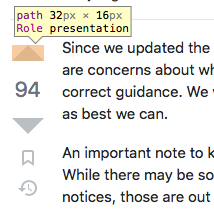
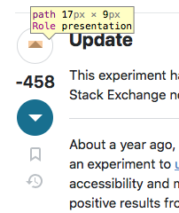
Numbers: The total surface area of the upvote/downvote arrow icons went from 264px² to 76.5px²: that's a 71% reduction in size of the one entire visually-identifiable element used to know whether you're about to upvote or downvote something. Hate to break it to you, but no matter how you spin it, that circle without the trusty triangle infers literally nothing about what will happen when you click, tap, or press it.

Vote arrow size back when accessibility must've suckedVote arrow size with accessibility enhancements applied

Furthermore, in the world I live in, which happens to feel very real, the only way these updated vote buttons will actually have a predictable outcome on a user's voting habits in a deterministic manner is if you add the classic MW2 hit marker sound to your onClick event and hope they have their speakers on.

Problem #2: How do we make our tiny but emboldened circled triangle more accessible to the physically-imparied users (DCD, hand tremors, age-related motor control decline, fat fingers, etc)?

Solution: Increase the size of the button (circle and all) by 5px because the intern just remembered that adding a circle also means adding margins or the whole UI begins to look like a broken record.

Numbers... Previous clickable area was 36 * 36 = 1296px². New clickable area, using πr² with a radius of 19.5 for the circle excluding the border width, we arrive at 1195px². Which is a mind boggling 101px² smaller than before. Bigger button, smaller hittable region.

So in other words, not only can you not eat your cake, but you can't have it either.

At least it's accessible.

1
  • 4
    No arguments against actual figures. Good job. Commented Jun 8, 2023 at 14:34
15

As a person who sits on advisory committees for persons with disabilities in a major Canadian city, I really have to ask; How many visually impaired people were consulted during the process of deciding to overhaul the UI?

As several other people have mentioned, these circles are making it harder for people with visual impairments to understand what they are looking at. As voting is an essential part of how content gets moderated on ALL SE sites, its very disturbing to know that people with visual impairments will have a harder time being part of that process as a result of this overhaul.

Changing things for the sake of changing them is one issue in itself, but making major changes to the visual layout of an entire network of websites without consulting people with disabilities, is a beyond concerning.

Want to help make the lives of people with disabilities easier? Consult with us, hire us, talk to us. We are always in need of a voice.

Disabled people exist.

1
14

Why, I'm thrilled about our new and improved voting graphics! It's nice of you to provide some diversionary entertainment while we are experiencing the moderator strike.

By the way... remind me, what is that Code-of-Conduct rule one violates if one degrades the network site's UI against the overwhelming objections and protest of the users? Oh wait, I guess there isn't any such rule.

14

I can see the style has been modified since this was posted. Both hover and clicked button styles differ much more substantially, making it much more readable. Despite there is even more contrast than before, I somehow find it more harmonizing with the whole page, in comparison to what was proposed originally.

enter image description here

I think this was my biggest remark, and perhaps I can retract my downvote now. Please propagate this to other SE sites!

For example, on Music SE the buttons look like this:

enter image description here

It somehow lacks contrast, and I need to look twice to see if I have clicked a button or not. Also, on my FHD screen the circle actually looks pixelated, the top, bottom, left and right edges look thinner, and overall the impression is not pleasing. It doesn't seem to affect the light gray unclicked button, but the darker line clicked one looks jagged. The filled button (as here, in the Meta site), looks much better.

Some sites, like Physics SE example shown below, use color, but I'm afraid this is of little help to colorblind people.

enter image description here

You must log in to answer this question.

Not the answer you're looking for? Browse other questions tagged .