69

New Focus Styles

We’ve released a design update to focus styles across the many components within our design system and as well as a new design for our button group component. See more details on how we approach accessibility in our Stacks documentation.

Why are we updating the focus style?

Prior to these recent changes, we would commonly apply a custom focus ring around elements to indicate an element was focused. There were several issues with this approach. For one, this focus ring was usually well below the 3:1 contrast ratio needed to meet WCAG (Level AA) standards. Also, the focus ring was always rendered as a ring outside of the focused element, meaning it would often be obscured when it exceeded the boundaries of its parent element. Additionally, we often set outline: none on elements that have this custom focus ring so an outline would not clash with our custom style, and since OS-level forced color modes often rely on applying an outline to indicate focus, our explicit removal of any outline meant that these force color modes would not indicate that an element was focused.

How are we making updates to the focus style?

Our new focus styles address these issues by applying two rings in the form of a contrasting outline and box shadow, one nested inside the other, to ensure focus is clearly indicated. The inner ring matches the page background color, while the outer ring is set to theme-secondary-400 (which is usually blue). With some exceptions for components with limited interior space, we place these new focus rings inside the bounds of the component. This prevents the focus from being obscured when it may otherwise exceed the boundaries of its parent element. And because the focus style includes an outline, OS-level forced color modes can reappropriate this style to apply focus styles per the user’s preferences.

Utility focus classes

In order to help our UI developers apply our new focus styles to components not within the Stacks library, we’ve added utility focus classes so we can apply the same focus styles across our products as needed.

Current status

Updates to focus styles for many components (see below for a list) have been deployed. On an ongoing basis, we’re updating the focus styles to many custom components across our UIs. Later, we’ll apply our new custom focus style to components that have never included custom focus styles, such as avatars, cards, and links.

What we’re looking for

Please report any bugs you find as an answer below this post. Automated tests can only catch so much when it comes to accessibility bugs, so we rely on a mixture of automated and manual testing to give us confidence in our work. There’s always a decent chance we missed a bug or neglected to consider all circumstances that are impacted by these changes, so we appreciate your feedback and enjoy hearing about your experience with these changes.

Sample screenshots

Block link

Block link in focus with blue outline

Button

3 button variations in focus with outlines

Button group

3 buttons within a button group, the first in focus

Form elements

Radio, checkbox

Radio button and Checkbox in focus with blue outlines

Input (text)

Input field in focus with blue outline

Select

Select in focus with blue outline

Textarea

Textarea in focus with blue outline

Navigation

Selected item

Selected navigation item in focus with blue outline

Unselected item

Unselected navigation item in focus with blue outline

Pagination

Selected item

Selected pagination button in focus with blue outline

Unselected item

Unselected pagination button in focus with blue outline

Tag

Tag in focus with blue outline

Toggle switch

Single

Single toggle switch in focus with blue outline

Multiple

Multiple toggle switch, the 3rd option in focus with blue outline

Top bar

Top bar with the inbox icon in focus with blue outline


Accessibility: new button group style

We’ve also released a design update to the button group component. This change will be applied across all Stack Exchange sites.

Before

Button group before the change showing 1 button in focus and 1 button selected

After

New button group after the change showing 1 button in focus and 1 button selected

Why are we updating the button group component?

Our original active state did not meet accessibility standards for WCAG AA. The background color used as a visual cue to differentiate between the active and inactive states did not meet the 3:1 contrast needed to meet WCAG (Level AA) standards. Although we explored alternate color options (with higher contrast), we decided to bold the text in addition to the background color change when a button has been selected (is active). Changing the background color created additional complications and inconsistencies with other components and theming. If the link is a different color and bold, it no longer fails because the boldness is not color dependent. Using bold as an active state is also consistent with our navigation items.

Additionally, we removed the inner border lines as a tiny step towards our design vision — yes, we’re still thinking about that and hoping to sneak in some improvements whenever possible. Although it may feel small, removing unnecessary lines helps reduce the overall noise on a page and deemphasizes the button group from other components that deserve more attention.

How are we making updates to the button group component?

In order to bold the selected button while avoiding layout shift, we added a bolded hidden pseudo-element containing the button text within each button (See this CSS Tricks post for a broad overview of this approach). The pseudo-element is populated by the value of a data-text attribute on a wrapper around each button’s text. This results in each button’s width being equivalent to its selected state even when it’s not selected.

Check out the Stacks library pull request for the changes made to our design system and the Stacks docs to see the new button group design in action.

What we’re looking for

With the new focus state style, we needed to add additional padding so that the smallest size of the button group component would display the focus ring accurately. This does increase the overall size of the button group. If you see any issues with wrapping or any bugs related to the button group, please post an answer below this post.

7
  • 8
    "removing unnecessary lines helps reduce the overall noise on a page and deemphasizes the button group from other components that deserve more attention." The extra space this introduces between the tabs and the border of the entire component does the opposite of deemphasizing the button group. It now has a permanent outline as opposed to just a border.
    – Kevin B
    Commented Mar 26 at 15:40
  • 22
    For those who are wondering how to test this new style: on any page of this site, even the page you are reading right now, just press the TAB key on your keyboard and the focus will shift to the next element. Pressing it many times will cycle through the elements of the entire page. I suppose most of those who are interested in trying out the new style already knew how to do it, but still, sharing this won't hurt! Commented Mar 26 at 19:15
  • 14
    Great to see you are working on accessibility issues. Thank you! Commented Mar 26 at 20:06
  • Was the double Search icon a consequence of this change?
    – Joachim
    Commented Mar 28 at 8:34
  • 6
    Is this why there's a POP-UP asking me to follow stuff? Kinda lost my focus after that.
    – Mazura
    Commented Mar 29 at 0:53
  • @Mazura: I'm pretty sure that pop-up has existed for ages, ever since the Follow feature was introduced in 2020. Dismissing it on a site once should mean it doesn't appear again, at least on that site. (But it might be possible that a recent change caused it to start appearing again for some folks, even if they previously dismissed it.)
    – V2Blast
    Commented Apr 1 at 21:44
  • 3
    Checkboxes and radios are nearly indistinguishable.
    – canon
    Commented Apr 10 at 18:25

10 Answers 10

28

Thank you!

This is an appreciated change, and a good step in the right direction; always good to see some accessibility work being done.

With that said: What are useful bug reports in the current state of this project?

Do you want us to maintain a list of UI elements that don't have an updated focus, particularly elements that have been troublesome in the past? What's in scope of this project - I assume chat is out of the question, but what about, for instance, the stackexchange.com domain? Moderator tools? Stack Overflow for Teams1? Having some kind of information on what to report (or rereport) in this specific context would be useful.


1 I assume Teams is out of scope, particularly since they just declined my bug report about keyboard shortcuts with the stance that they're not officially supported at all in Teams, but you never know...

1
  • 7
    For right now, we're mostly looking for any issues that would have come from the direct changes we made. Even though a list of UI elements would be helpful later on, we'd like to make sure what we shipped is working as intended. For this post, only report on the components we mentioned were changed. Teams will be getting these changes as well, they have their own release schedule we have to wait for.
    – Carrott Staff
    Commented Mar 26 at 17:12
21

Answer sorting dropdown

Answer sorting dropdown with focus

The outline comes very close to the "Sorted By" label

Activity button

Activity button with focus

The outline is a strange shape

Search box

The search dropdown doesn't disappear when you tab out of the search field, leaving it overlapping

Search field focused with dropdown

Search field unfocused, dropdown remains

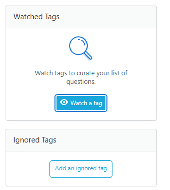
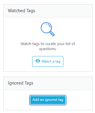
Watch a tag / Add an ignored tag

Watch a tag button with focus shows as an active button

Add an ignored tag button with focus shows as an active button

These buttons should probably stay as their default fill?

(Aside, should it be "Ignore a tag" to match "Watch a tag"?)

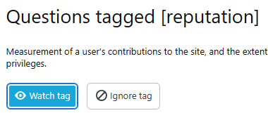
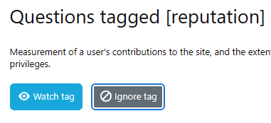
Also applies on the tag page:

Ignore tag, unfocussed, showing as inactive

Ignore tag, focussed, showing as active

And even in the navigation buttons, it looks different to your screenshot

Nav button when focused looks almost active

Badges

At least on MSO, it's pretty hard to see the outline

MSO badge focussed showing low contrast with focus outline

Cramped text on profile page

Cramped text on profile page focused

Looks even more cramped when focused

Help Centre Left Nav

Help centre left nav active page focused

Should the little blue lozenge on the left get an outline?

7
  • 2
    I didn't notice this answer when I submitted this bug report. But it turns out the search tooltip not going away was reported a while ago. Commented Mar 27 at 21:01
  • 5
    Thank you for adding all the screenshots to your post, I'll go through each one in order. For additional details, see the Stacks documentation. Answer sorting dropdown: dropdowns, selects and input fields all have the focus ring on the outside. Because of this, some closeness will occur with other elements. Activity button: this was not a component we were able to update in this first round, this is unchanged. Search box: this was unchanged as well but I'll see if I can prioritize this older bug.
    – Carrott Staff
    Commented Mar 28 at 15:07
  • 4
    Watch a tag / Add an ignored tag and navigation buttons: This is by design, see the documentation for details on why we took this approach. Badges: this was not a component we were able to update in this first round, this is unchanged. Cramped text on profile page: The smallest button group size does get pretty tight for focus but it's similar to just having an outline around text links (by design). Help Centre Left Nav: having the lozenge outlined was not intentional, I'll report the issue but it's likely to be marked as low priority.
    – Carrott Staff
    Commented Mar 28 at 15:11
  • 4
    @Carog - I will say, I understand that you want the focus to be obvious, but I think it just looks too much like an active option / primary button. I know you have limited colours now, but it would be good if you could try some iterations? Commented Mar 28 at 16:36
  • If you are trying to ping @Carrott, I don't think they will get notified if you call them carog :)
    – terdon
    Commented Apr 26 at 18:47
  • @terdon I believe they have changed their username!
    – Tim
    Commented Apr 27 at 20:15
  • I did change my user name ;) @TimHitchinsEkkoSense the not so great answer to your comment is that we did try A LOT of iterations (no we didn't post them on meta). It's really tricky balancing between meeting the requirements, maintaining some kind of consistency across components, while not conflicting with styles on existing components and keeping it simple in our codebase to implement and maintain. Focus states need to be obvious and easy to find on a page. We decided to go the route of that button being more obvious rather than risk it not being prominent enough.
    – Carrott Staff
    Commented May 16 at 19:17
14

The [Active]/[Pending approval] button group in the Tag Synonyms list is too wide, and also has the “Pending approval” label duplicated:

enter image description here

4
  • To be honest: I do not know if this is an issue with the new button group styling or if the problem existed before. Is there any way to switch between old and new styling?
    – Martin R
    Commented Mar 28 at 9:09
  • Well there's the Wayback Machine, and based on the latest snapshot from last November, the tabs in that page are new, but can't know when they have been added. Anyway the bug is in the tabs, they're not defined correctly. Commented Mar 28 at 9:23
  • 8
    Eeeeek! I'll have the team confirm but it seems we may have added a button group to that page accidentally or it's width is off. I've forwarded the issue to the team, thanks for reporting.
    – Carrott Staff
    Commented Mar 28 at 14:45
  • 6
    Thank you for reporting, the width and duplicate issue has now been fixed.
    – Carrott Staff
    Commented Apr 2 at 16:58
7

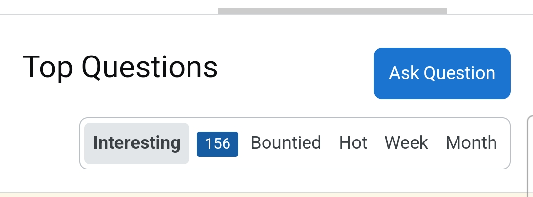
On site with English interface new design for tabs looks fine even on narrow screens:

enter image description here

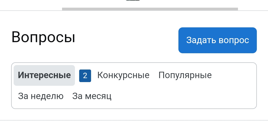
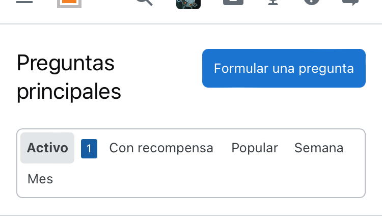
But on other sites, e.g. StackOverflow in Russian, the border around tabs looks weird:

enter image description here

As well as on StackOverflow in Spanish:

enter image description here

I'm not sure about original intentions here but I think that the border expected to be around tabs without so large empty area. It looks elegant only when all buttons fit into single row.

Additional links with "broken" tab design (observable even on screens regular aspect ratio, tested on iPad Pro 11"):

4
  • 3
    I even experience this on the English sites, on a phone with a narrow screen (Sony Xperia 10 V). Commented Mar 30 at 14:07
  • 1
    Was it stacking like this before the new design? I simulated the behavior on the old design using this wayback machine link and it looks like the previous behavior on narrow screens was also funky: i.sstatic.net/gIqSw.png (the corners are squared on right side of the first row). Actually I would say this is at least better than the former behavior. Commented Mar 31 at 19:37
  • 2
    Yes, the button group does look a bit odd when it wraps. That was the case before this change as well, and unfortunately is a necessary evil of responsive design where you can't have everything look perfect all the time. Due to to the way the button is built and how it needs to work with all the states (active and focus), we've decided to live with the additional white space that occurs with wrapping sometimes (worse in certain use cases depending on screen size and button length). We don't currently have the resources to prioritize improving the look of this.
    – Carrott Staff
    Commented Apr 2 at 18:57
  • 1
    @Carog actually you already have a solution for this - "more" button on questions page Commented Apr 2 at 19:46
7

On one’s profile page, the Select your next badge popup has buttons to choose to display either Available, All, Gold, Silver, or Bronze:

The Select your next badge popup with Silver selected, but gold and bronze badges still being displayed.

These buttons don’t seem to work anymore.

7

The checkbox and radio box look very similar and could easily be mistaken, could they have a clearer distinction between them? You also haven't shown what they look like when selected?

enter image description here

1
  • 5
    We're assuming the likelihood of this mistake happening should be fairly low because radio buttons will always come in a list of 2 or more. In those cases, you would be able to see the unfocused radio option as well. Additionally, these two components should never appear side by side like this in product (this was just for displaying the change in the meta post). You can see an example of all the states (included selected) without our Stacks Guidelines.
    – Carrott Staff
    Commented Mar 28 at 18:54
5

The "Migrated" tab alone in the "Tools" menu is still using the old Button Group style.

The other tabs "Stats", "Close" and "Delete" tabs are applied with new Button Group style.

"Stats" tab screenshot:

Tools - Stats tab

"Tools" tab screenshot:

Tools - Migrated tab

GIF for the same:

Migrated Tab style issue

1
  • 1
    The Migrated tab isn't using the button group component when that page is active. It's using an old custom navigation component. This would have been the existing pattern before this change. As much as I agree this is an odd behaviour, since this is a pre-existing issue, it's not likely to get prioritized any time soon. I'll create a ticket to remove the old deprecated style.
    – Carrott Staff
    Commented Apr 2 at 19:03
5

Very high or low scores cause strange issues

Tl;dr - when the score takes up a lot of horizontal space, the voting circle outlines aren't circles anymore. Can this be fixed? This is easiest to see on scores with five non-comma chars (i.e., negative four-digit scores / positive five-digit ones). That said, it's also visible if you look closely at a four-digit score that's positive.

Example #1 (high score, Stack Overflow)

Stretched voting buttons in a post

Looking at the Wayback Machine, these buttons used to be circular. Not exactly sure why this happens, but... they should probably still be round even with a score of over 10,000

Example #2 (low score, Meta Stack Exchange)

I didn't check the Wayback Machine, but I'd assume it's the same root cause.

3
  • 2
    This is a separate issue (not related to the changes we made to the button group of focus state). I can't find/recall if there's already a meta post about it but we have it logged internally and the fix is currently scheduled to come out over the next month.
    – Carrott Staff
    Commented Apr 2 at 17:53
  • 3
    A fix was deployed for this issue, thanks for reporting it!
    – tanj92 Staff
    Commented Apr 16 at 14:05
  • @tanj92 Good to hear; thank you for fixing it!
    – cocomac
    Commented Apr 16 at 16:44
3

Font size in the button group component as used on the sites has decreased; please increase it to match the old size

I noticed that the font size in the button group (tabs) component has gotten smaller than it used to be, especially in user profile pages when going through subtabs of activity subpages.

I find this smaller size less accessible. Can the size please be bumped up to match what it used to be?

4
  • 3
    The font size did not changed as part of this update. All font sizes were kept the same. The sorting and filtering buttons on the profile page have a font size of 11px (before and now). You can see an example on the profile page (next to "Top posts" section) of the old button using the wayback machine with a font size of 11px. The new style is still using 11px.
    – Carrott Staff
    Commented Mar 26 at 19:51
  • 1
    @Carog I'm not talking about those buttons there. I'm talking about the subtabs of activity pages, i.e., in meta.stackexchange.com/users/377214/…. The buttons to filter to specific types of actions are a lot smaller than before. Commented Mar 26 at 20:28
  • 3
    All the filter buttons in within the profile pages (including the substabs of activity) use the same size for consistency — s-btn__xs is and has been applied to those buttons for a while (possibly since the last time we made a change to the profile page design). I can't get a wayback link since it's harder to get a specific tab that's been captured but you can still see the old buttons on those subtabs within an instance of Teams. Teams hasn't gotten the update yet but they share the same styles for those sub pages.
    – Carrott Staff
    Commented Mar 26 at 21:22
  • 9
    @Carog Ah, yes, I see. The reduced gray color along the top and bottom edges made the text appear perceptibly smaller when it wasn't actually so. Commented Mar 27 at 0:34
2

Hover state background for button groups too light

There is a hover state for each button in the button group. But there is not enough contrast between the hover state background and the page background. So the hover state is barely visible.

For example, in this image, my cursor is hovering over the "Bugs" button.
Button group with hover state for first button

Hover state background overrides focus state background

Note this might be directly caused by the above issue.

When you tab into a button, a dark gray background is applied to it.
button with dark gray active state background

However if your cursor happens to also be hovering over the button, the above mentioned hover state background overrides the dark gray background, causing it to look like there is no background applied at all because of the presence of the stronger blue outline. See following image:
button with active state and hover state background

This will probably be fixed if a darker background is used for the hover state. Or perhaps the hover state background should not be applied on focus-state buttons.

2
  • 1
    We did not modify the hover state colors on button groups as part of this change. Even though the hover state background color is quite subtle, WCAG AA does not require that "mouse hover indicators contrast with the default state". All our buttons include a cursor change on hover as well, which means we're not relying on that background color alone to convey the information of the hover state.
    – Carrott Staff
    Commented Apr 2 at 18:12
  • 1
    For hover state overrides, focus states are primarily seen/used by people not using a mouse. The use case of somebody first focusing on a button and then using the mouse to hover over that button, seems pretty rare. I would argue, that even if that happens, maintaining the hover state visuals would be expecting rather than blocking them.
    – Carrott Staff
    Commented Apr 2 at 18:18

You must log in to answer this question.

Not the answer you're looking for? Browse other questions tagged .